
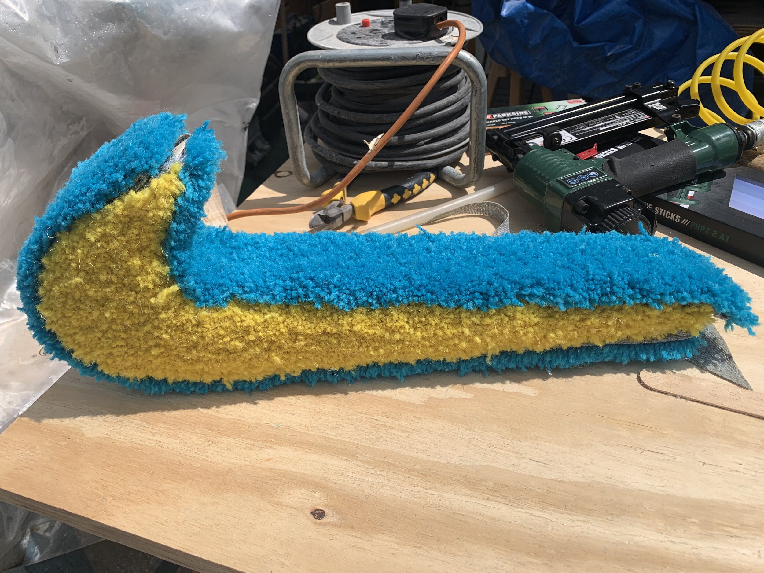
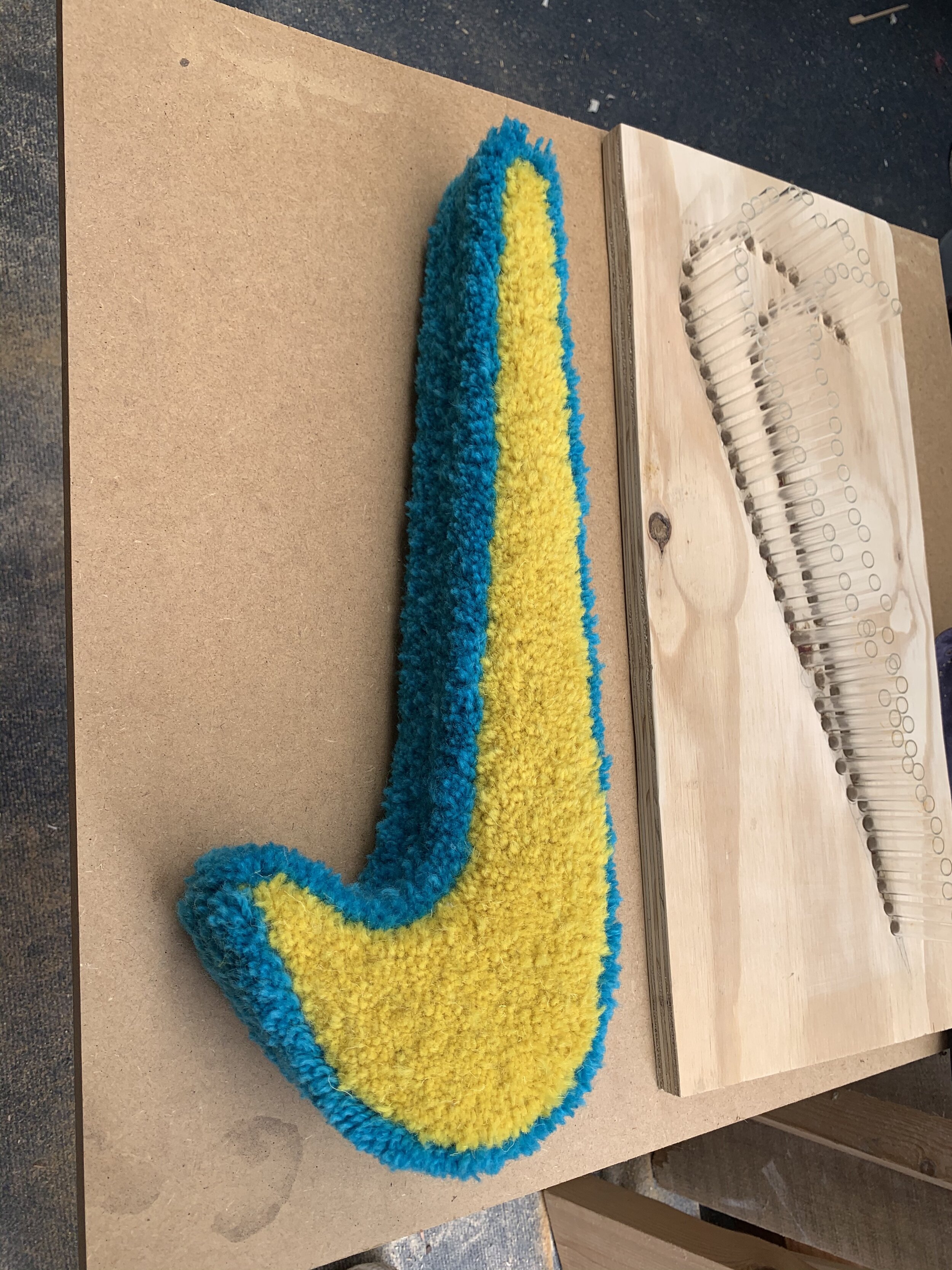
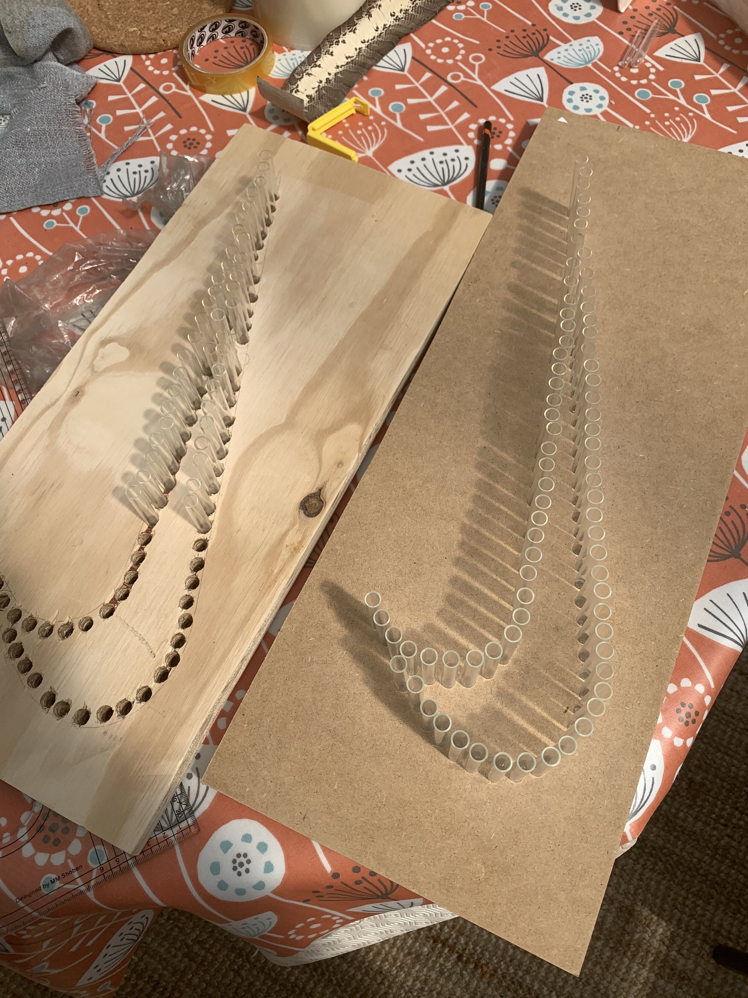
Just a tick // Nike
Art Direction
— 2021
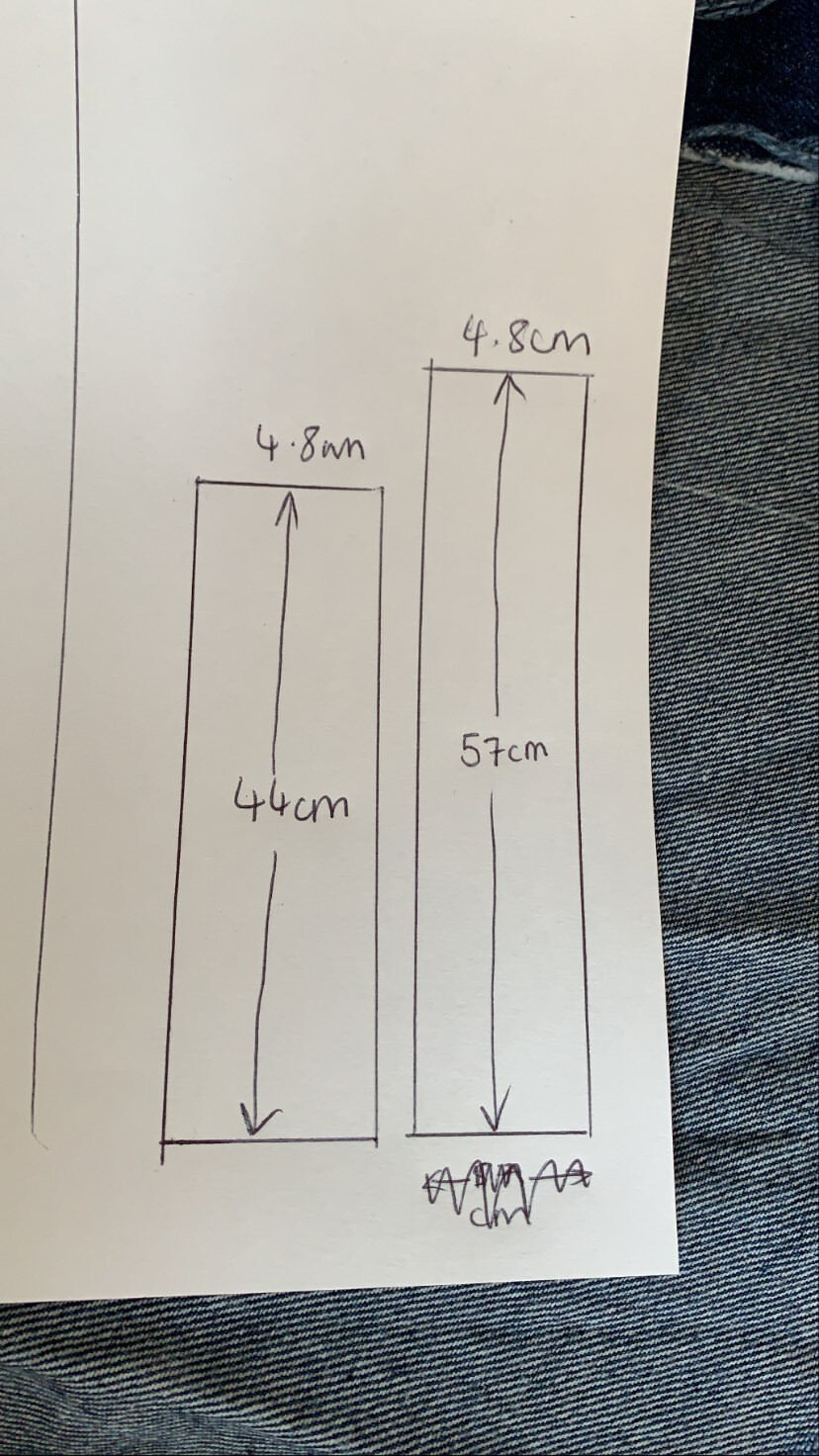
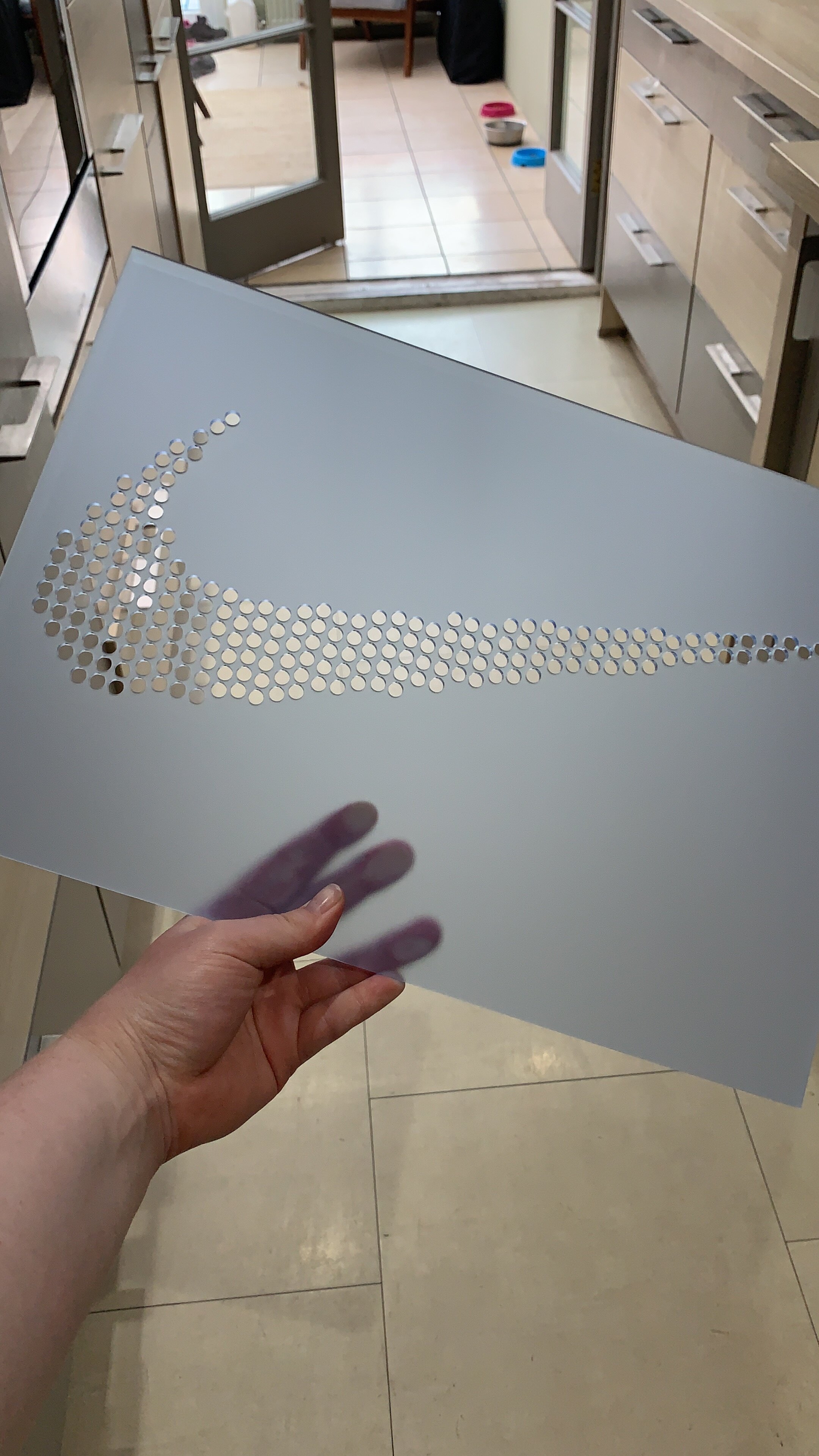
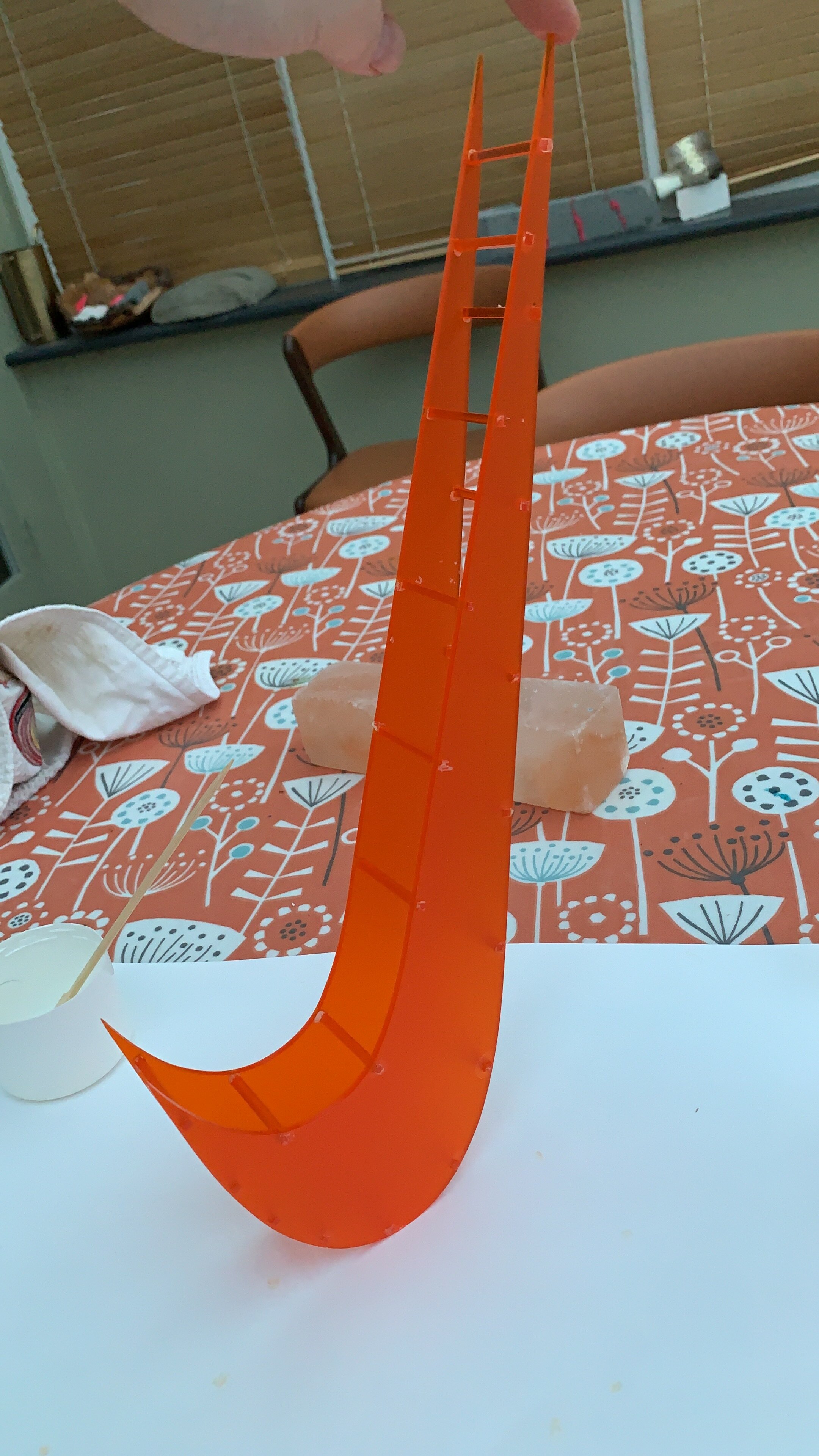
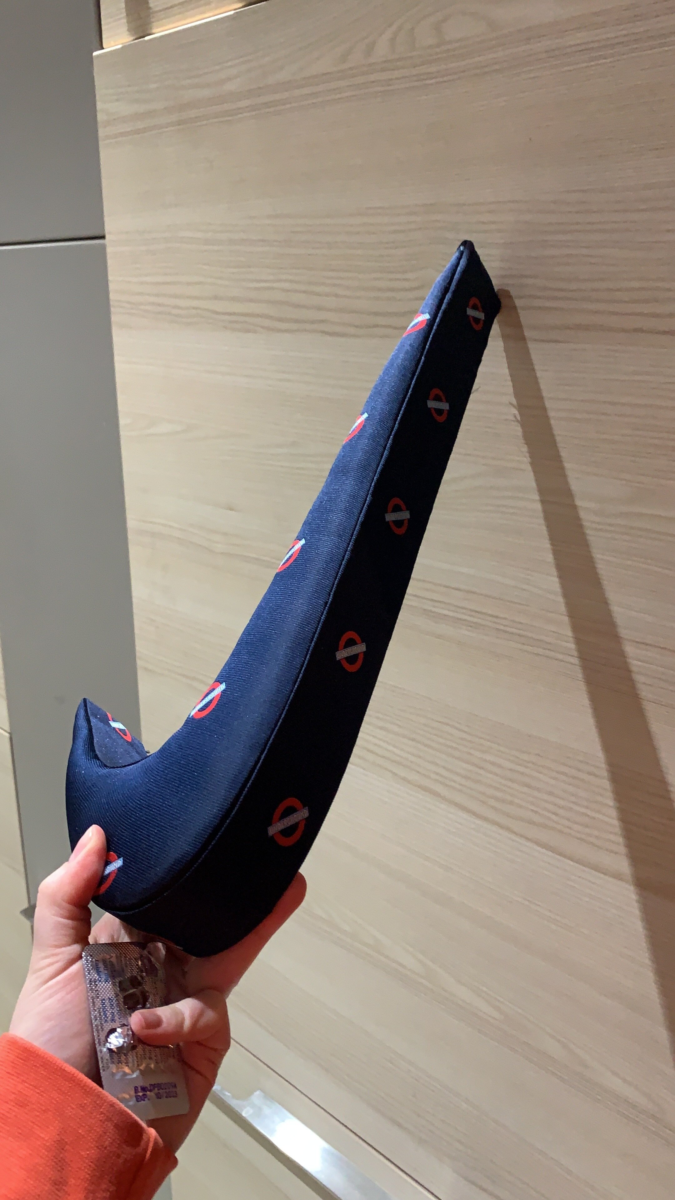
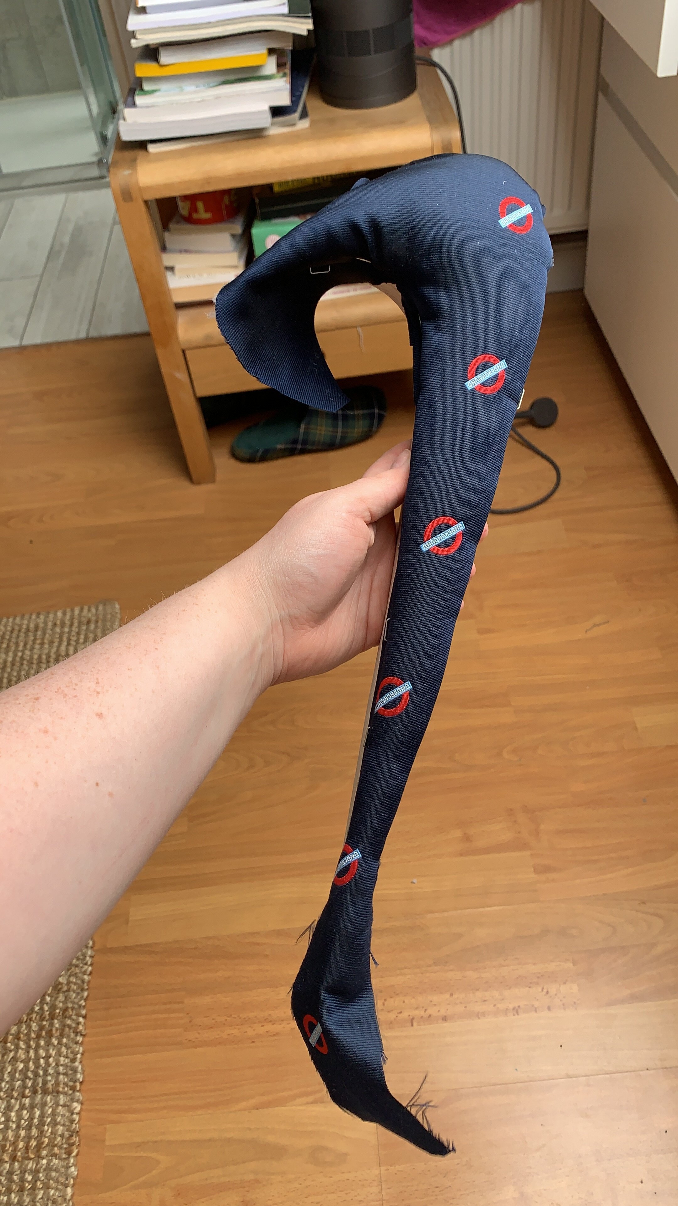
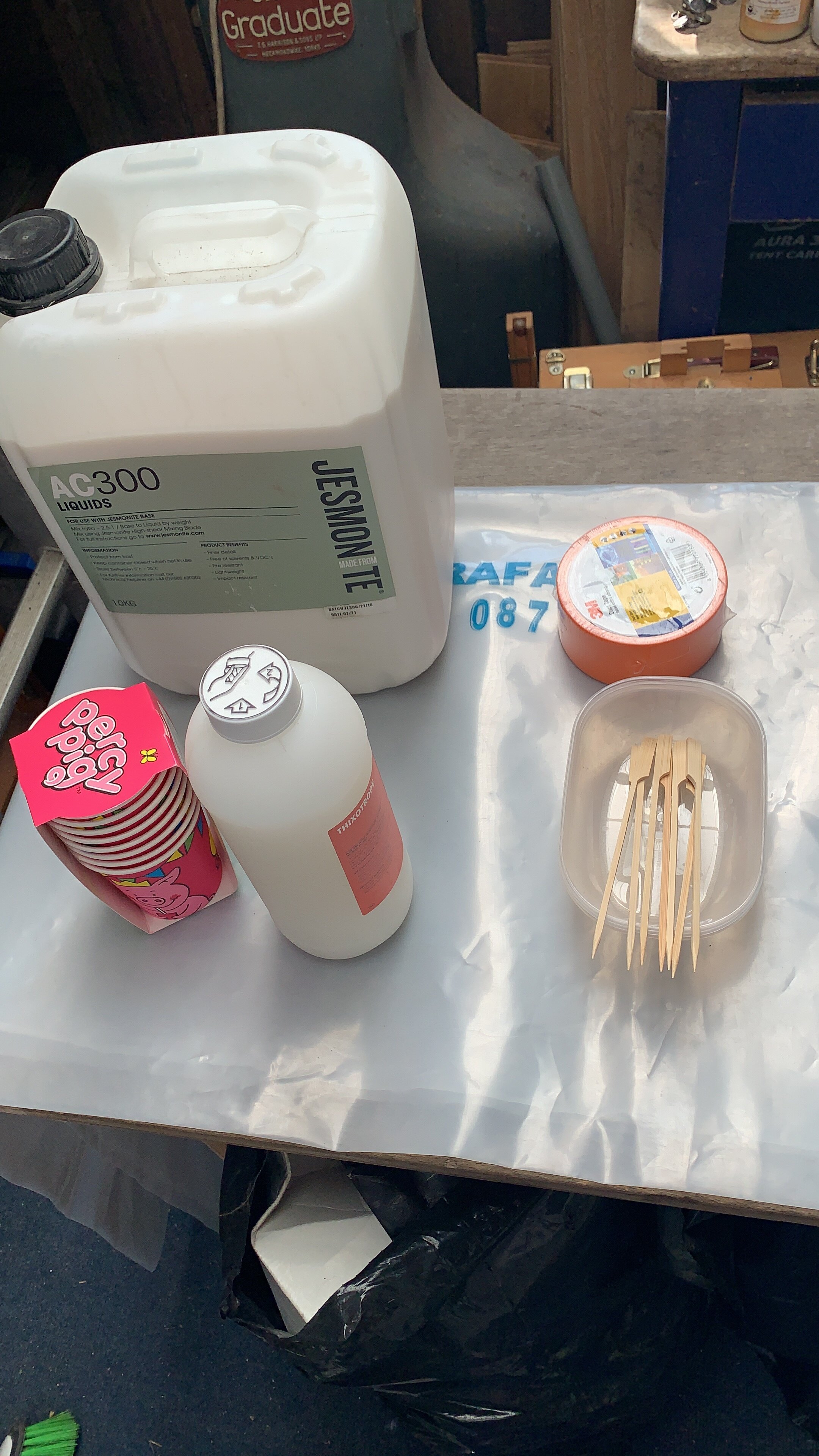
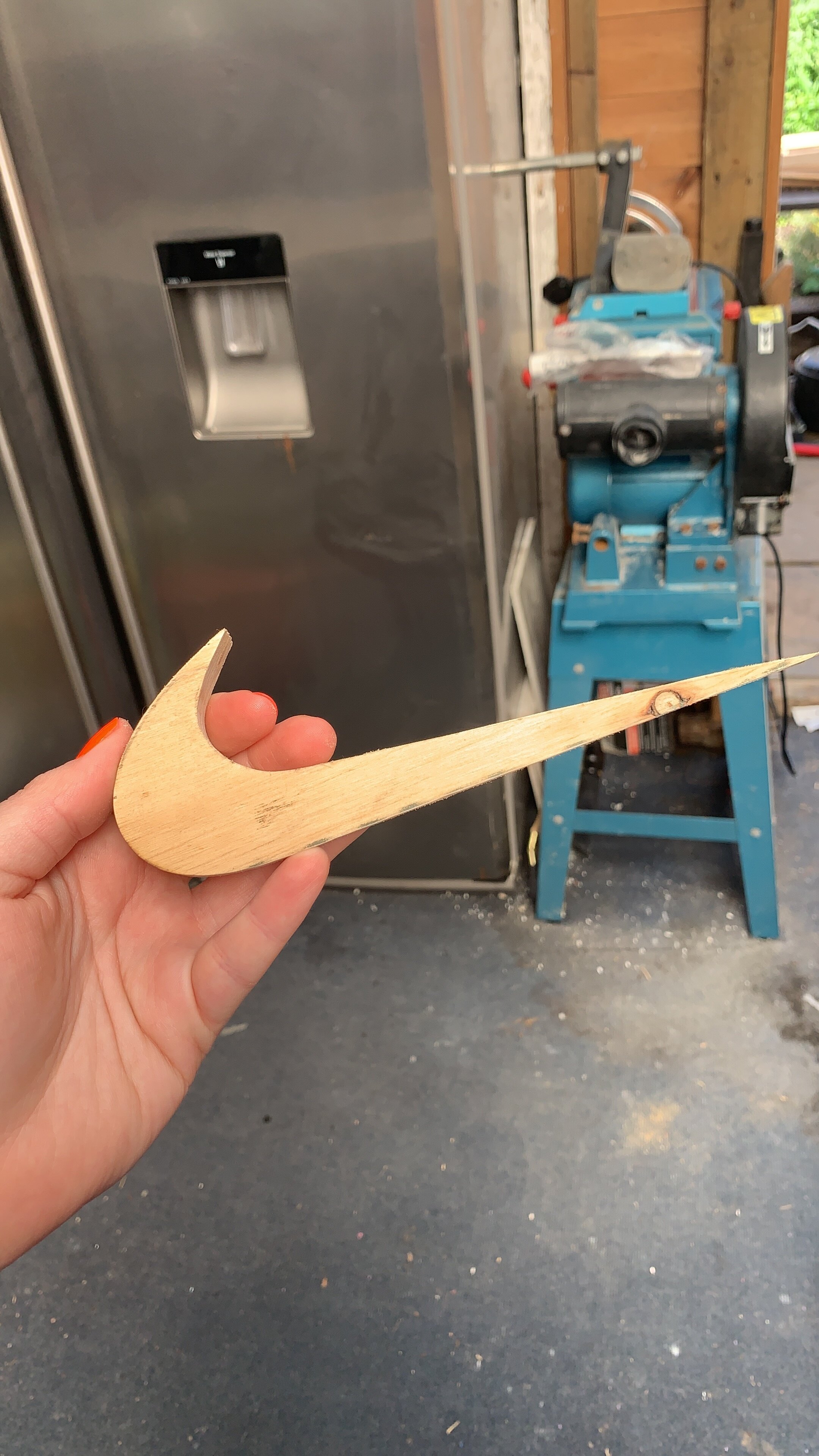
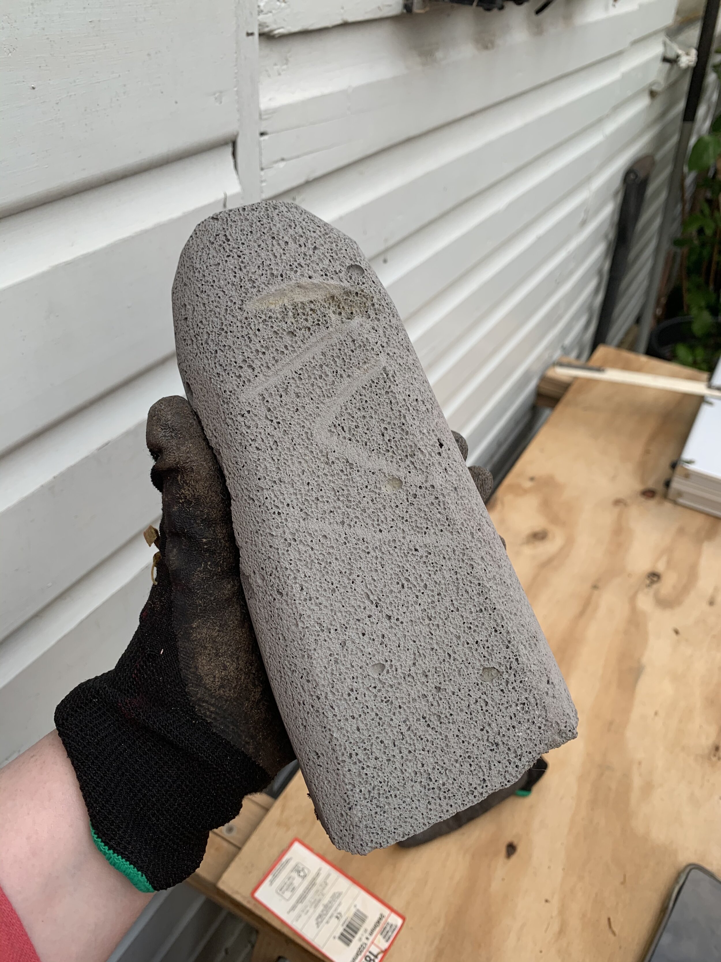
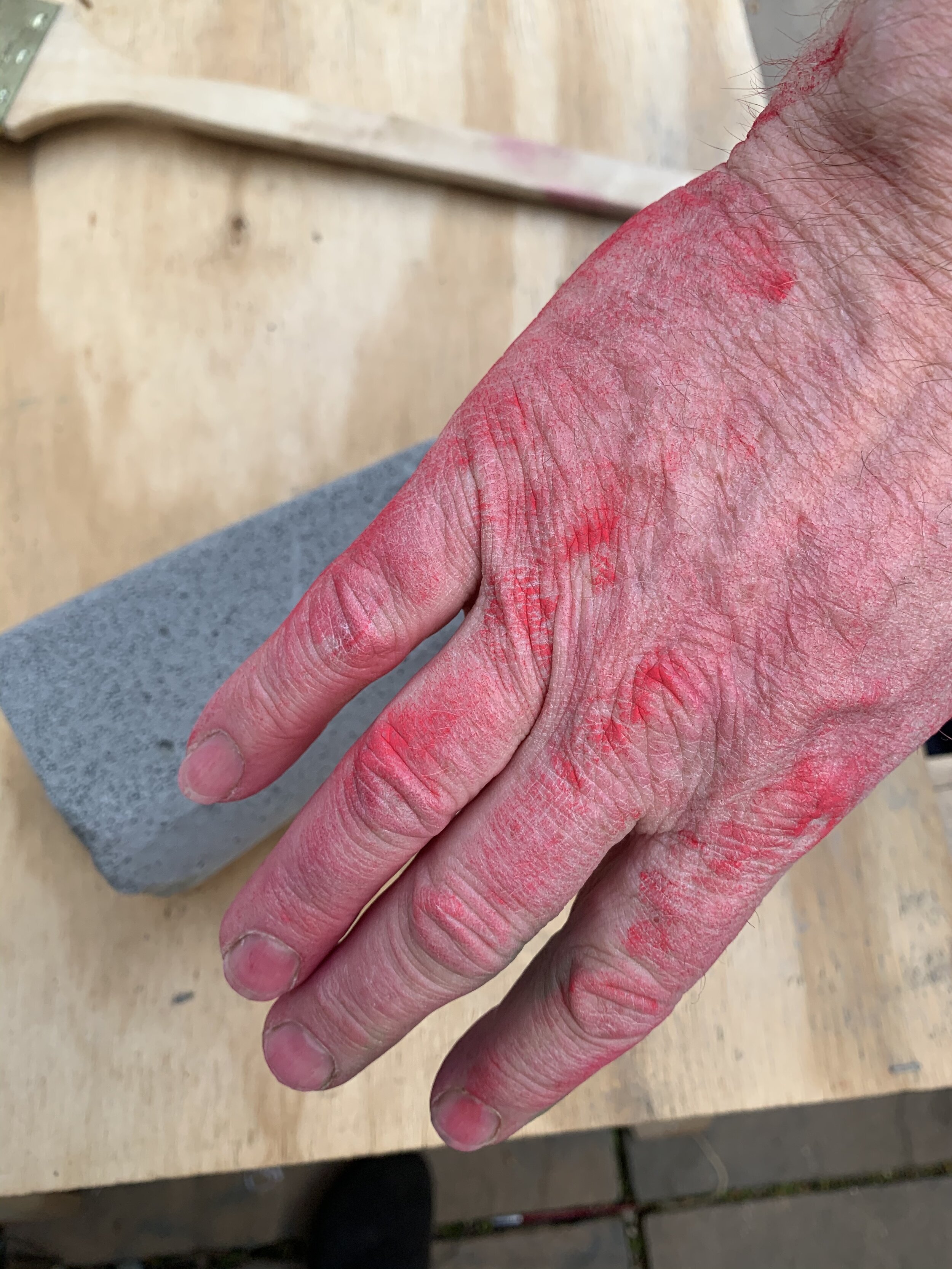
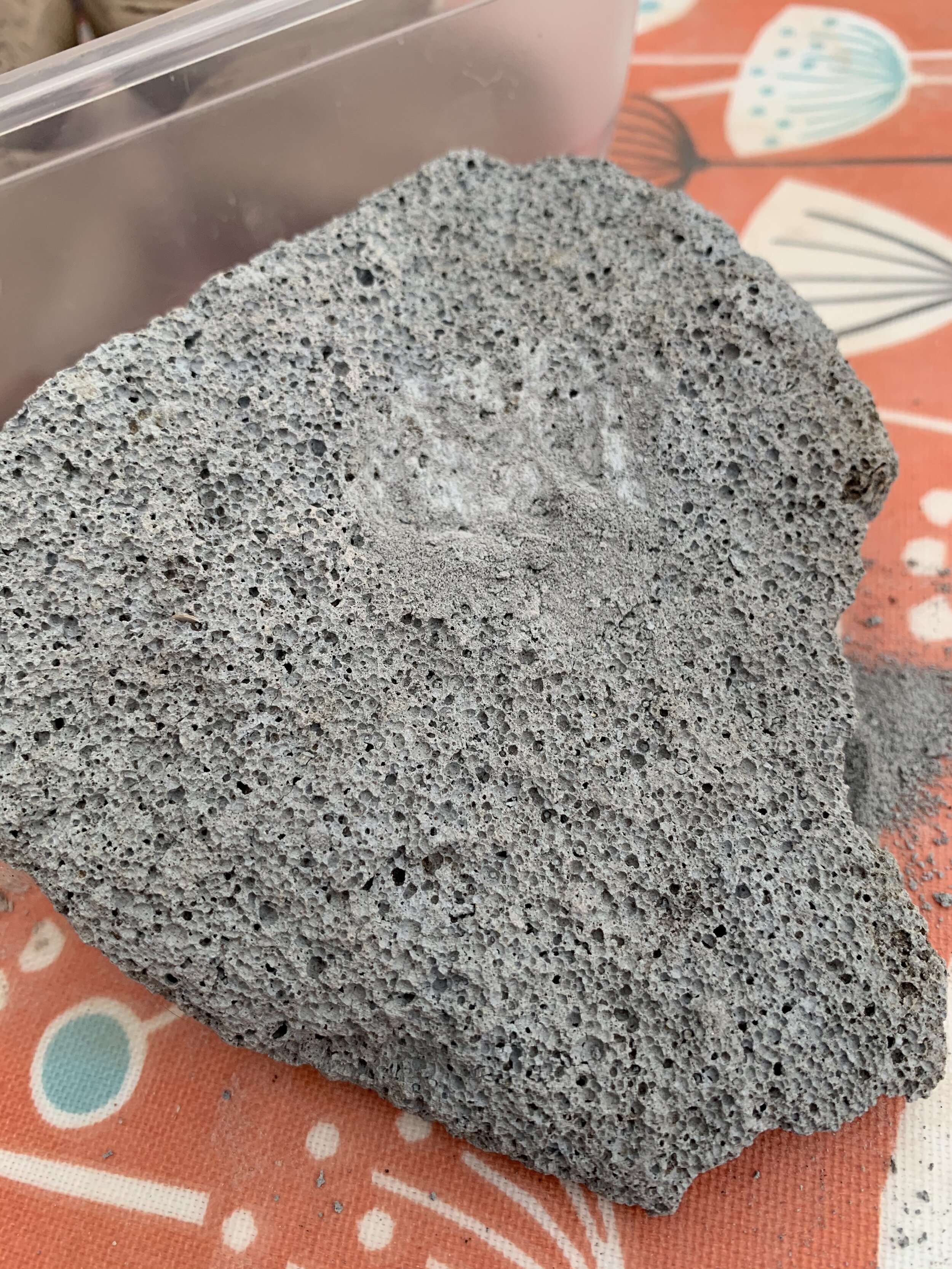
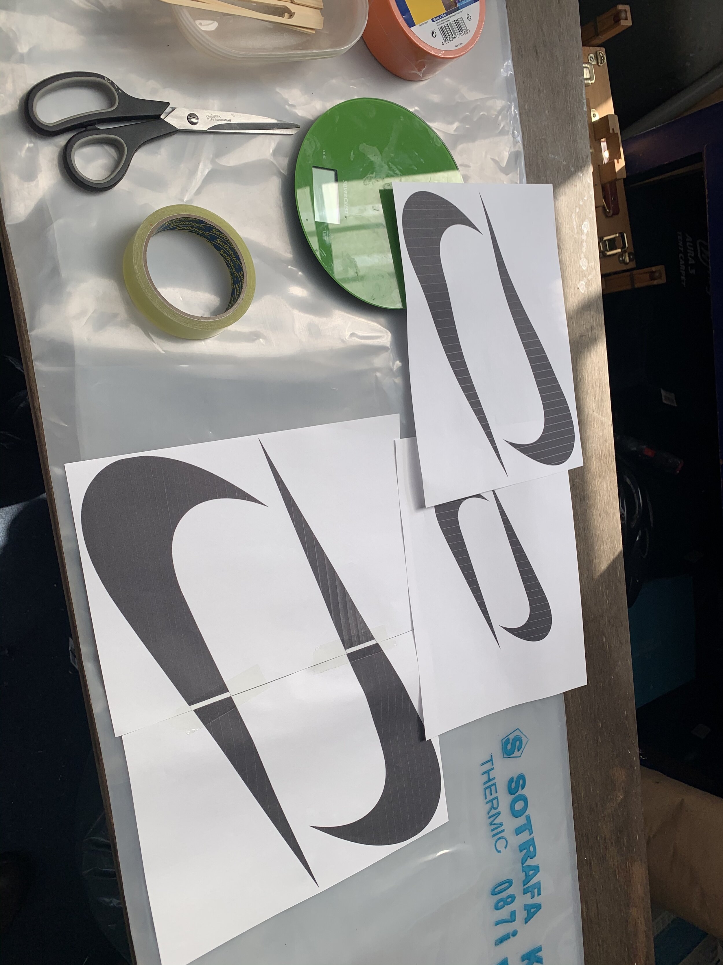
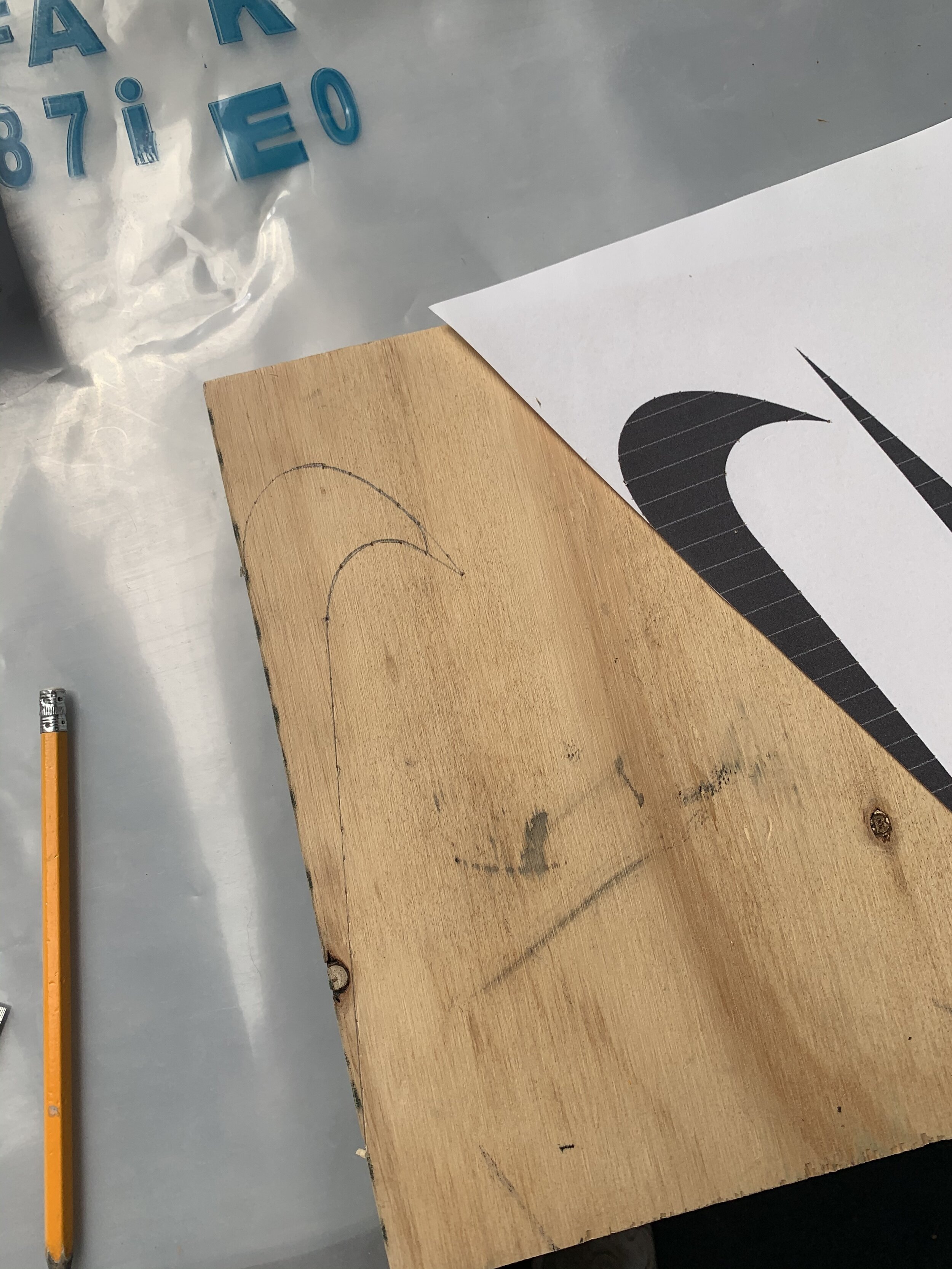
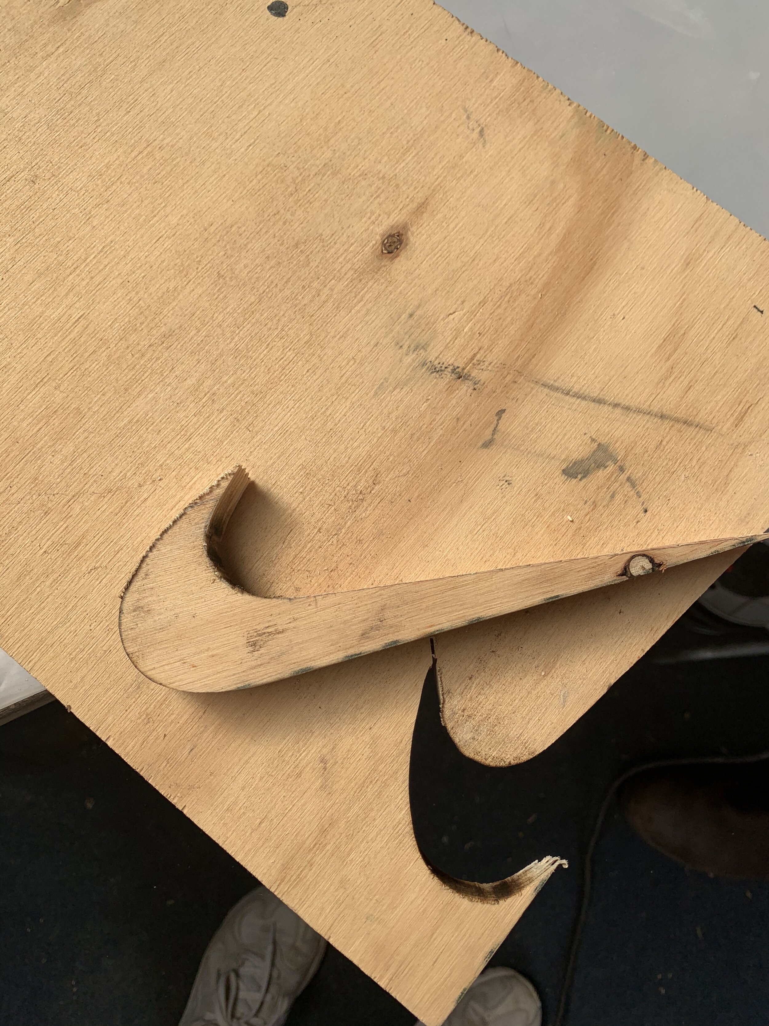
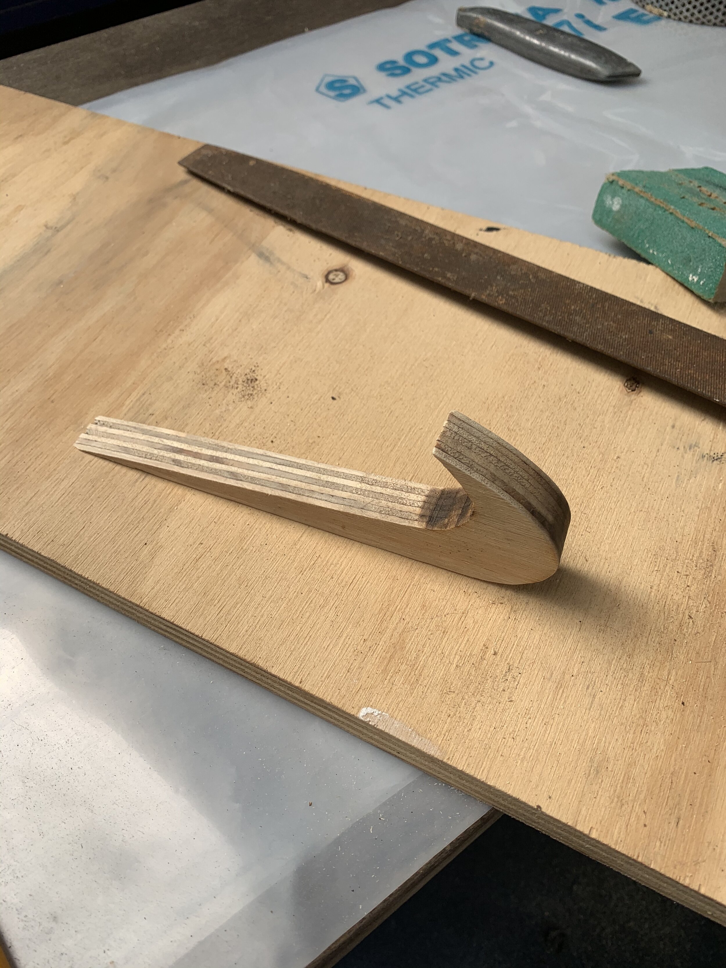
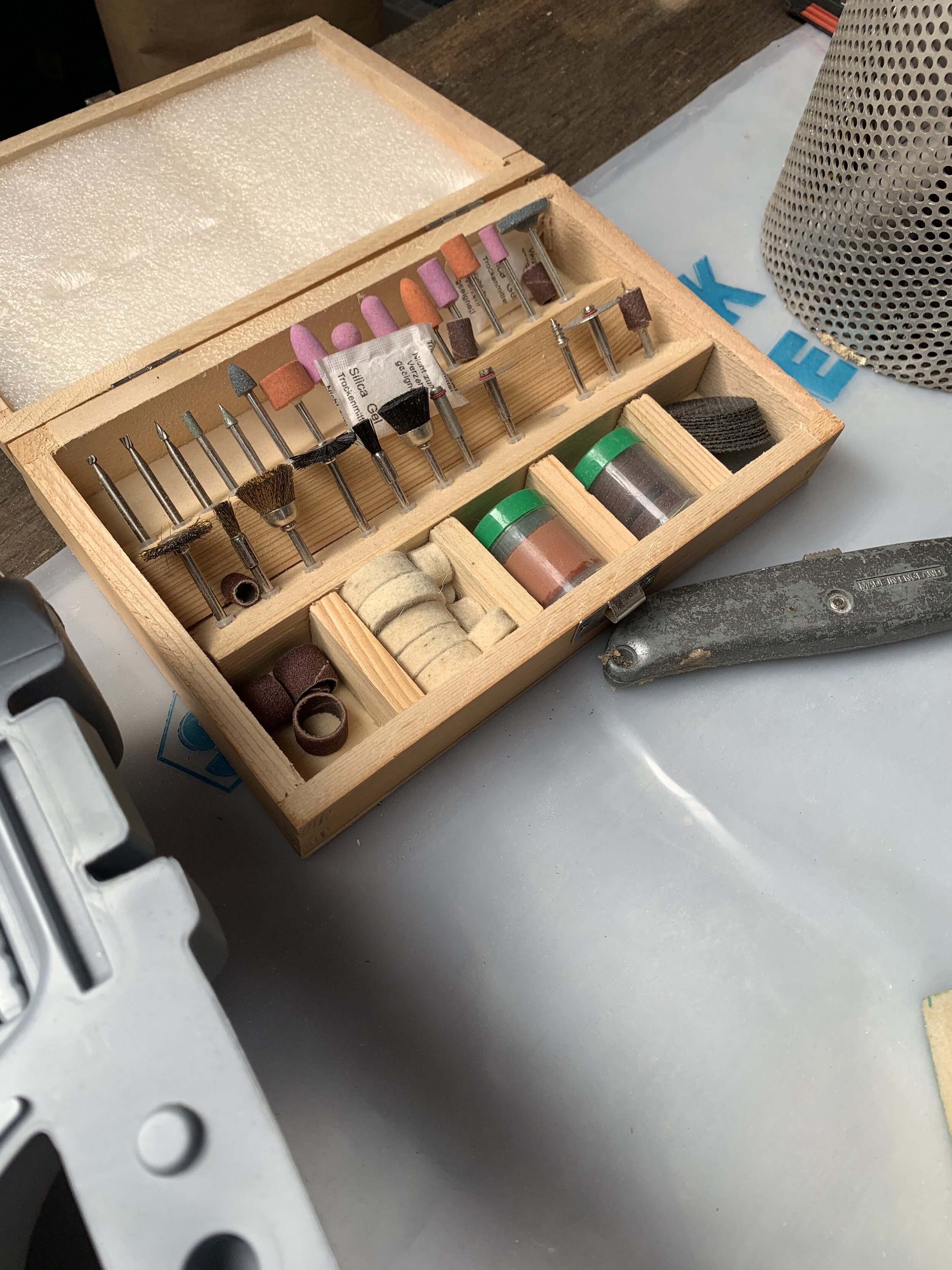
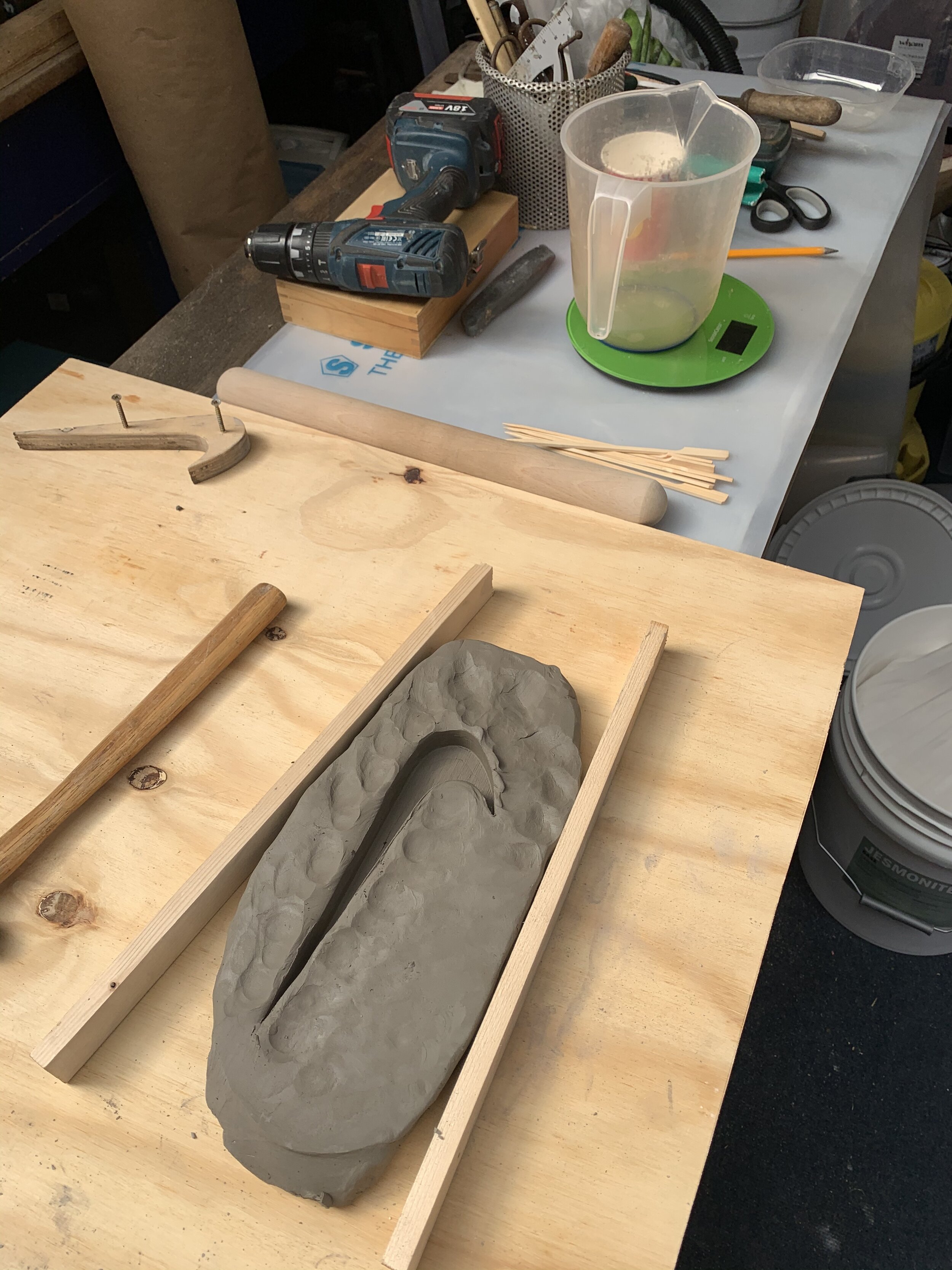
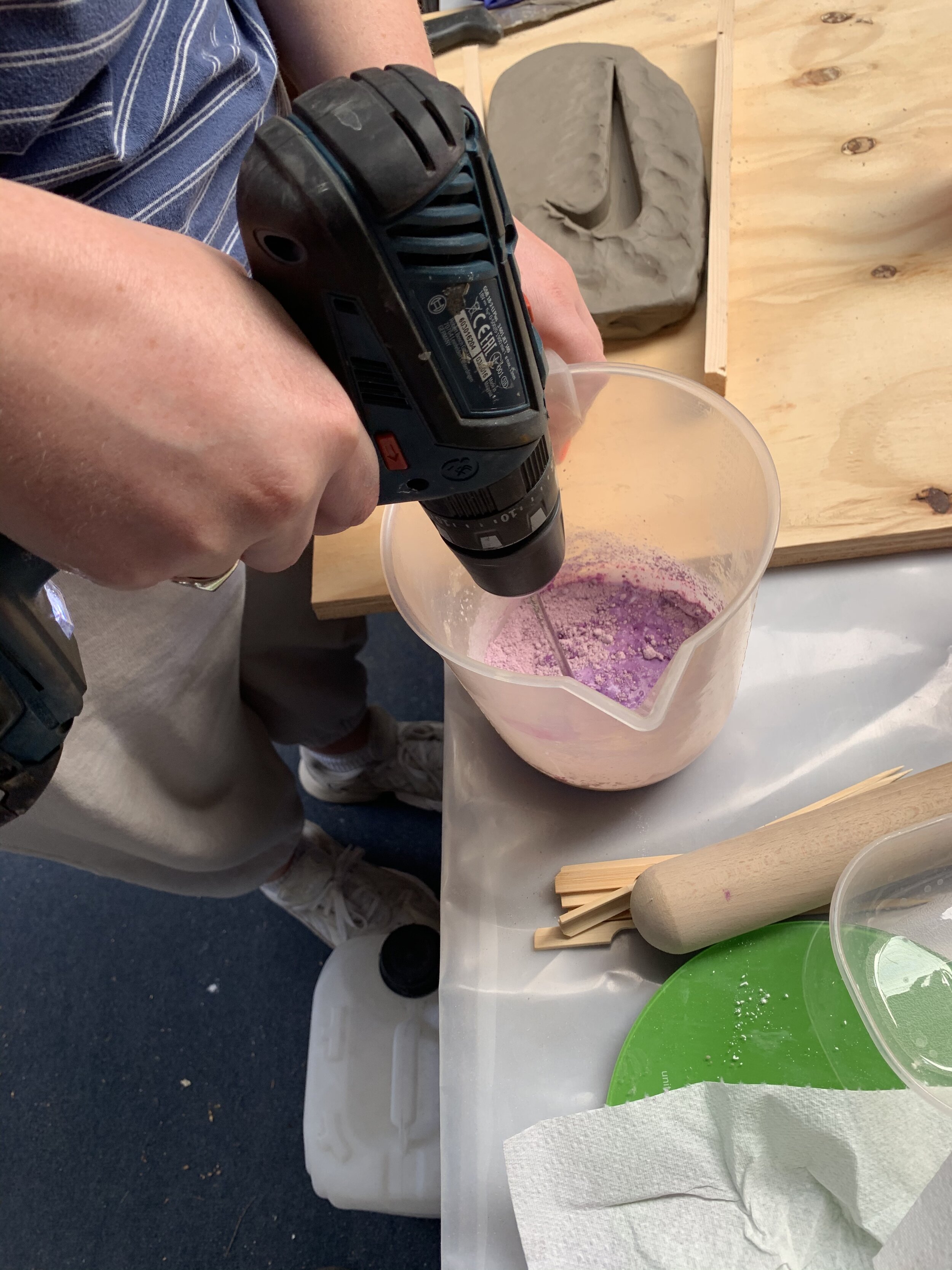
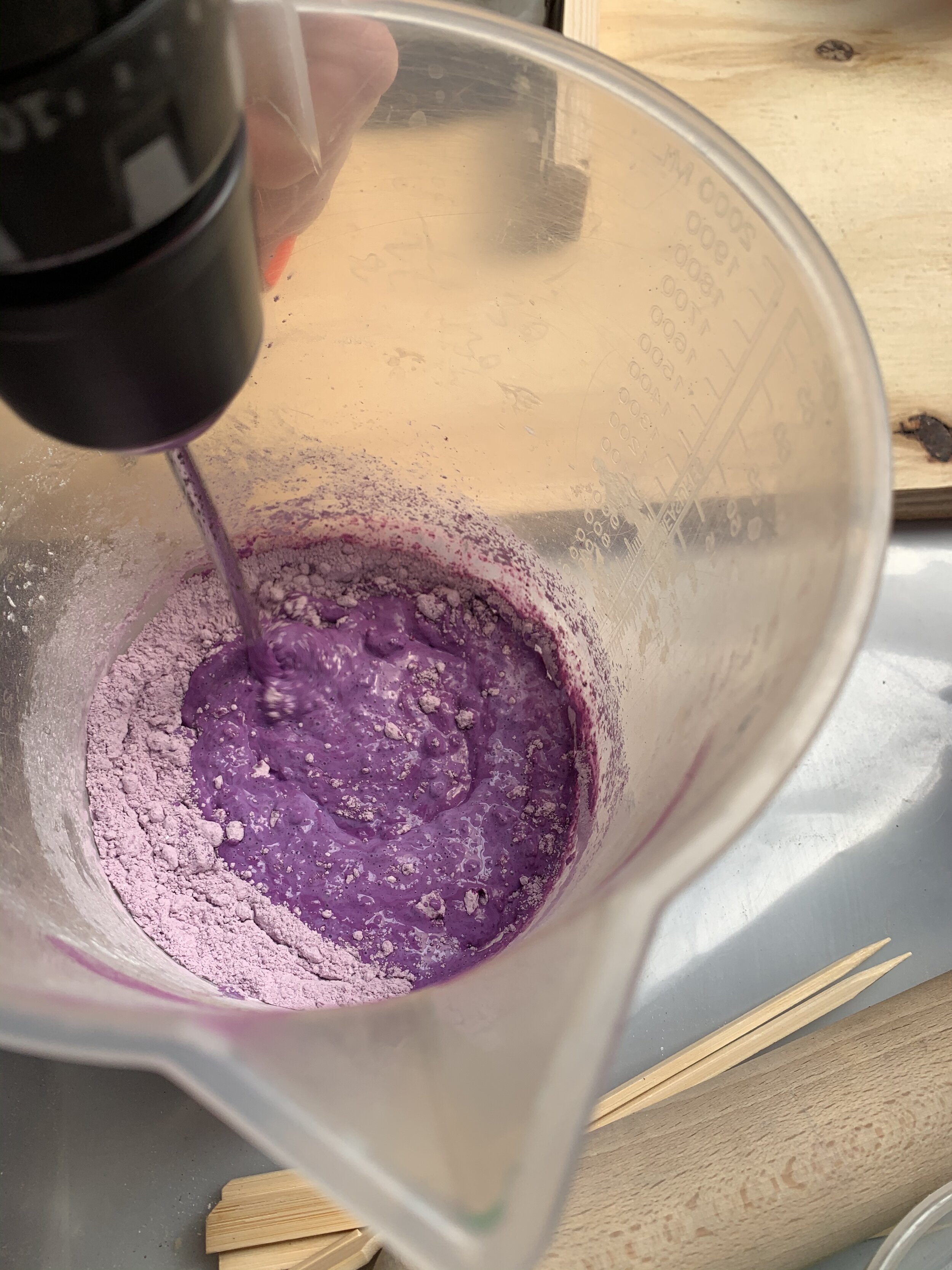
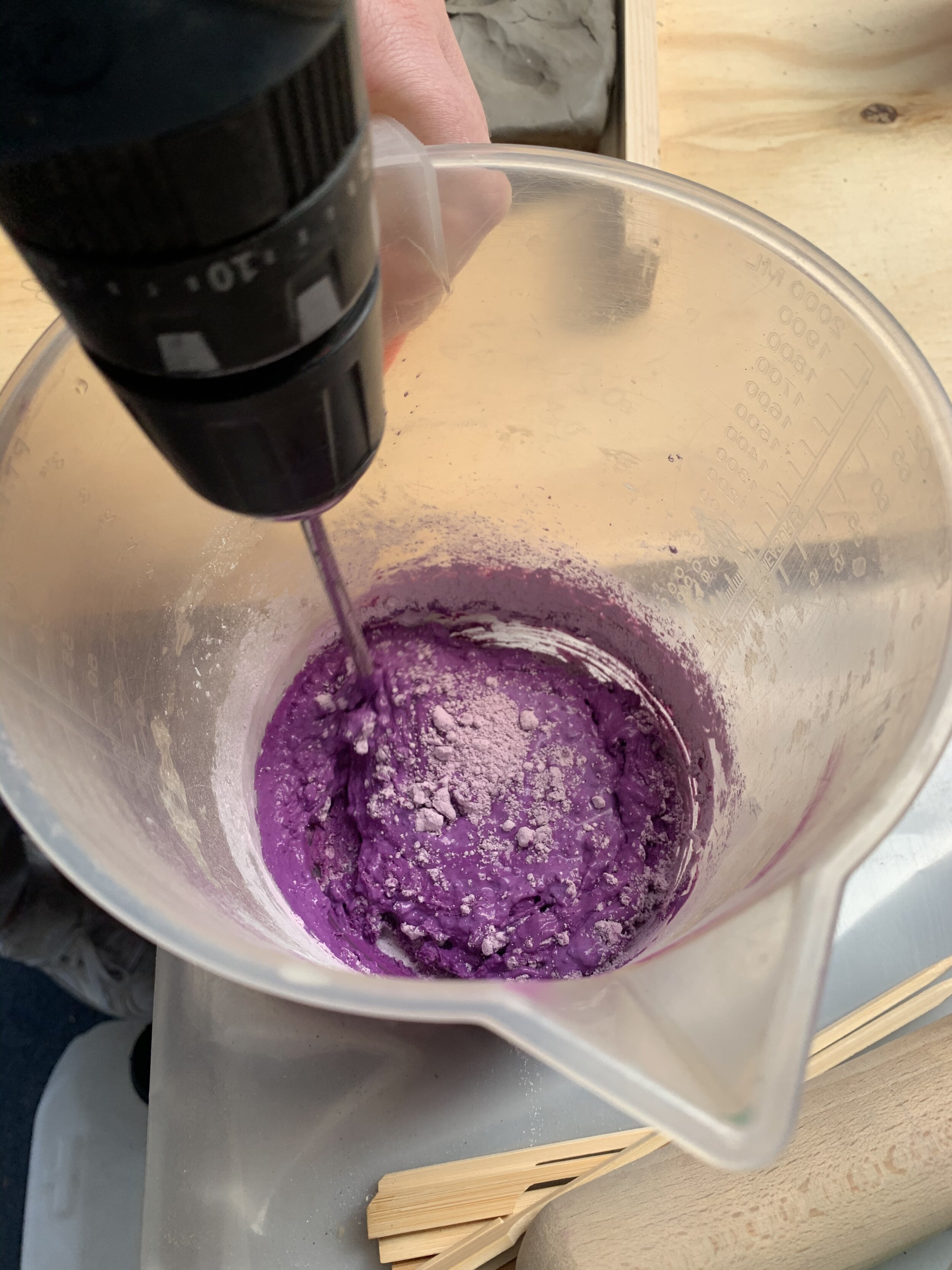
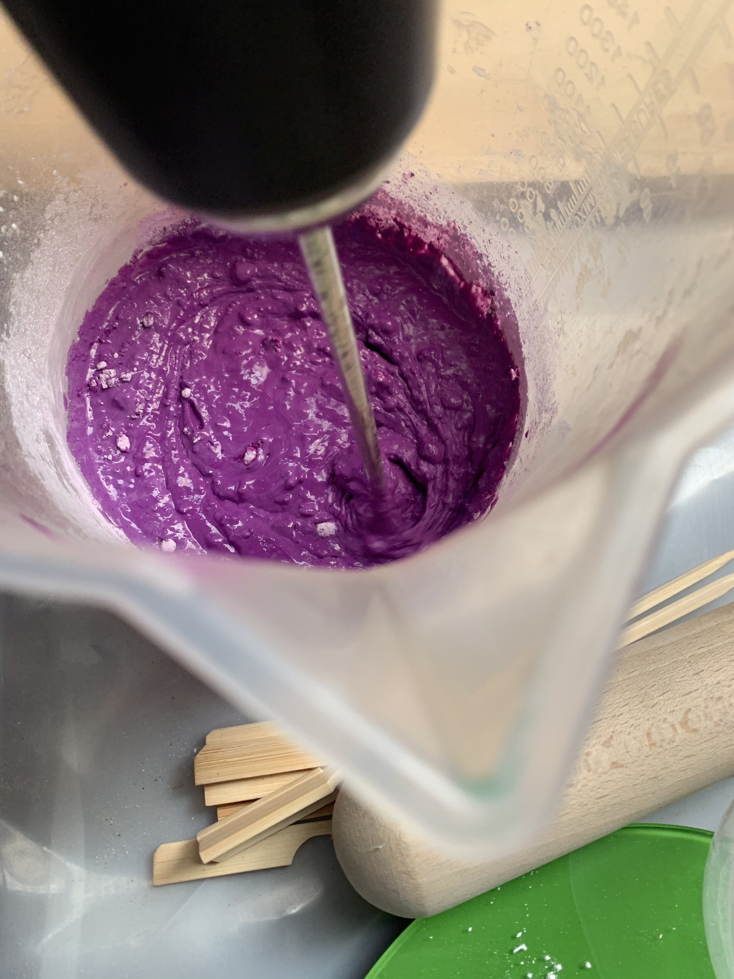
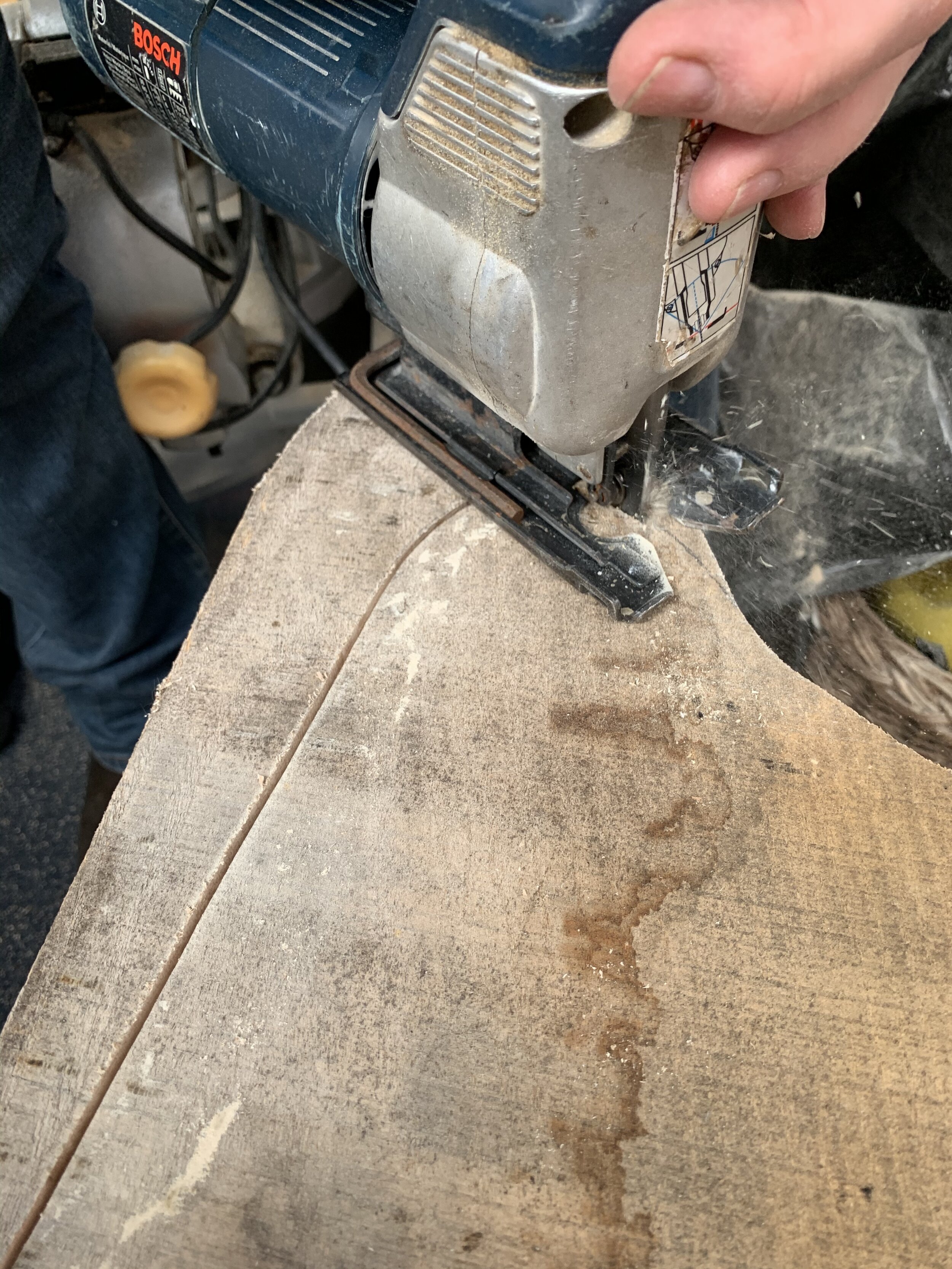
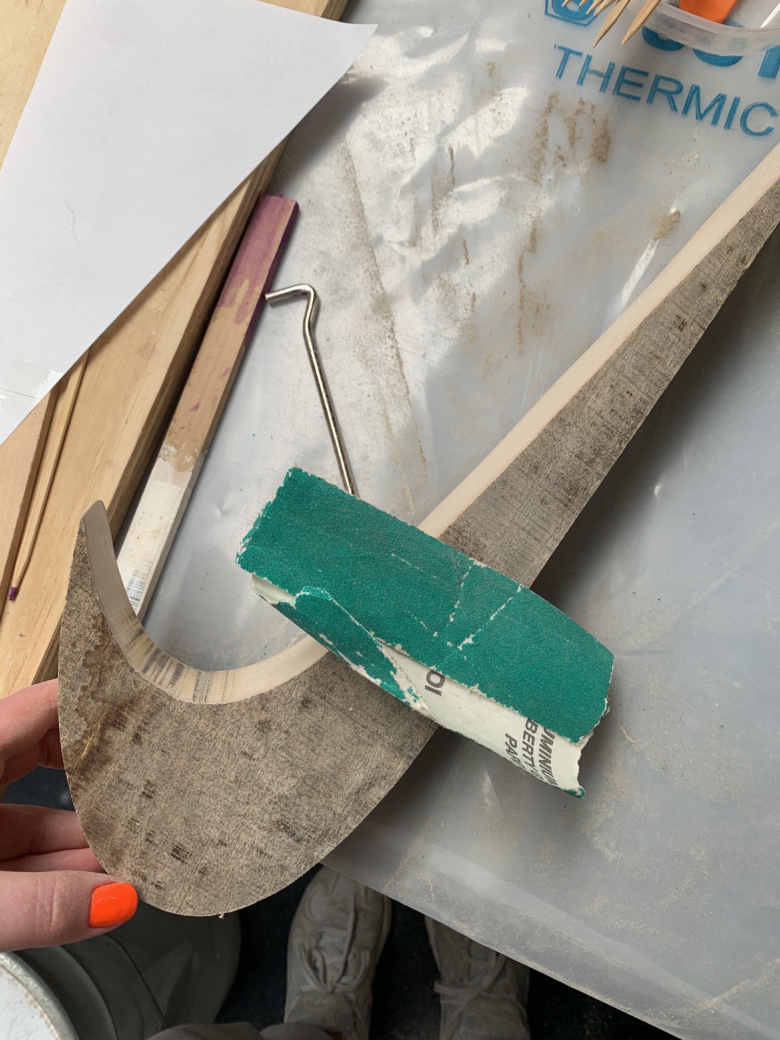
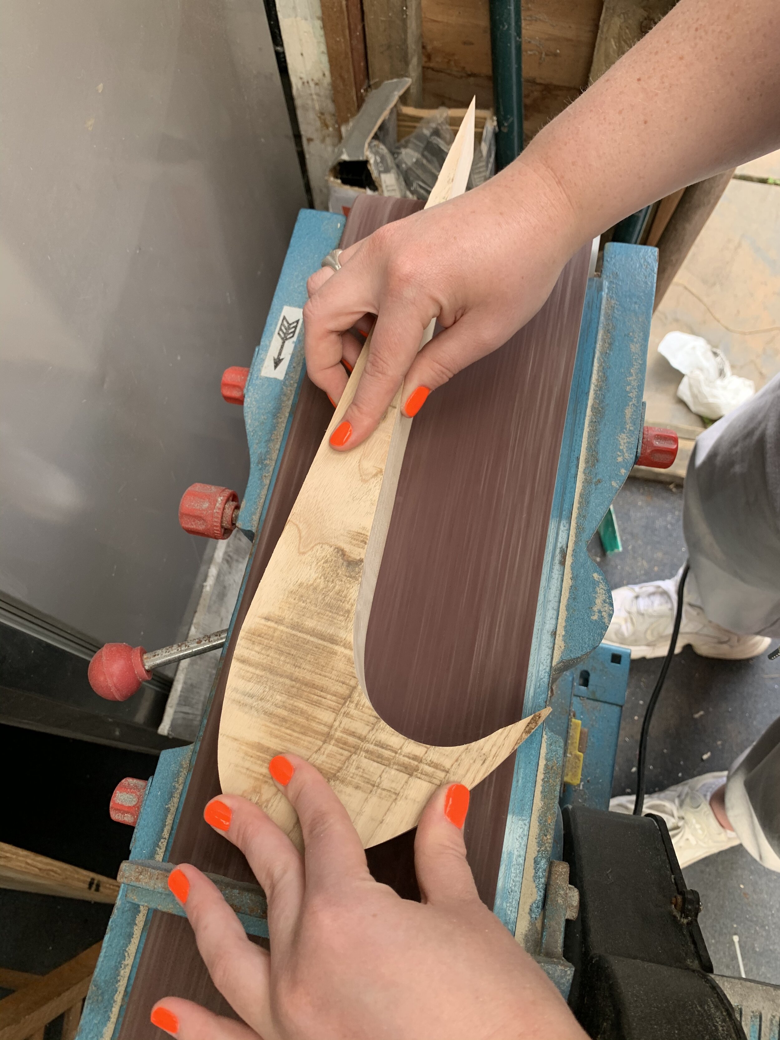
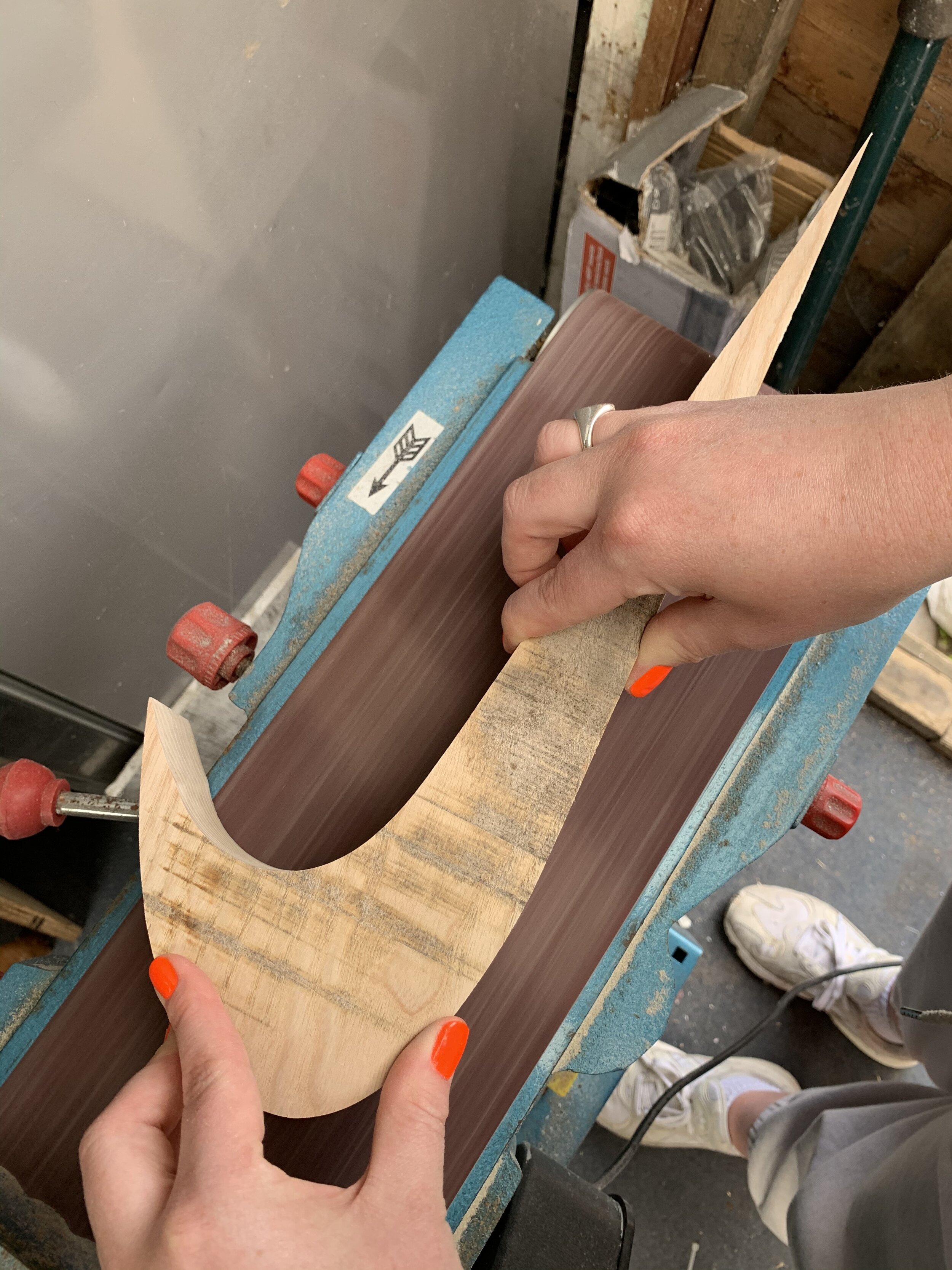
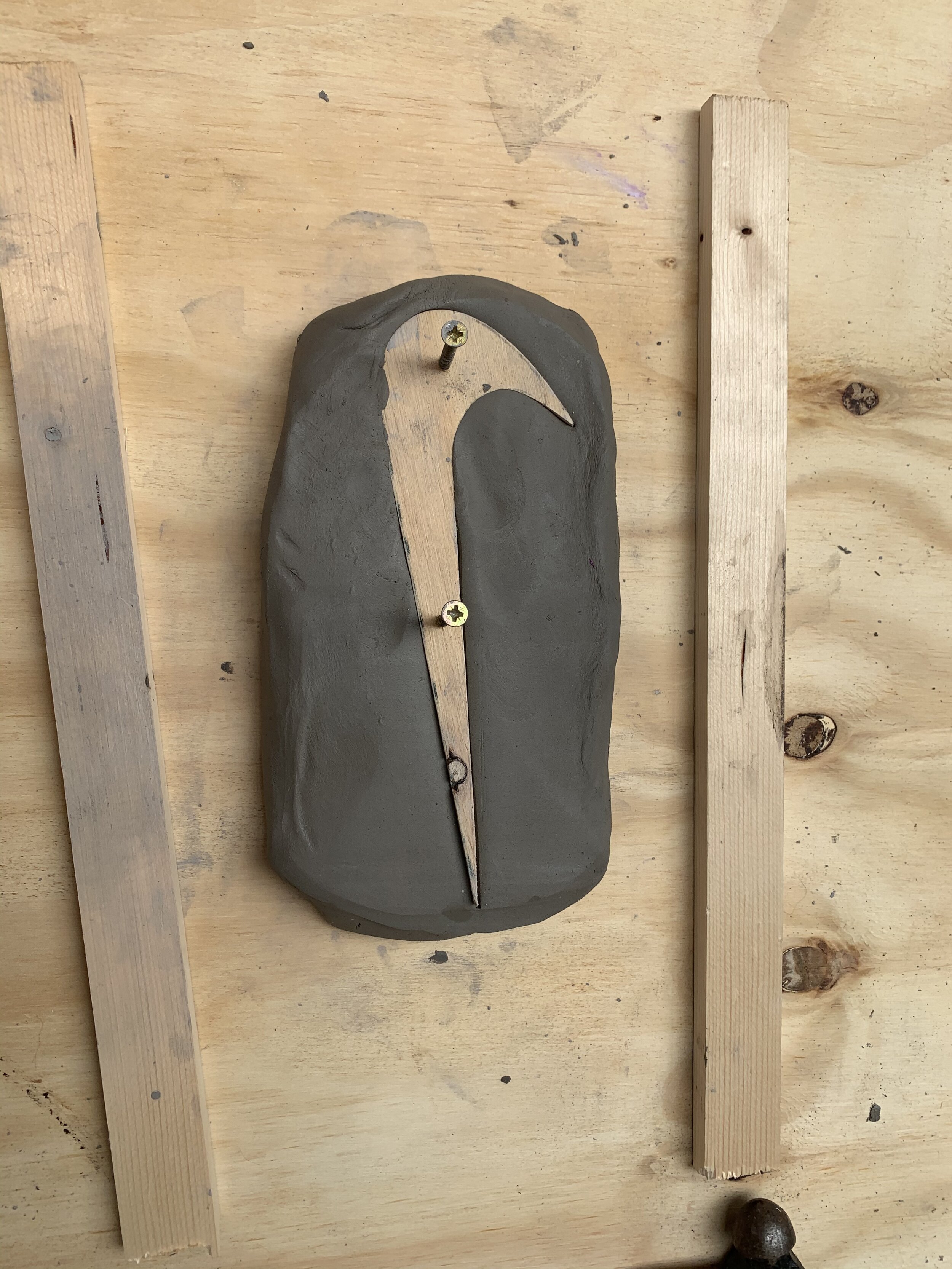
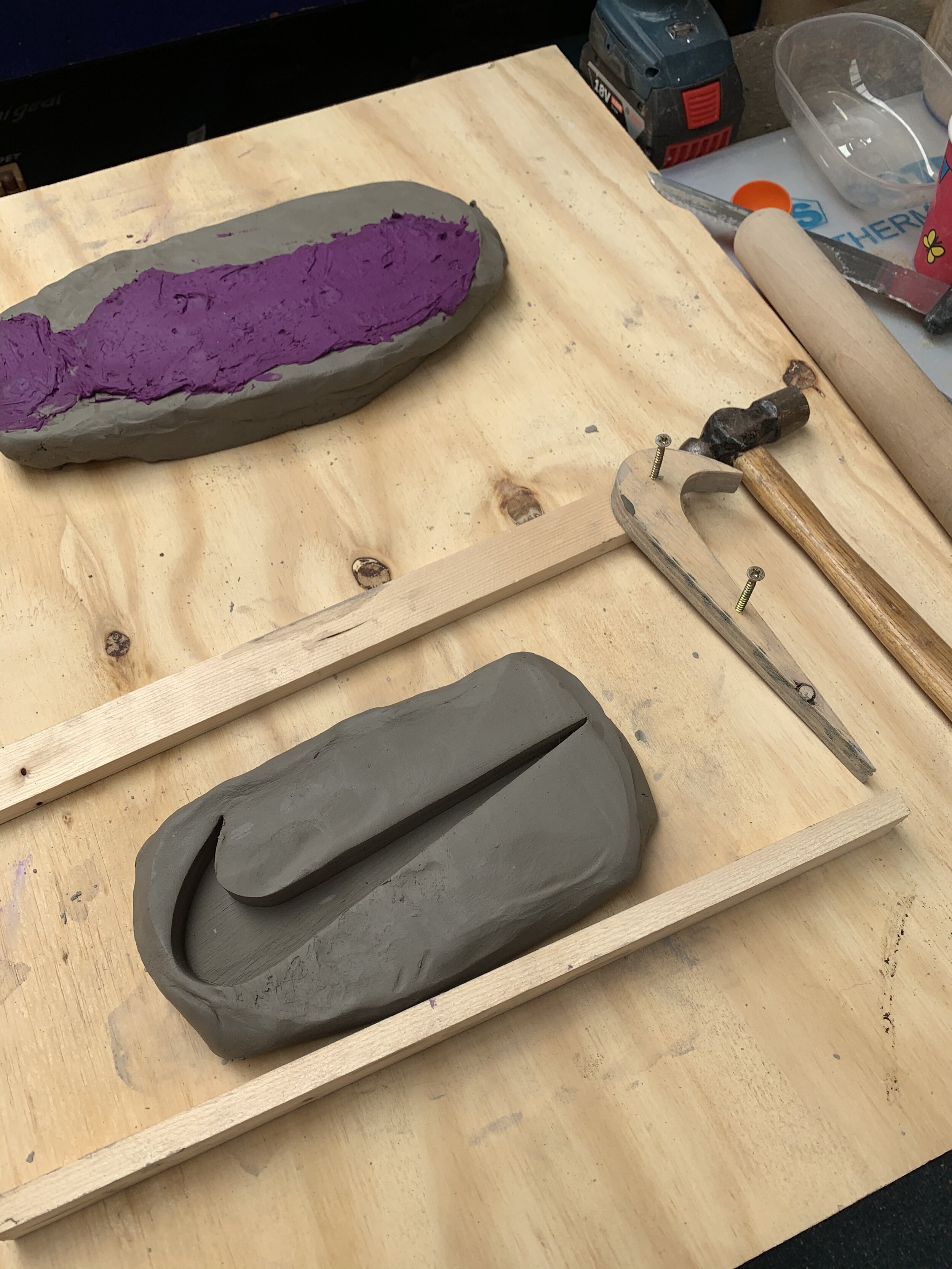
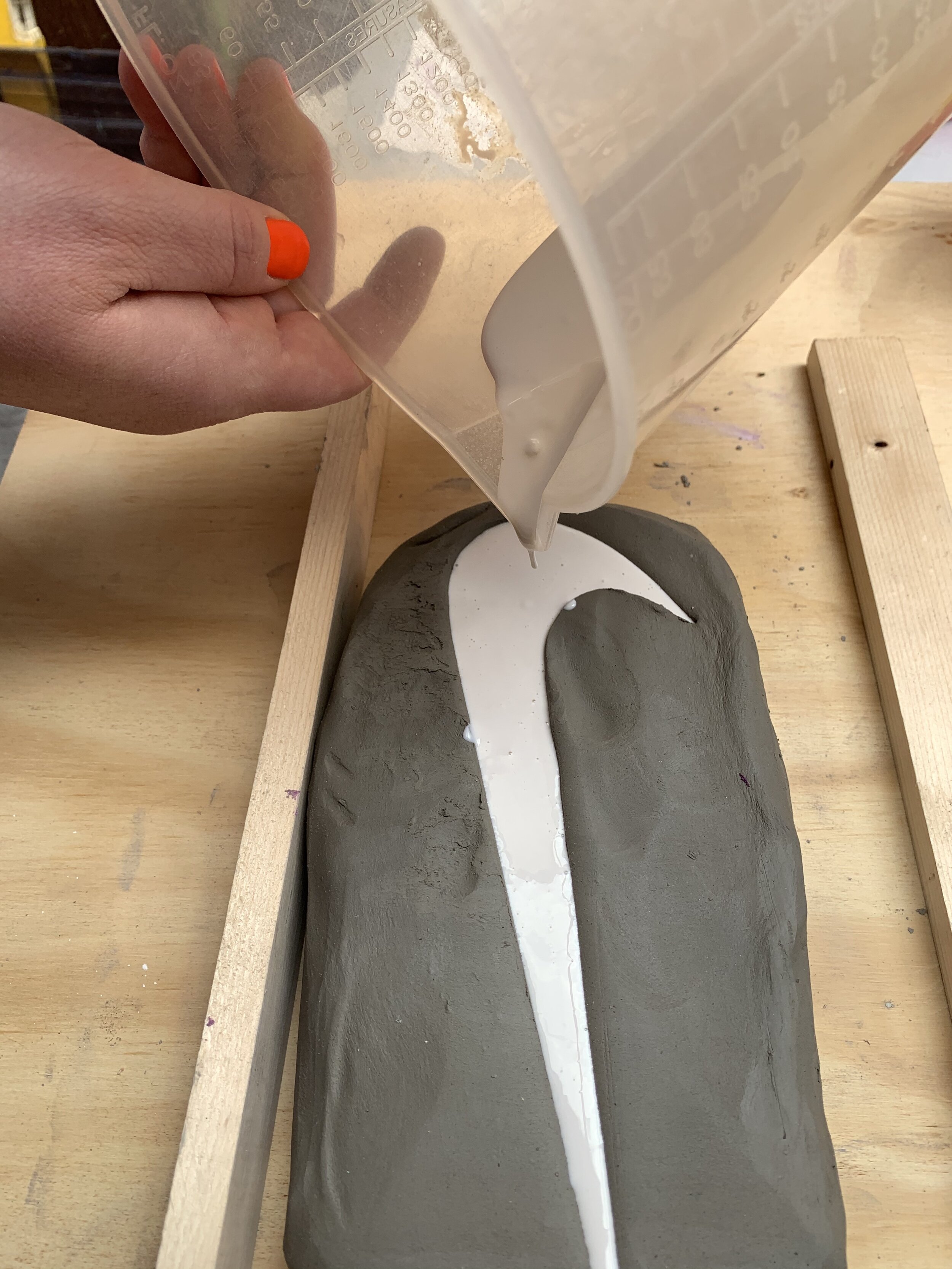
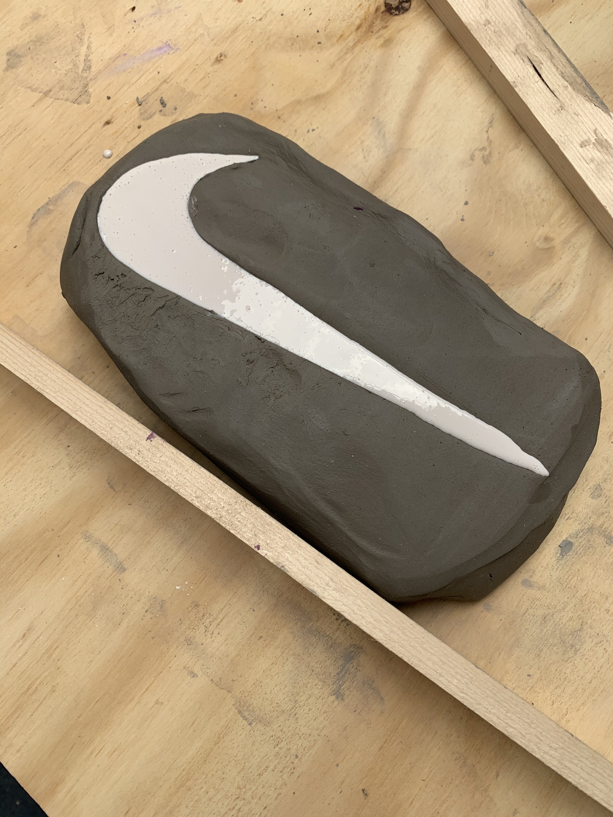
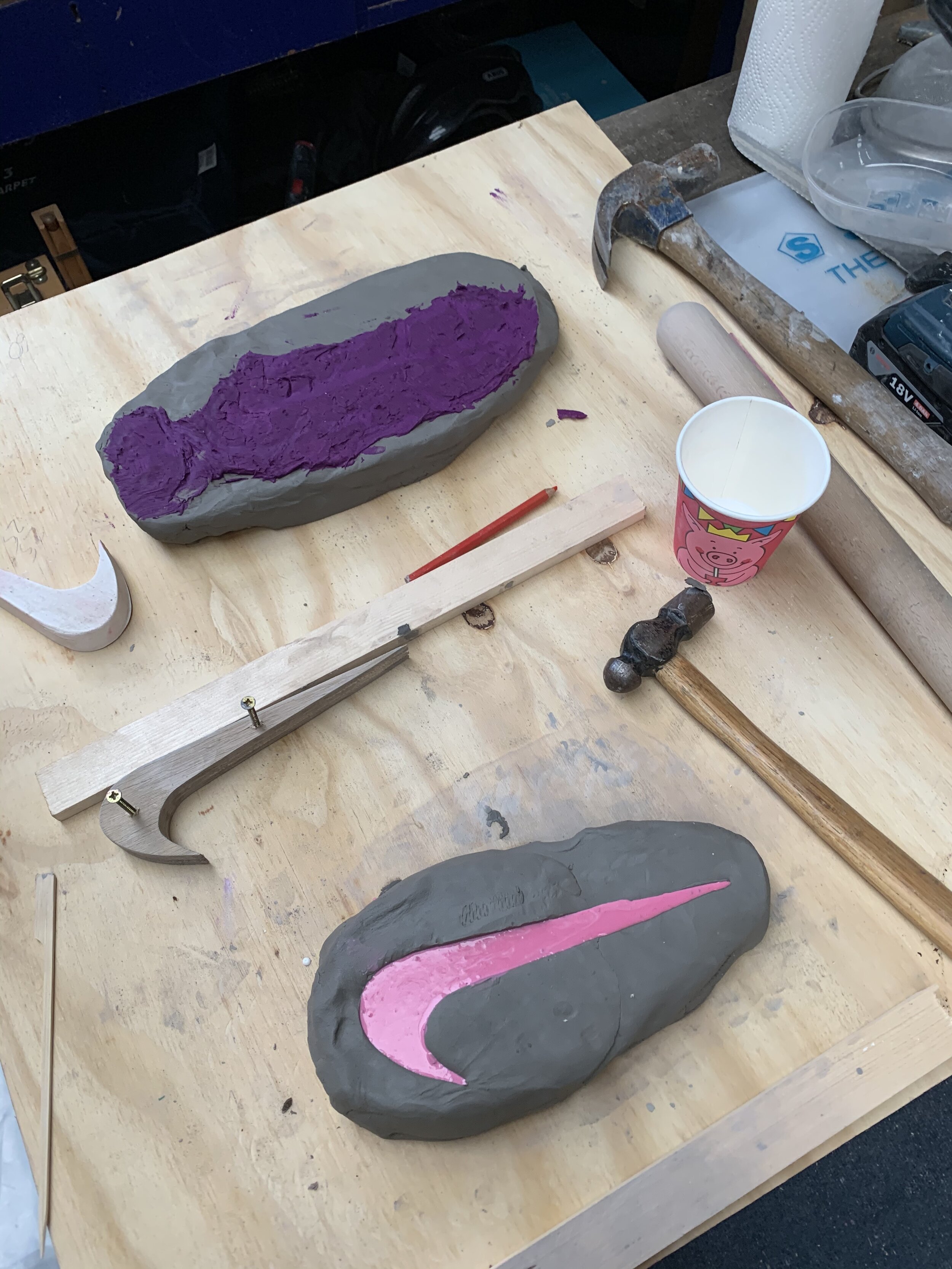
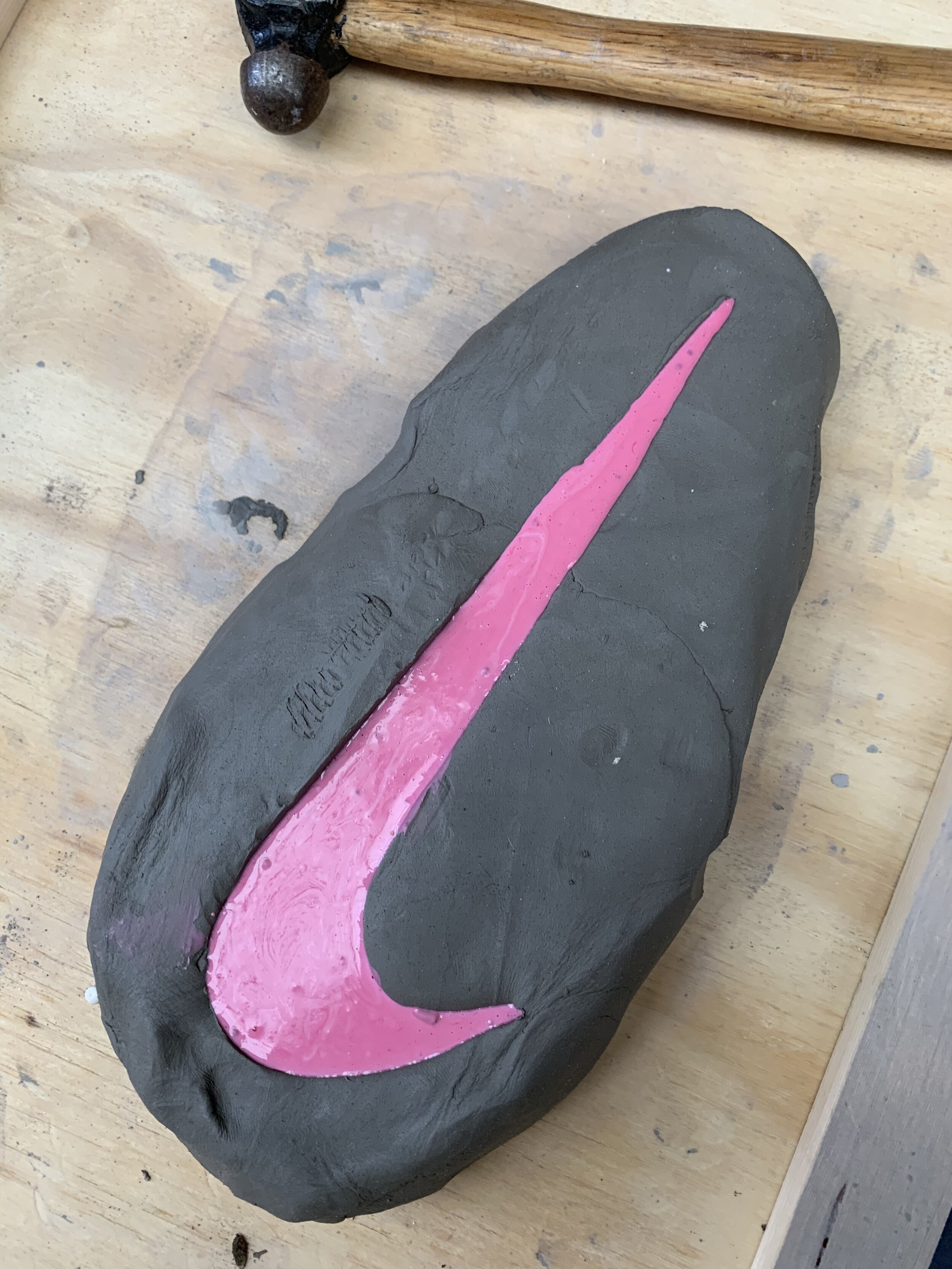
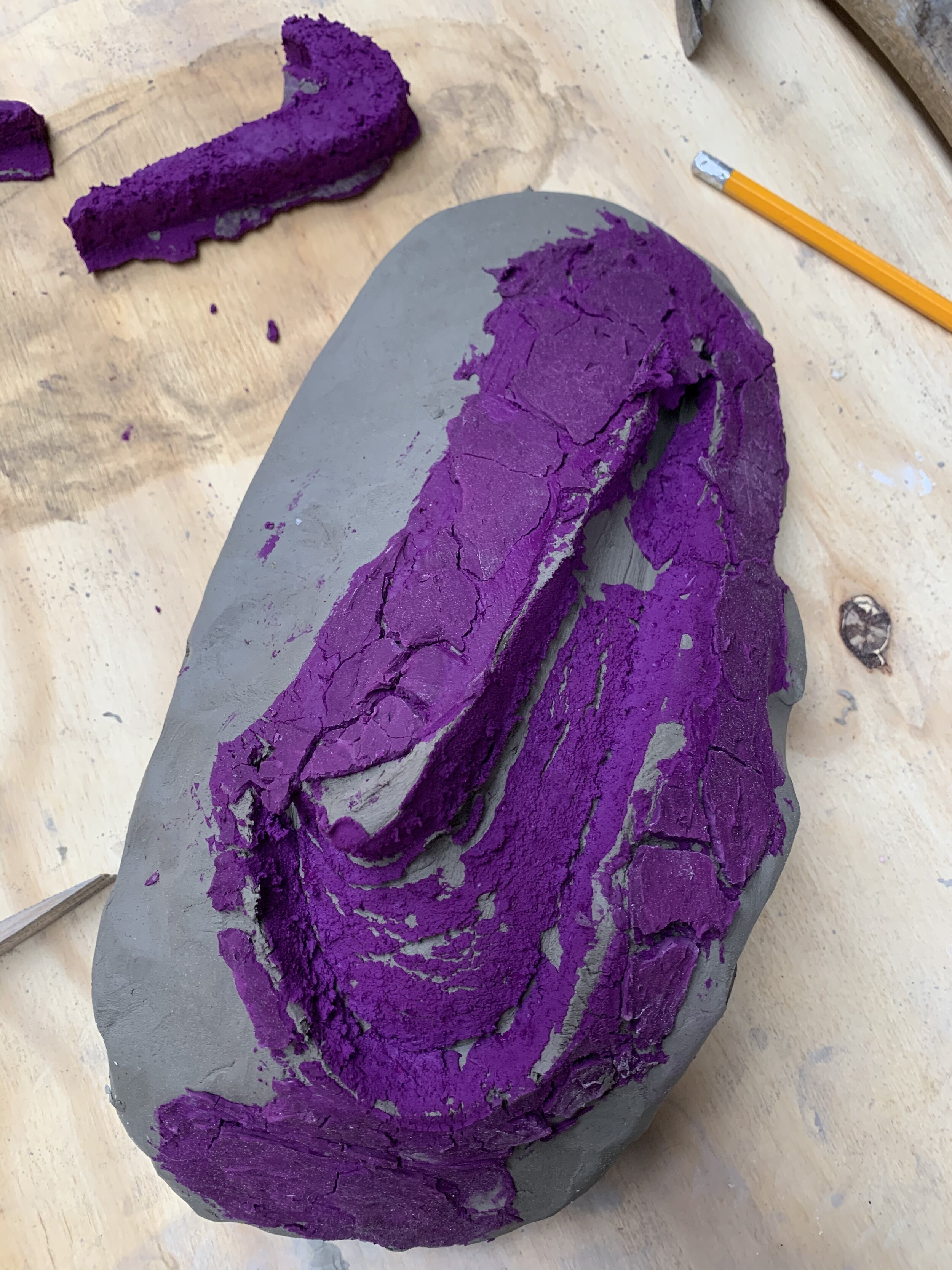
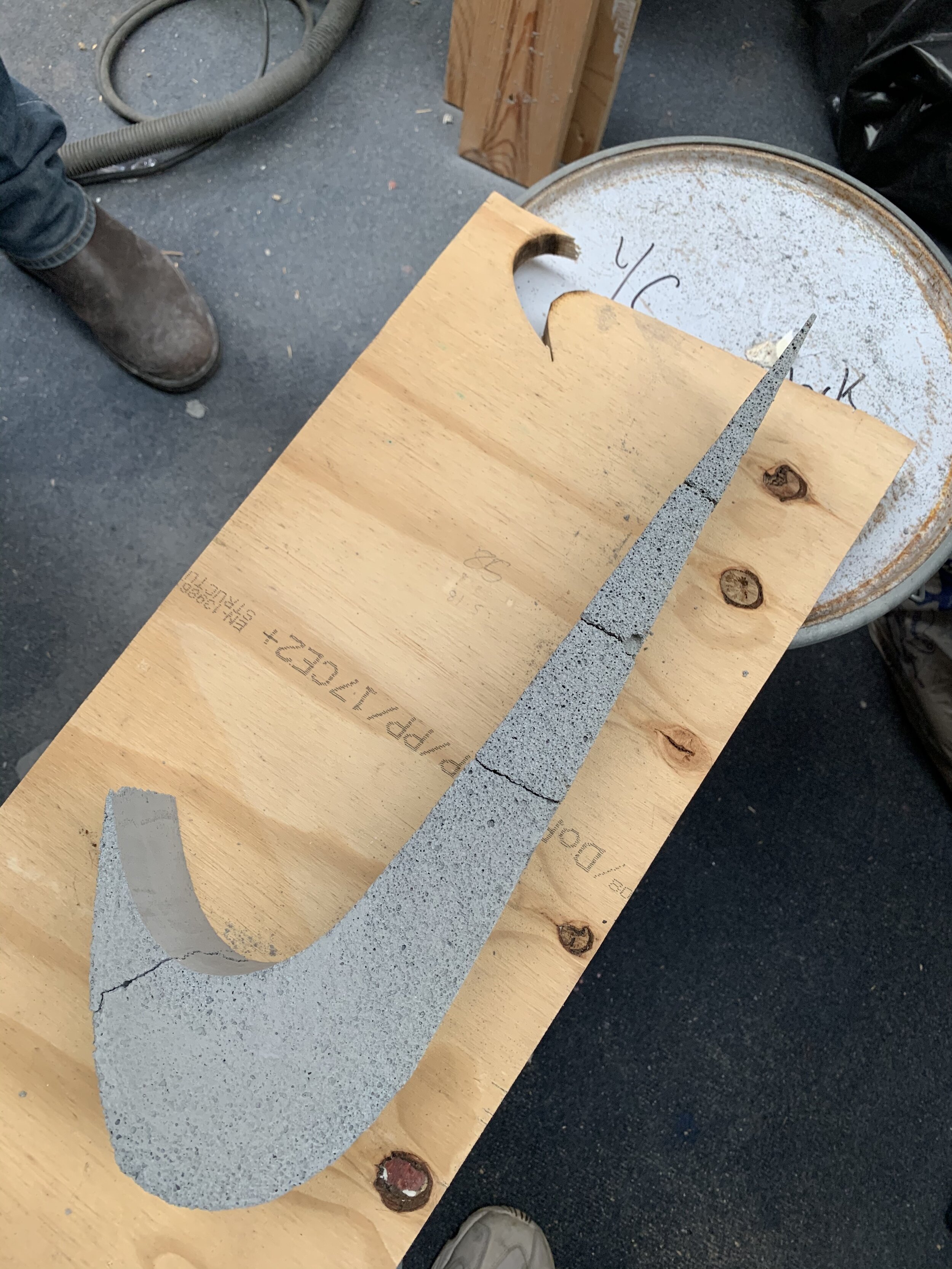
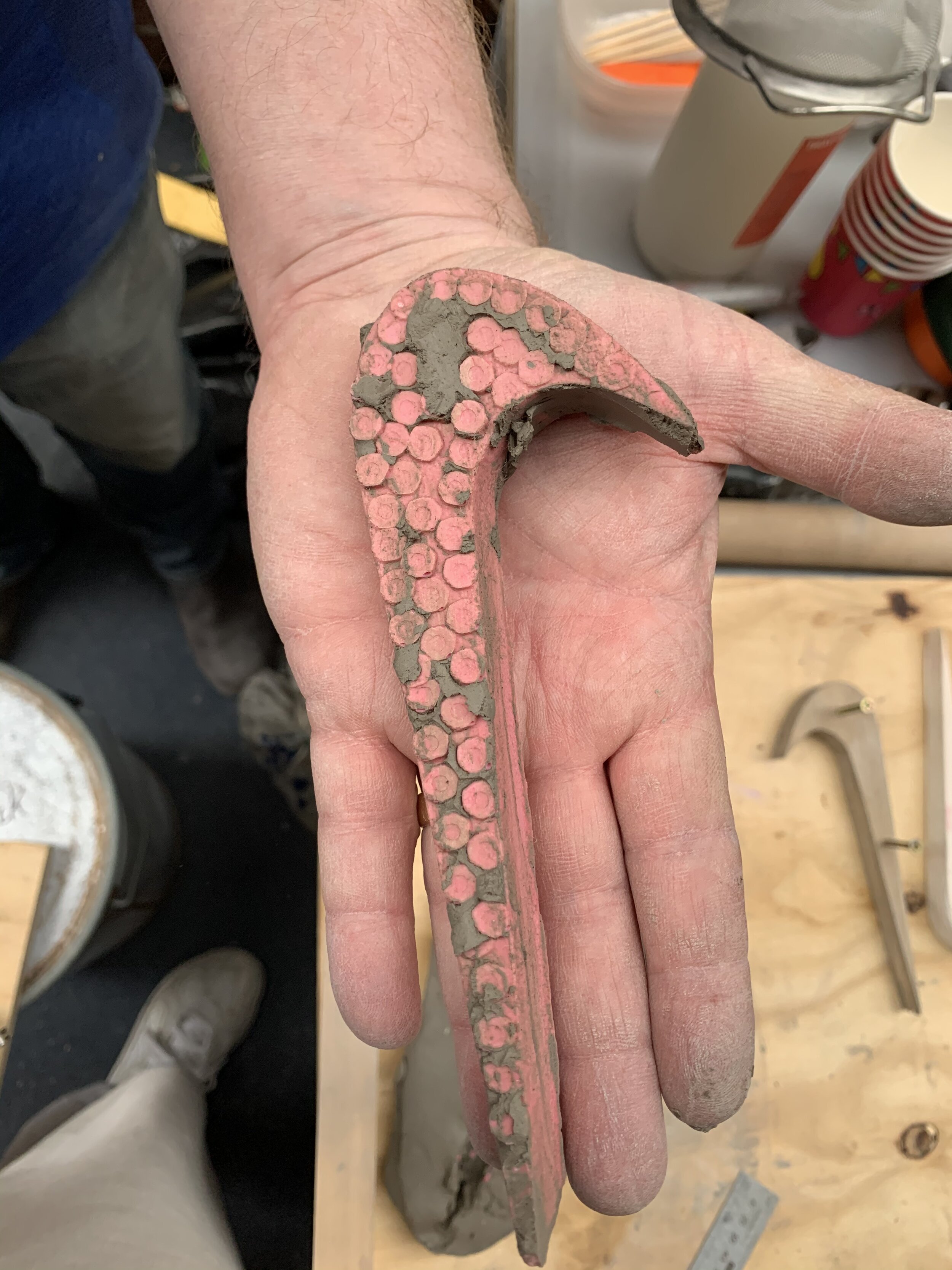
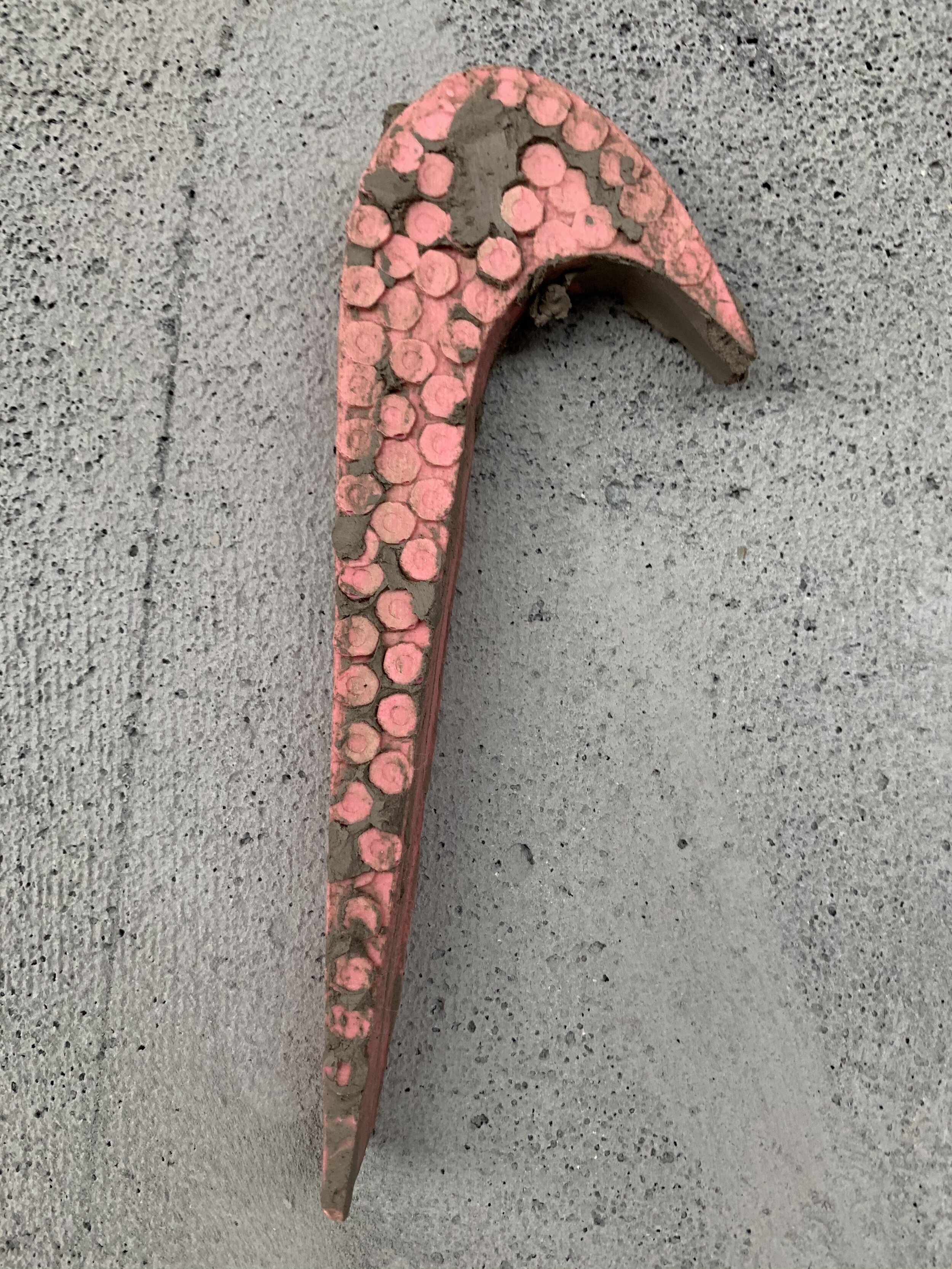
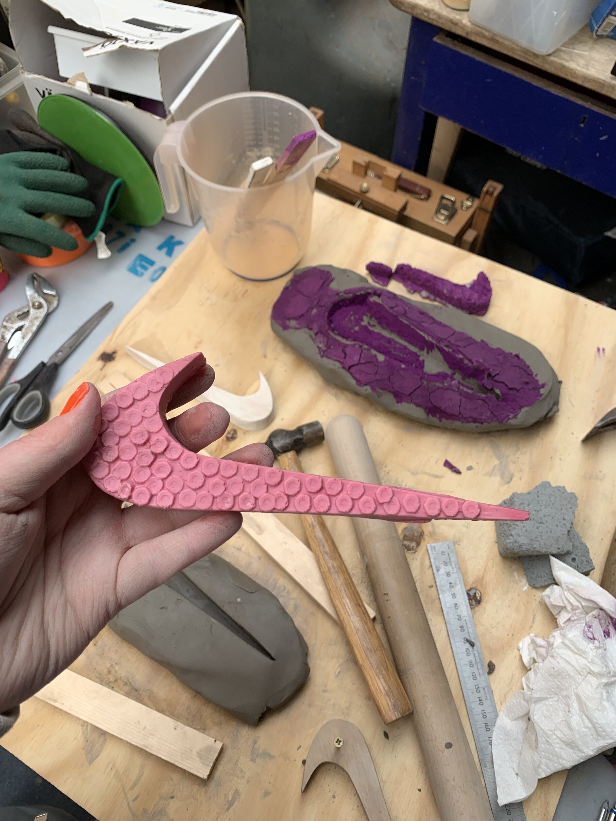
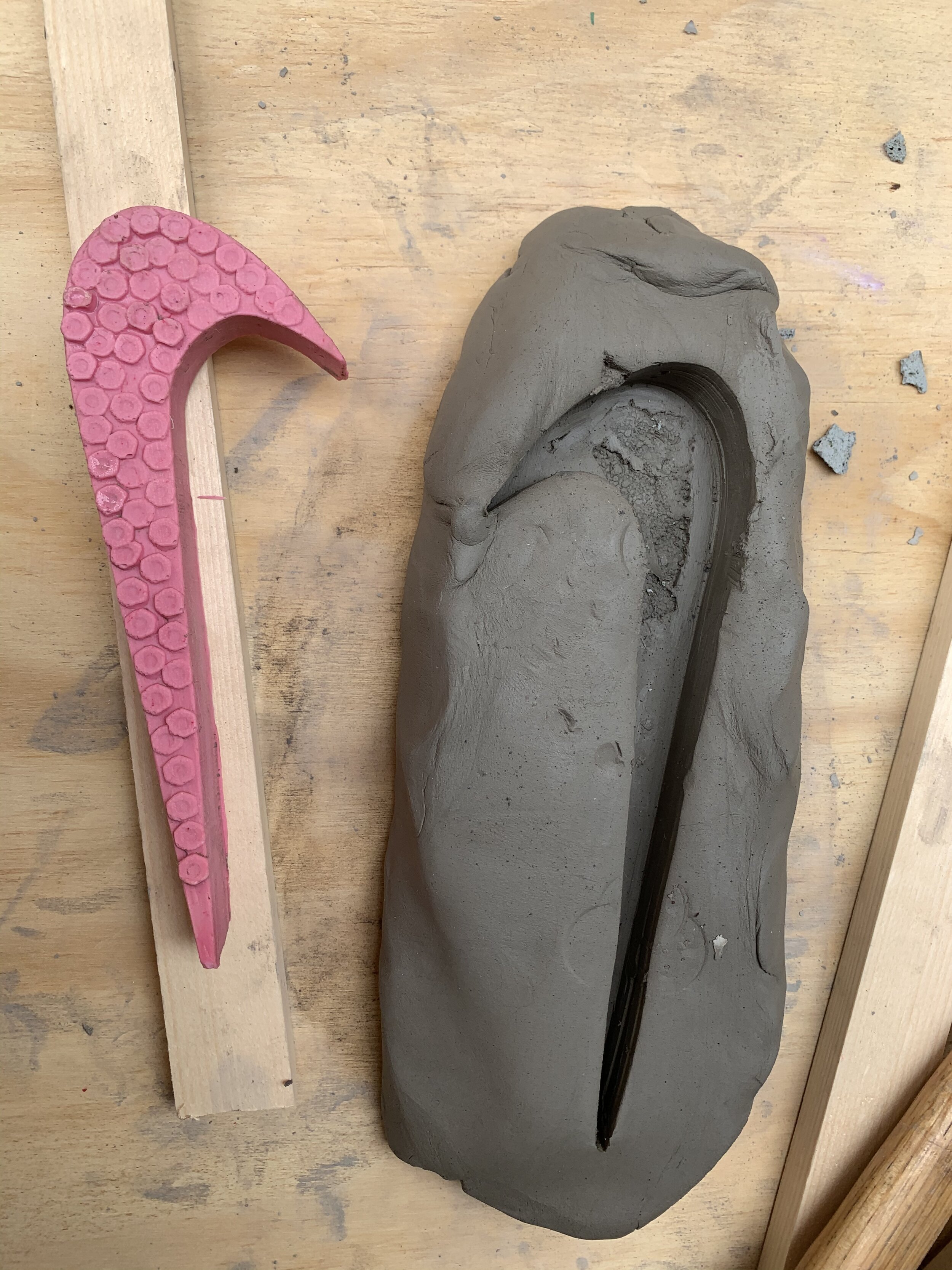
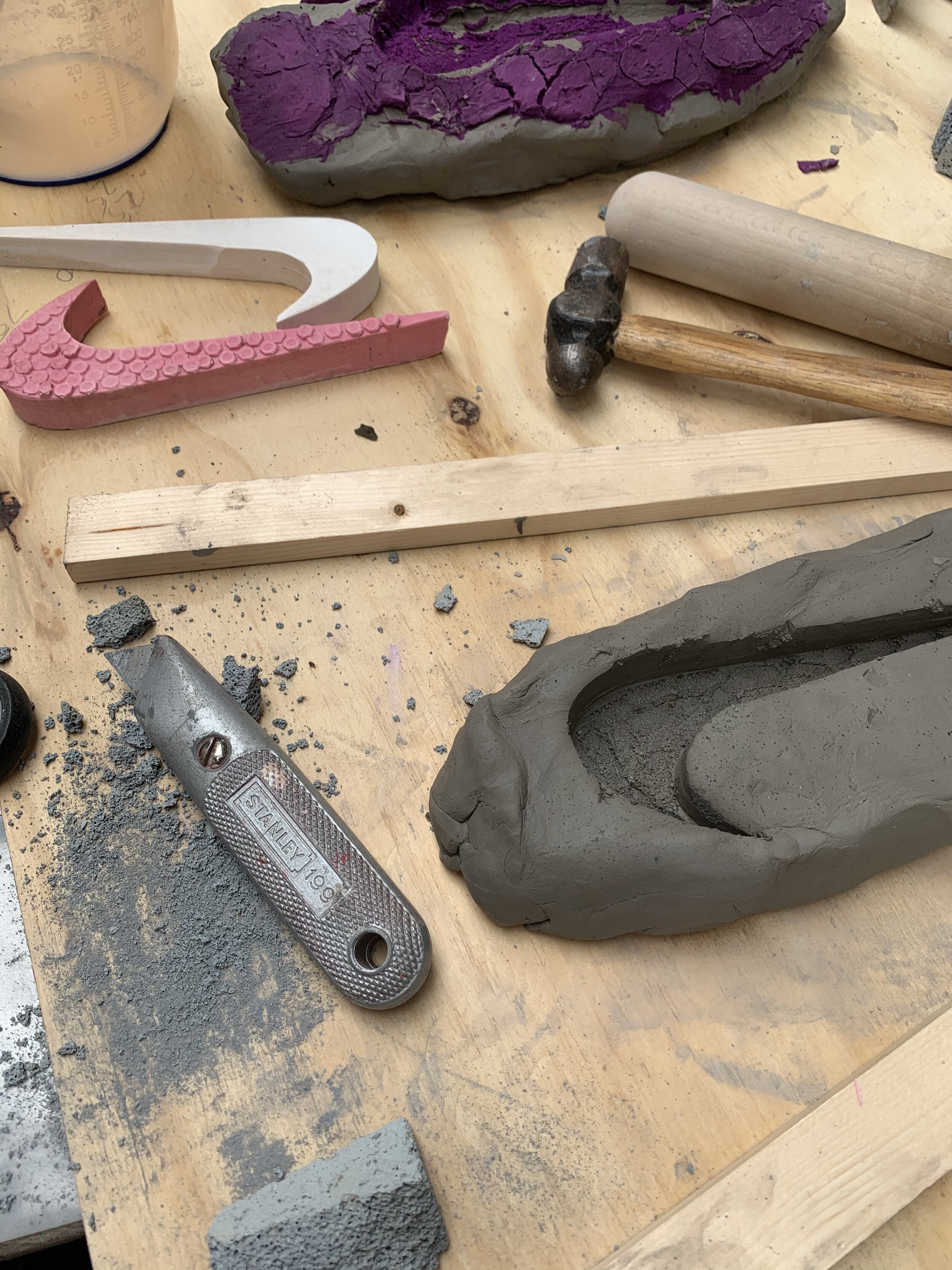
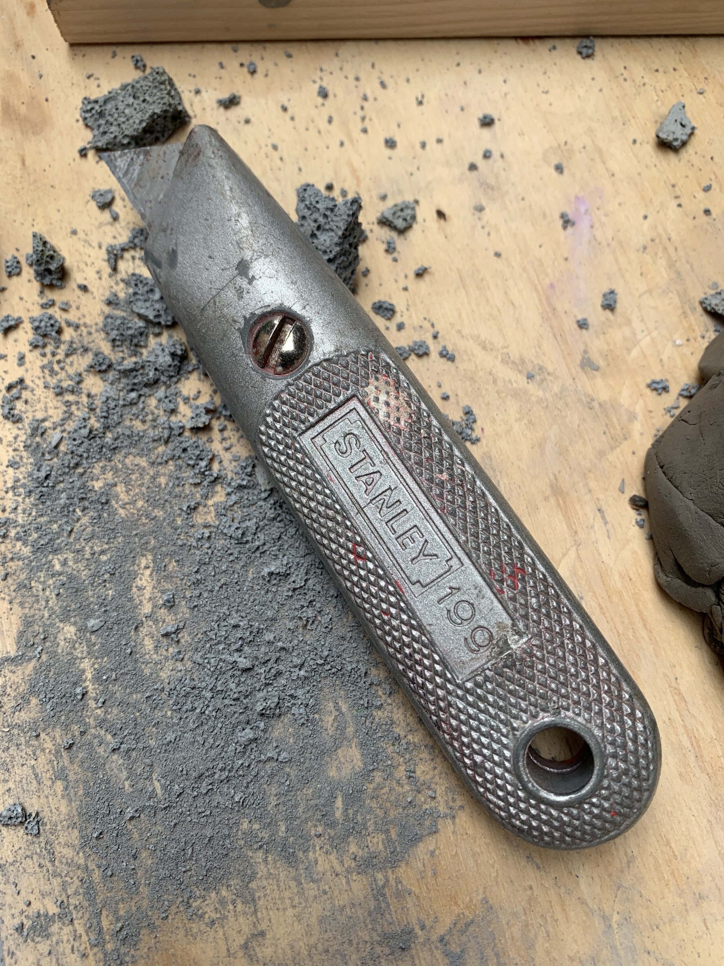
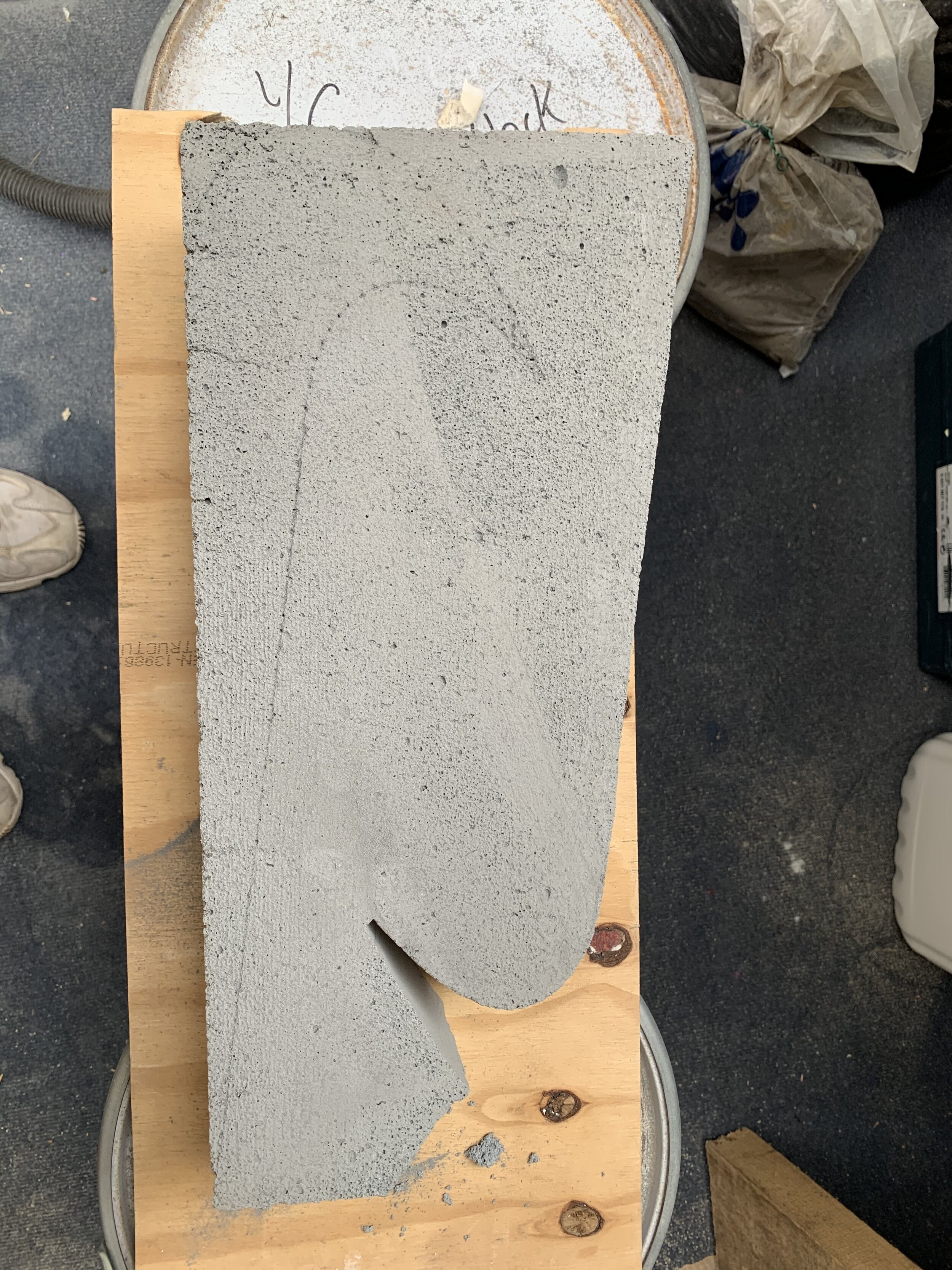
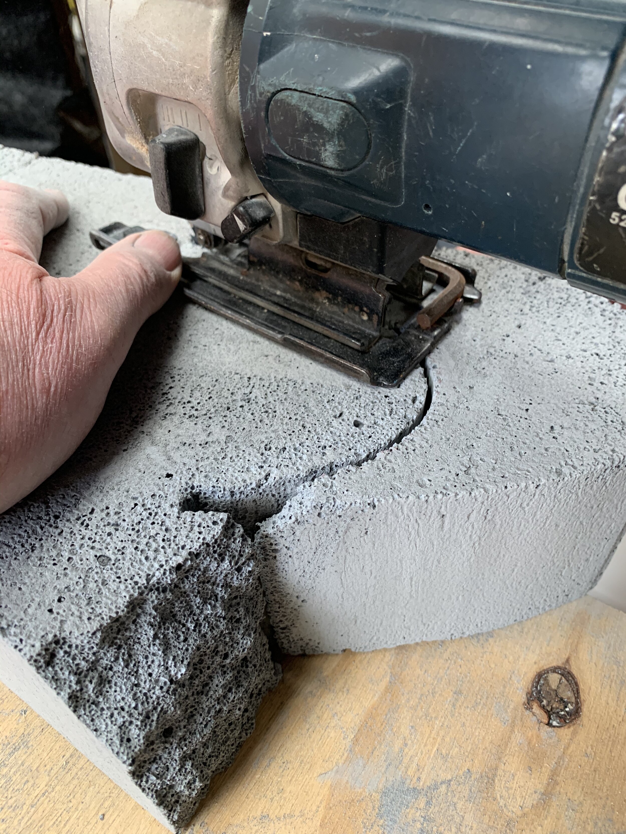
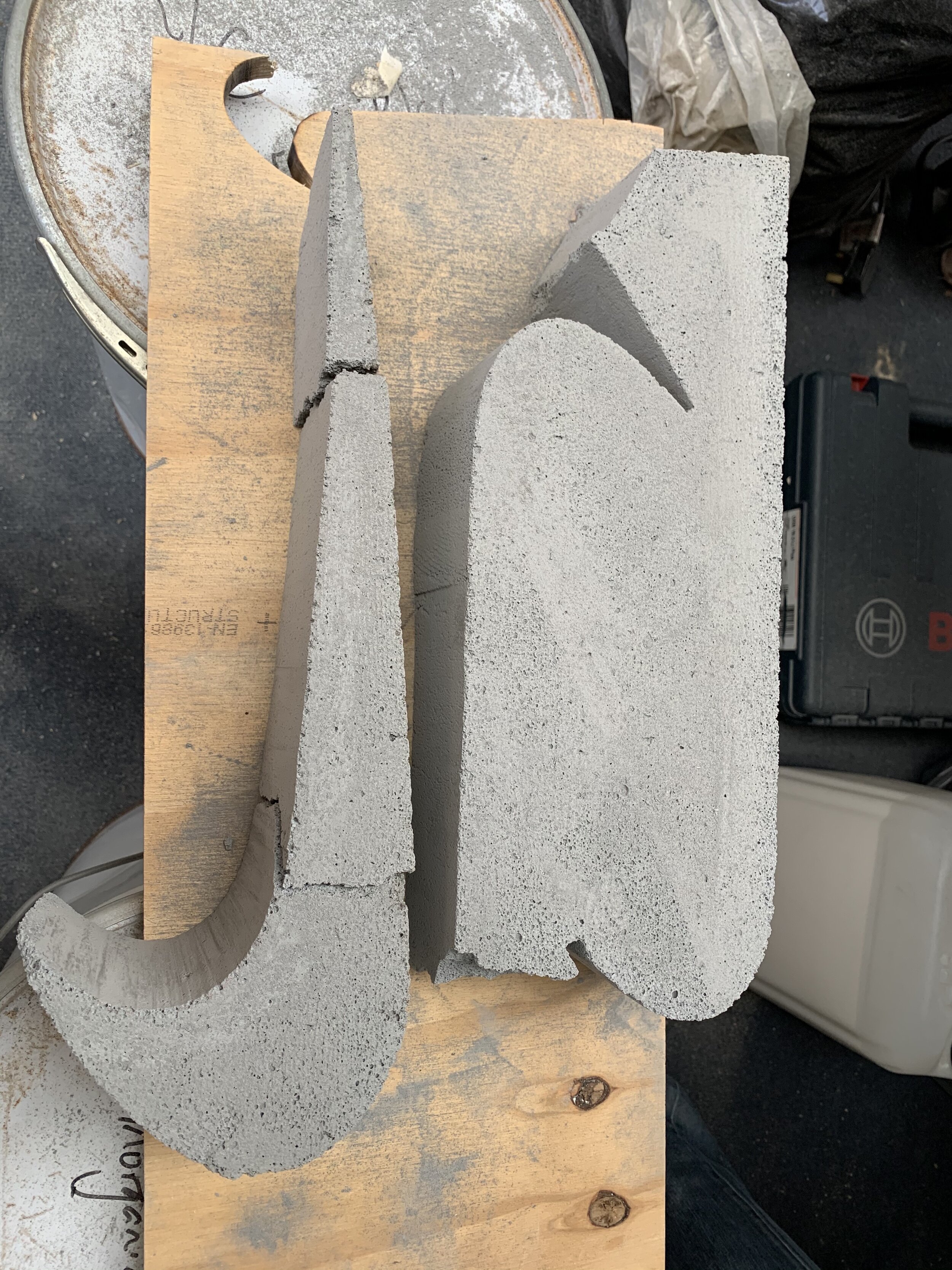
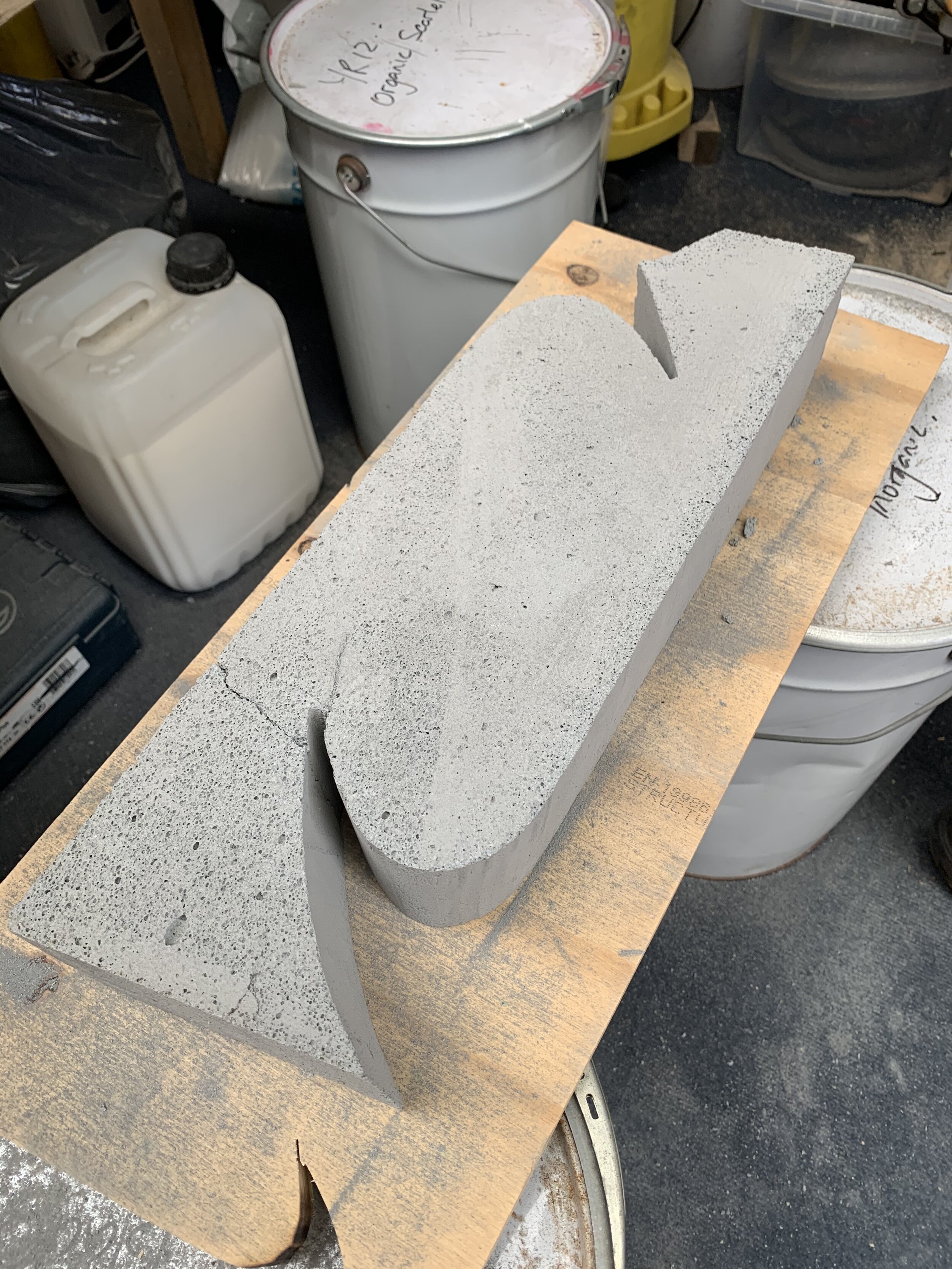
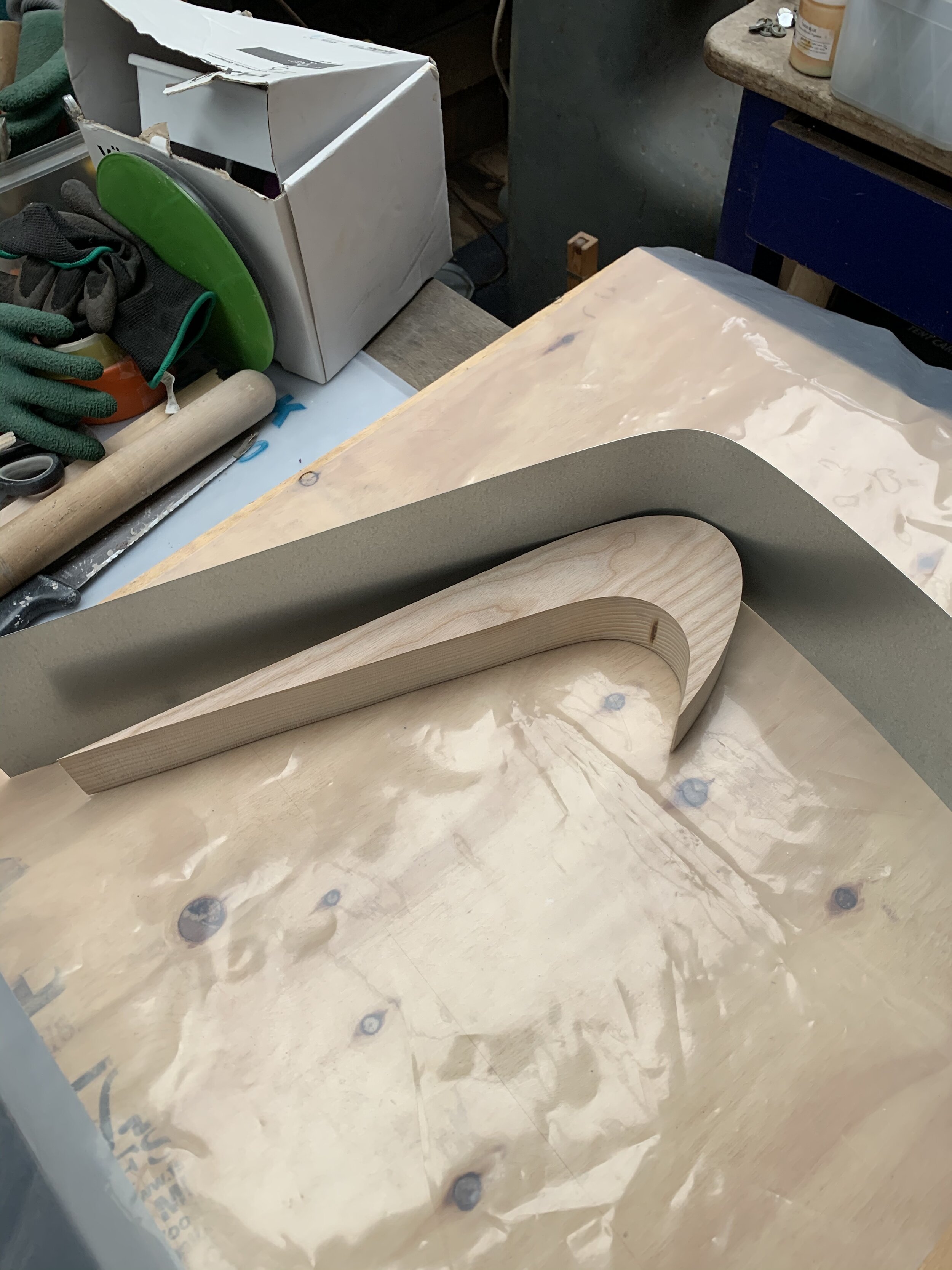
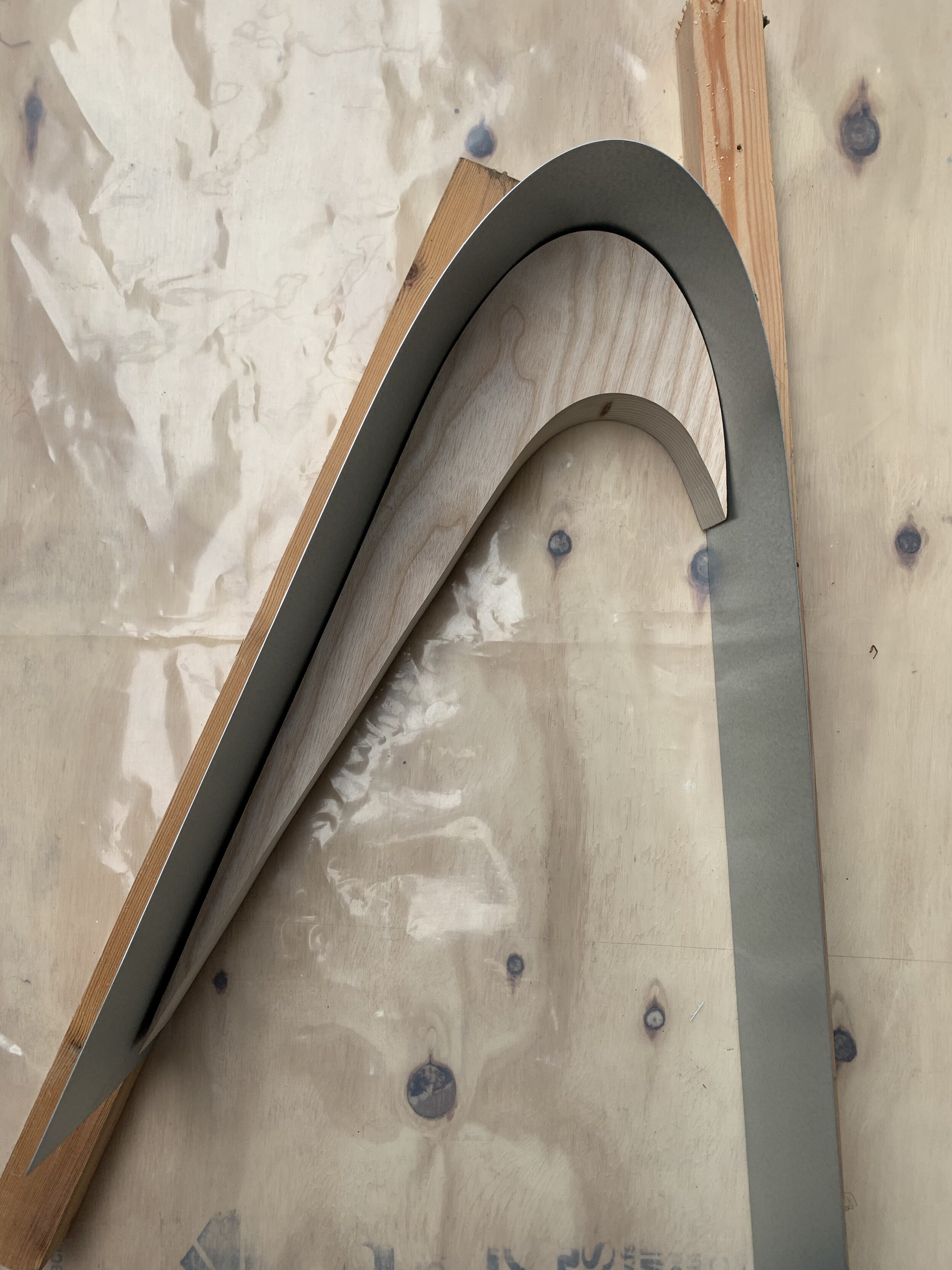
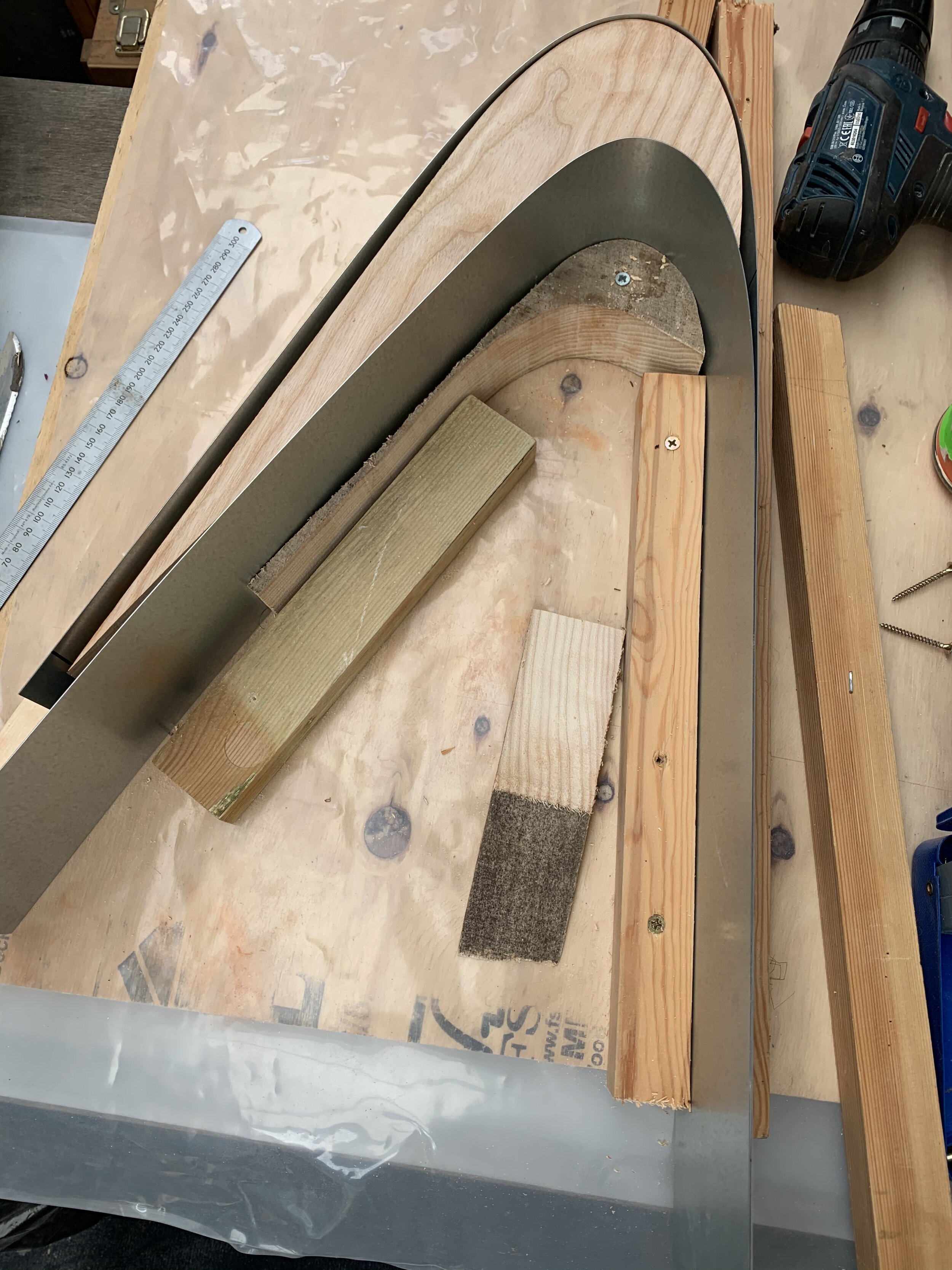
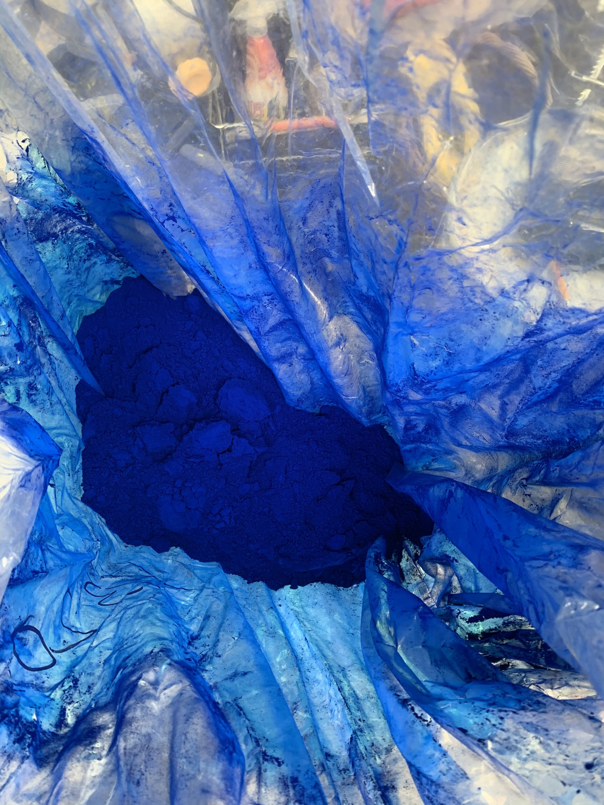
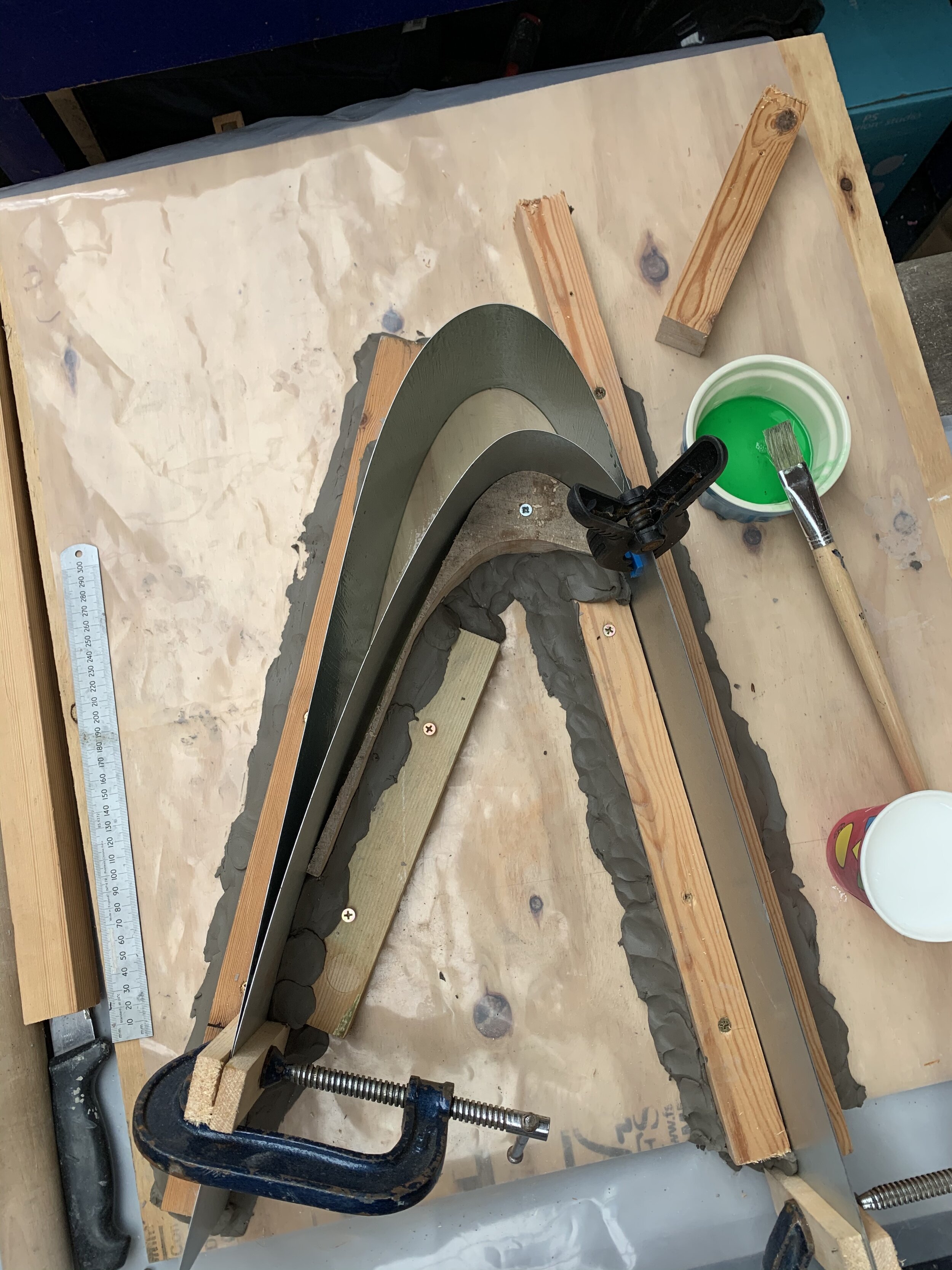
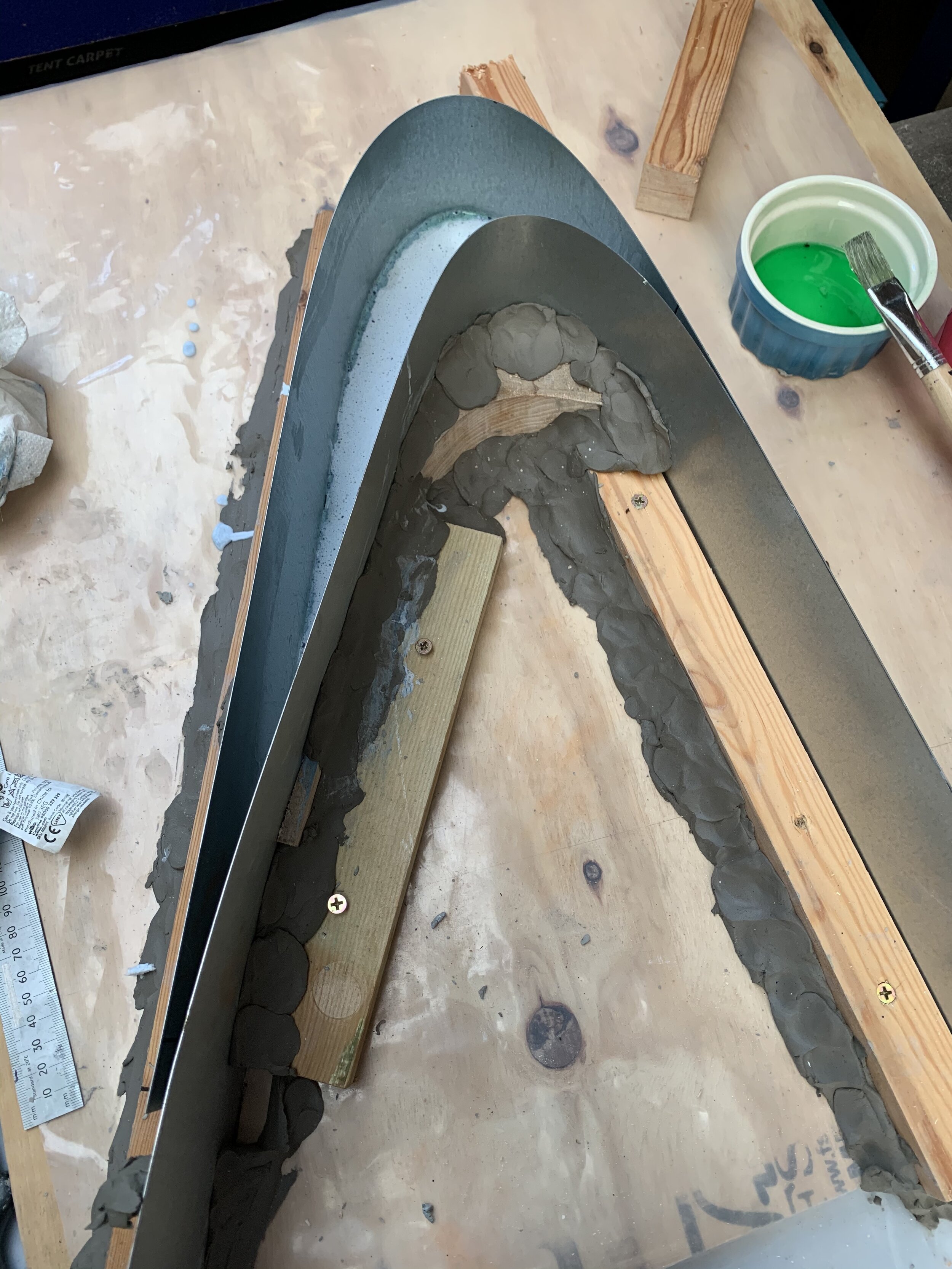
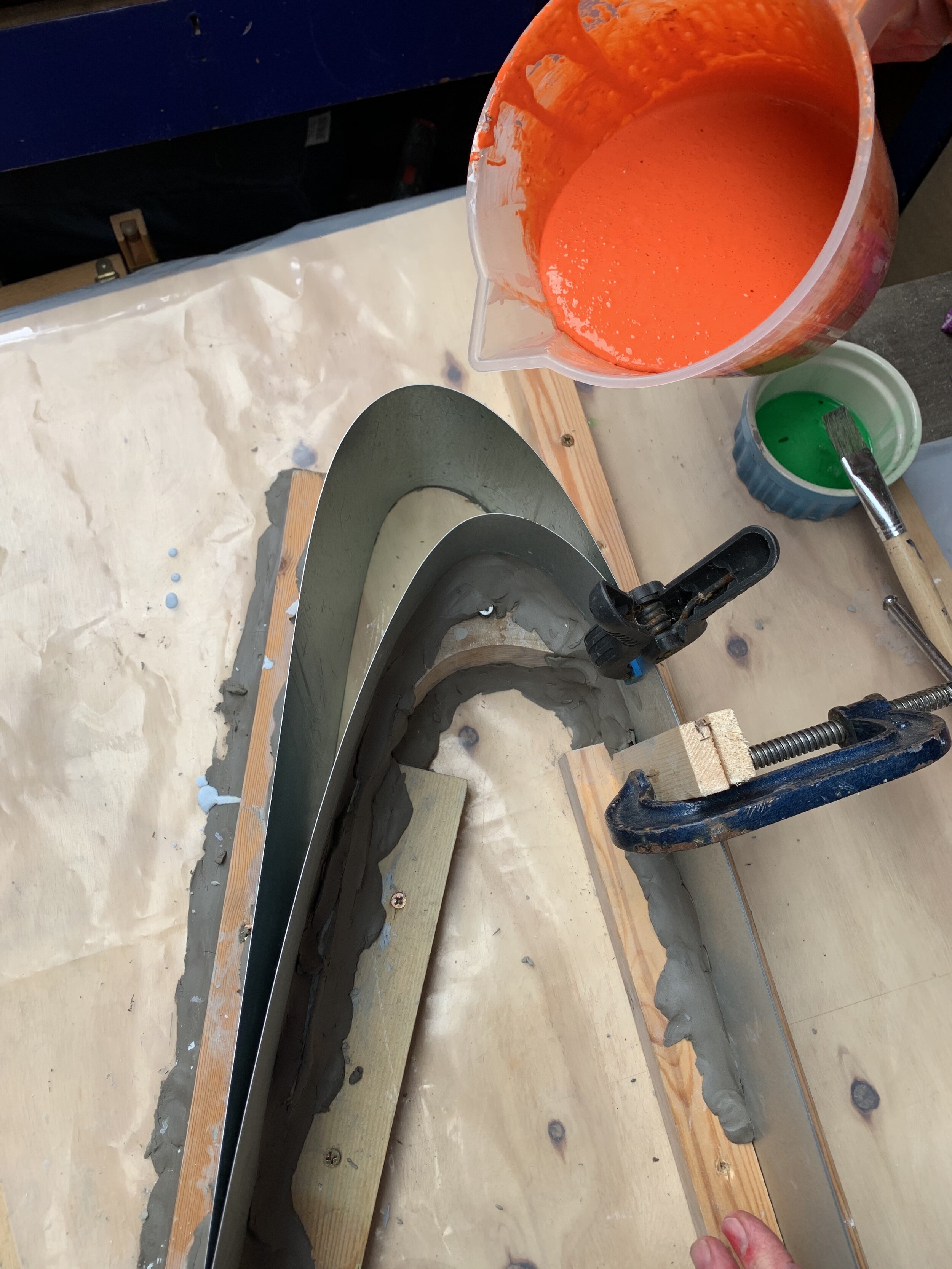
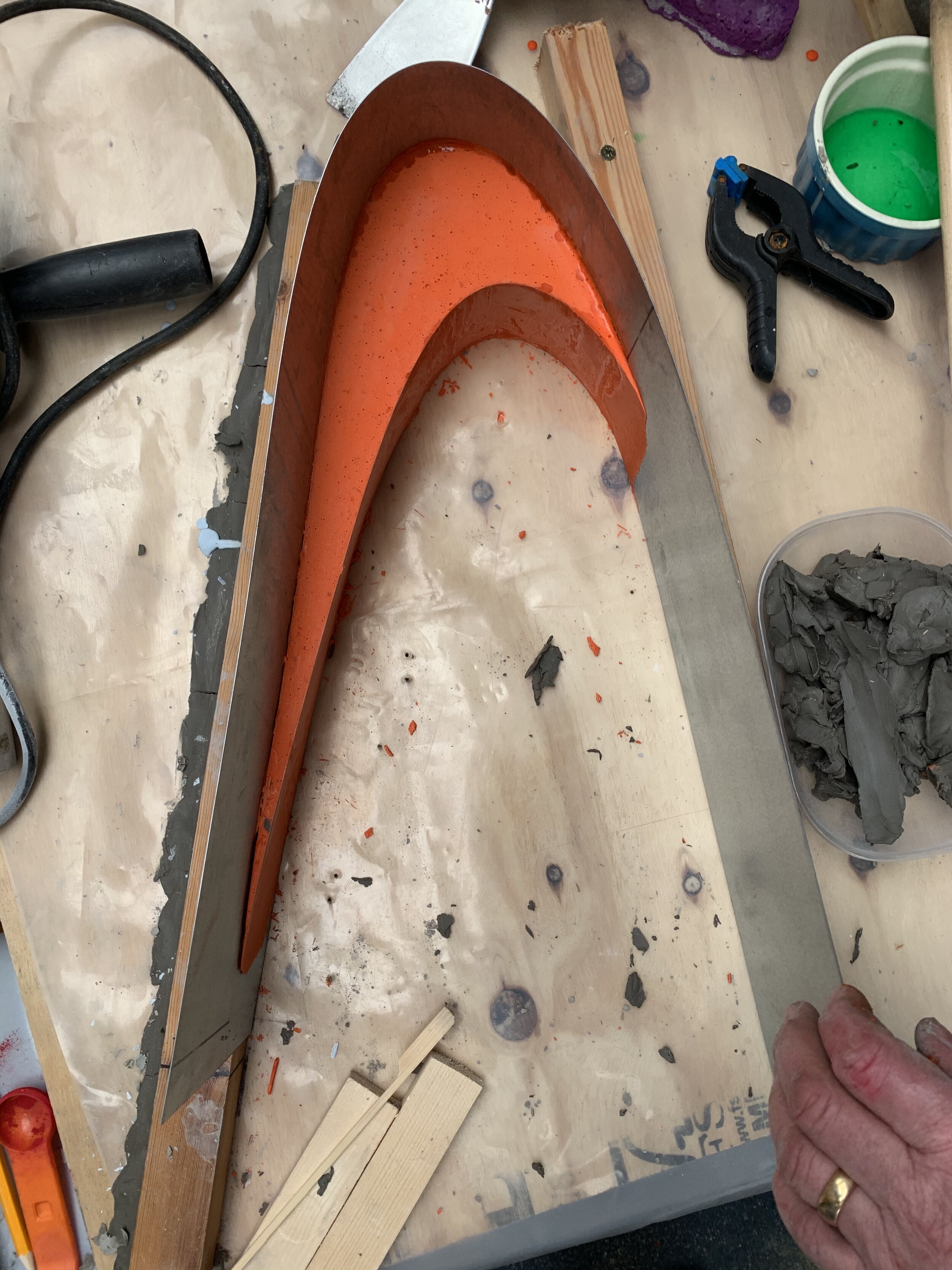
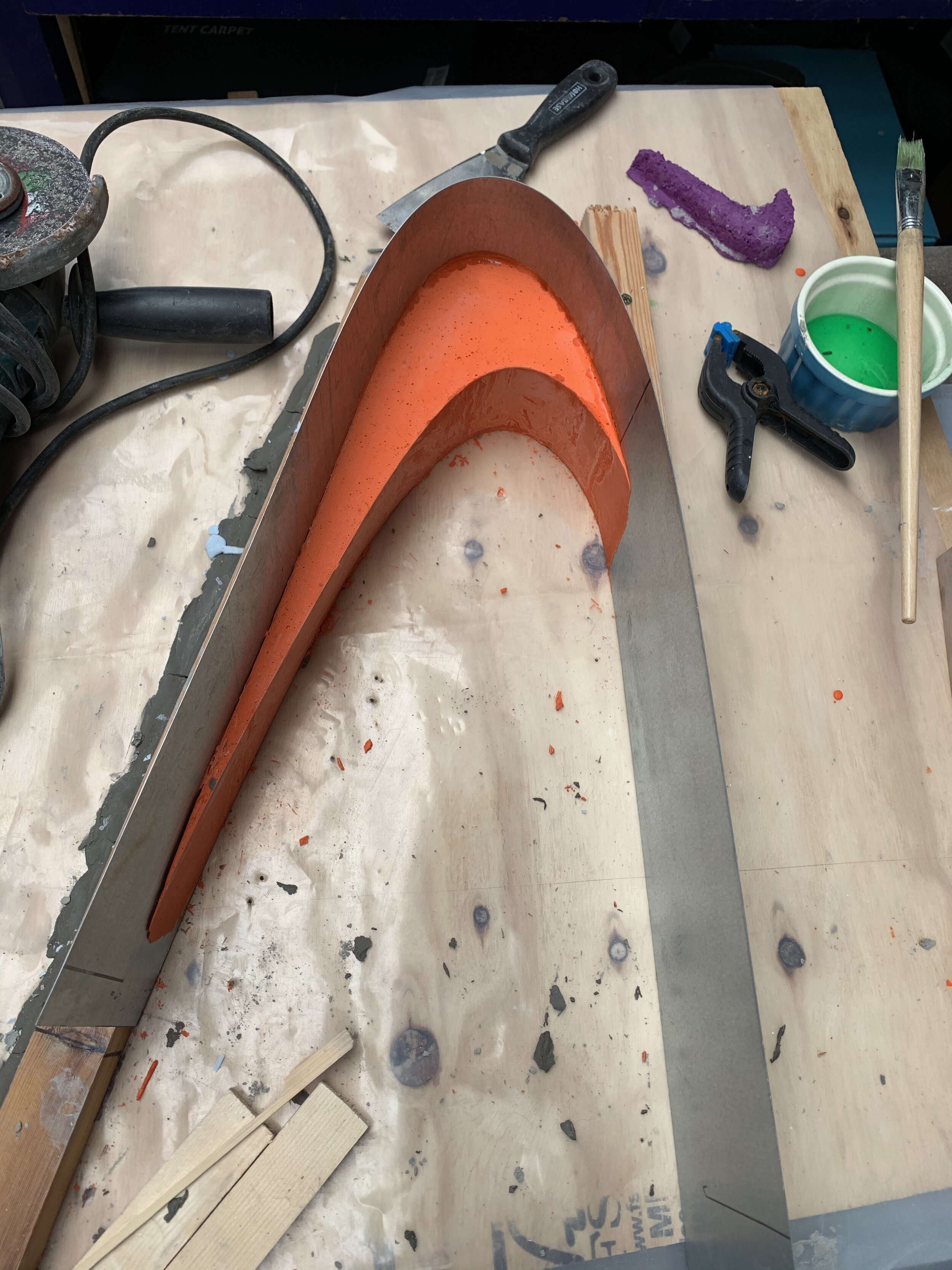
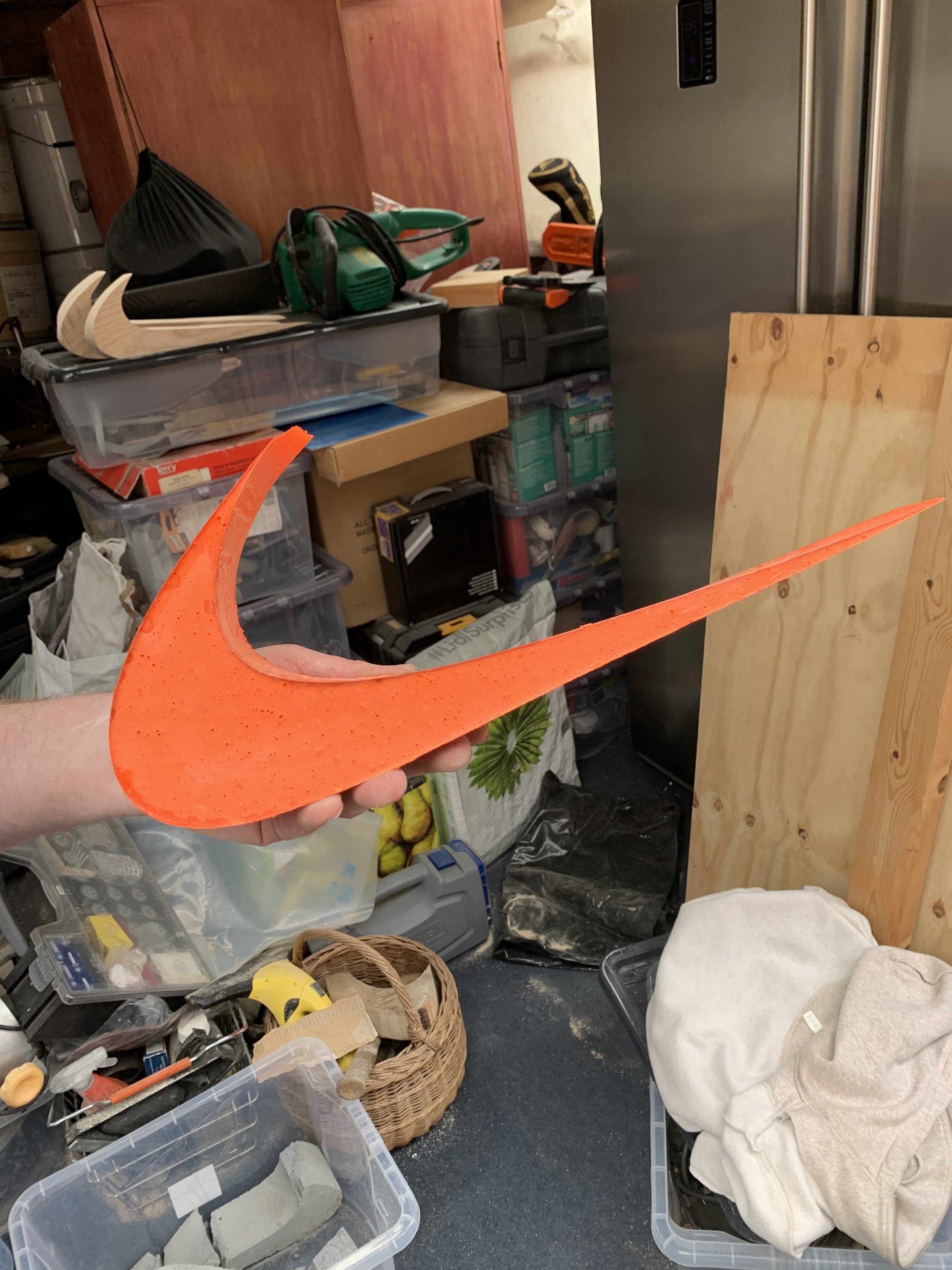
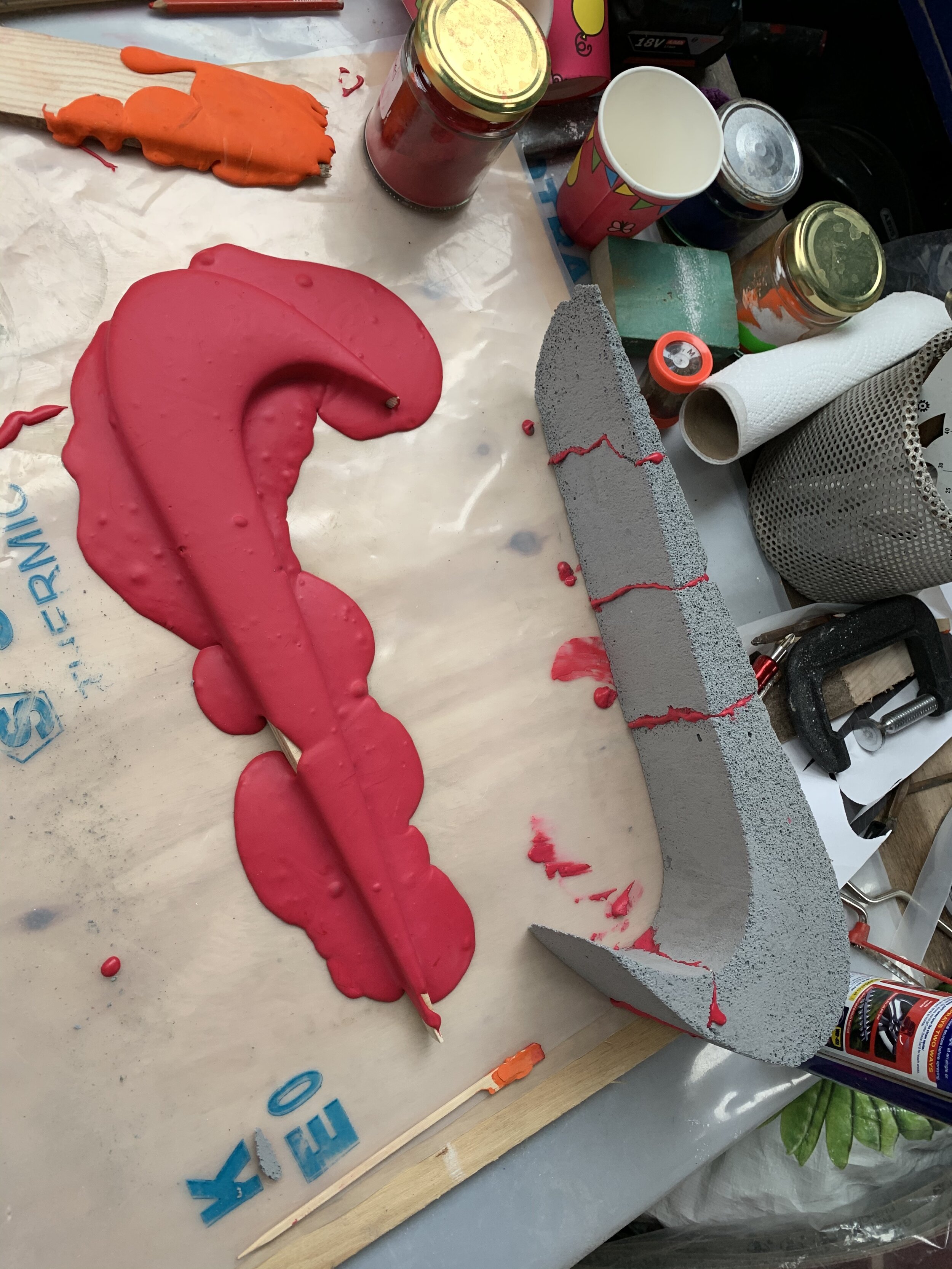
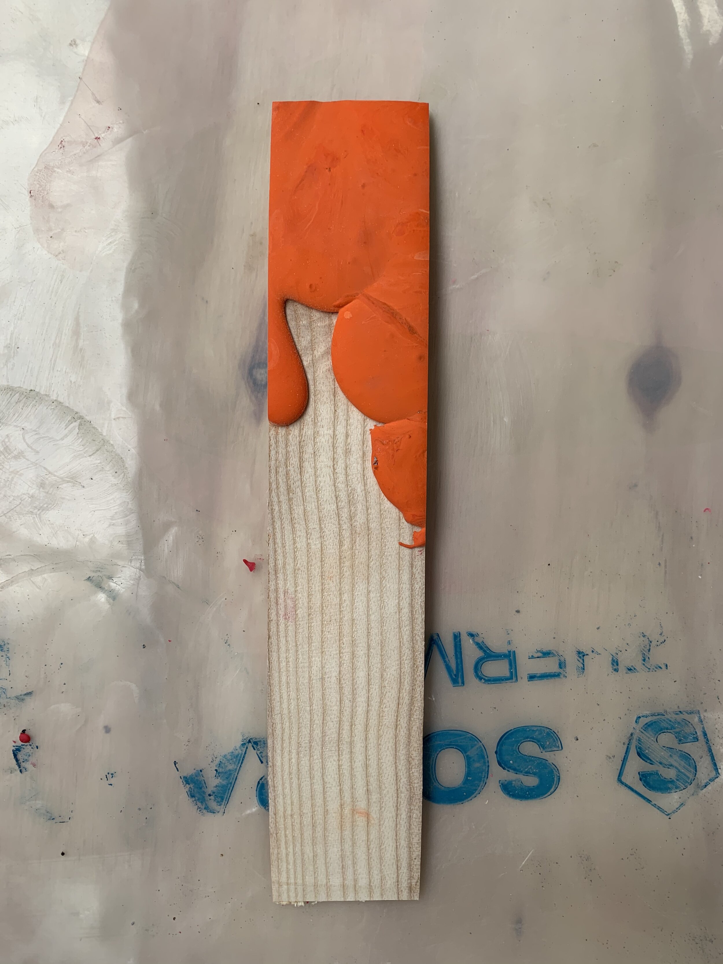
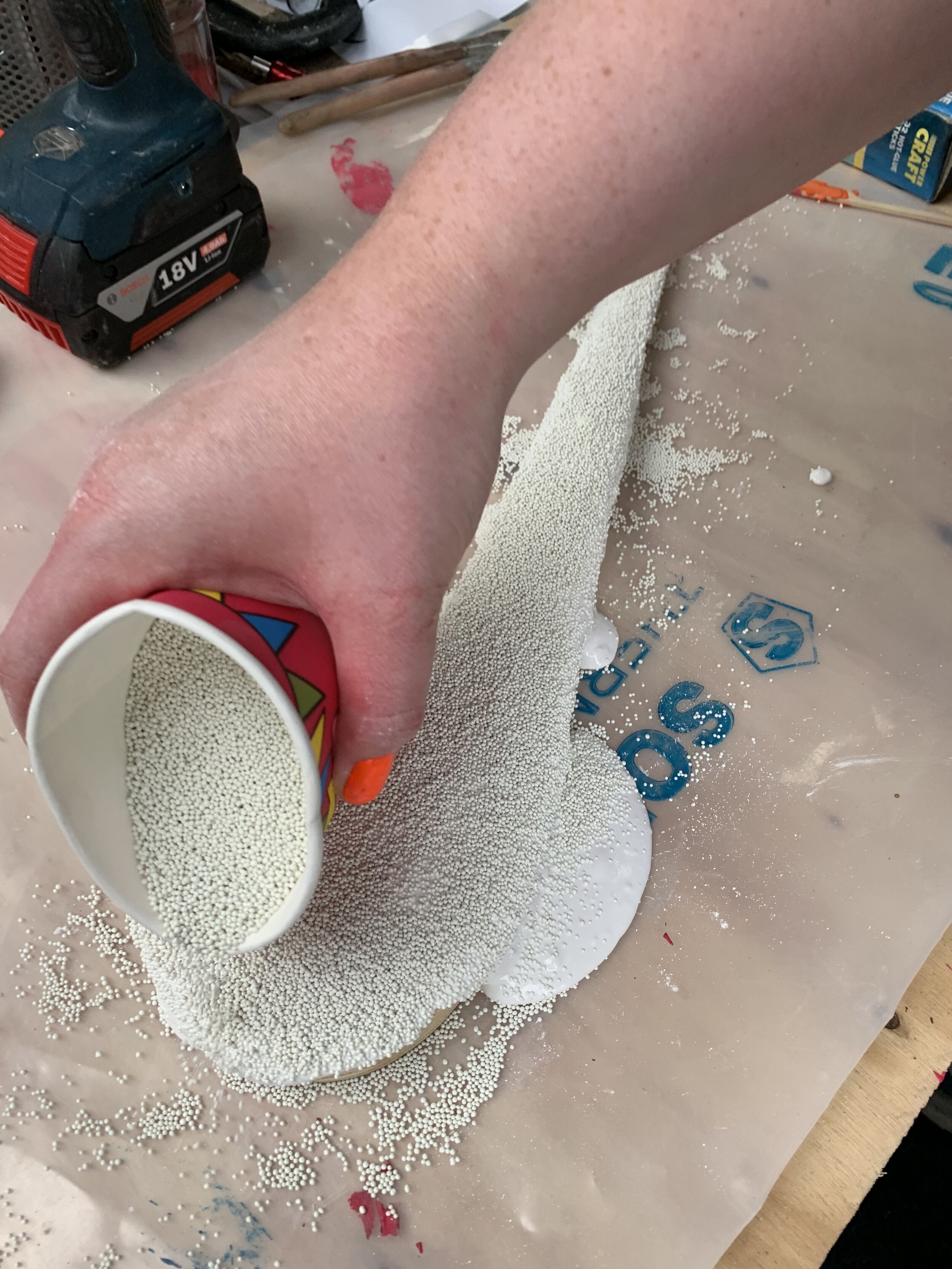
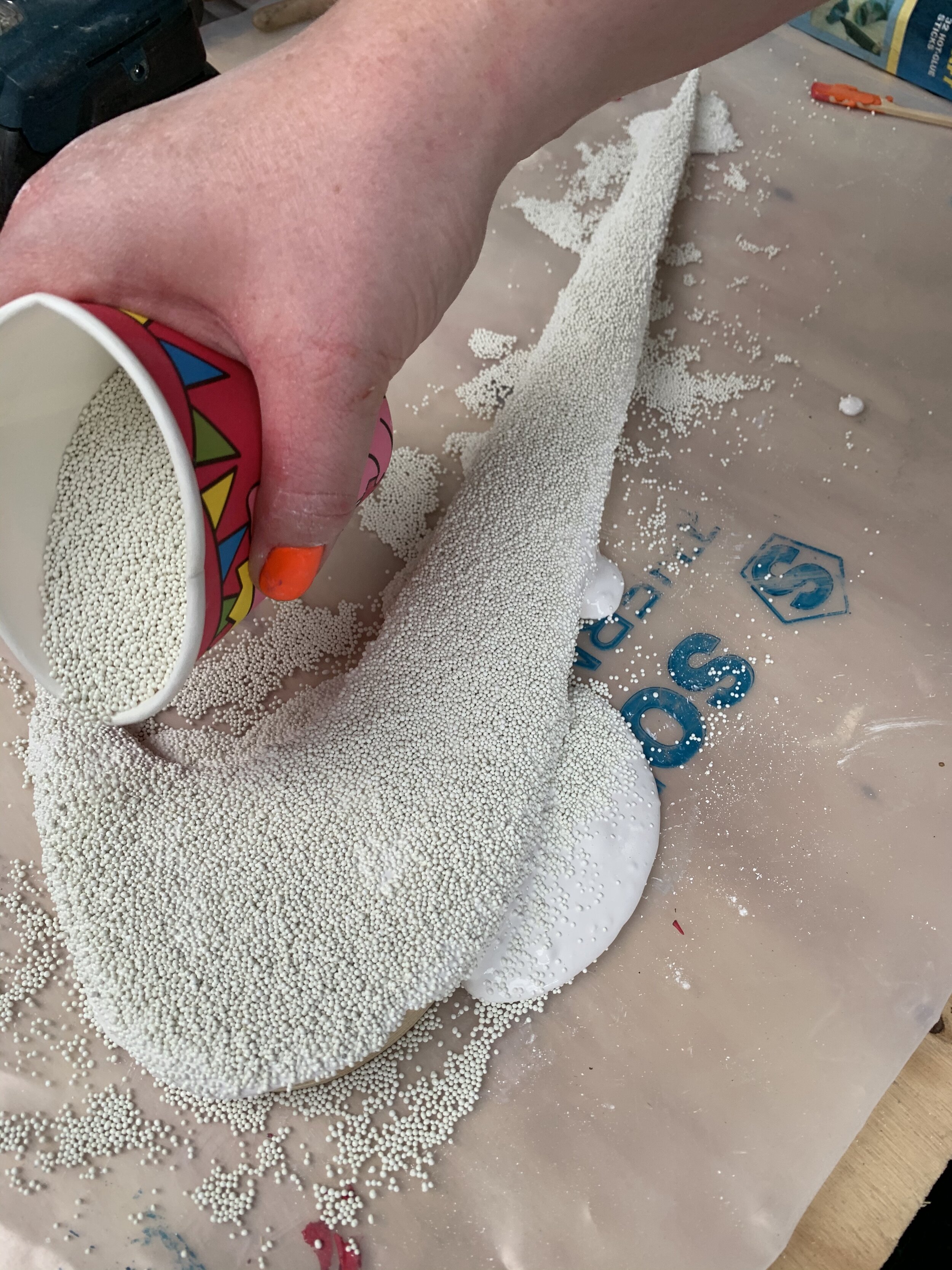
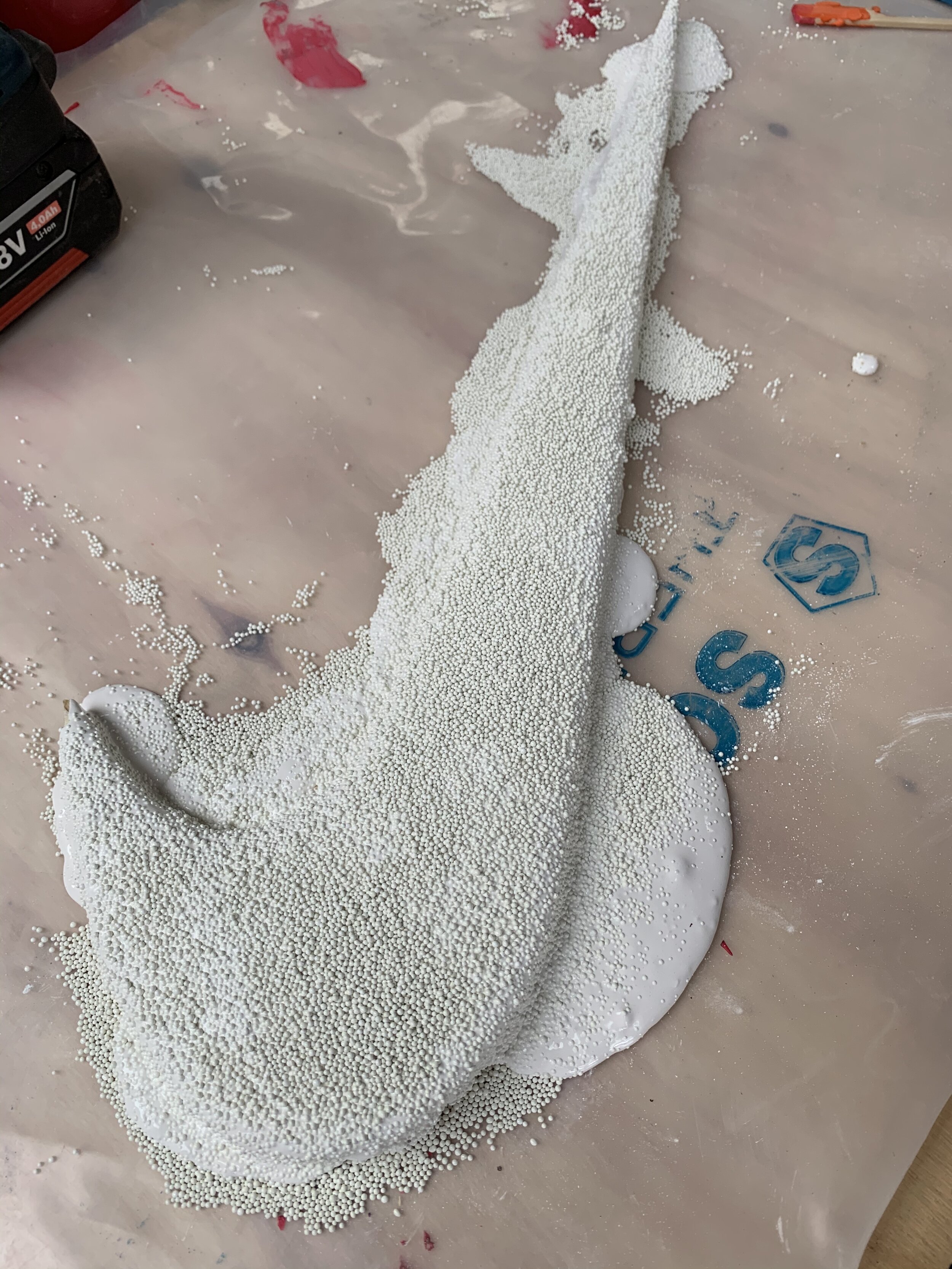
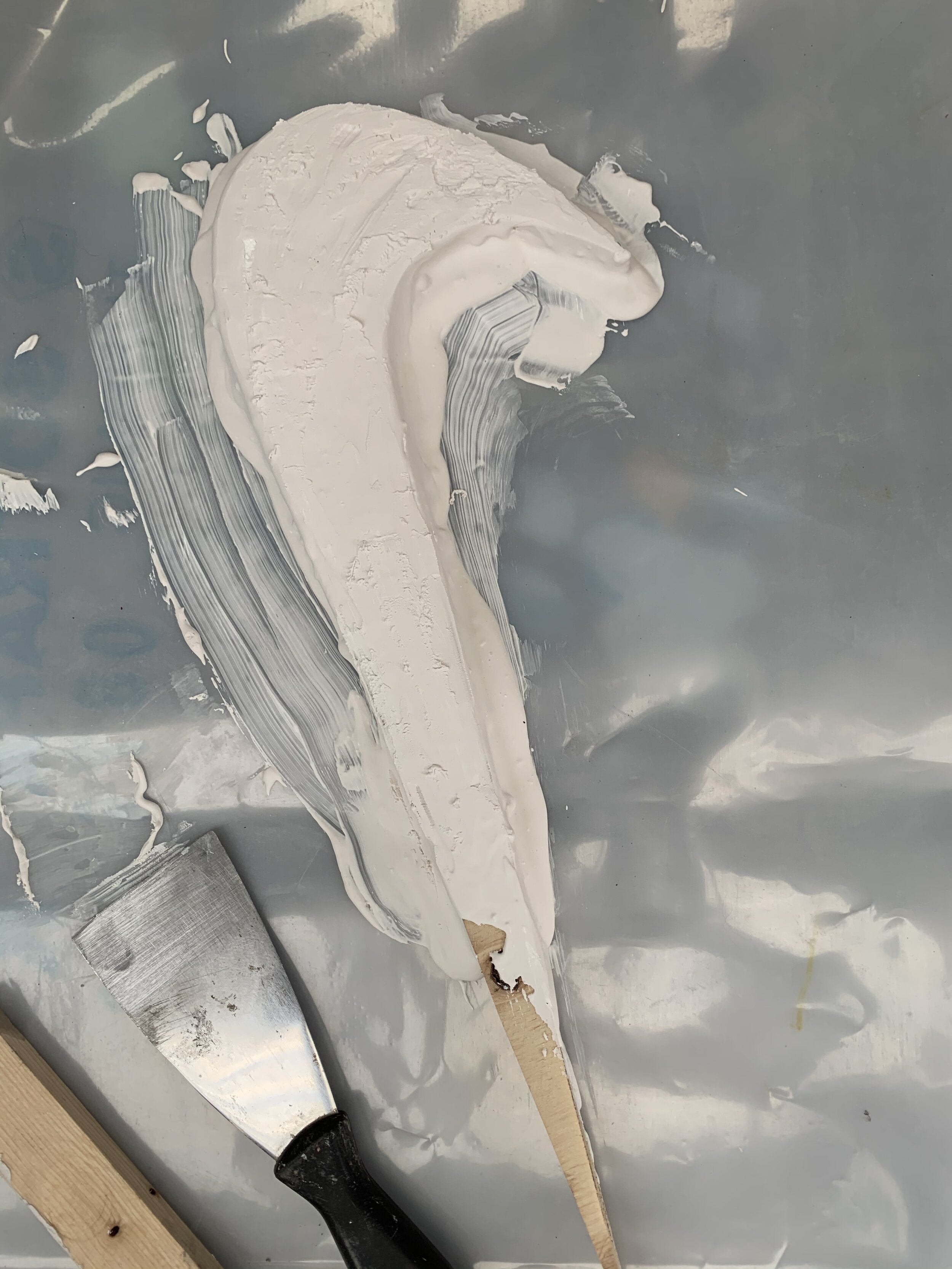
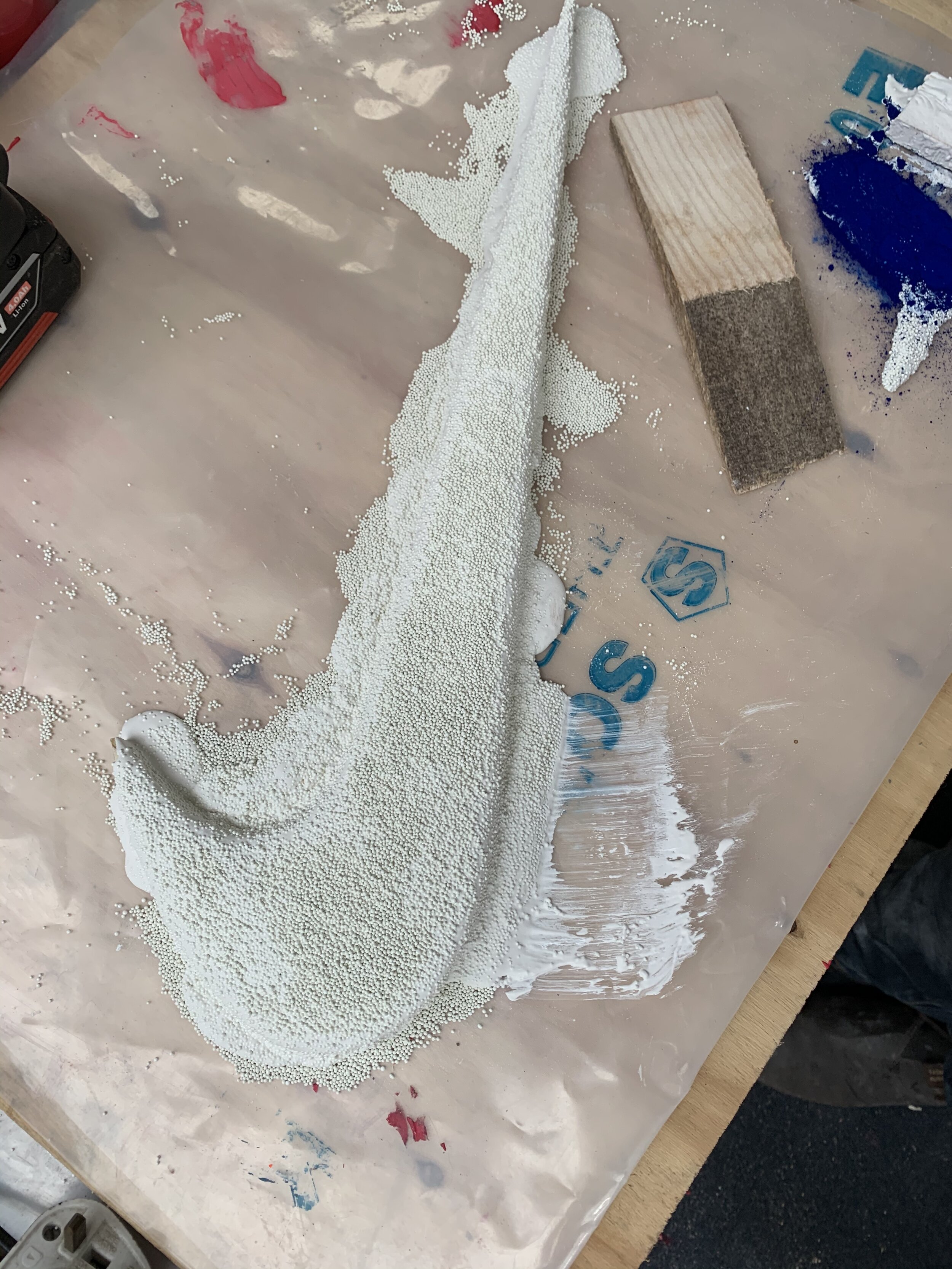
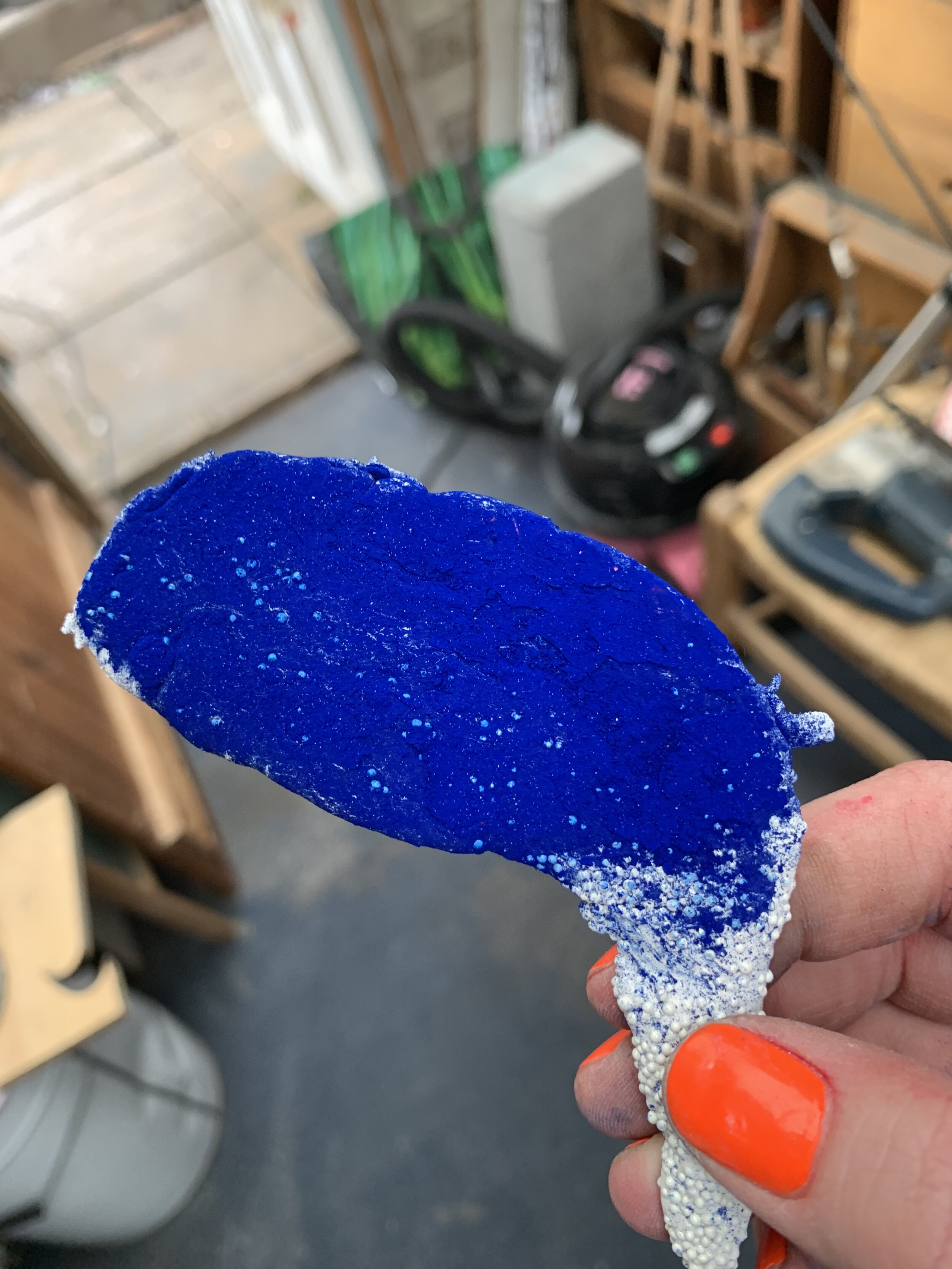
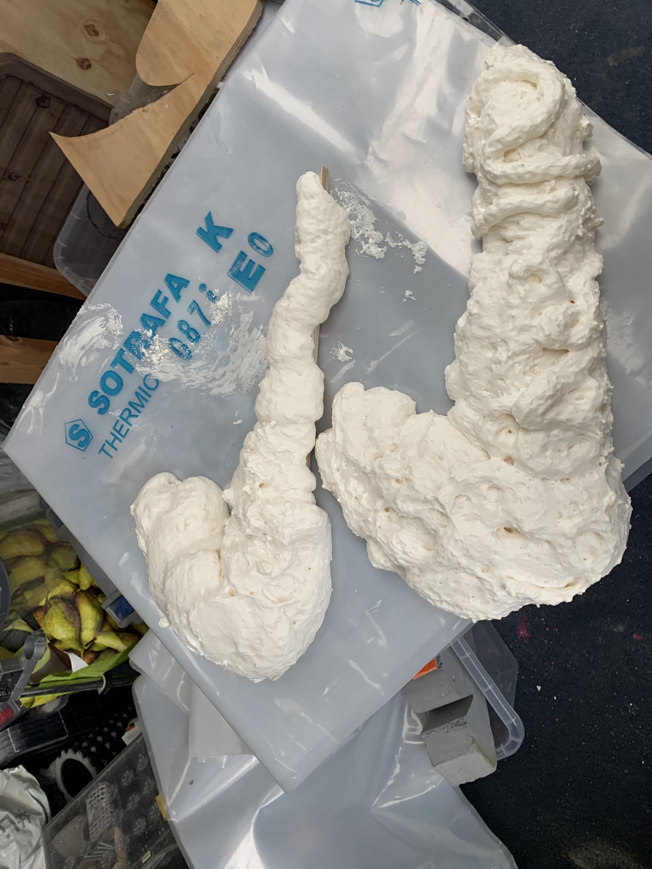
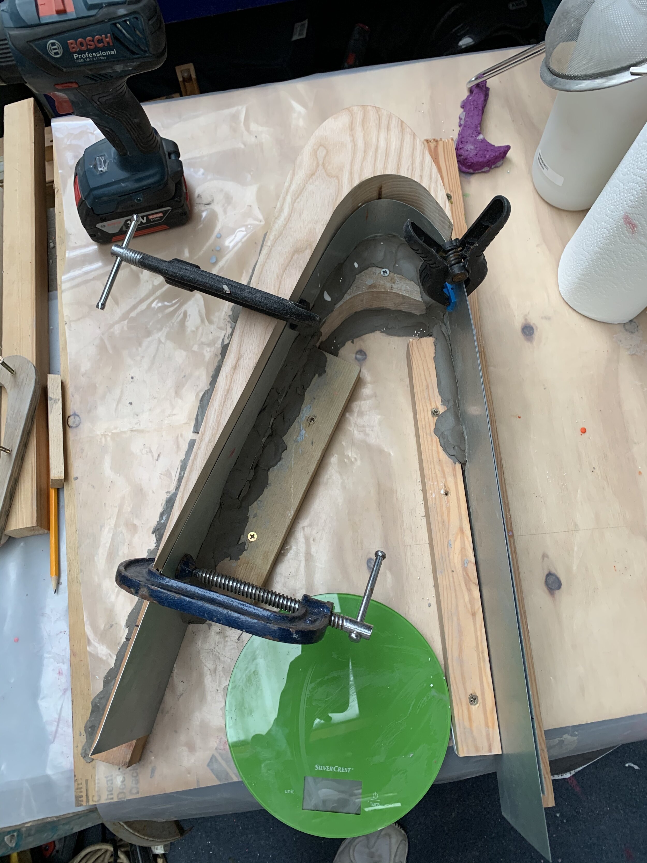
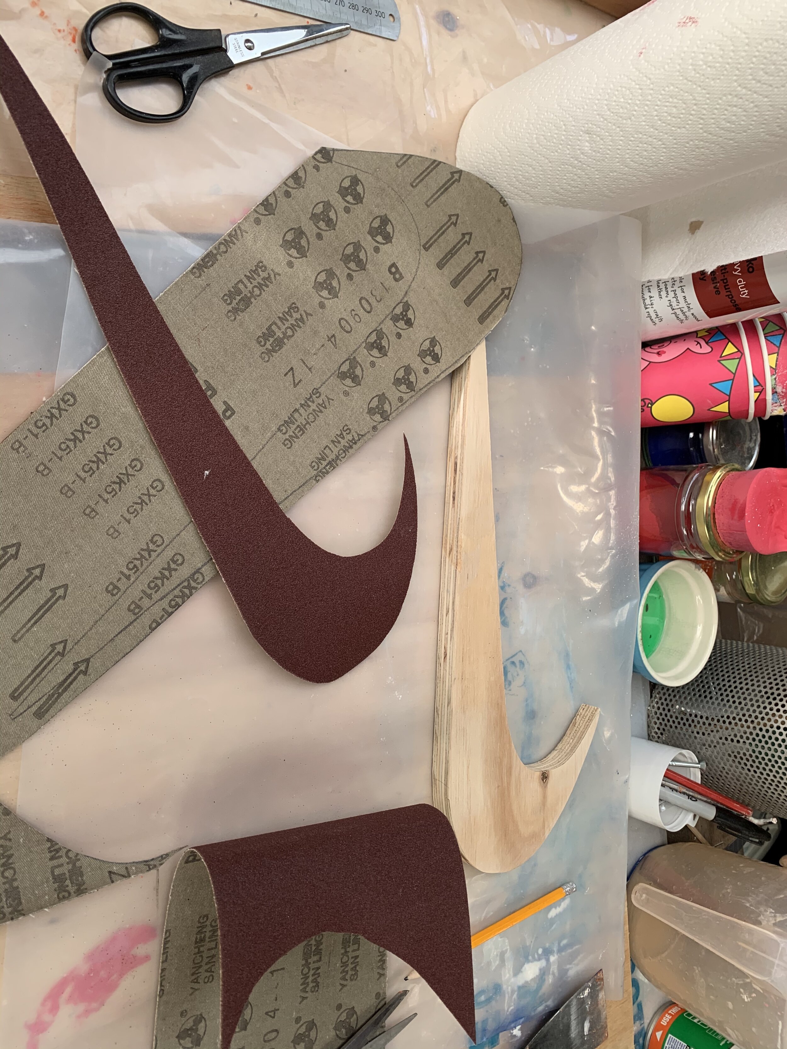
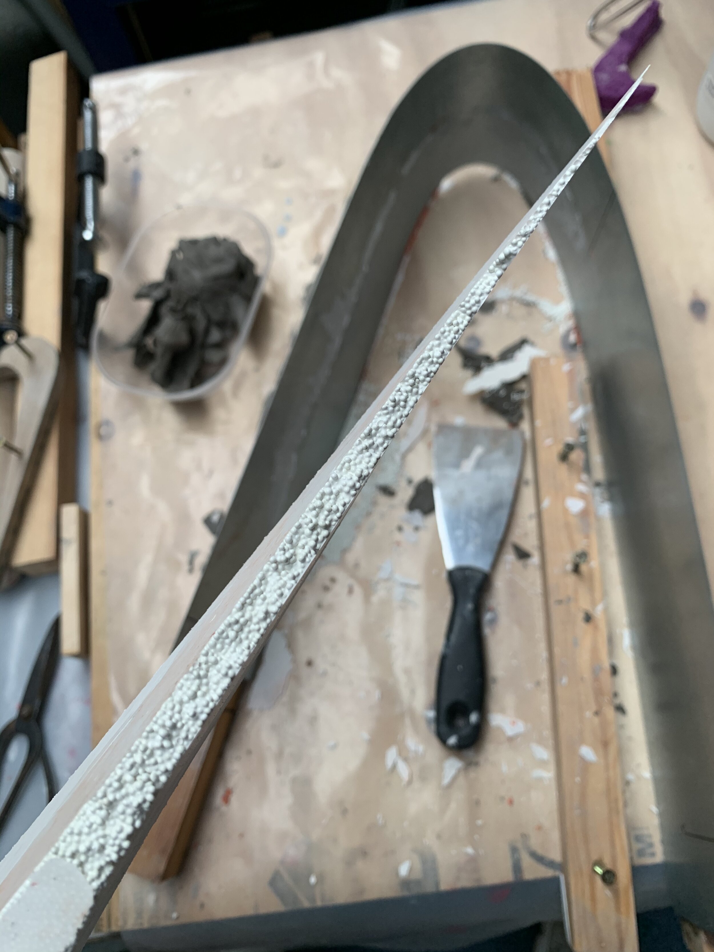
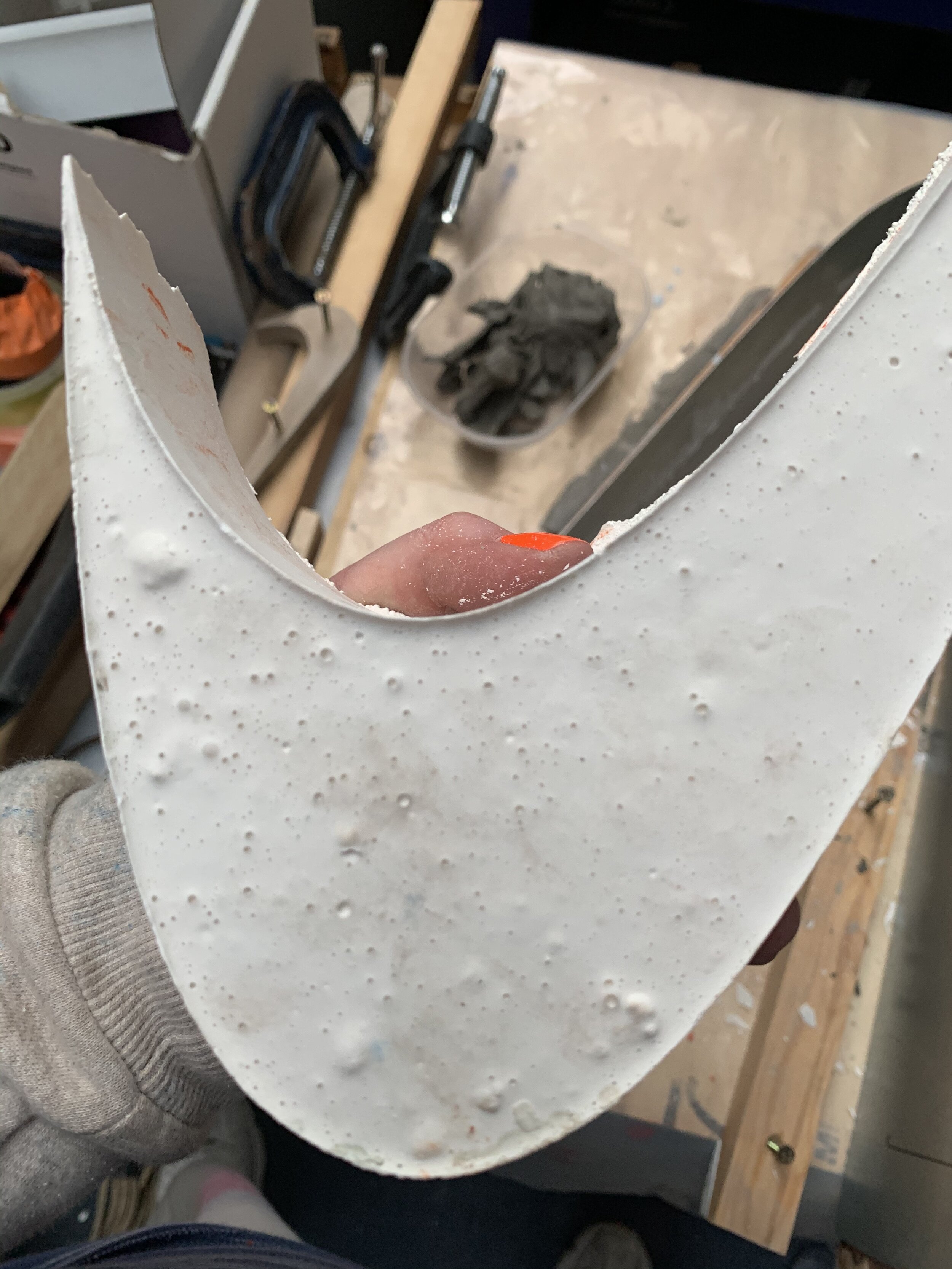
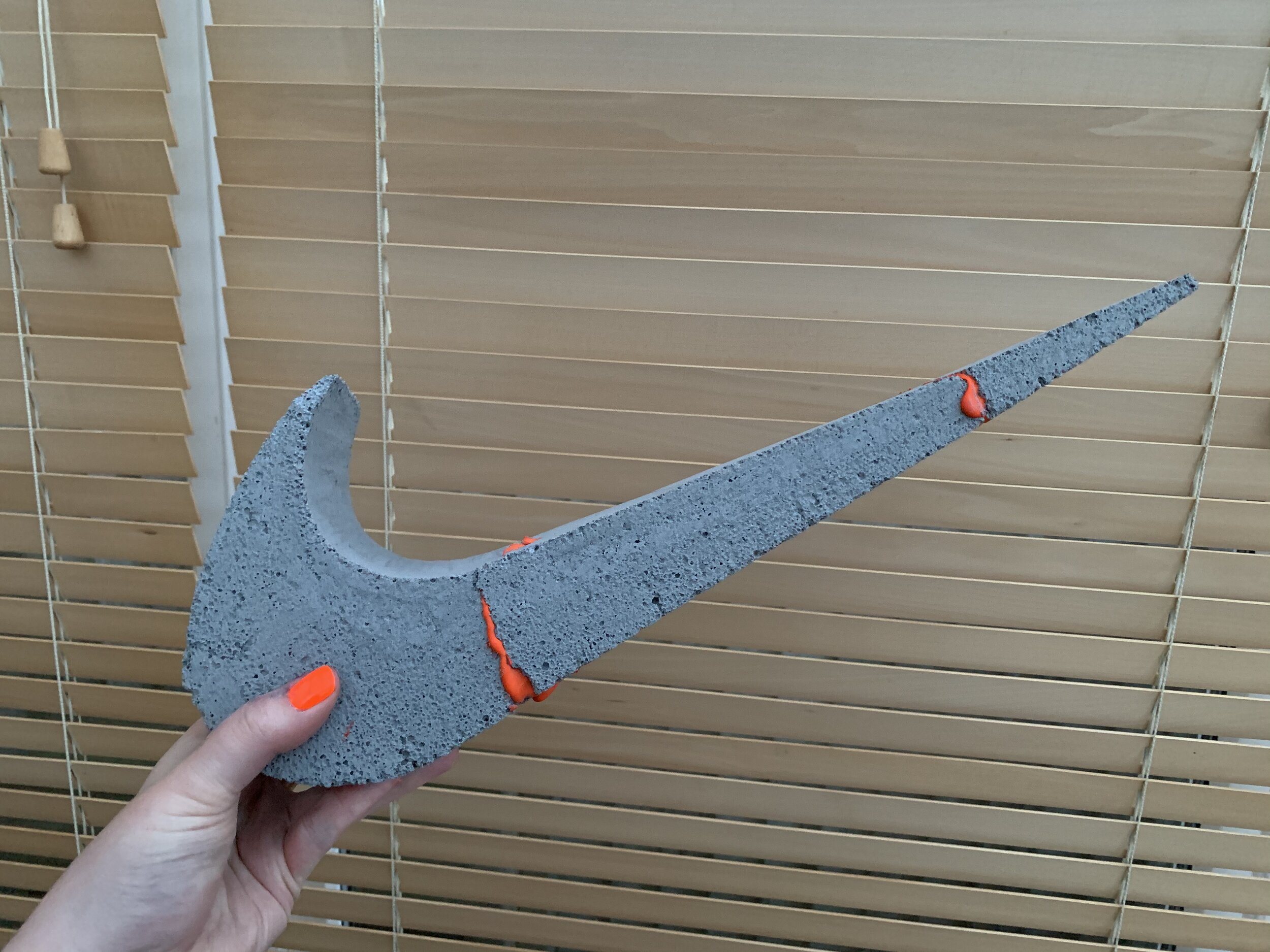
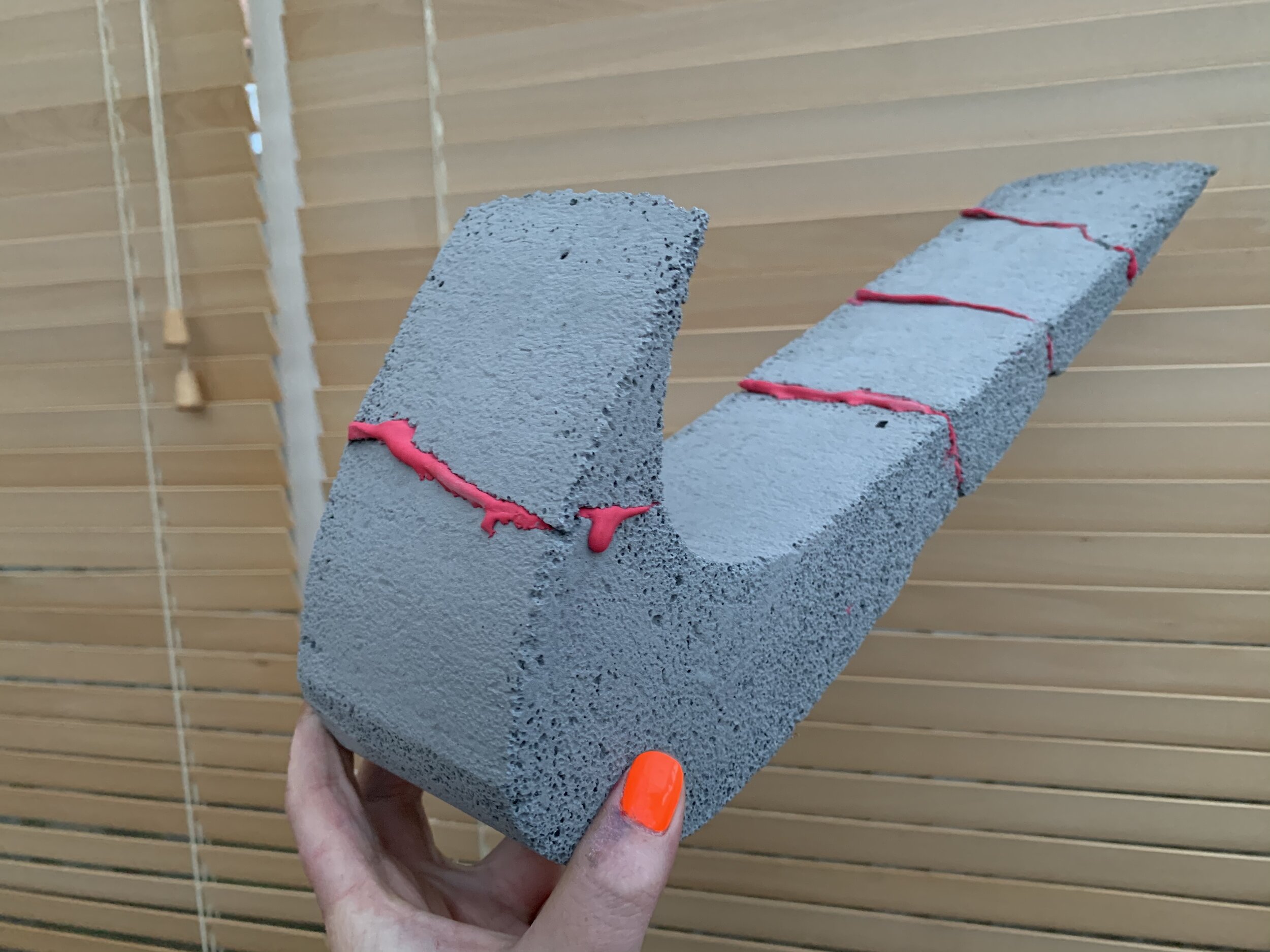
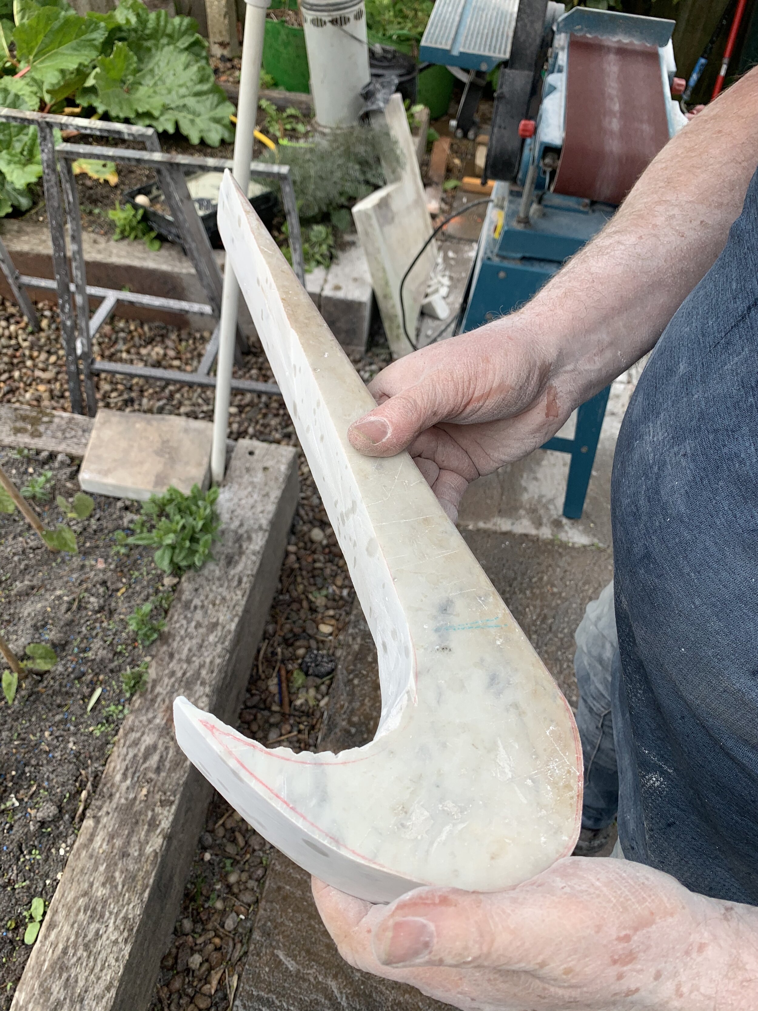
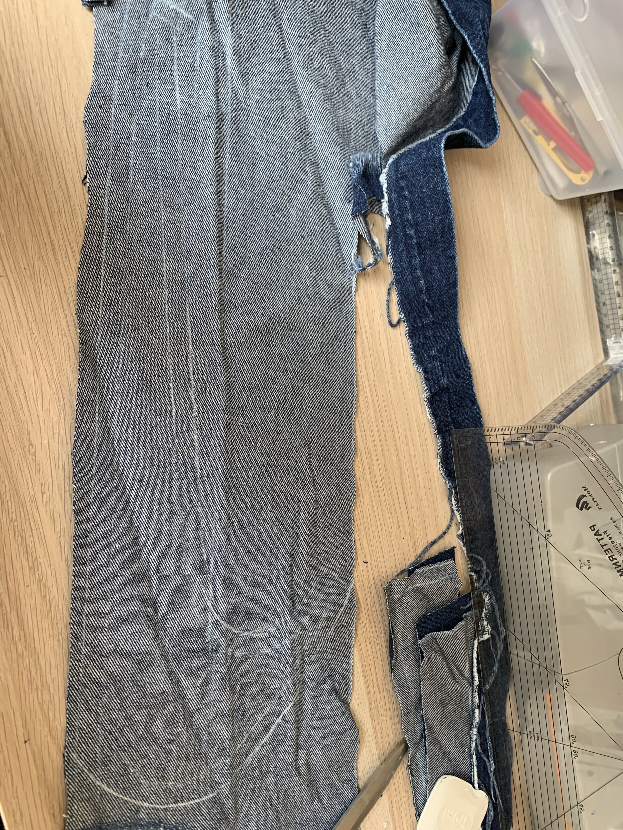
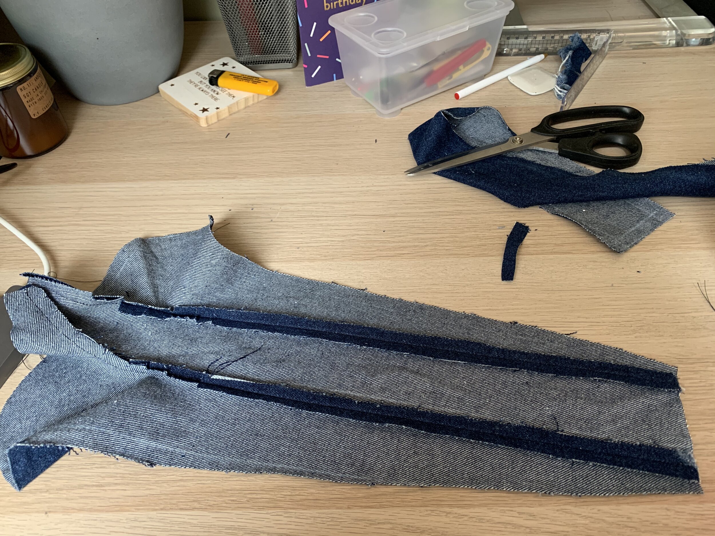
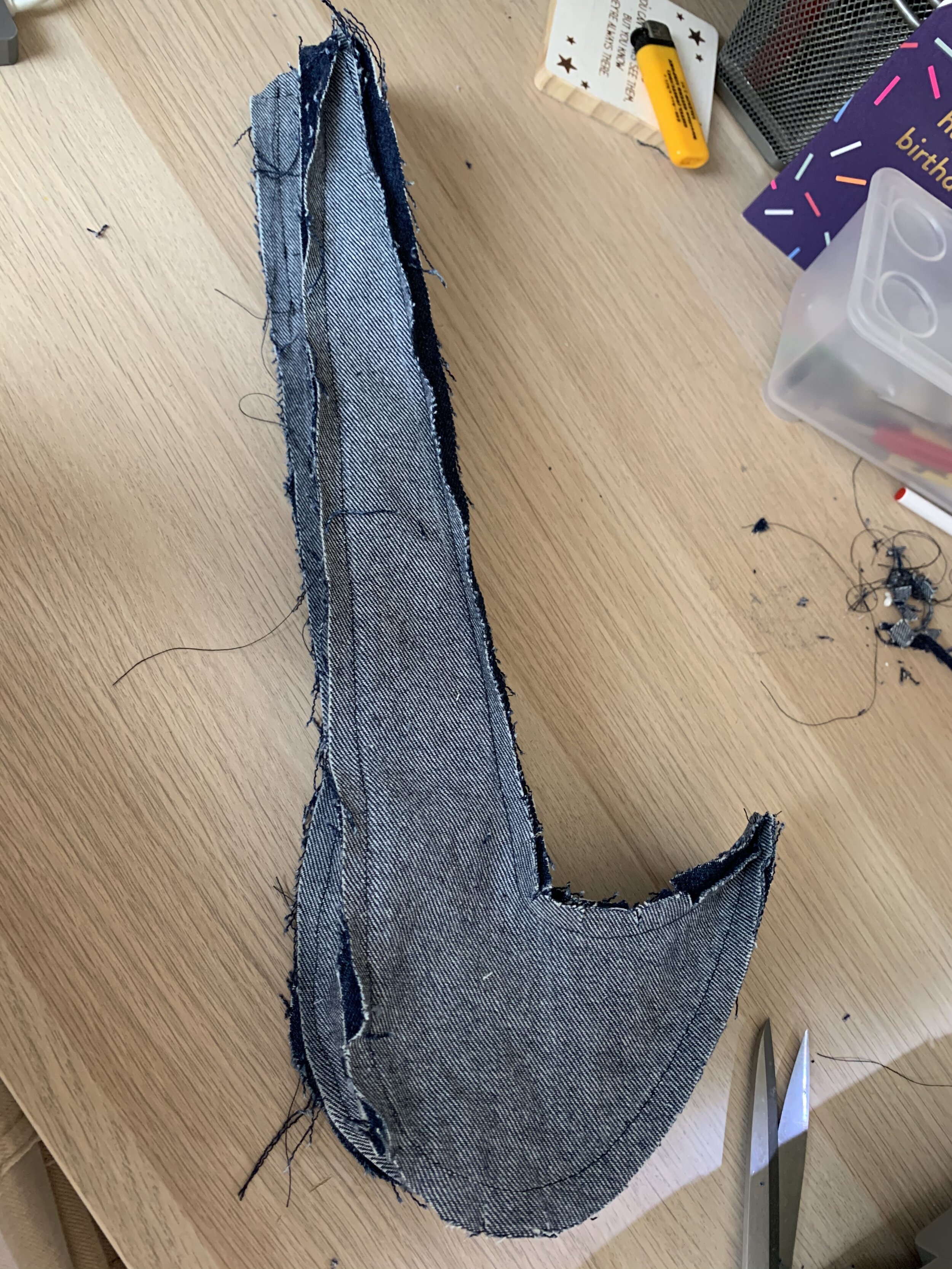
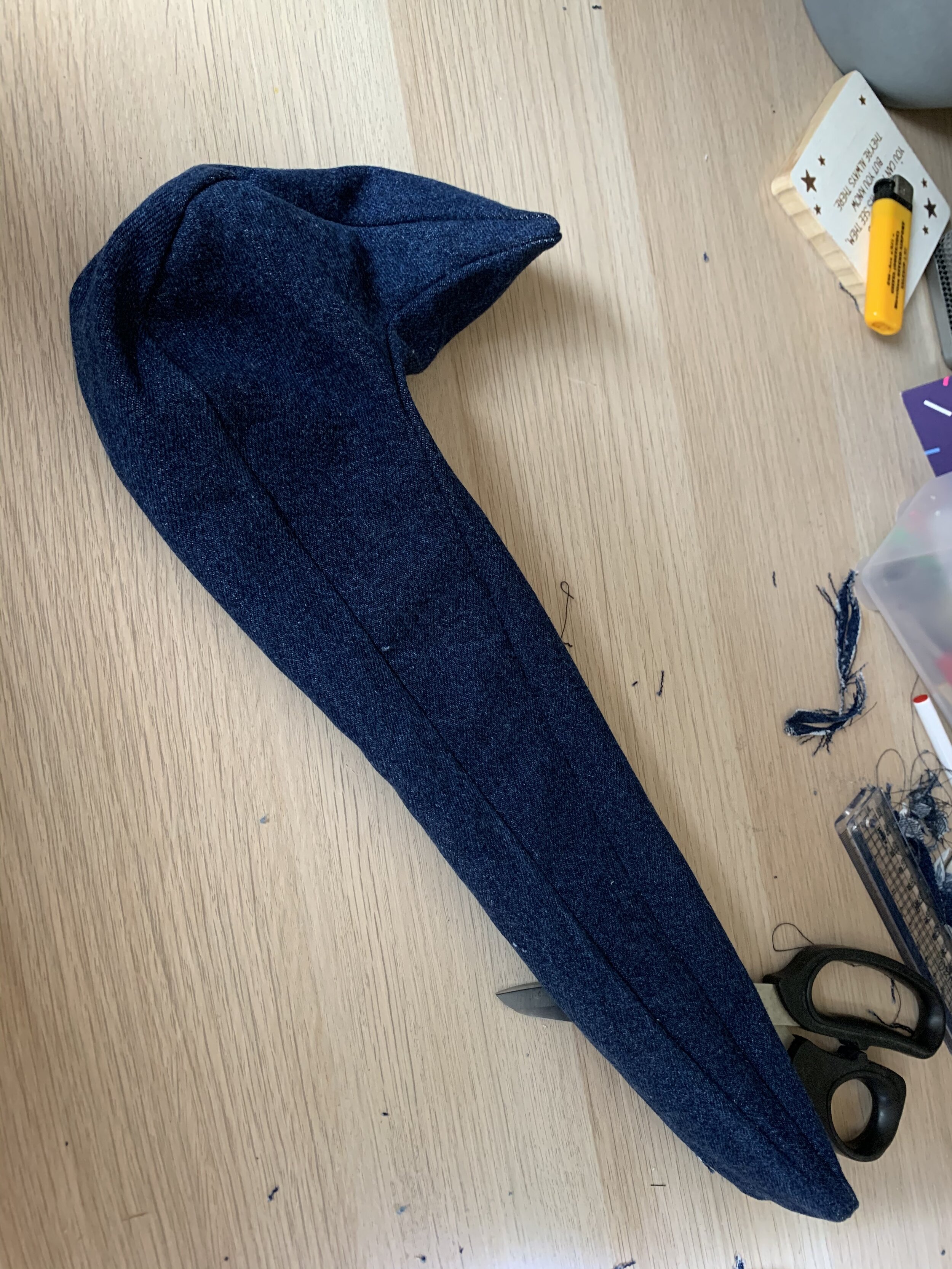
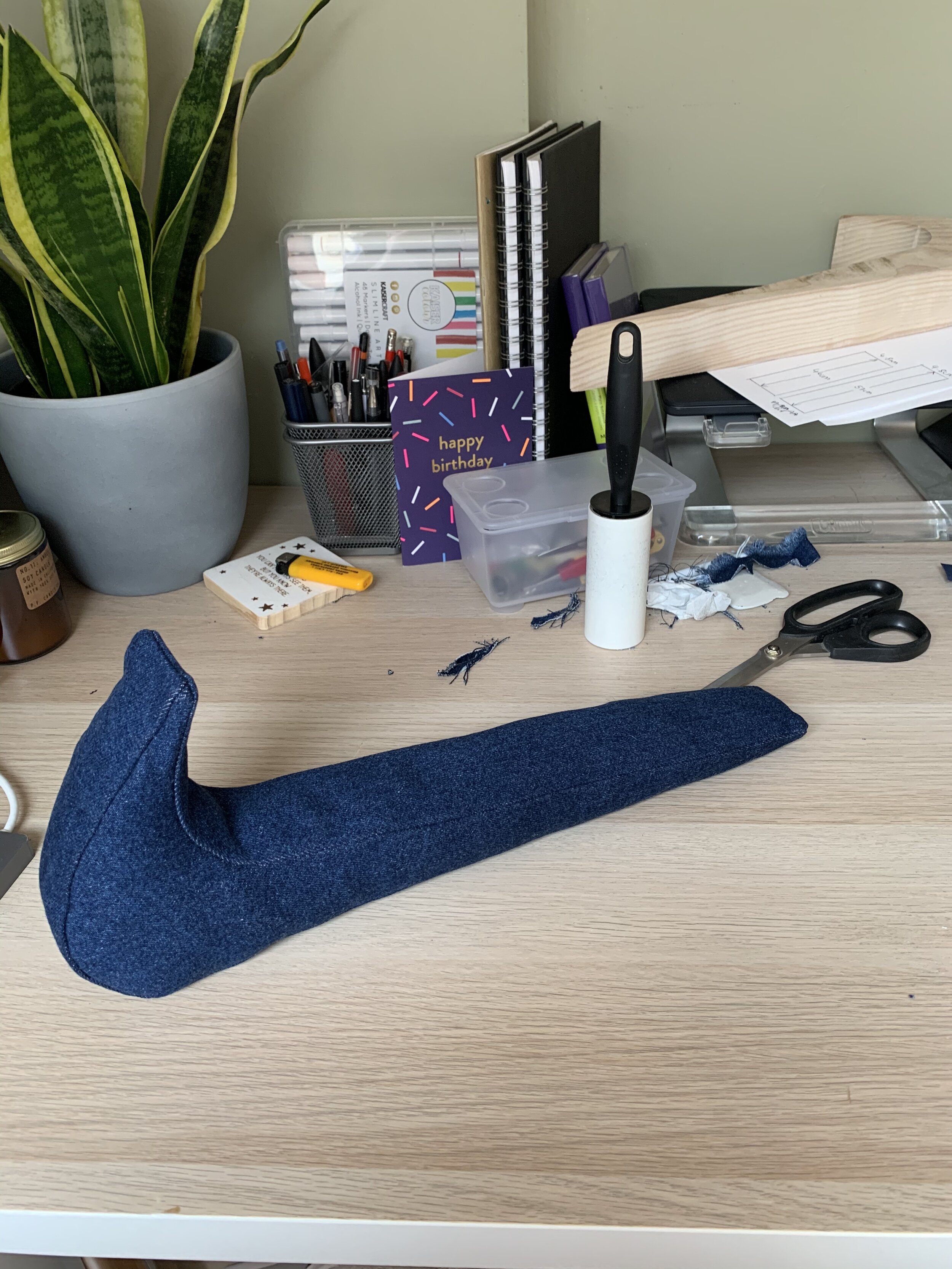
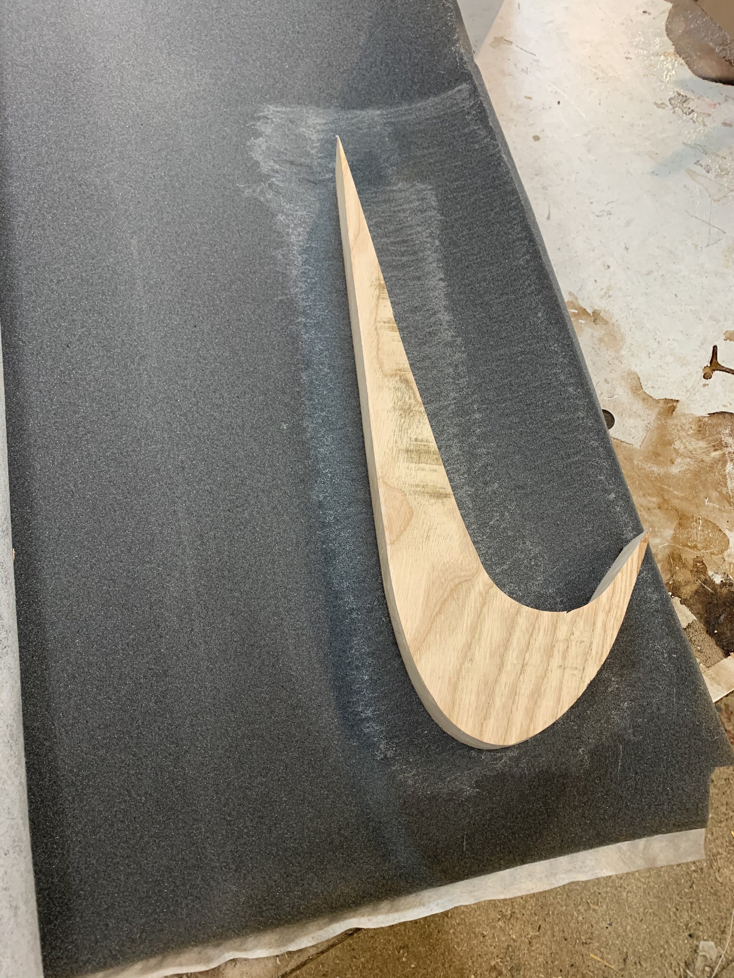
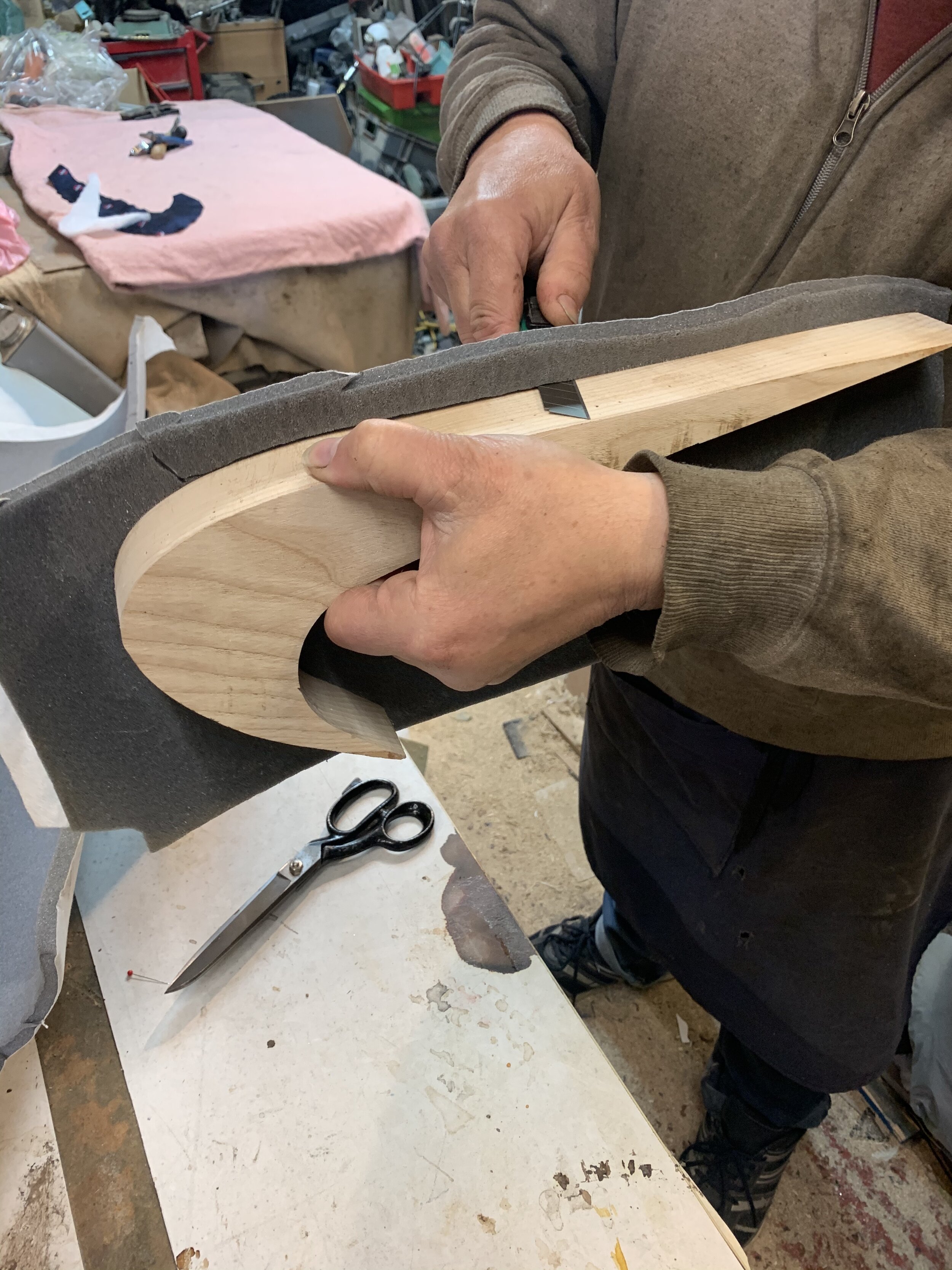
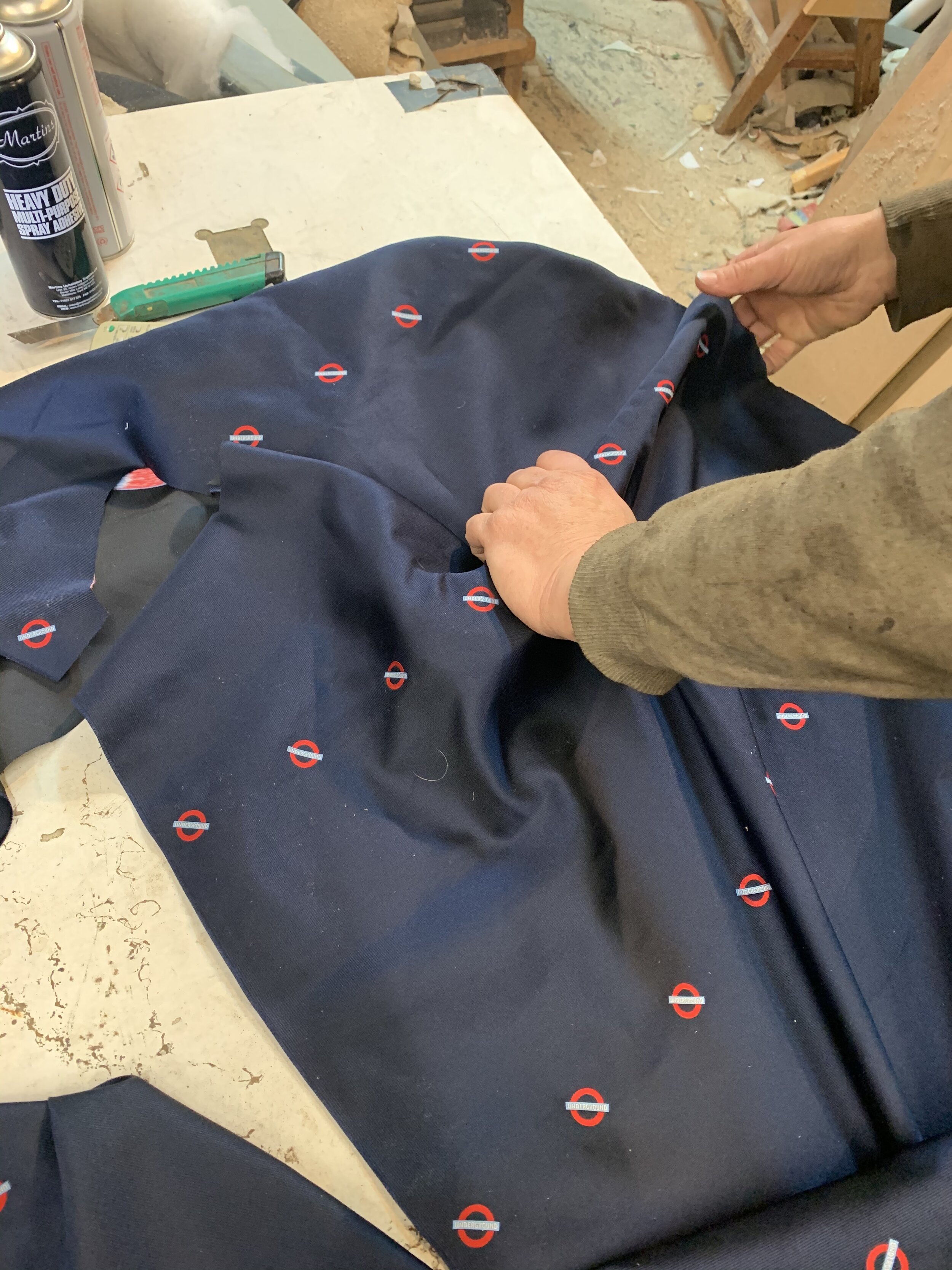
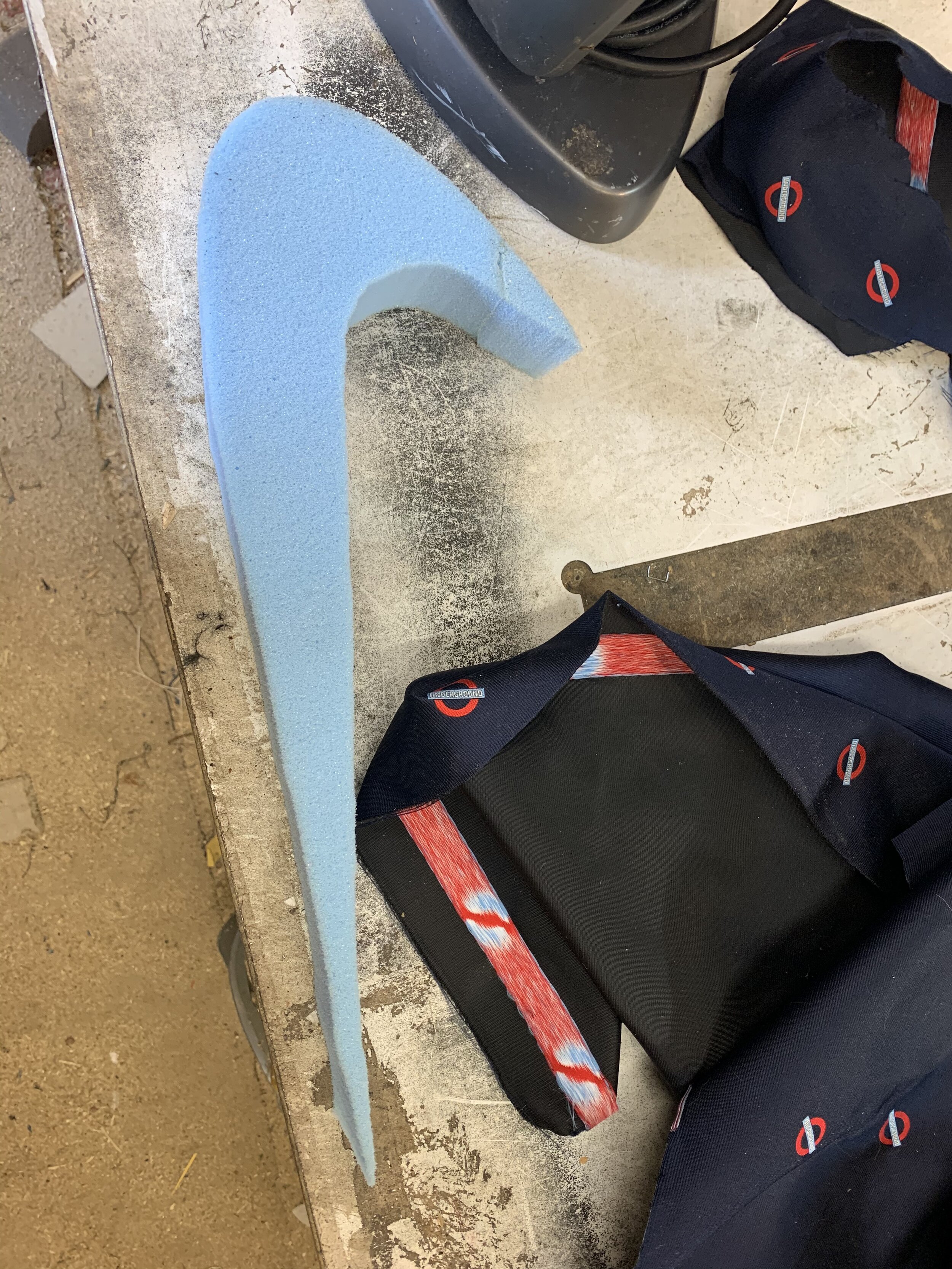
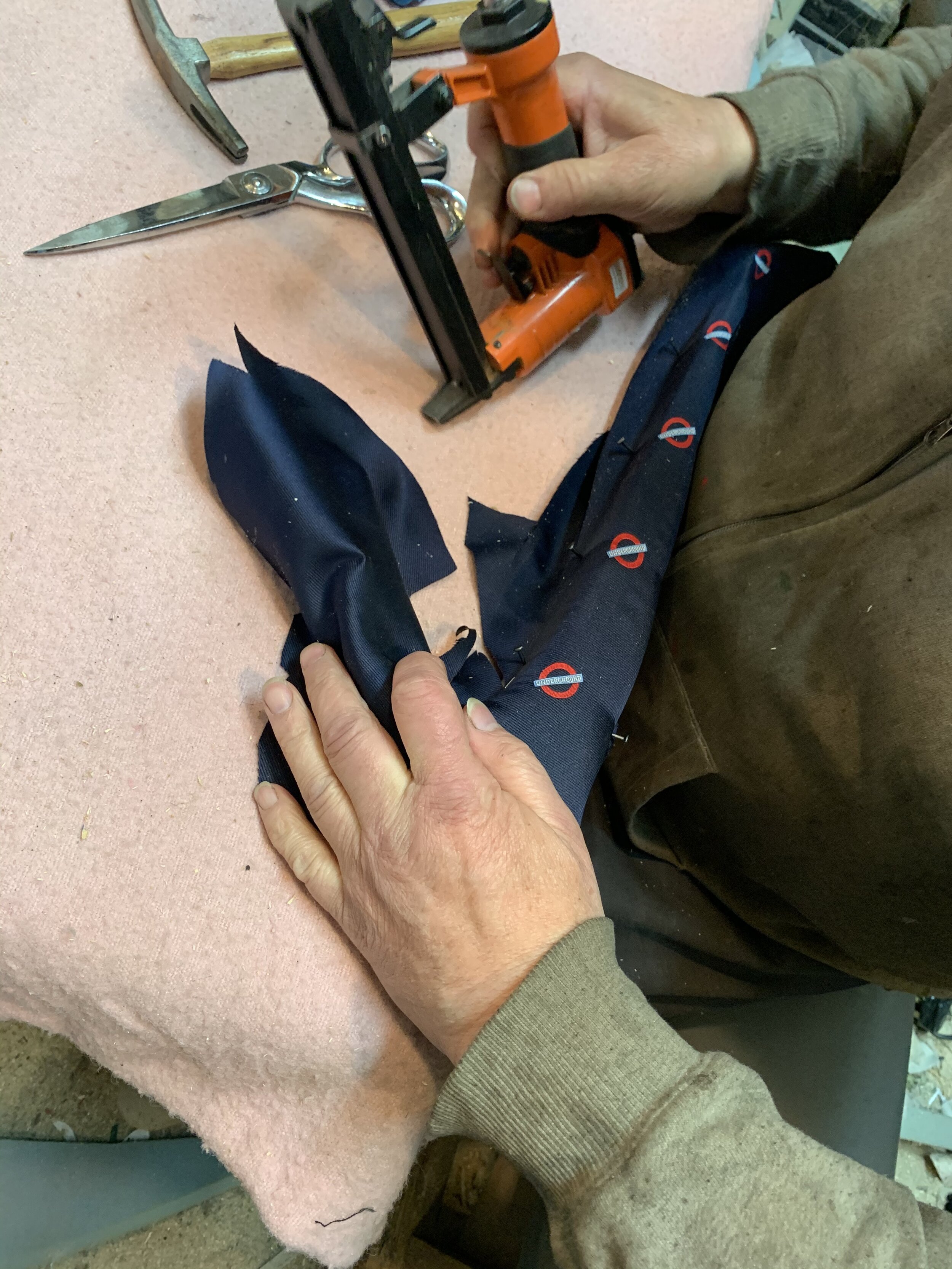
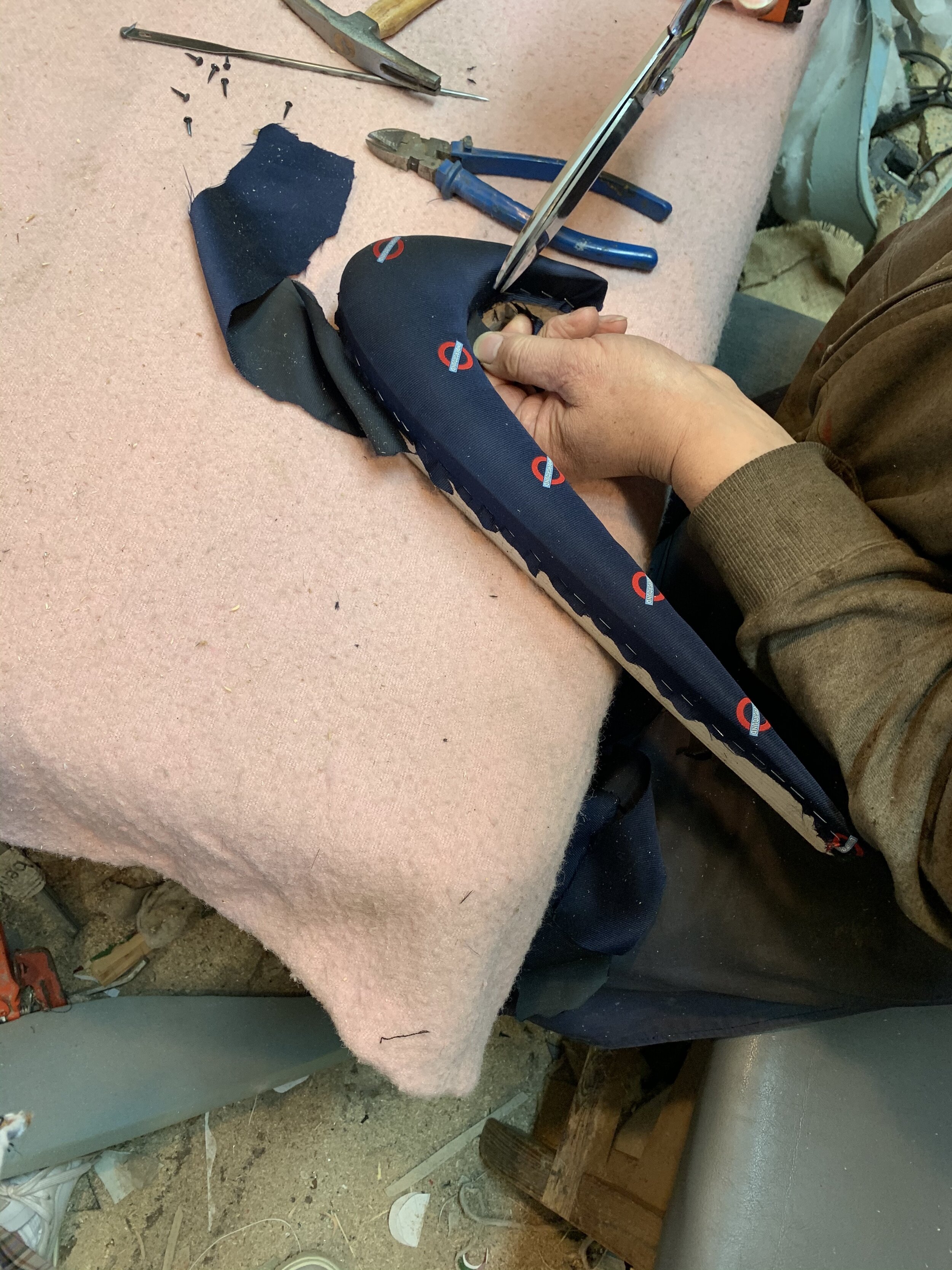
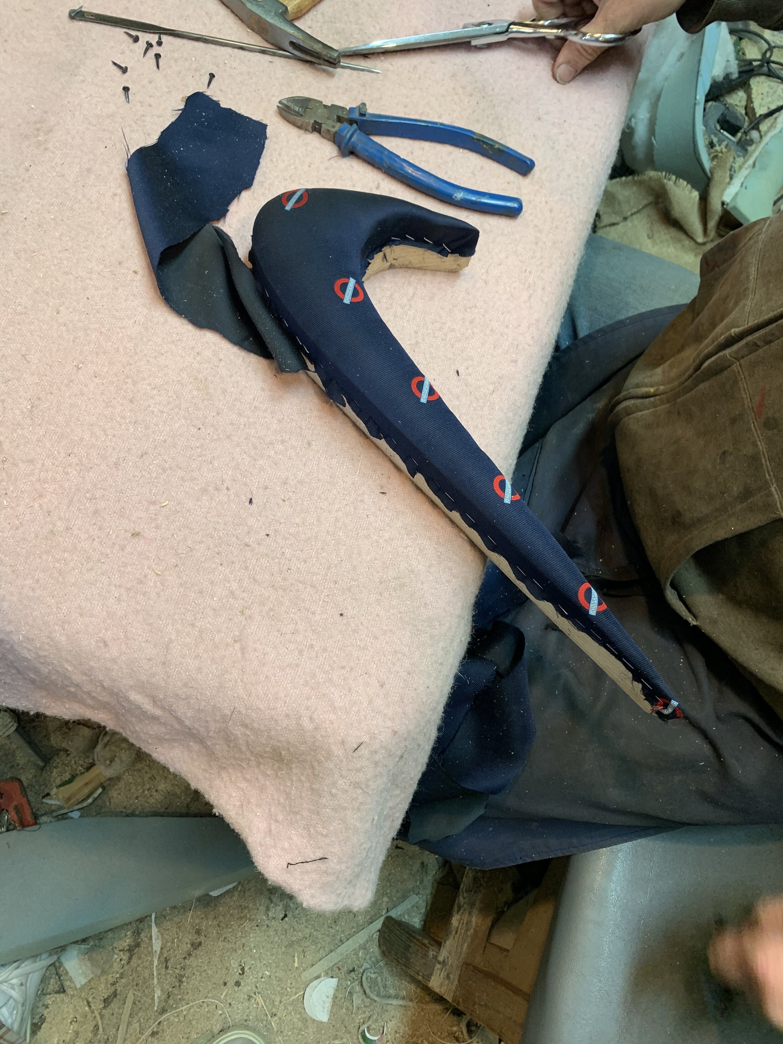
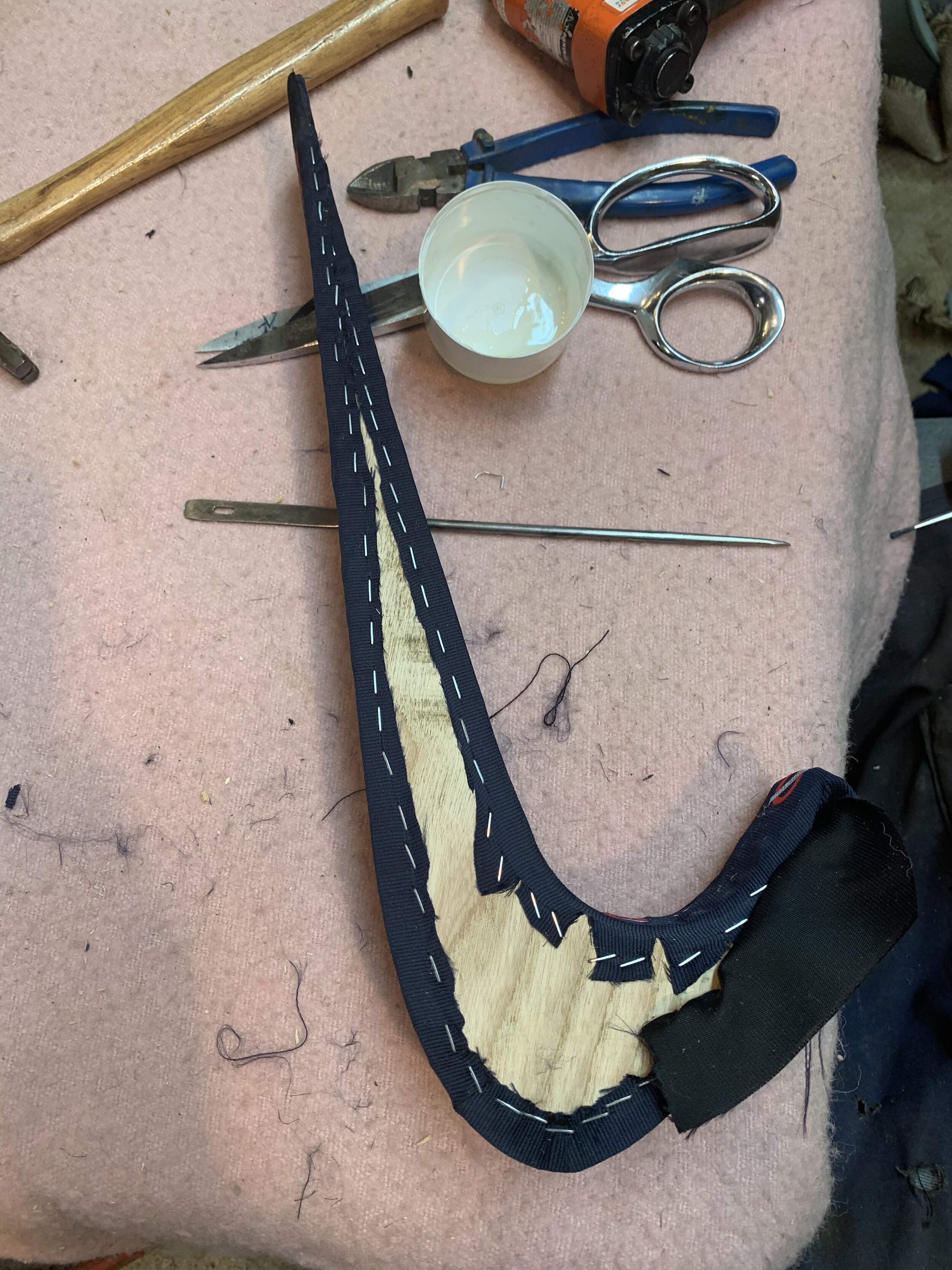
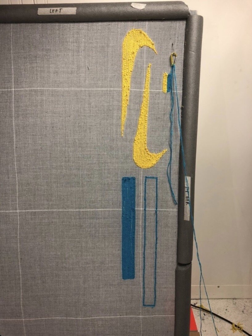
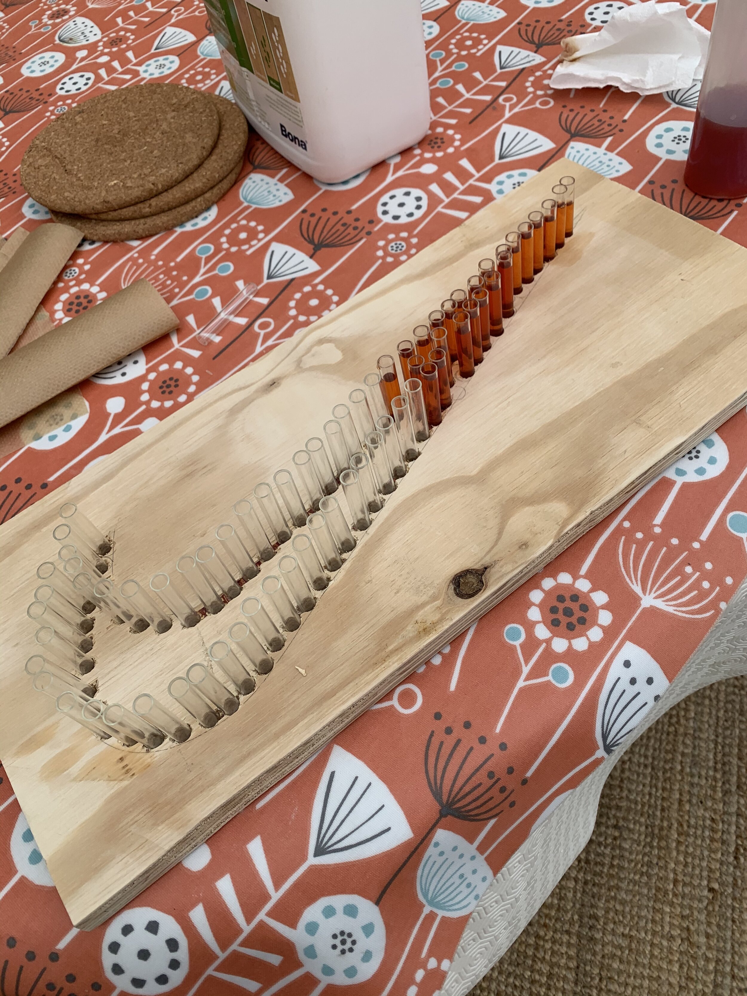
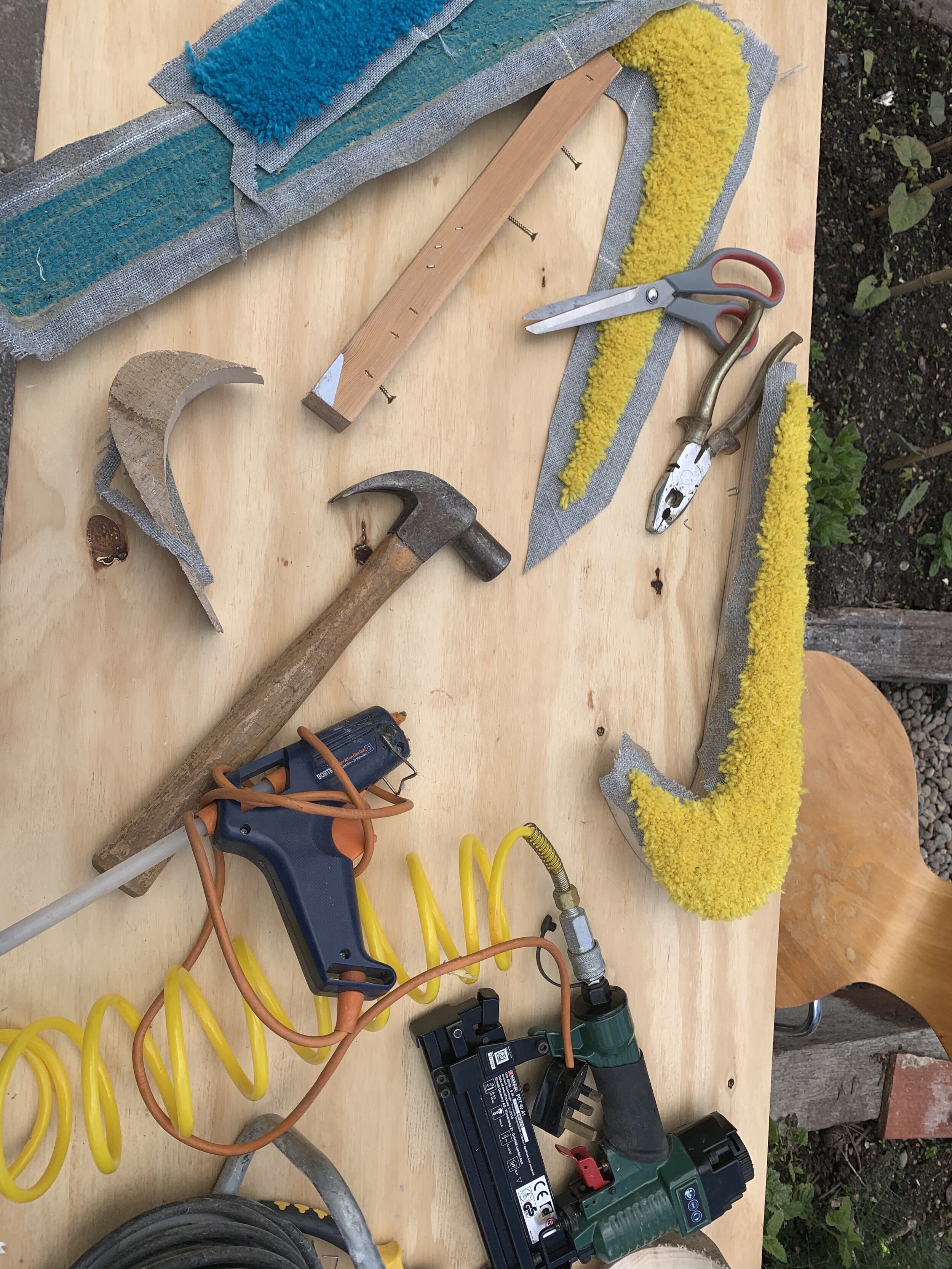
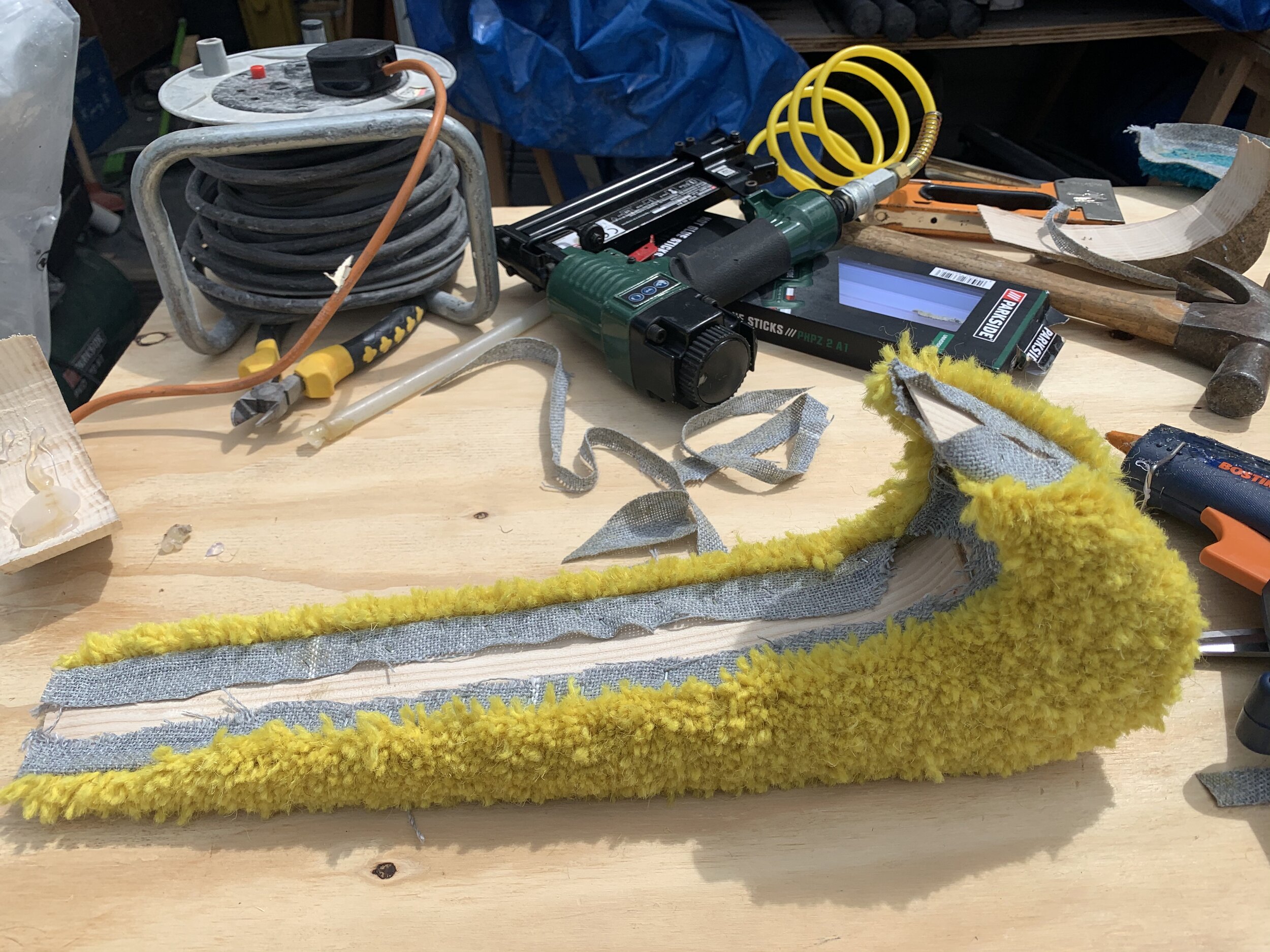
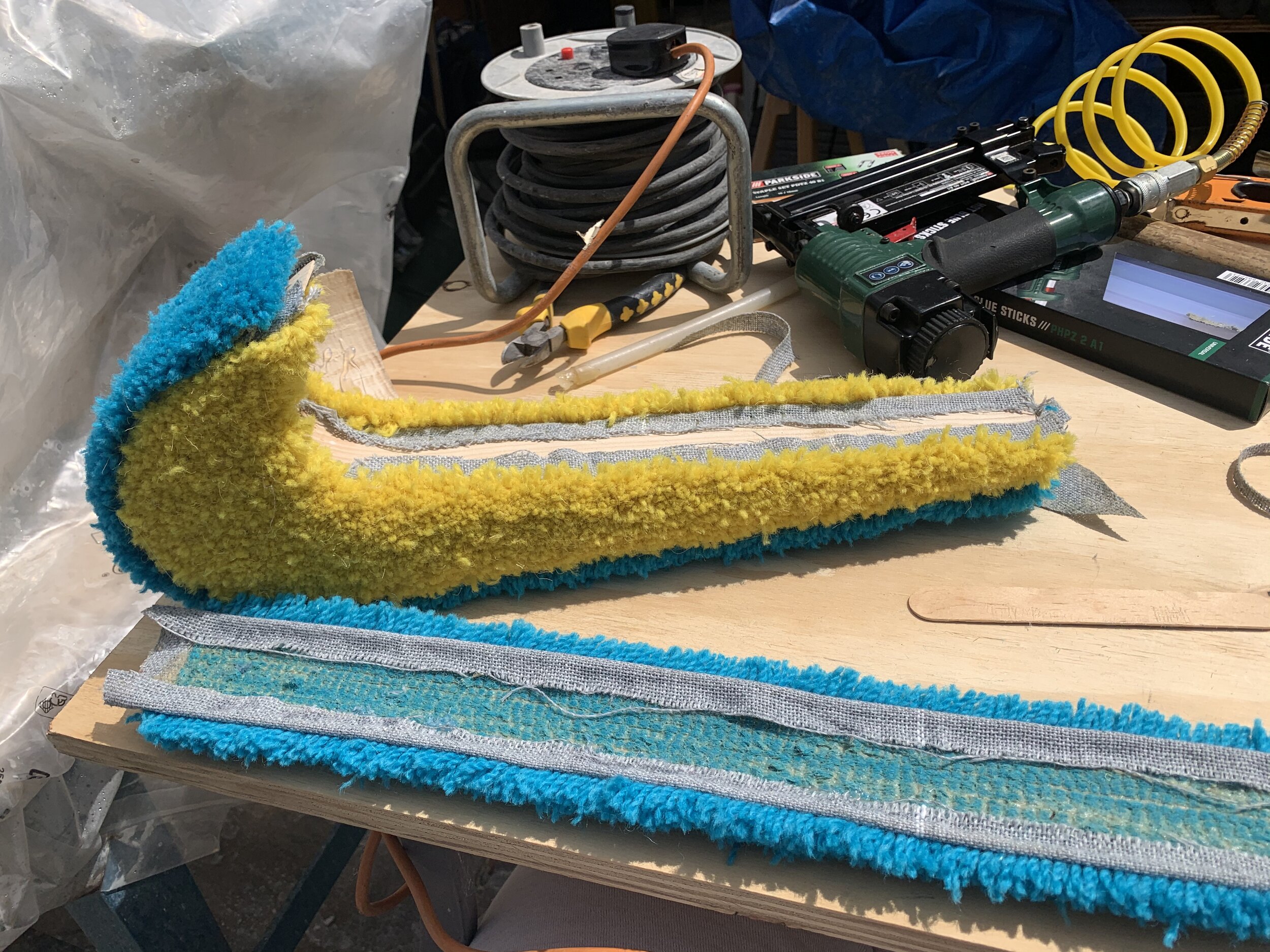
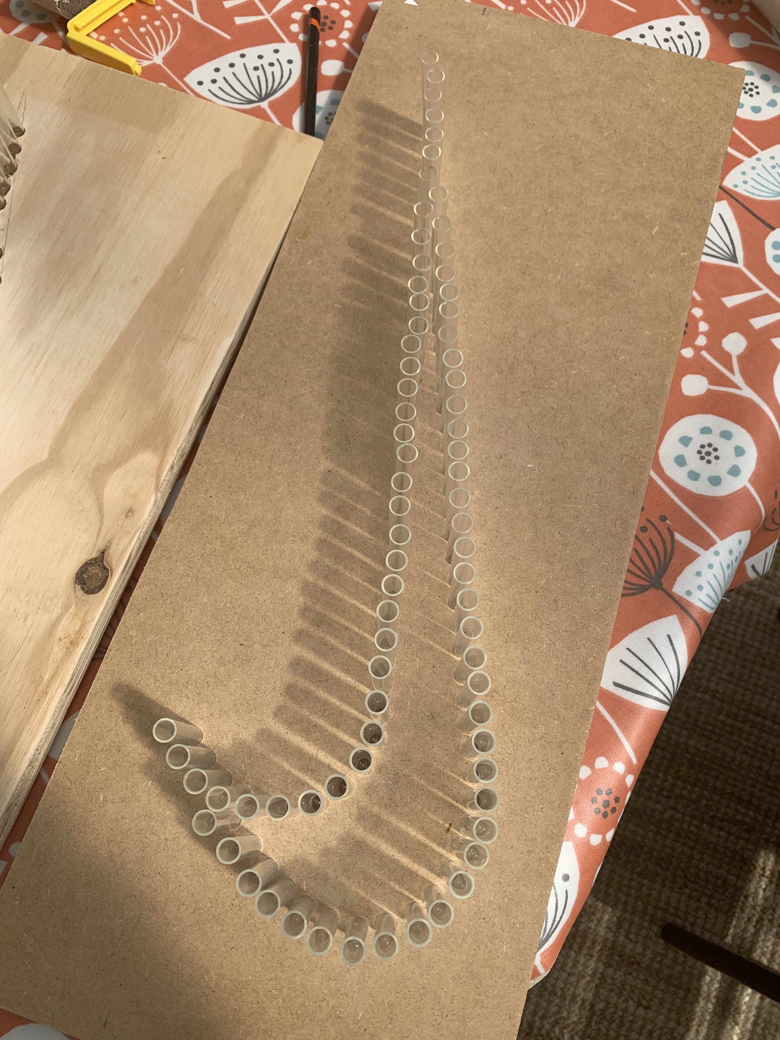
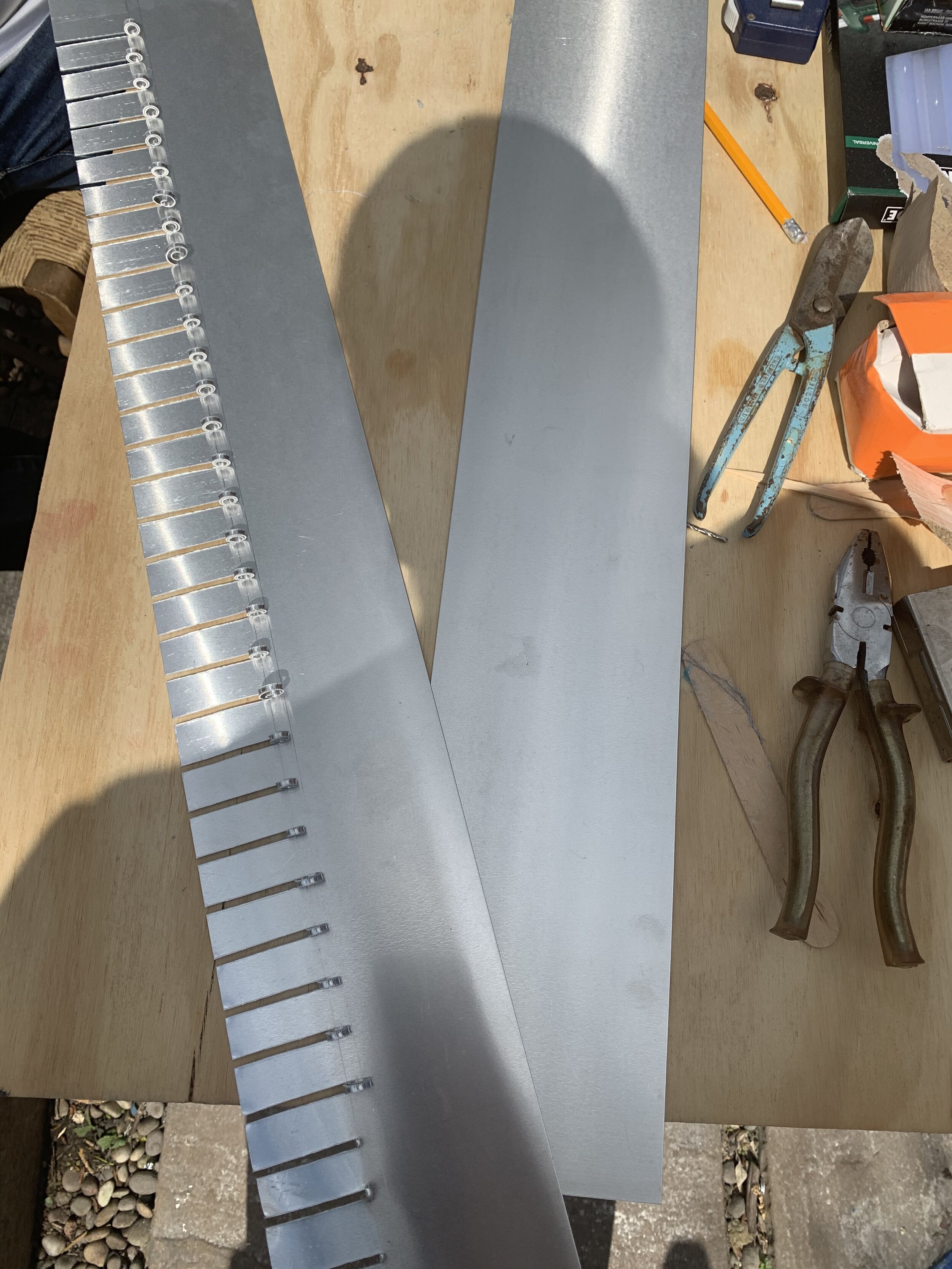
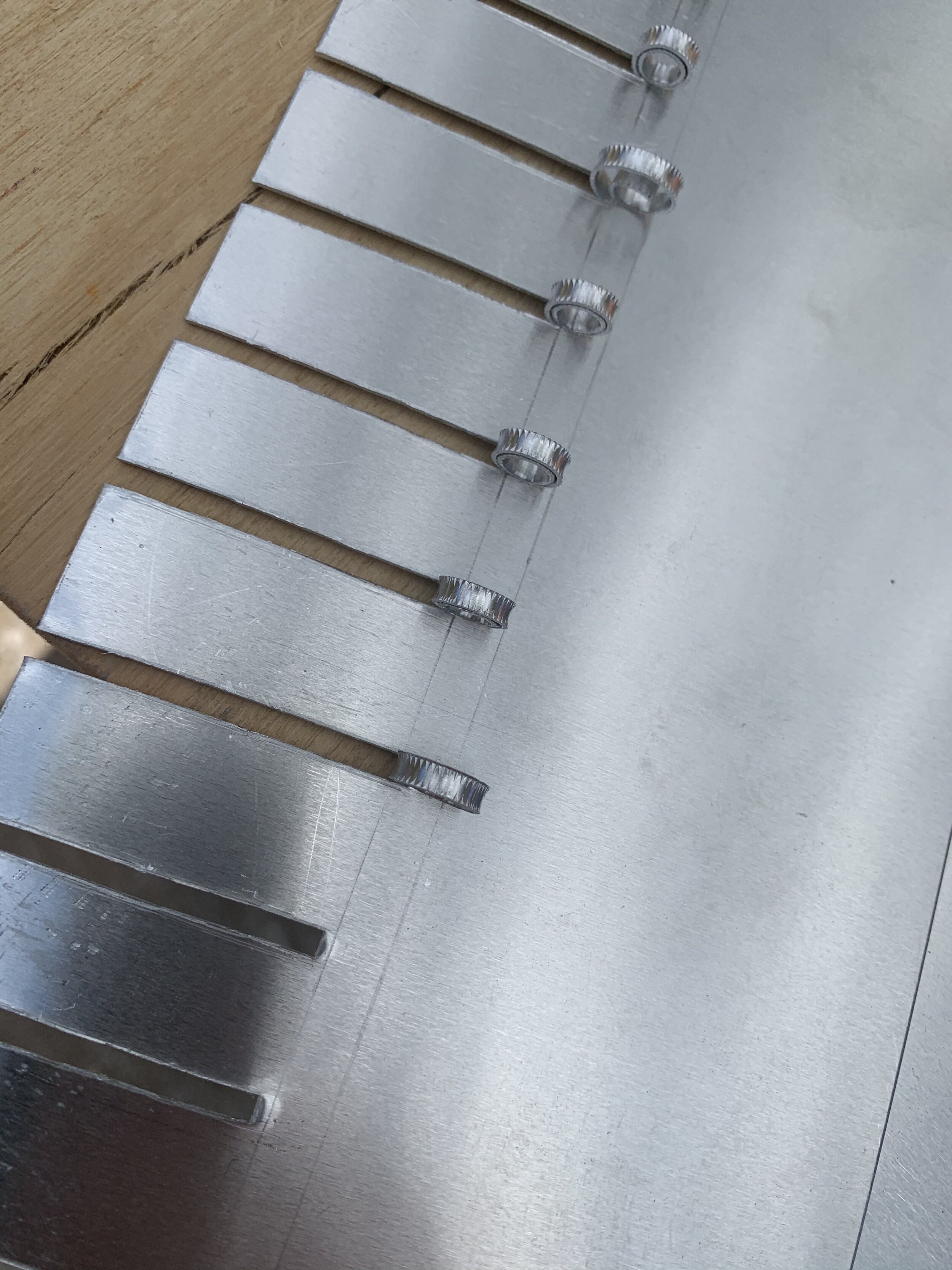
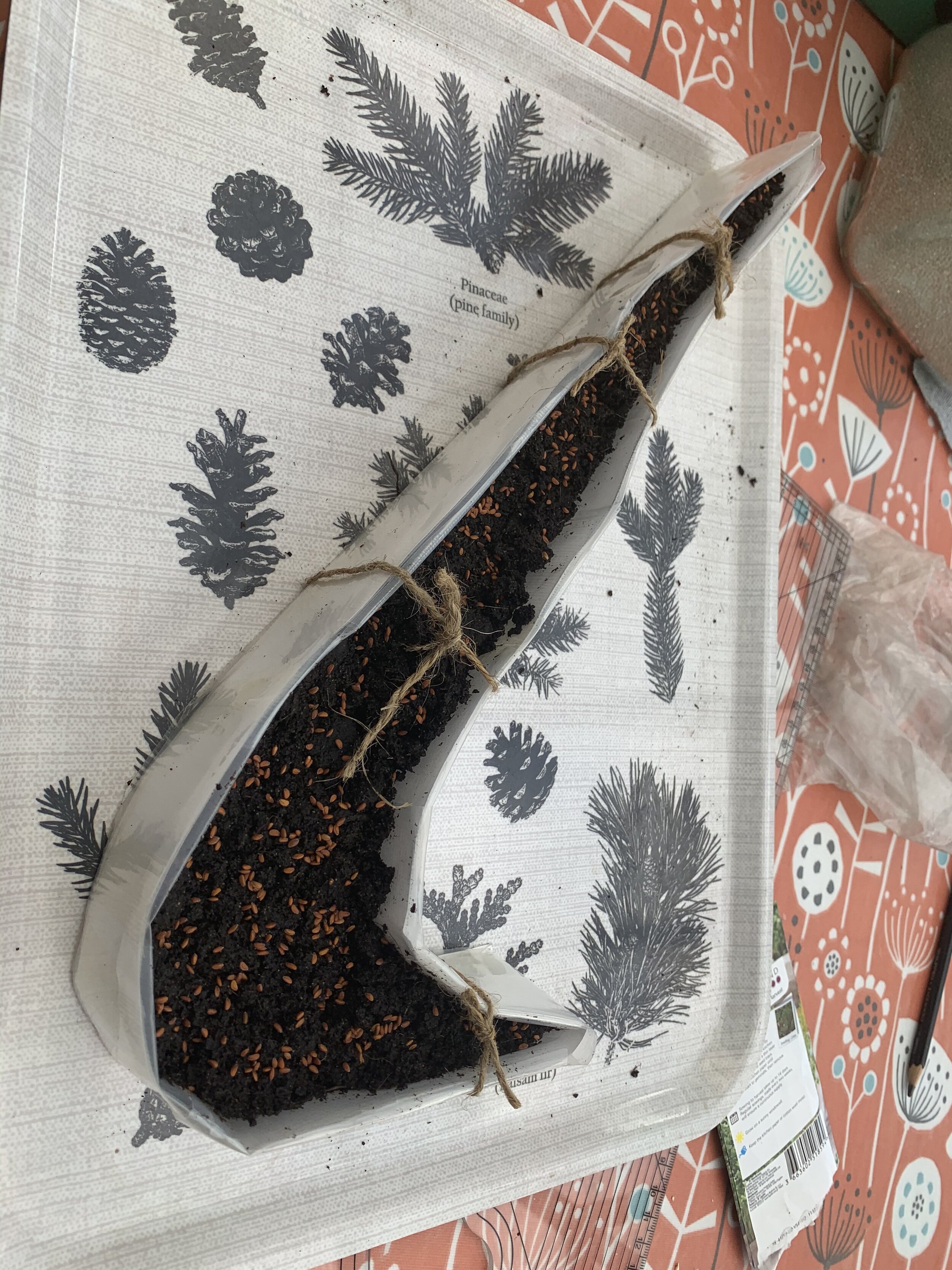
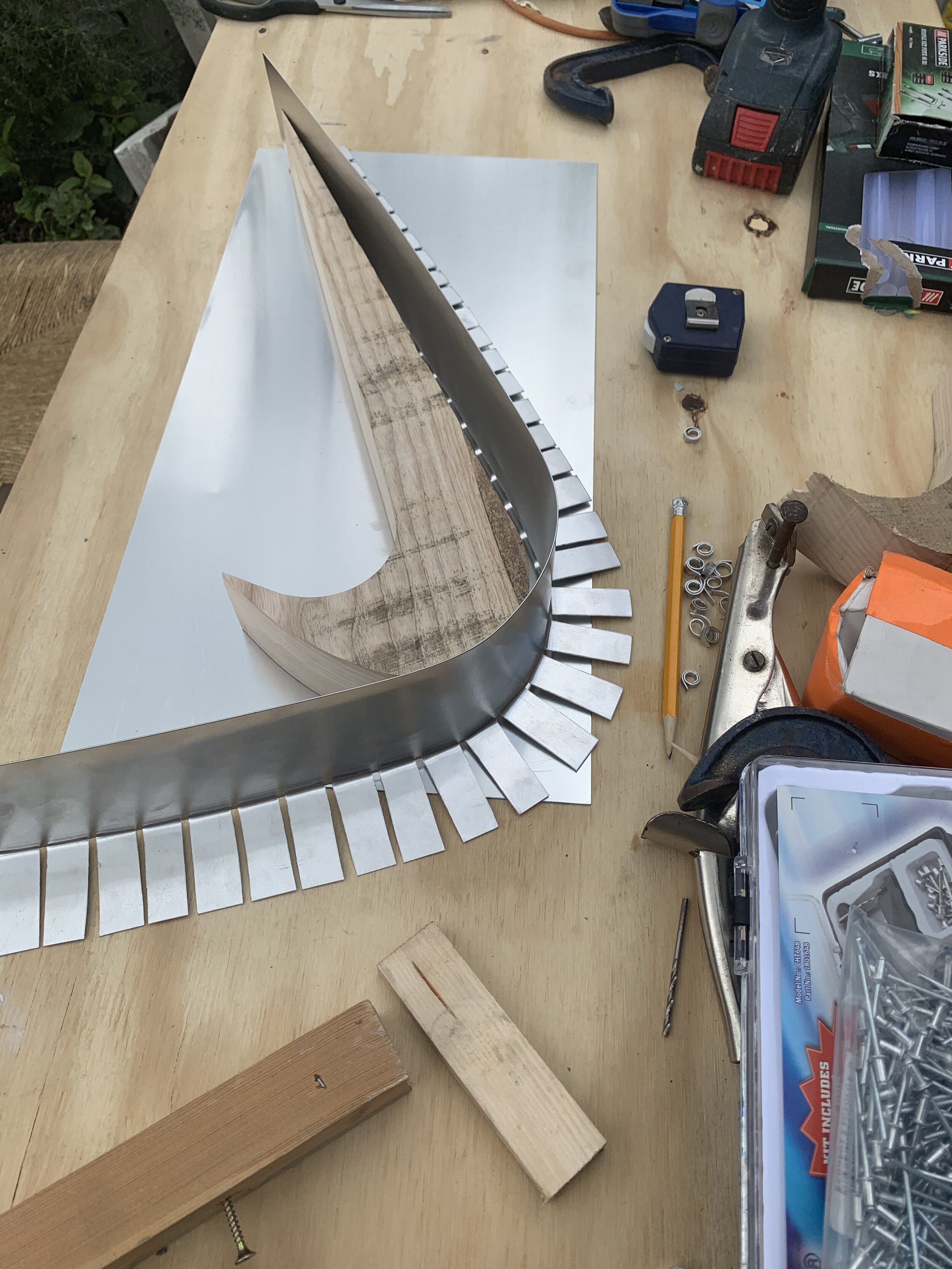
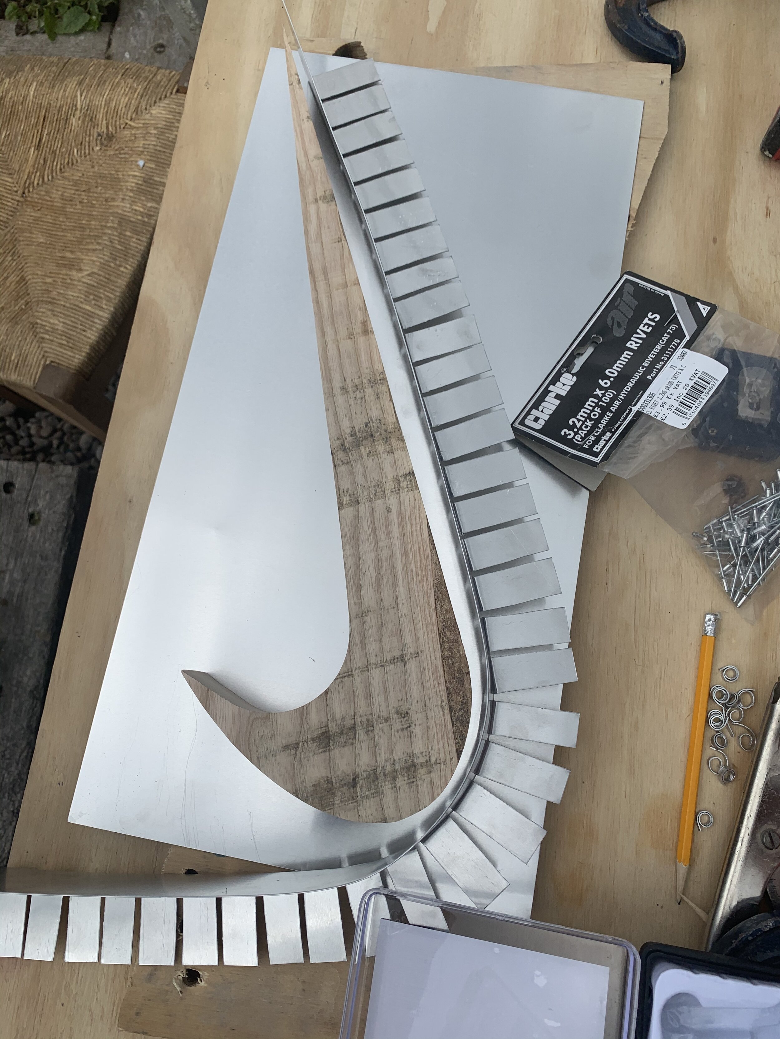
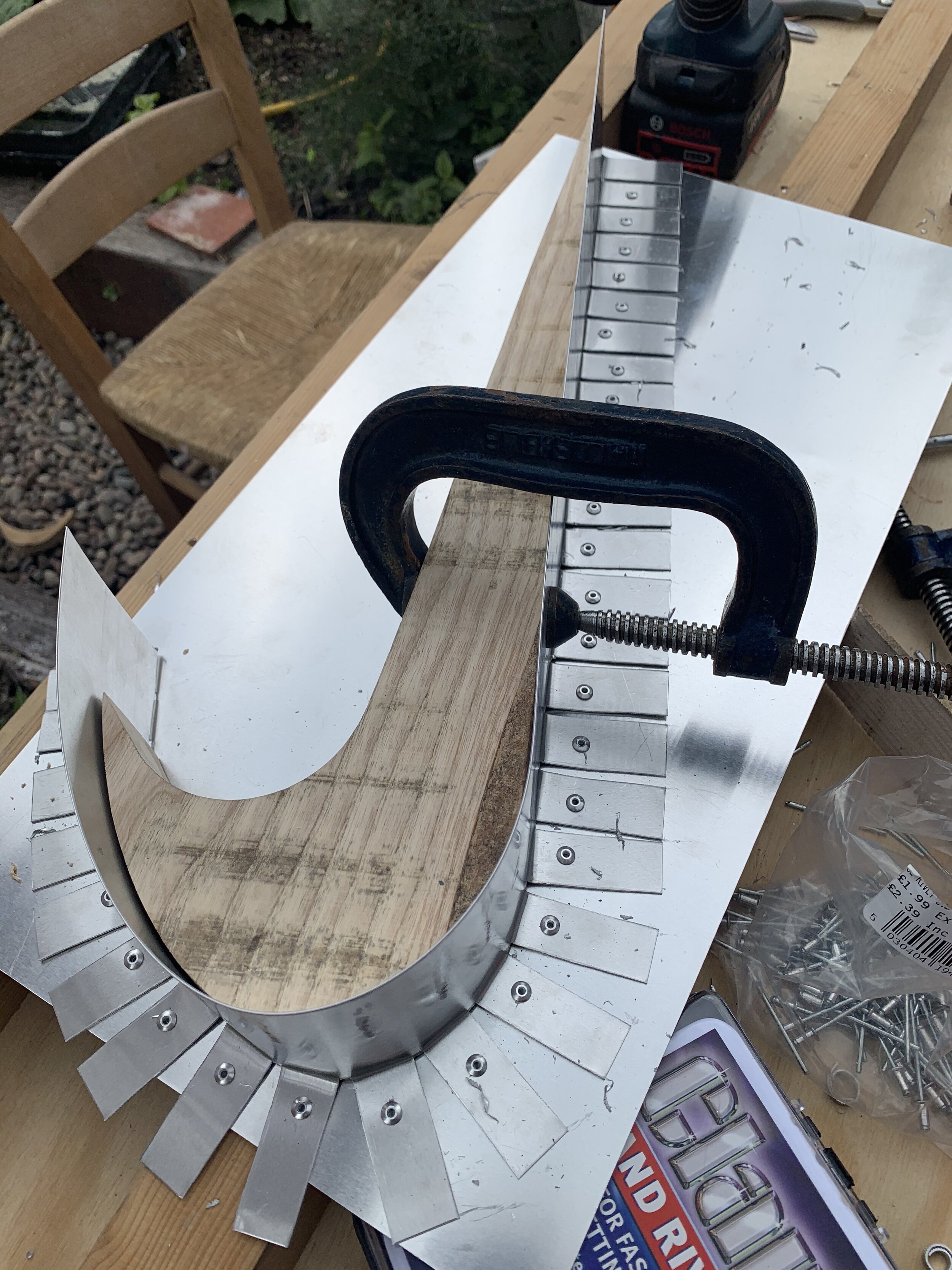
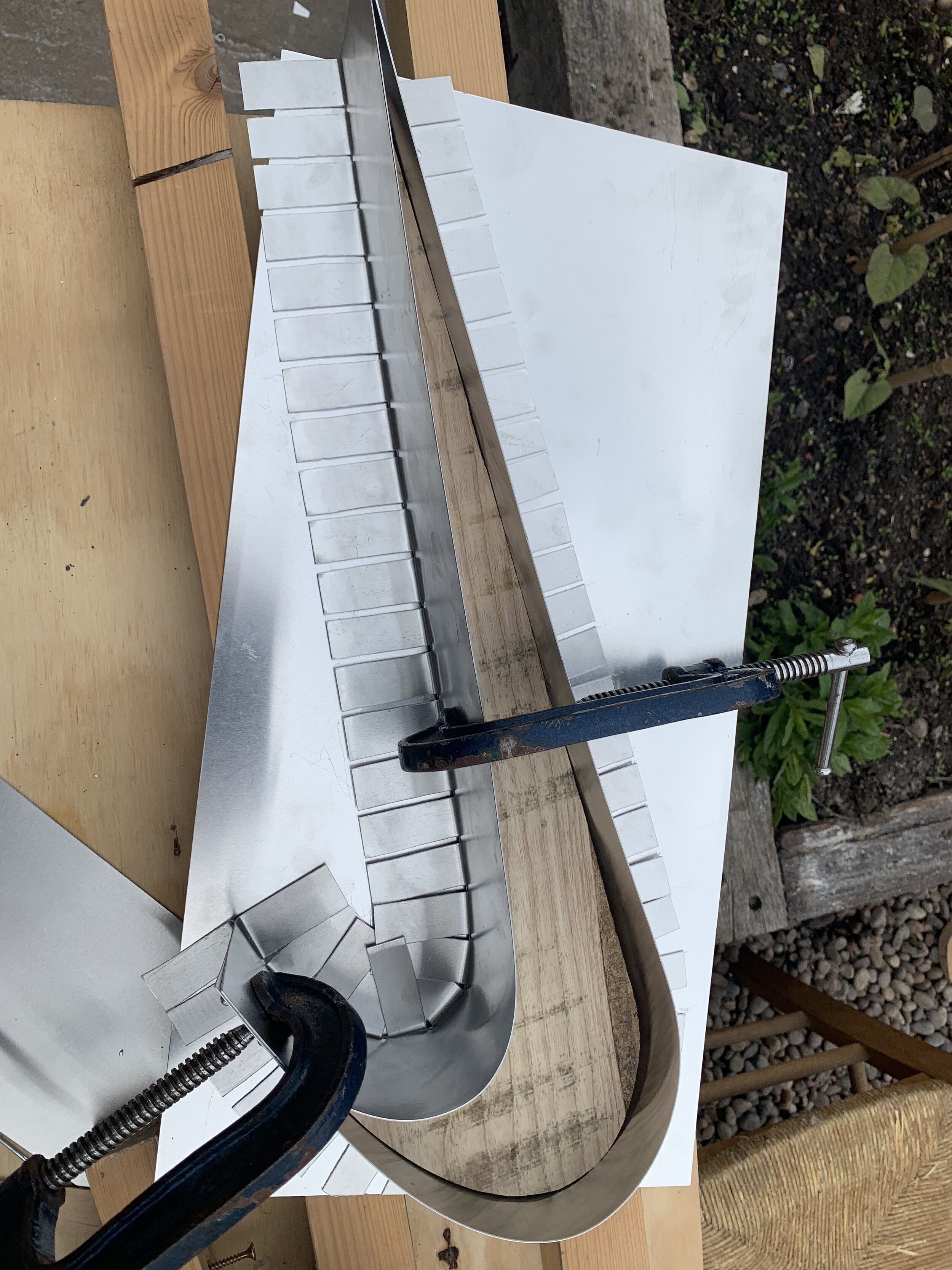
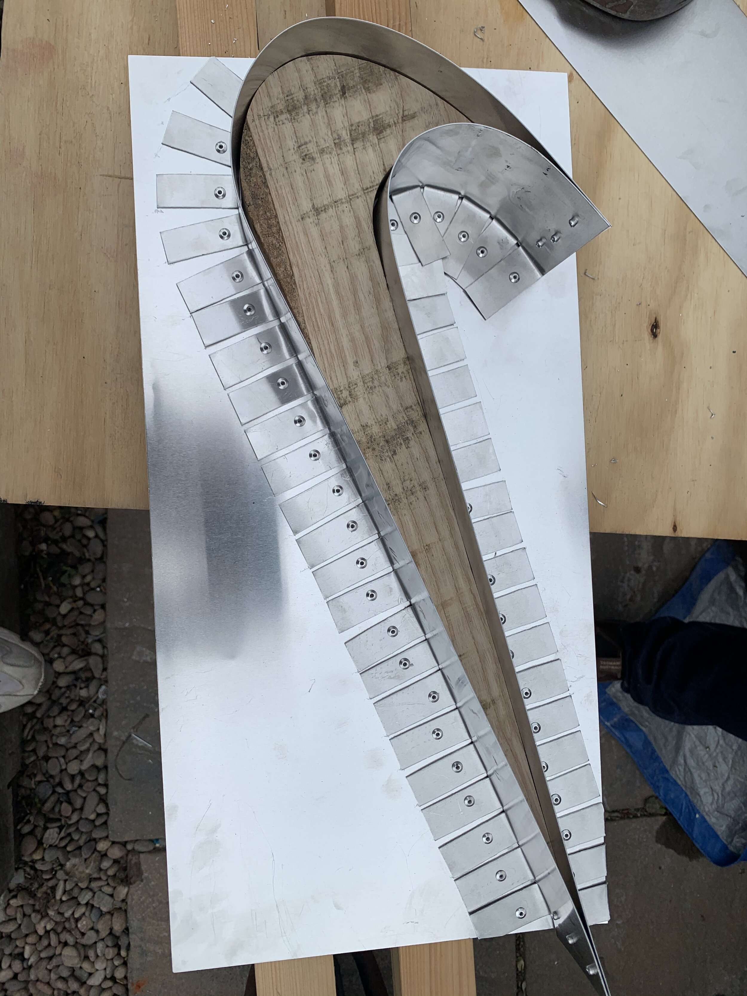
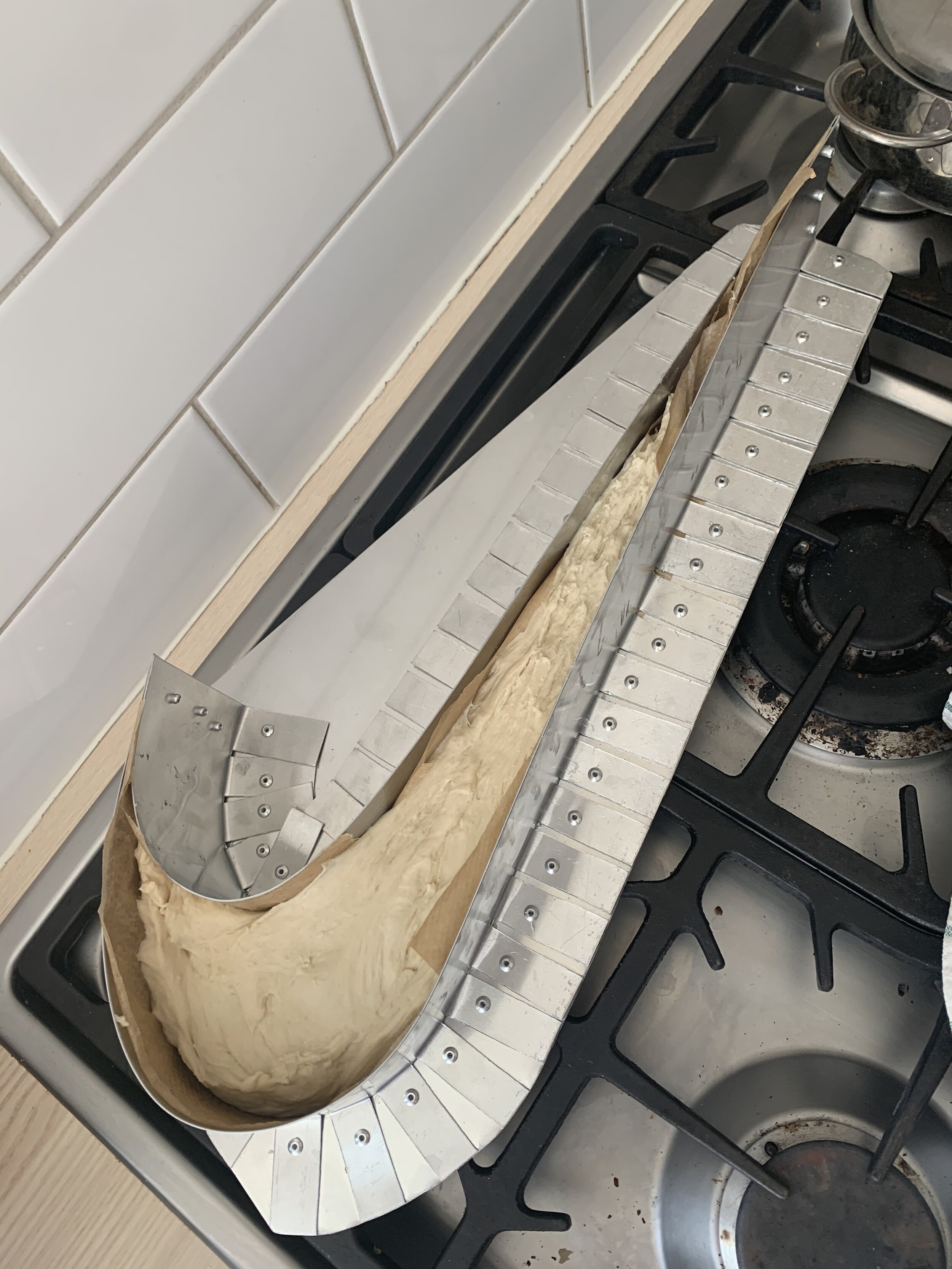
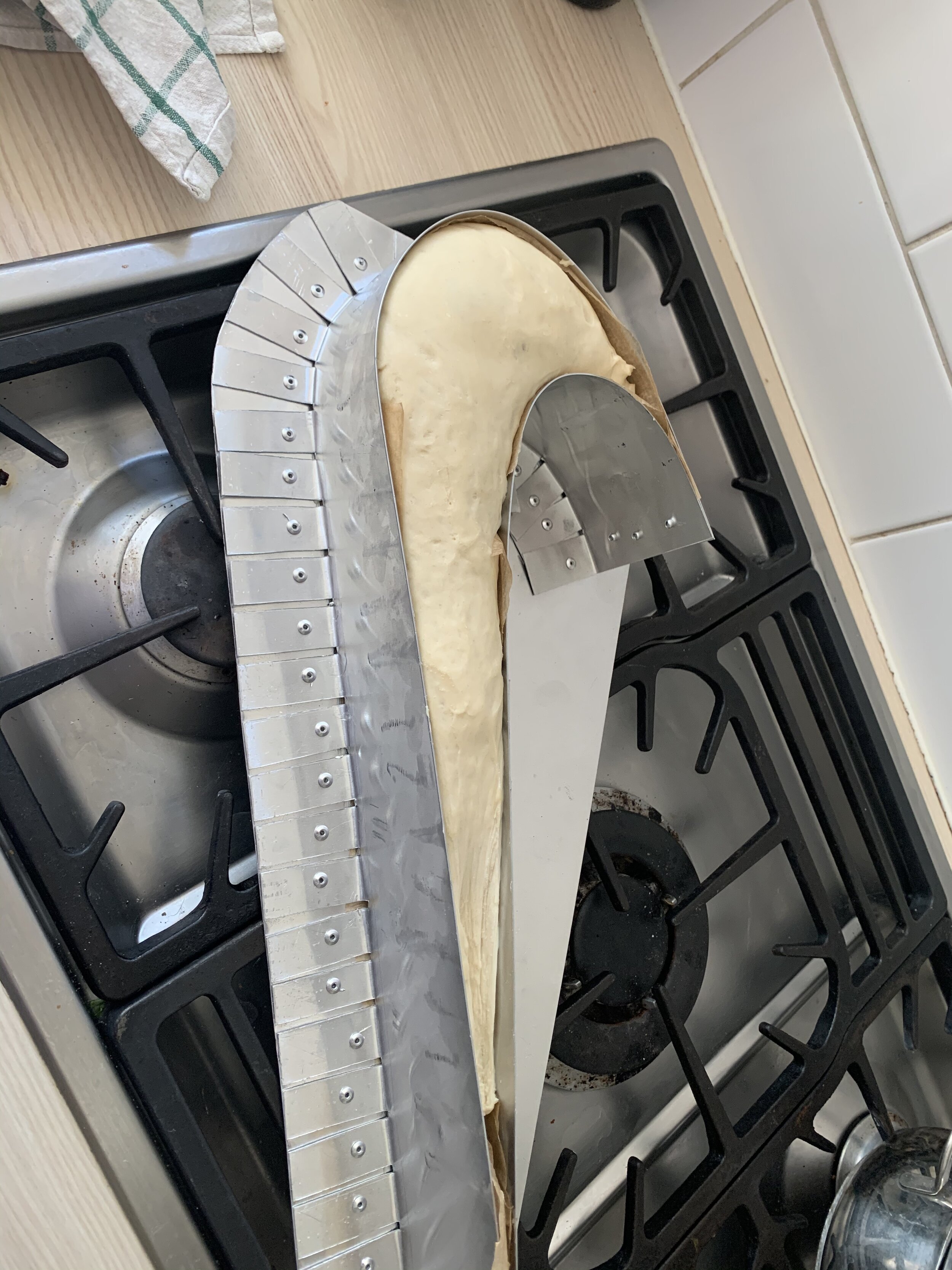
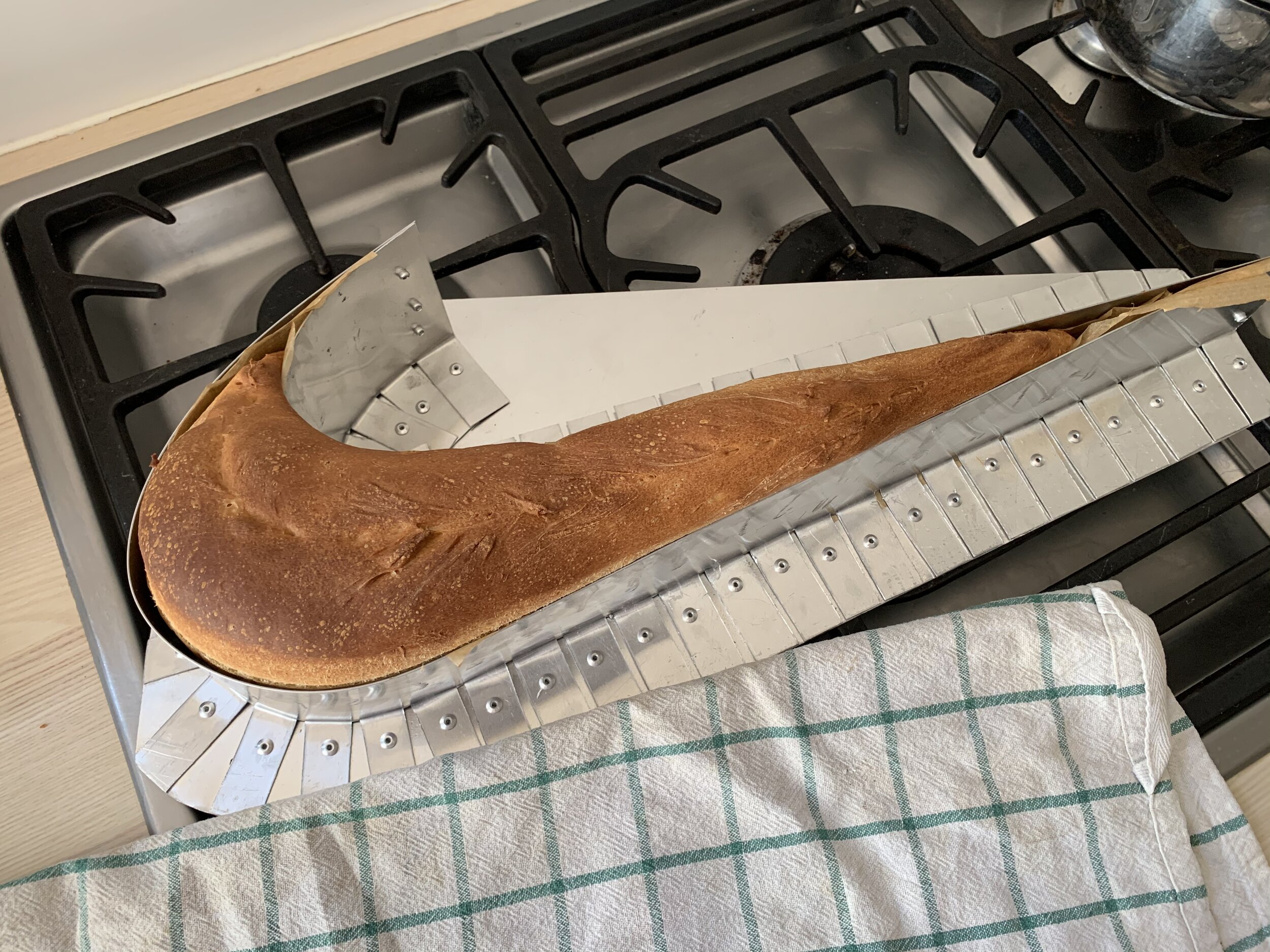
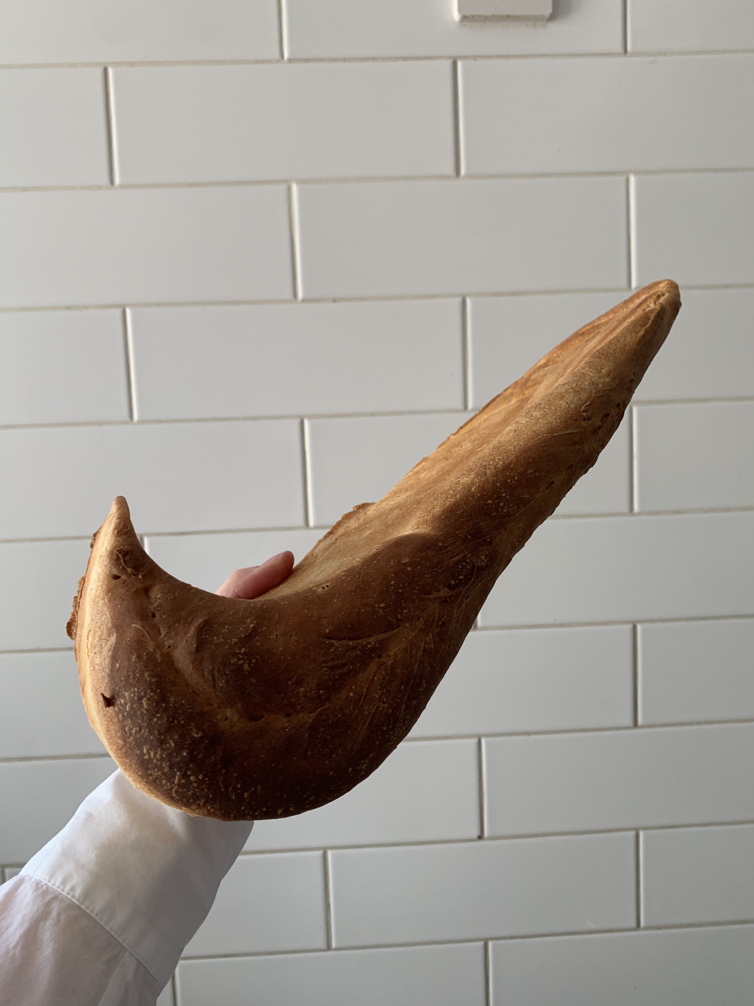
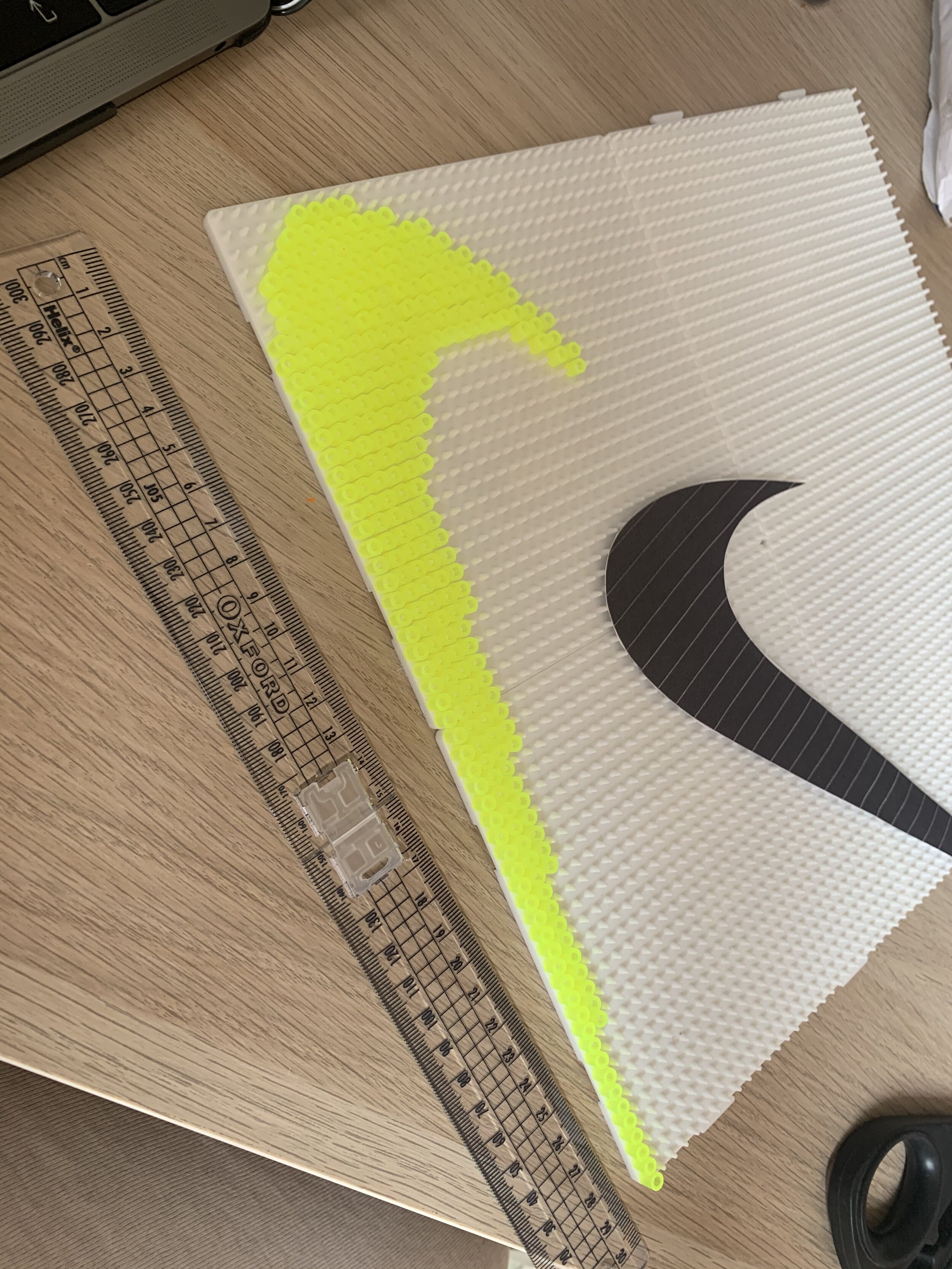
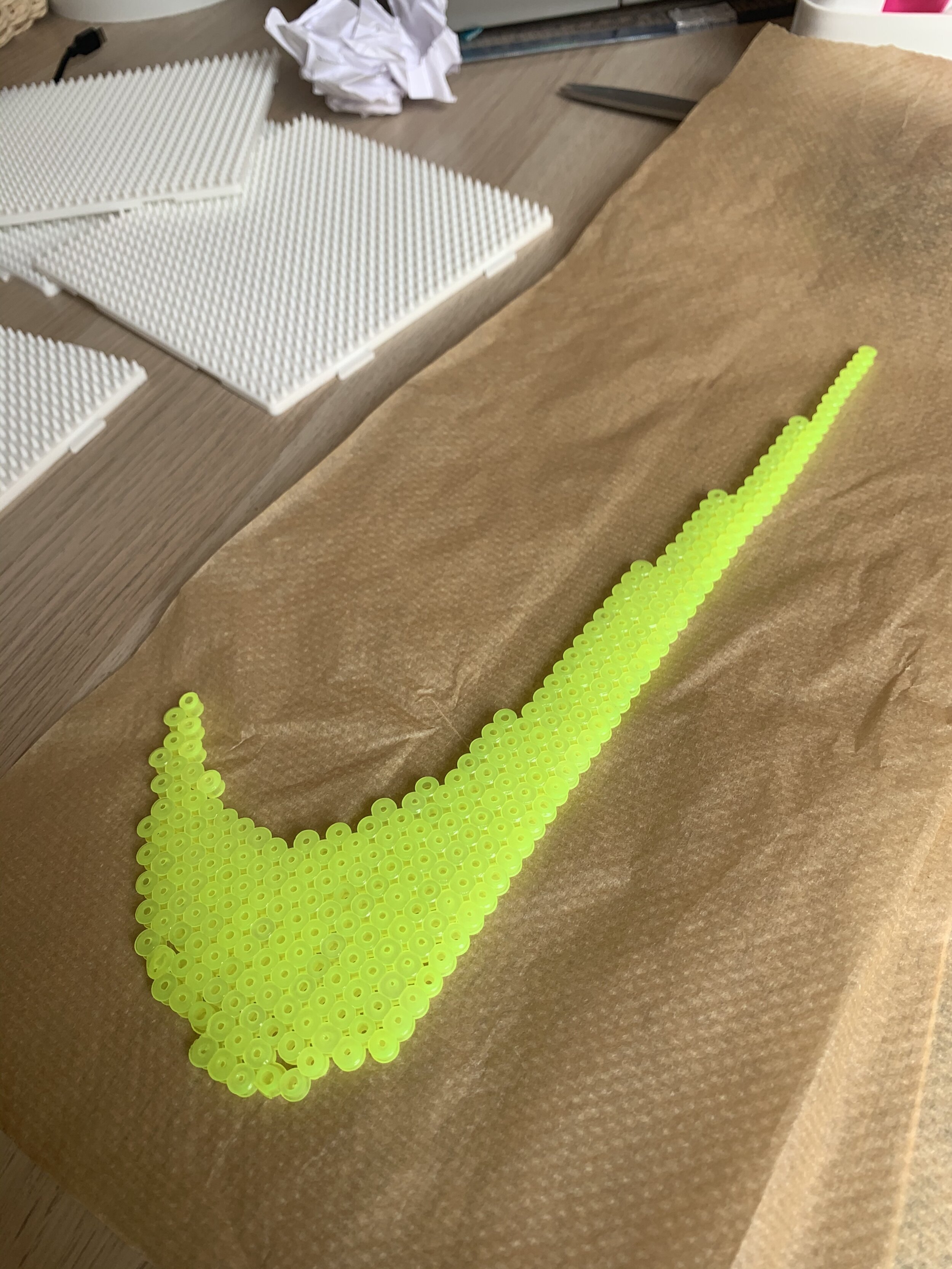
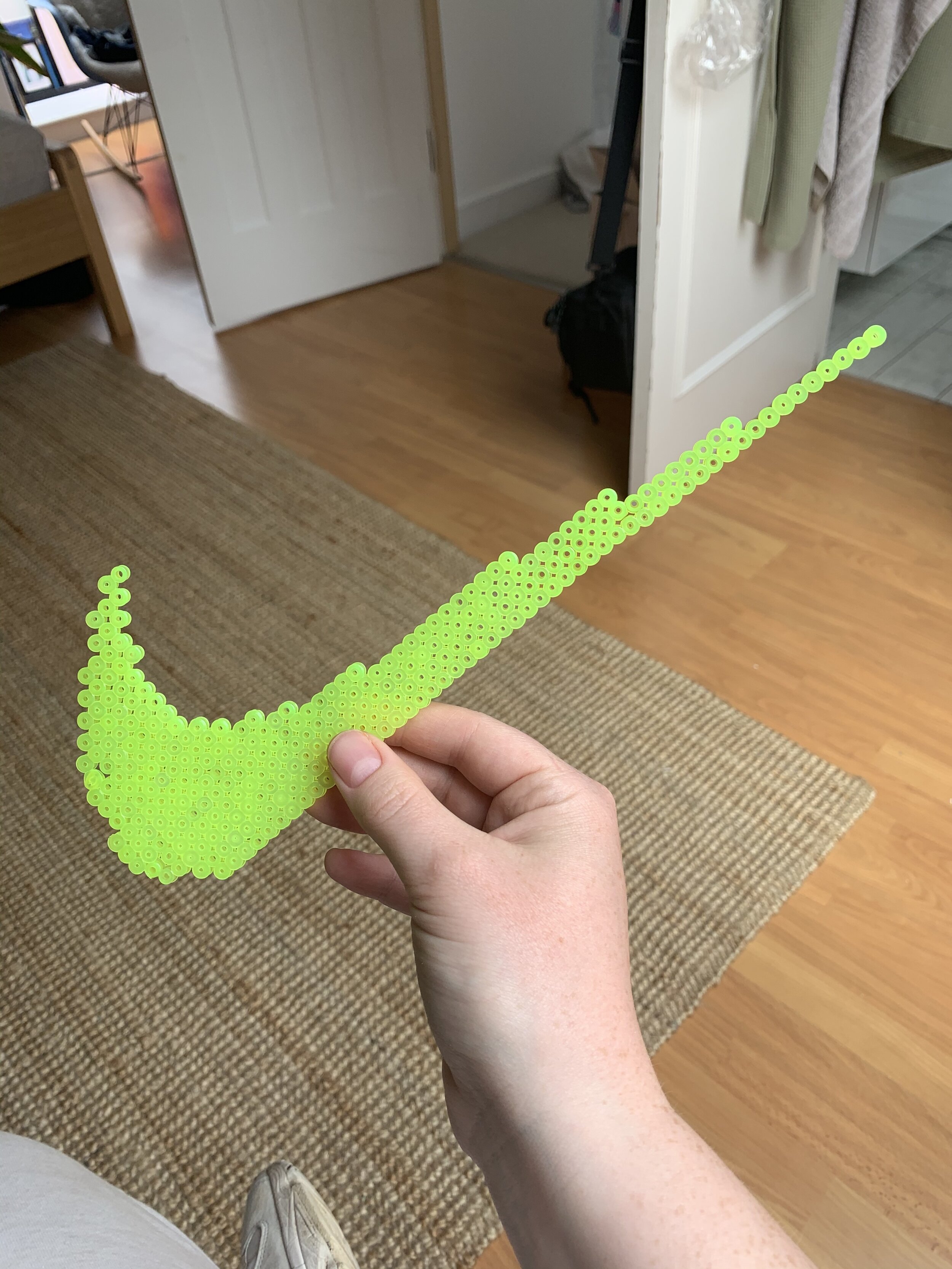
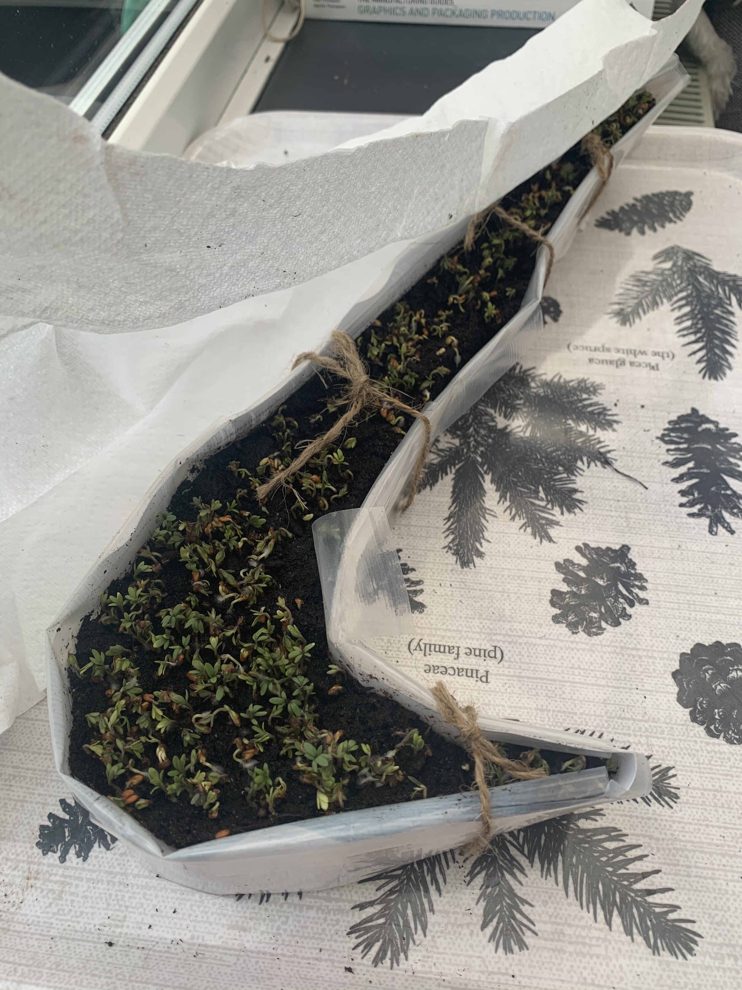
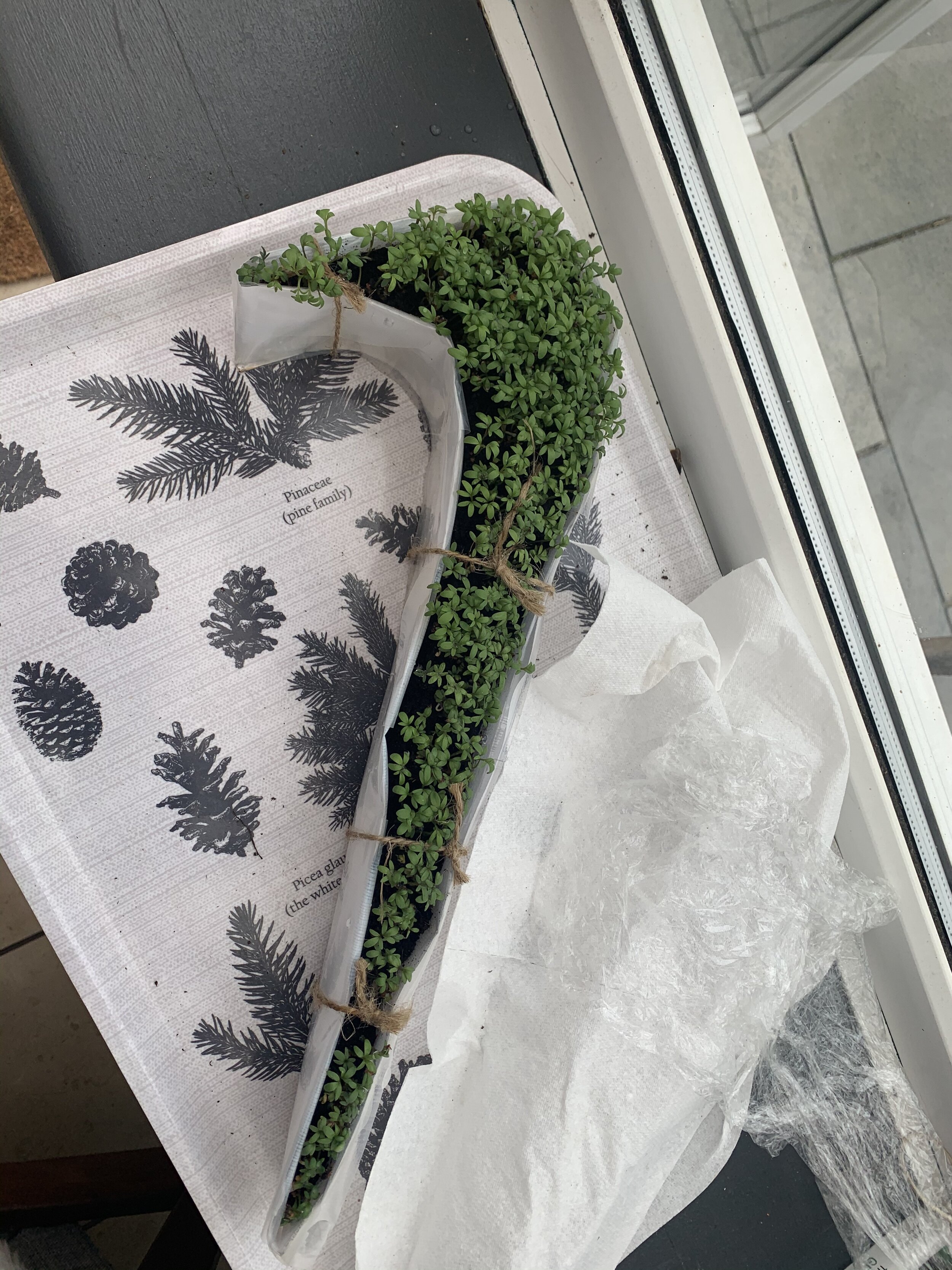
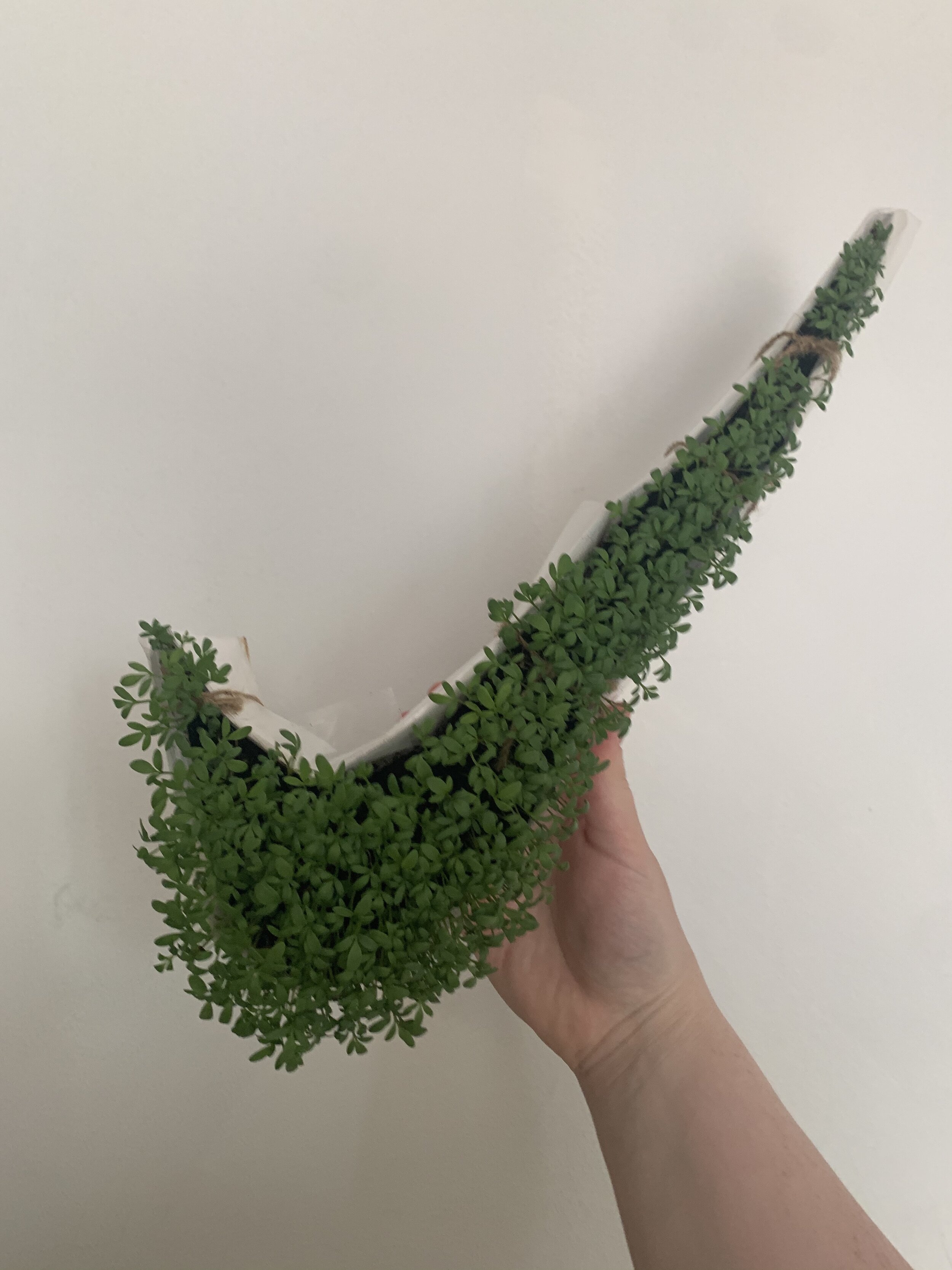
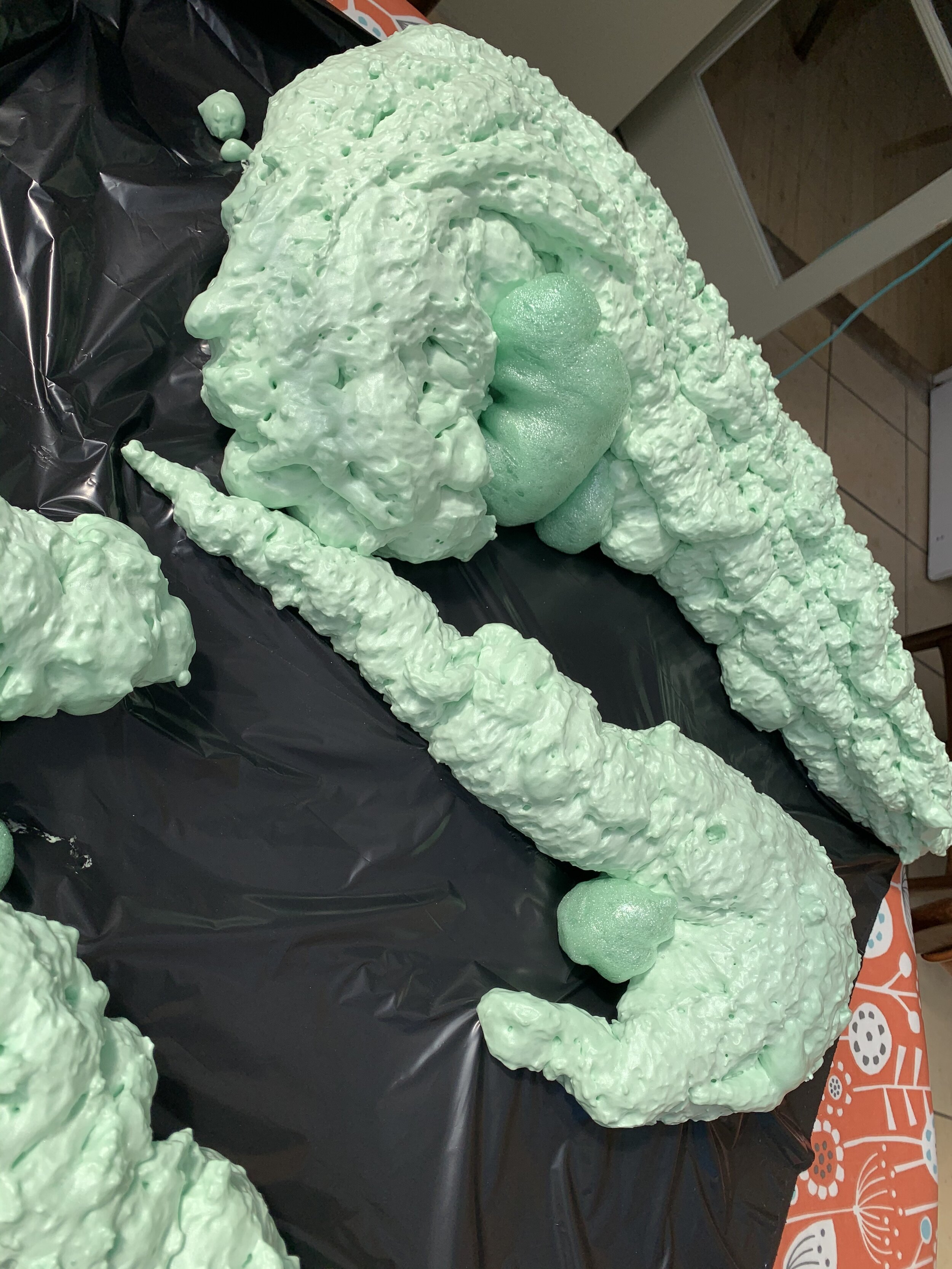
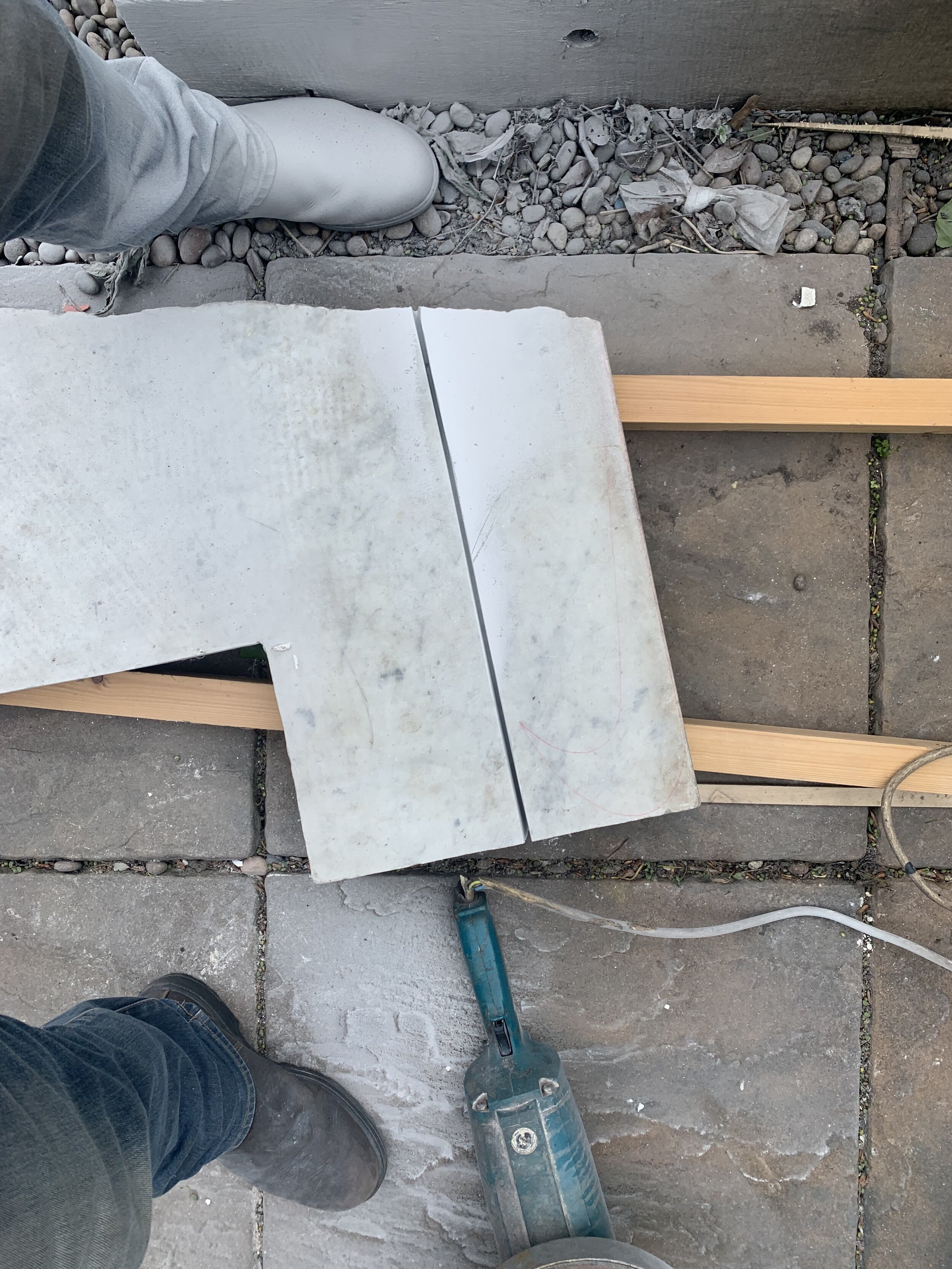
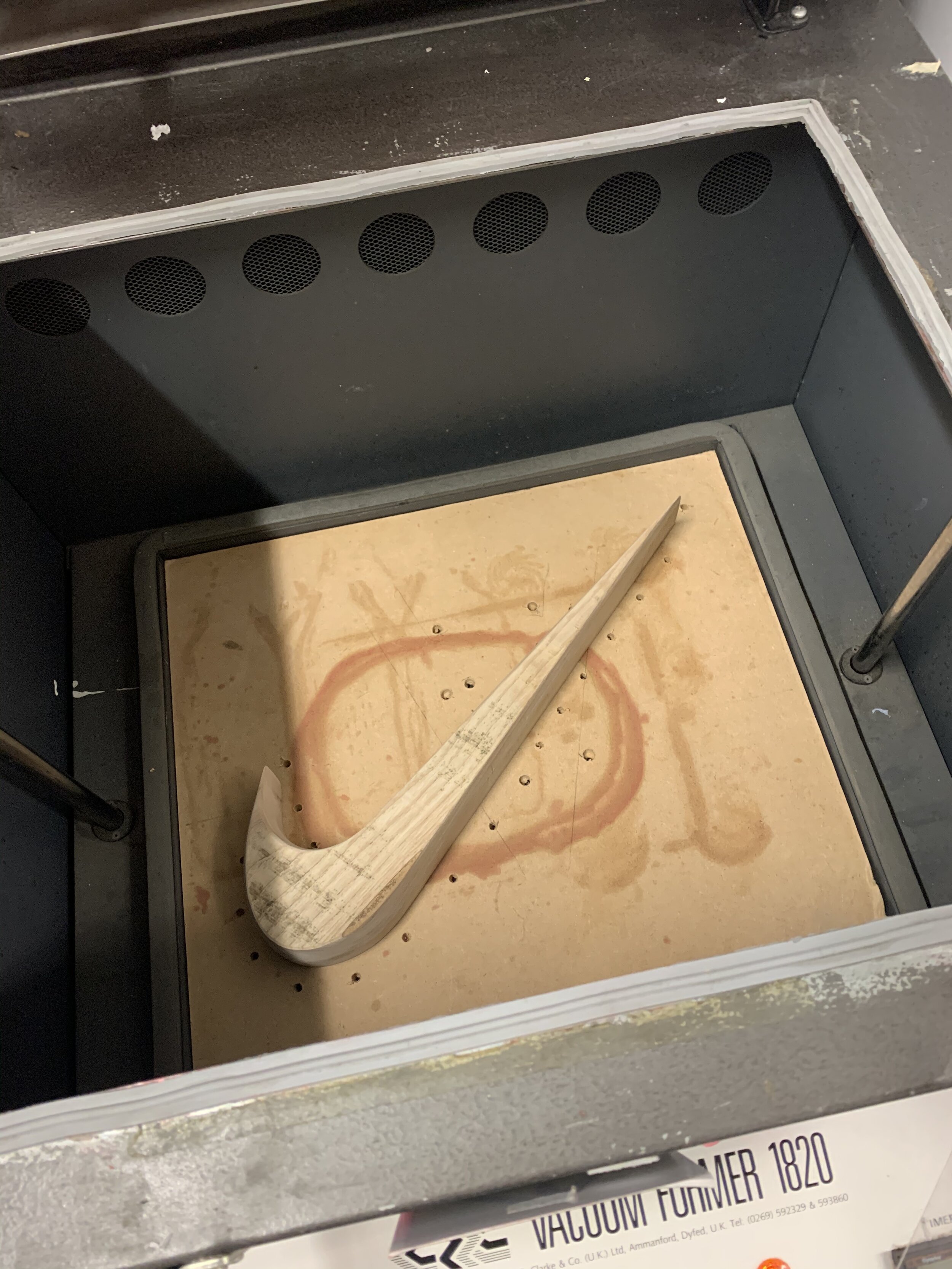
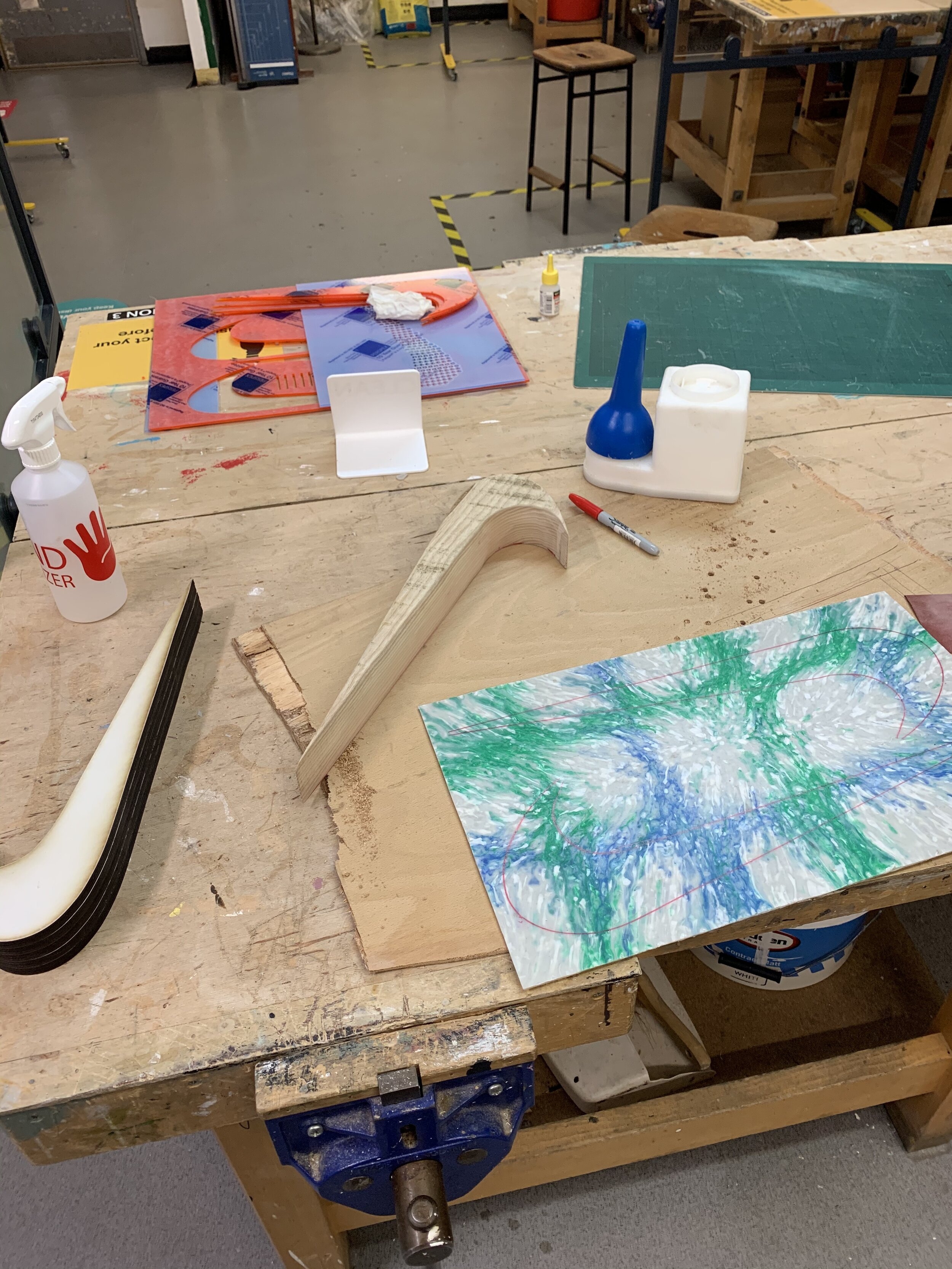
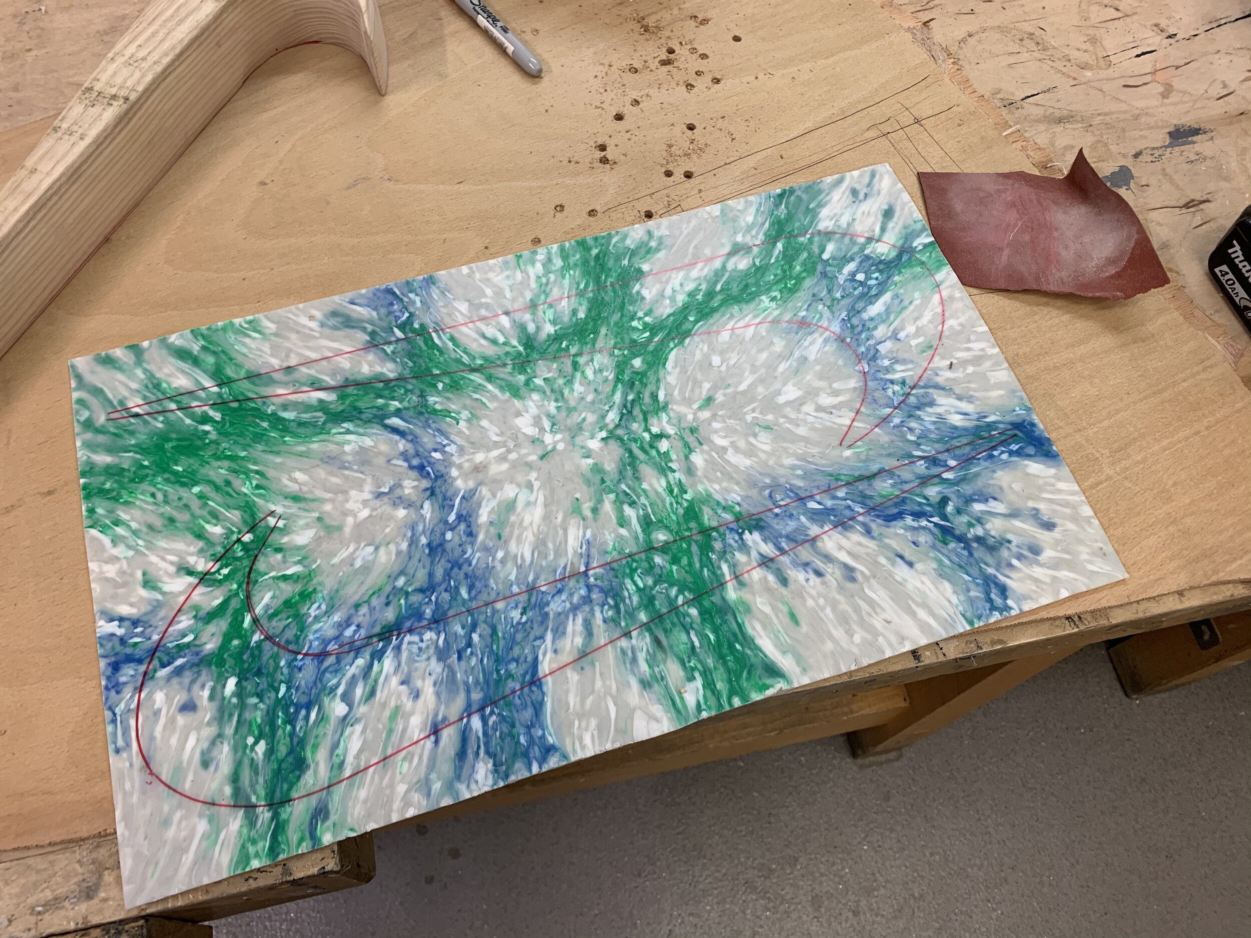
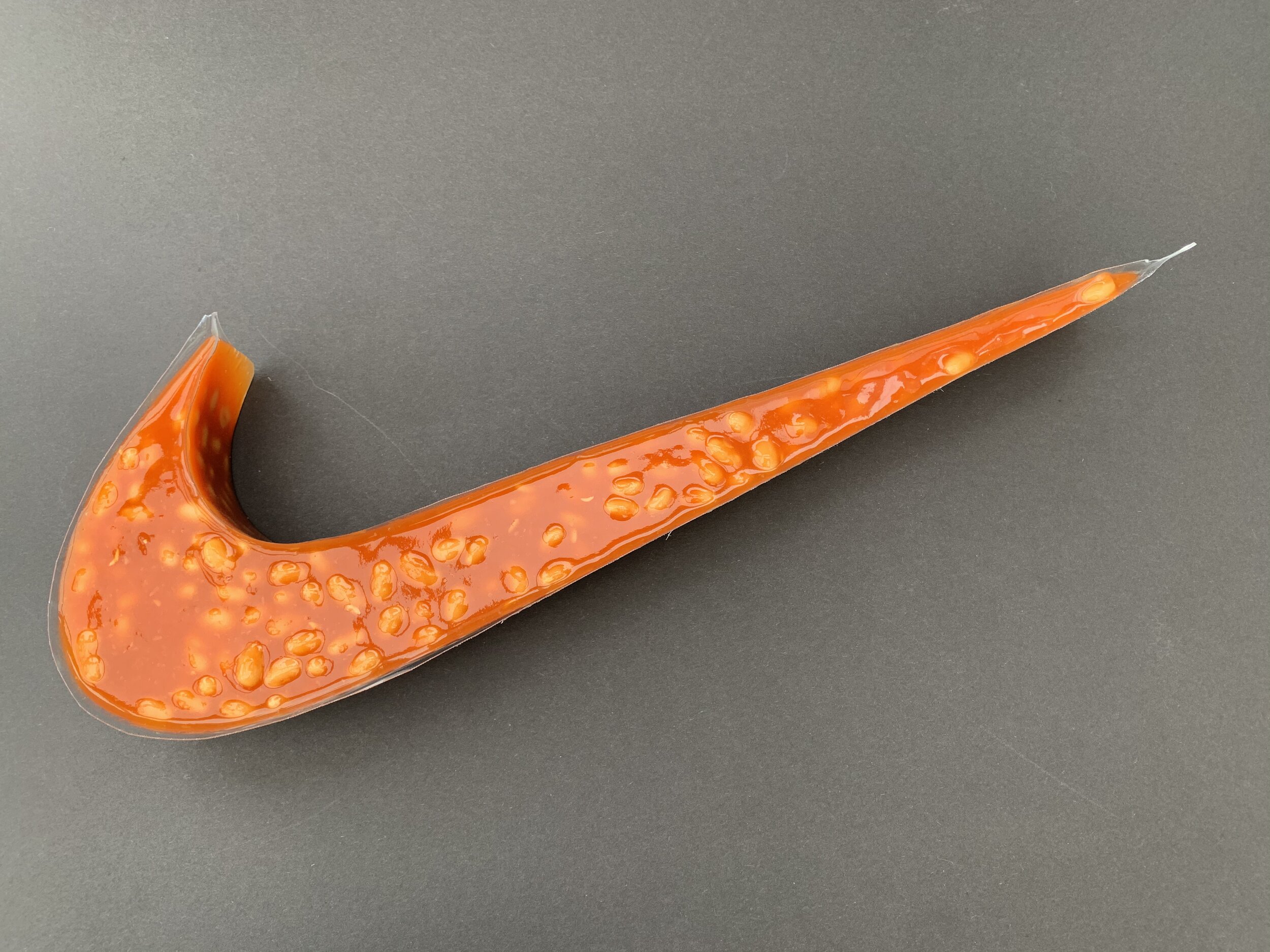
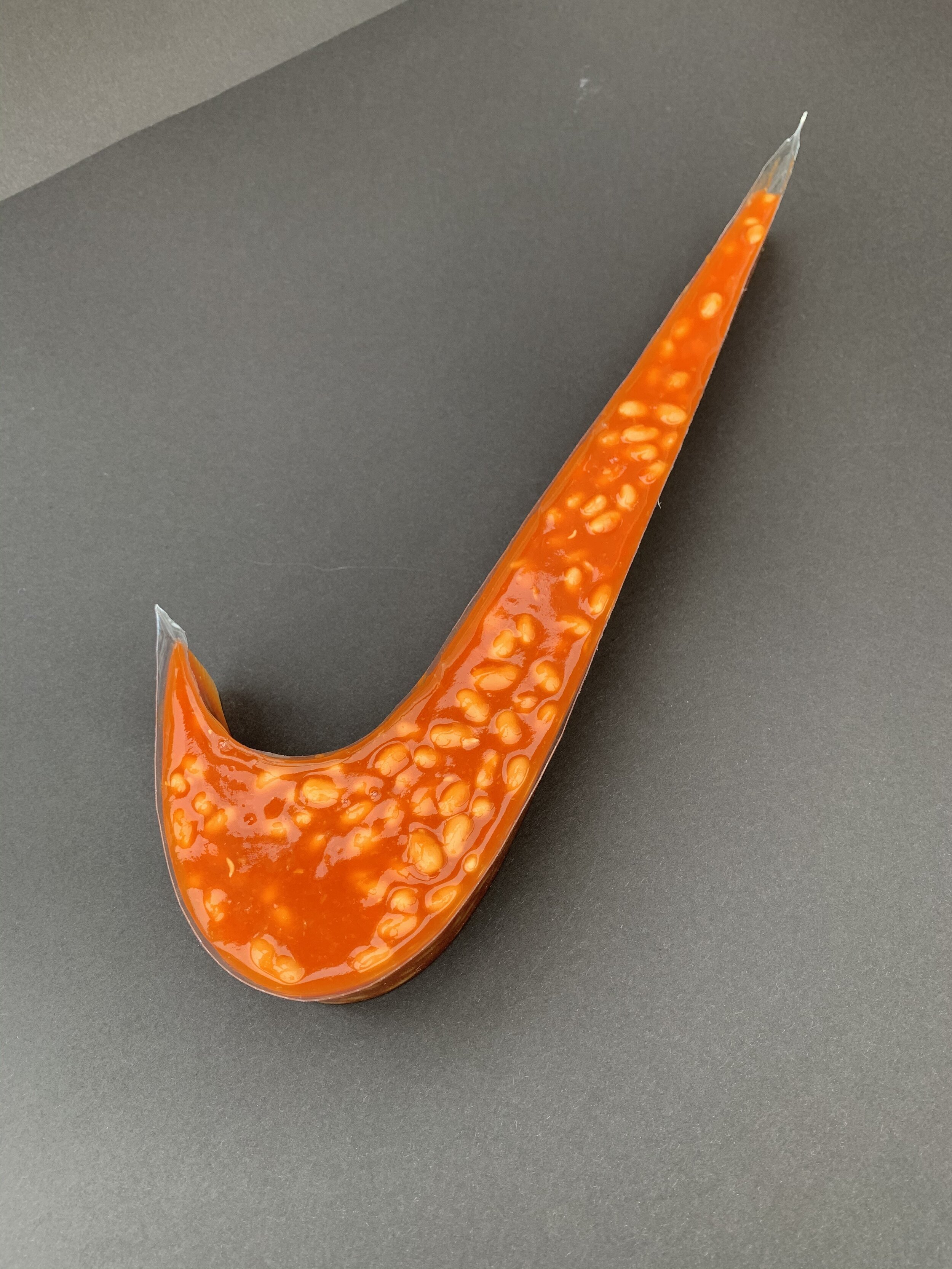
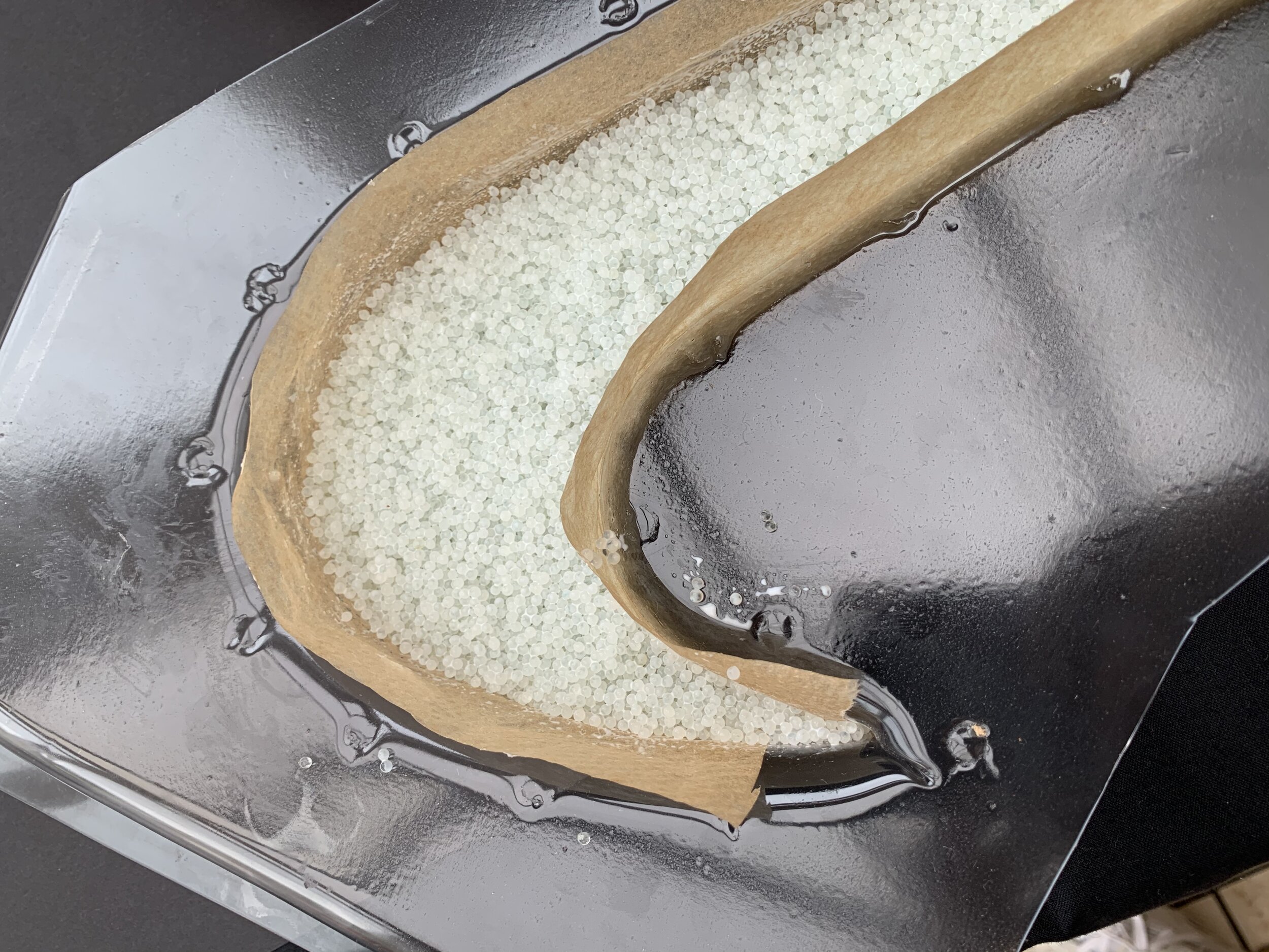
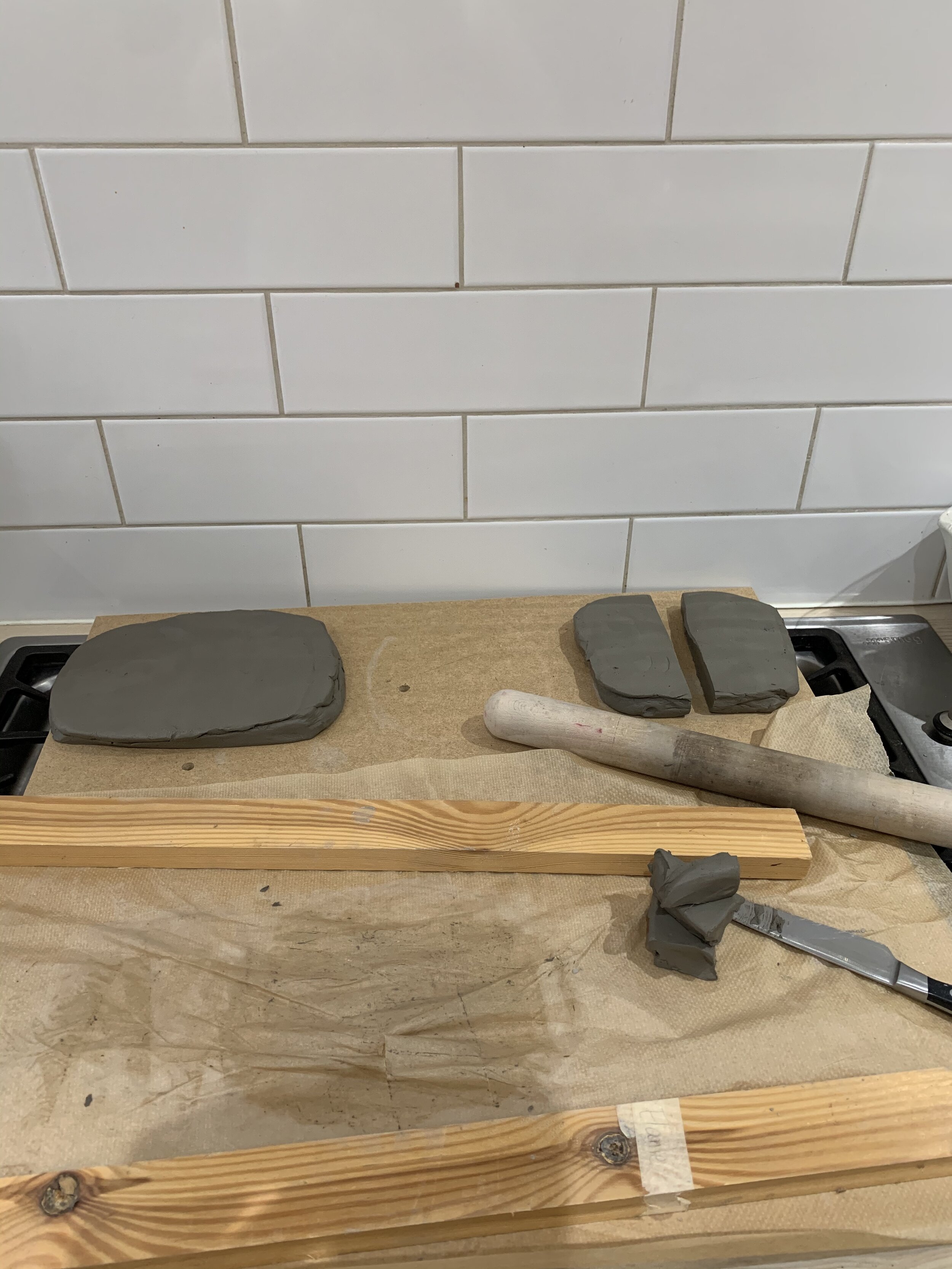
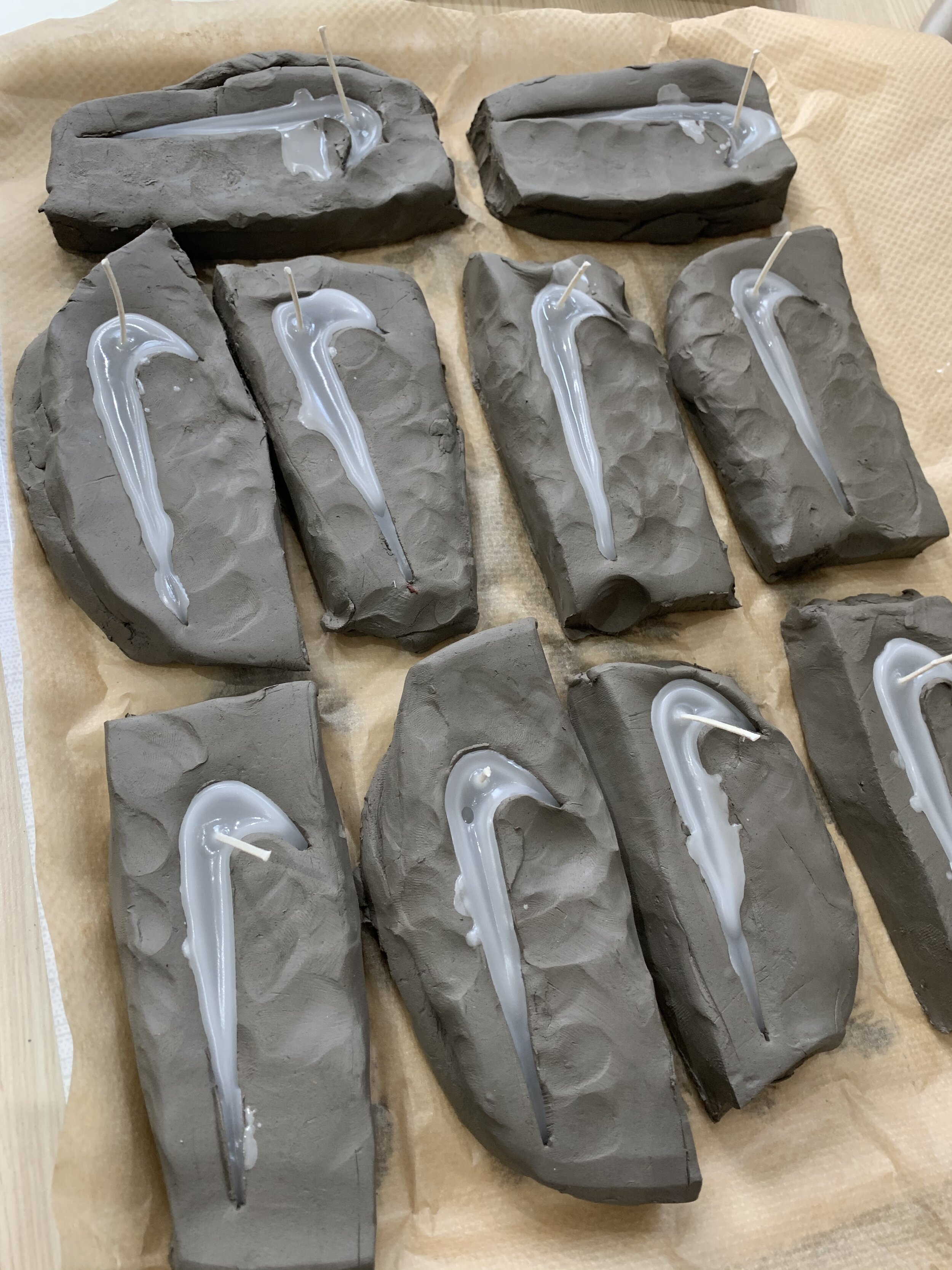
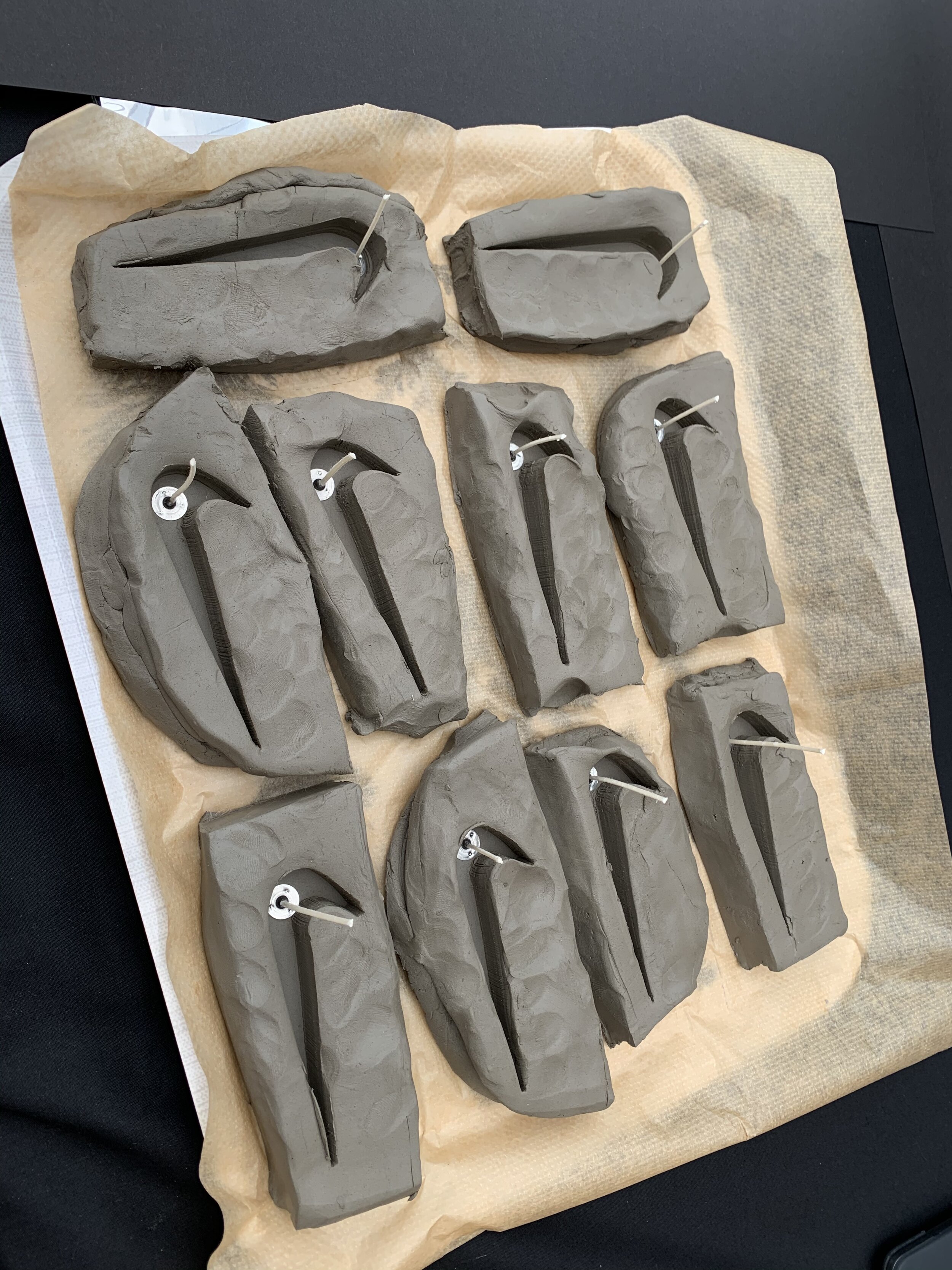
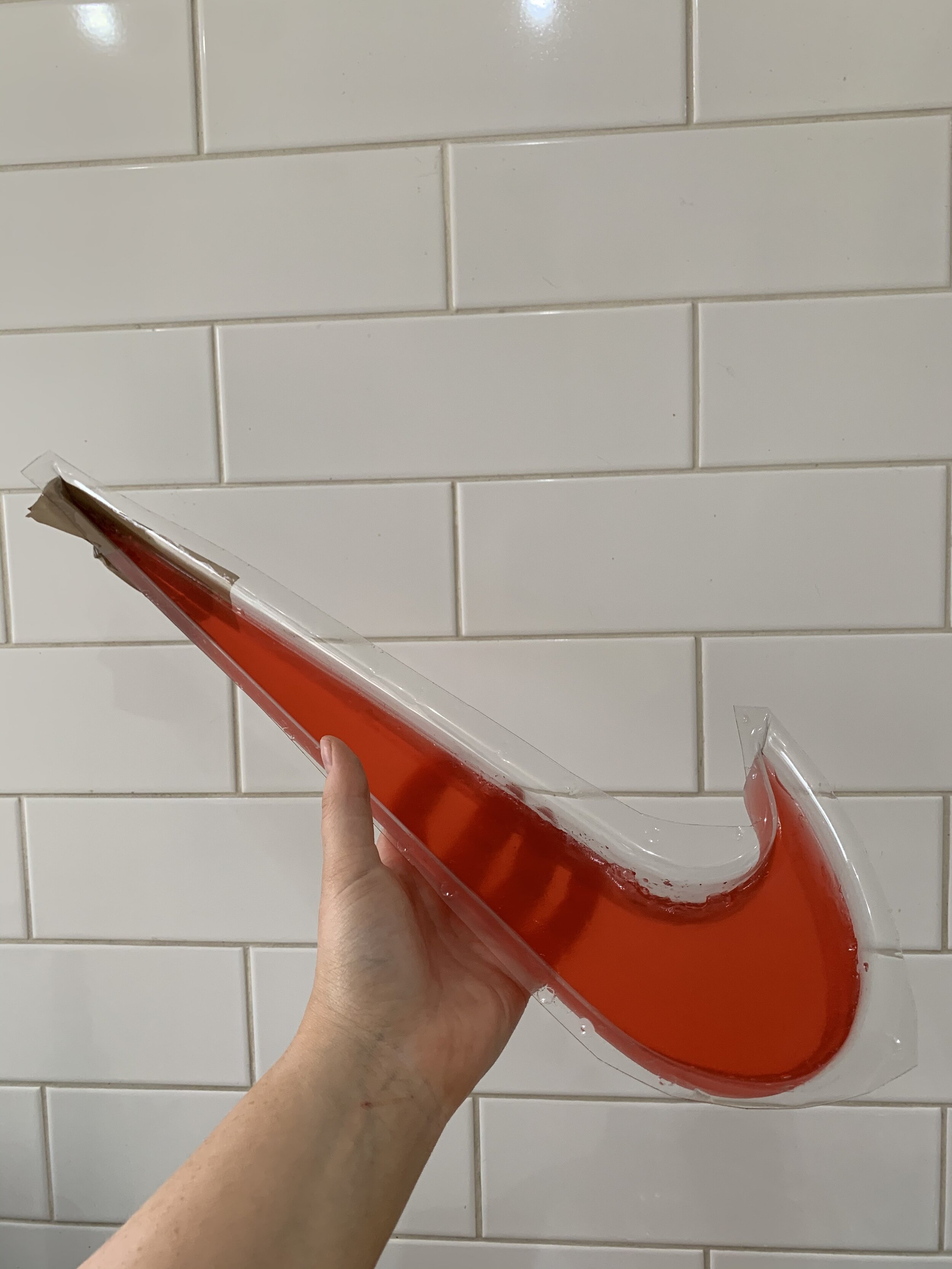
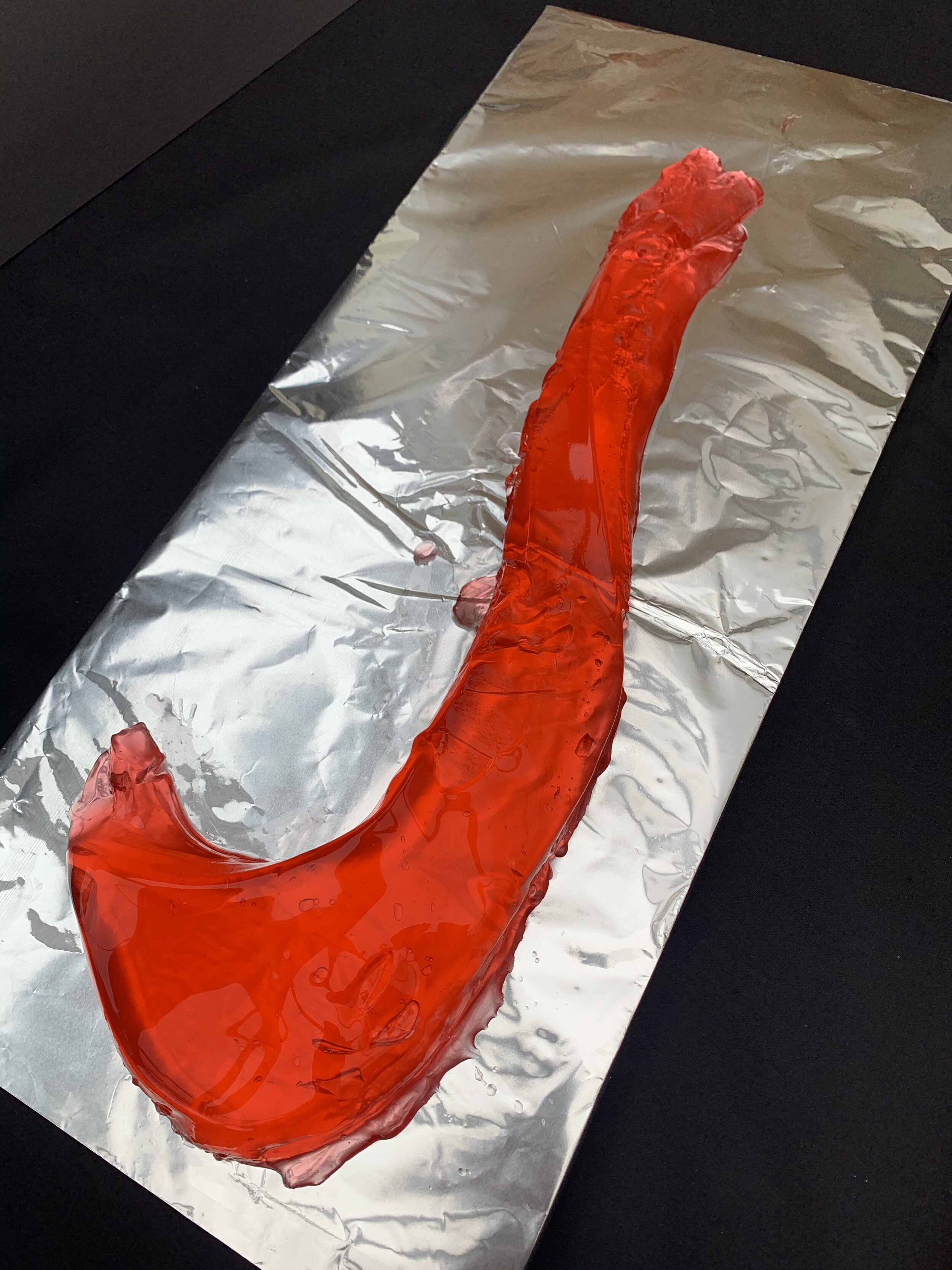
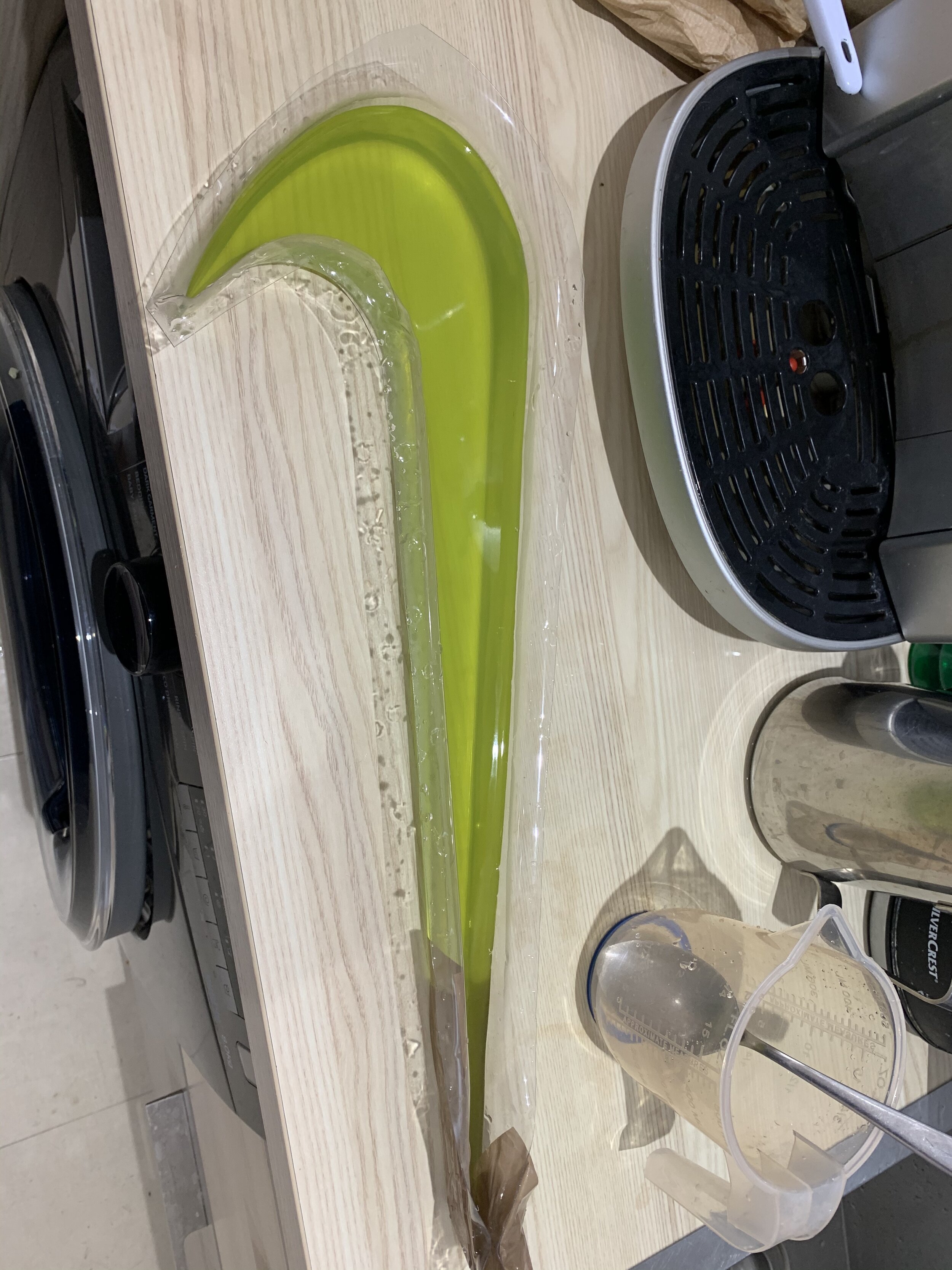
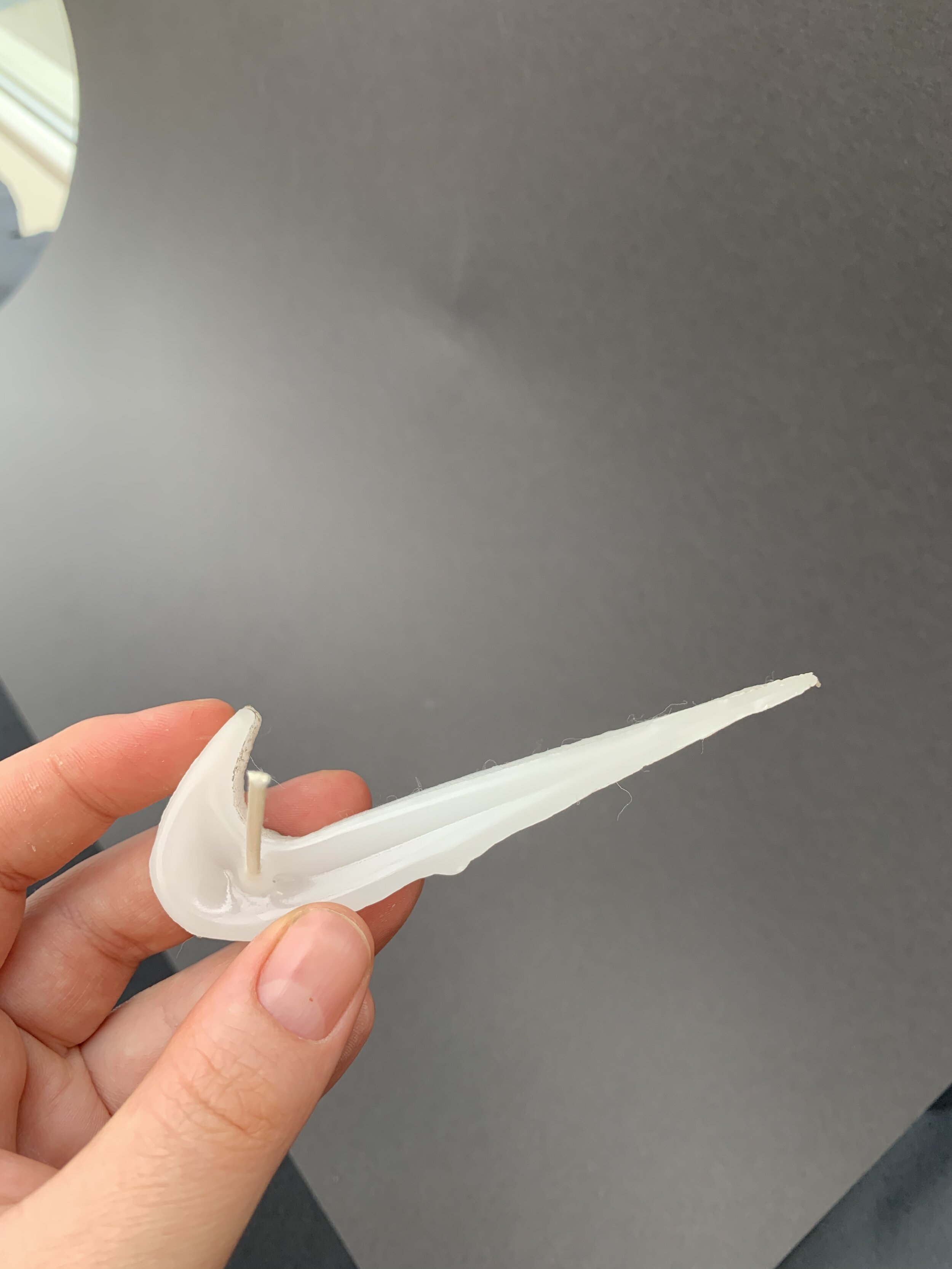
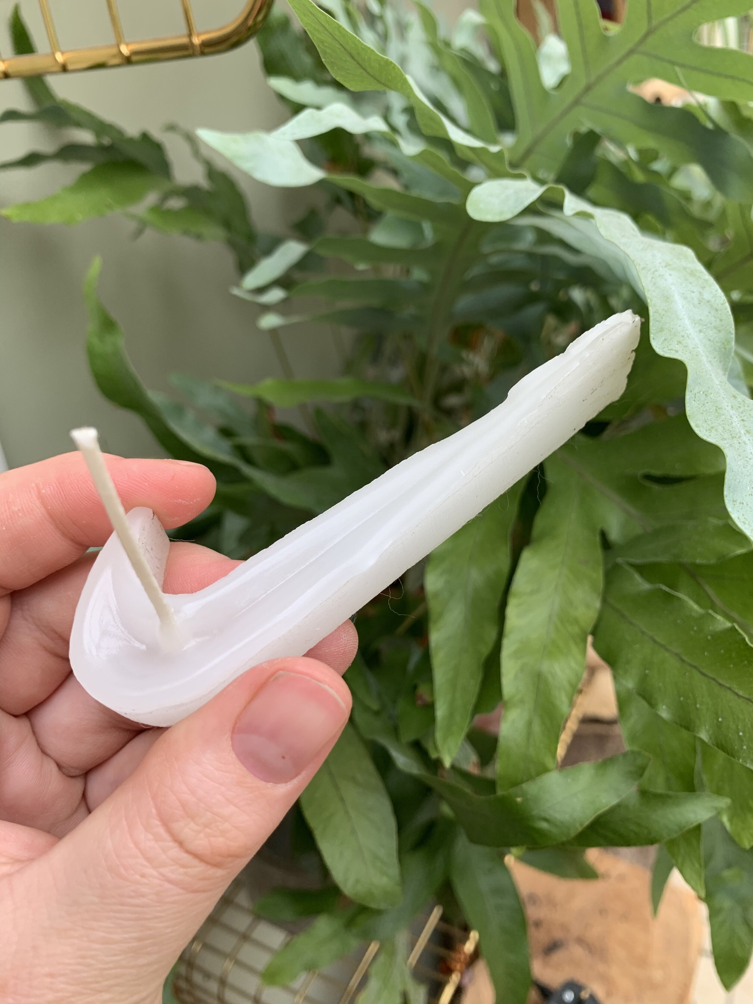
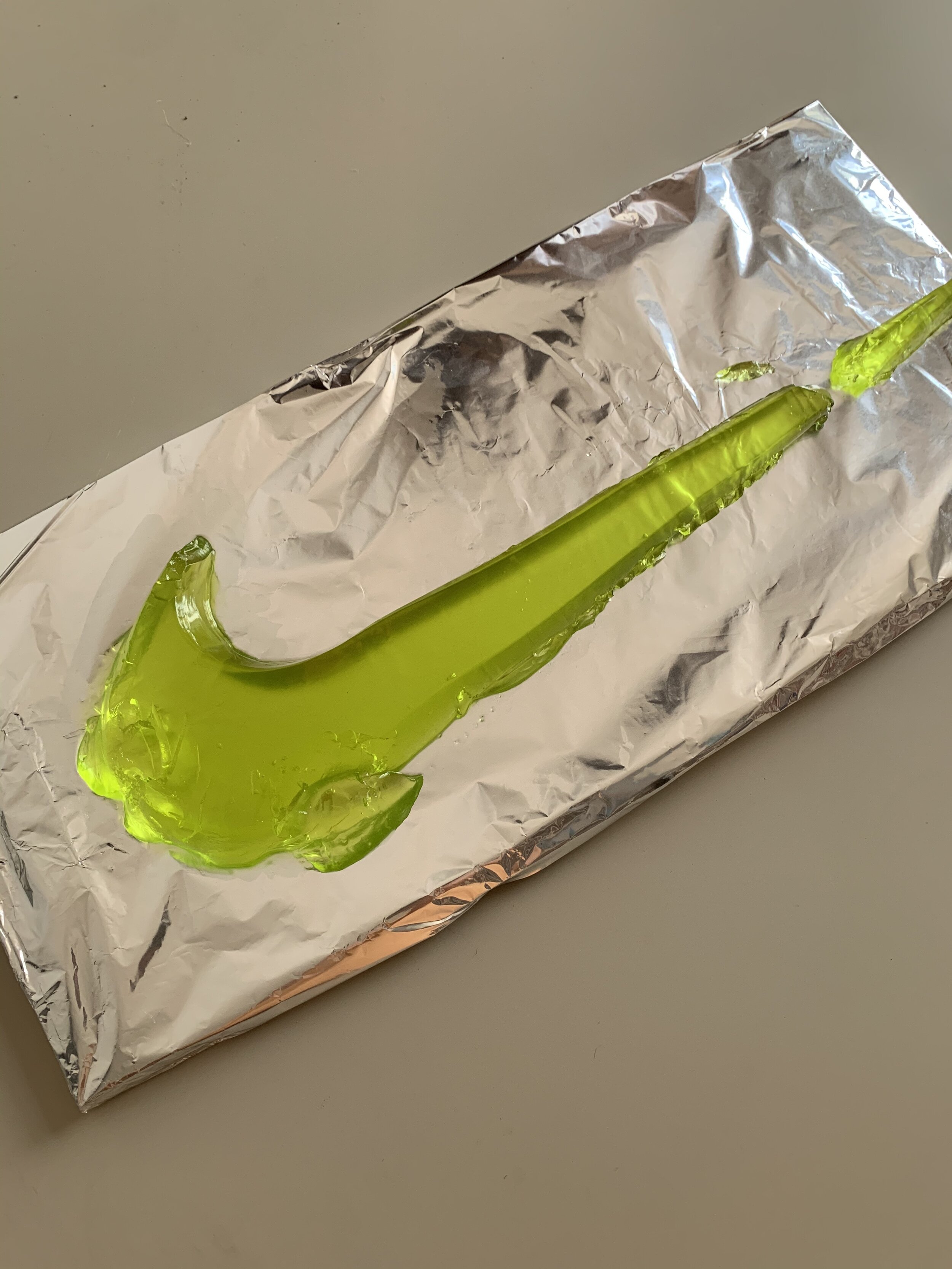
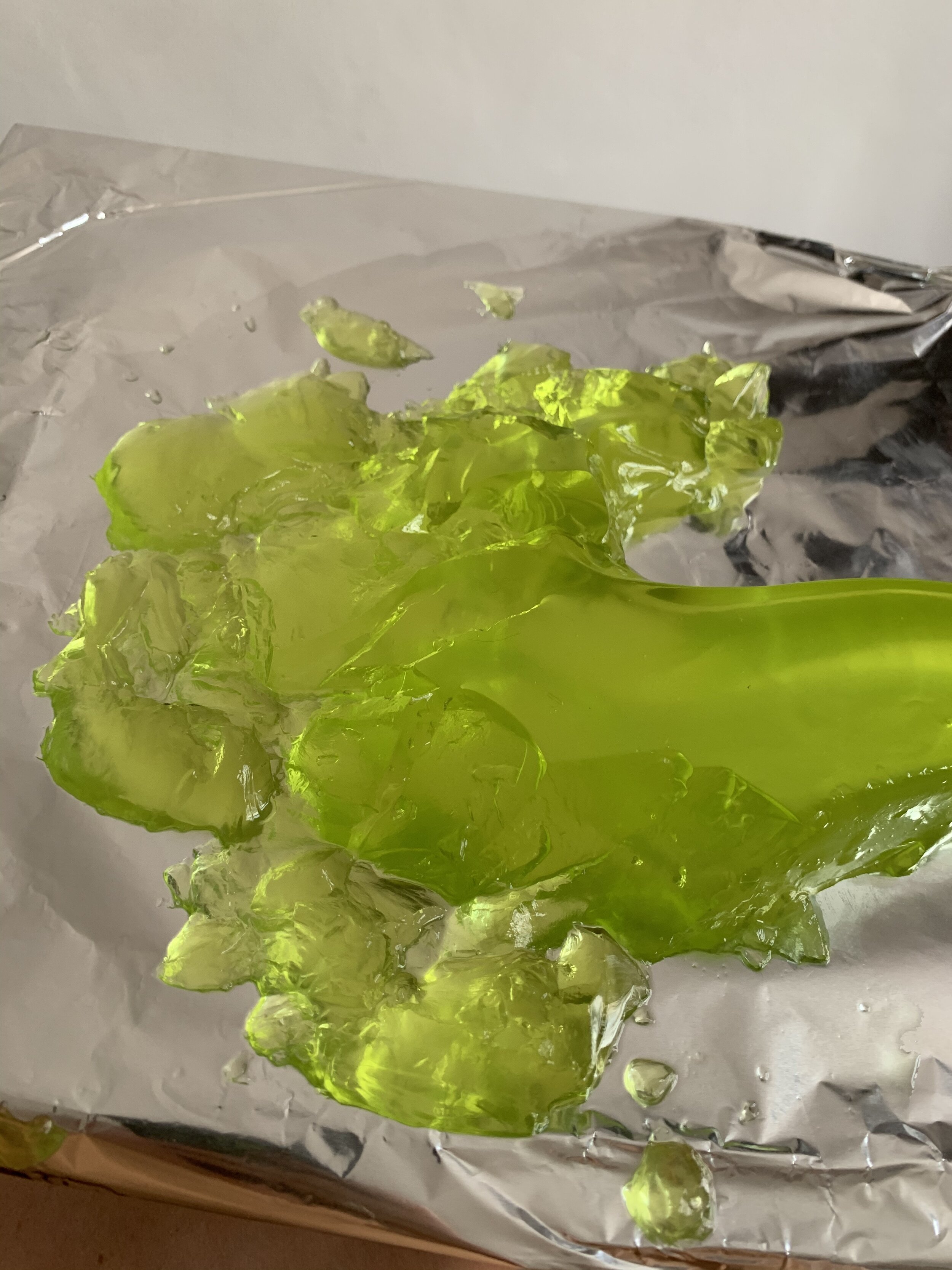
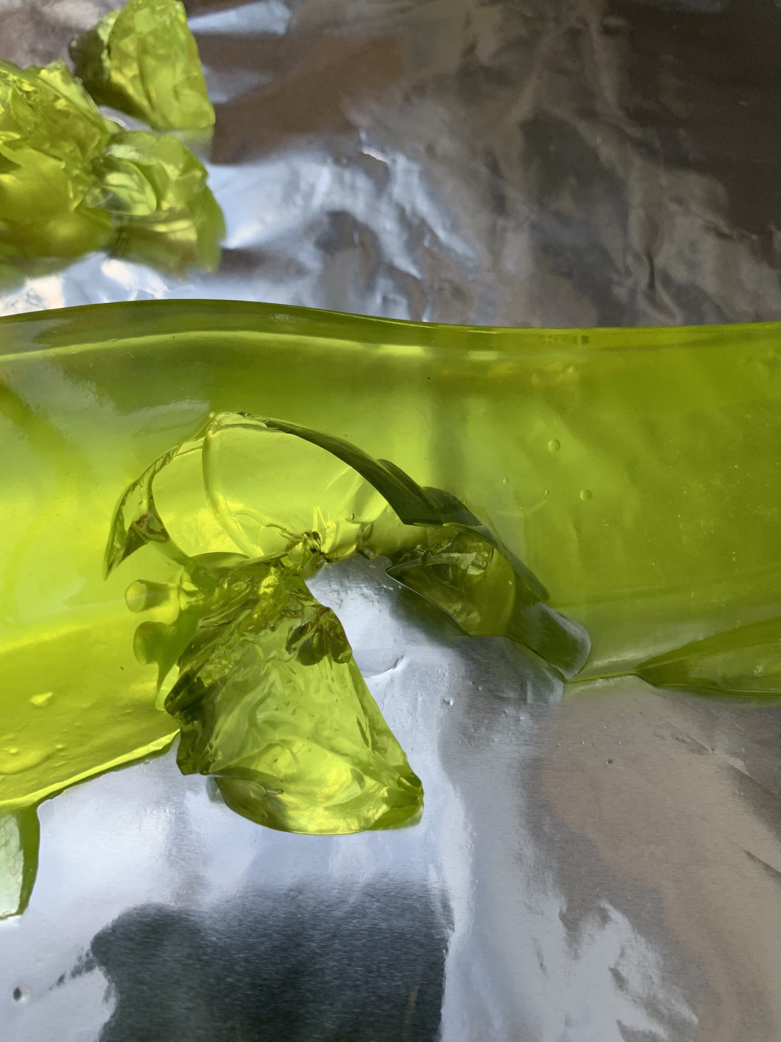
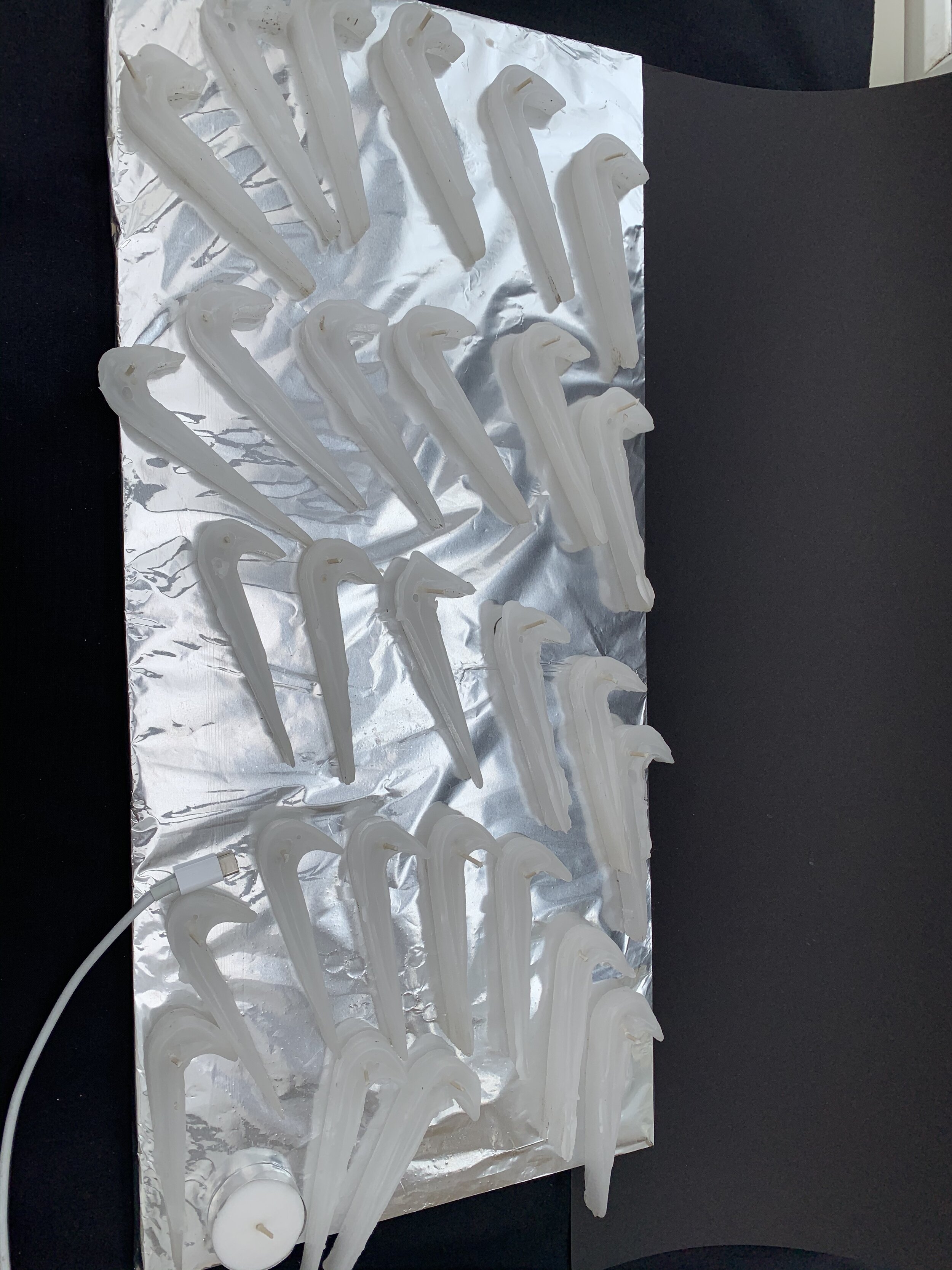
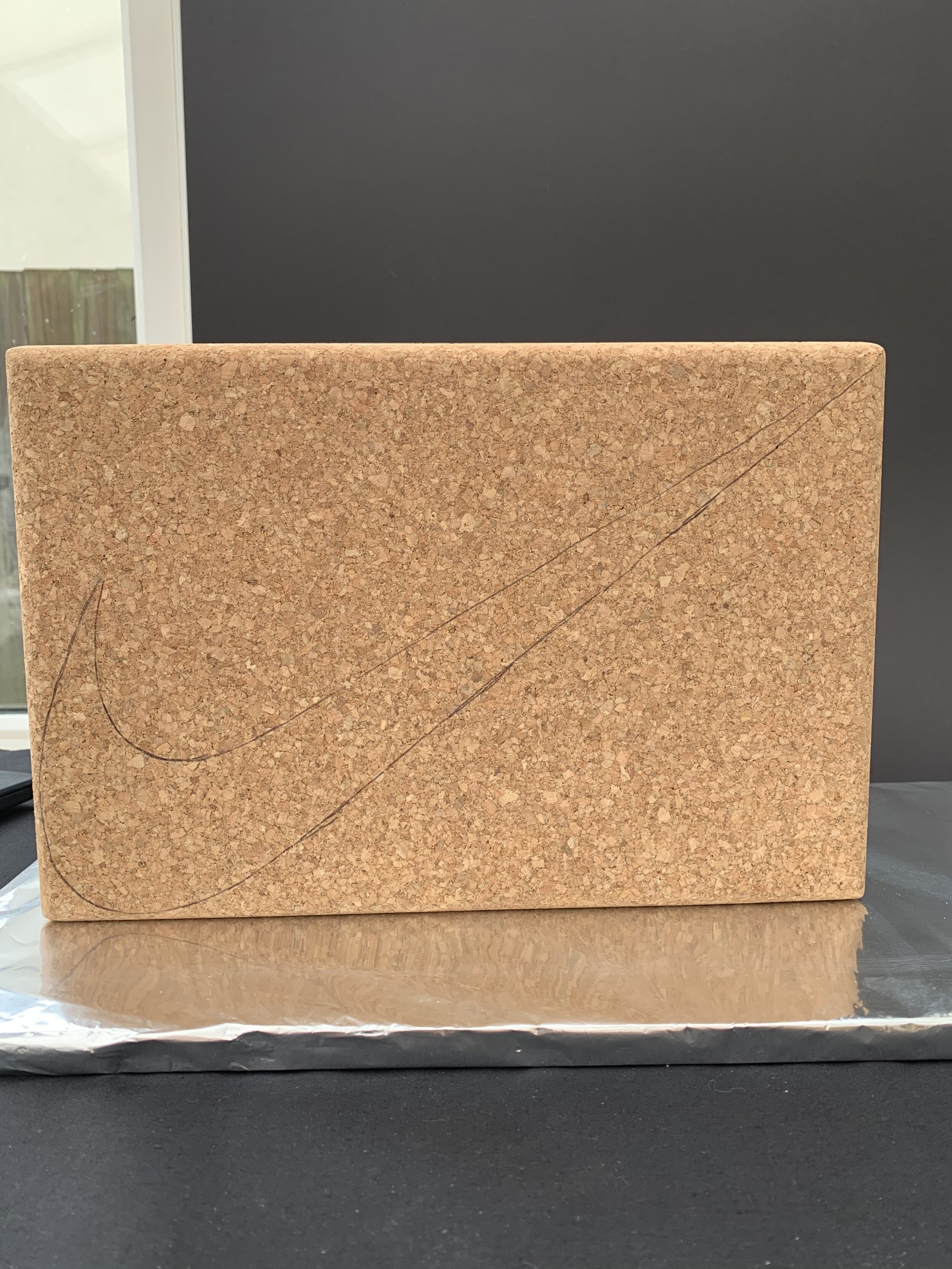
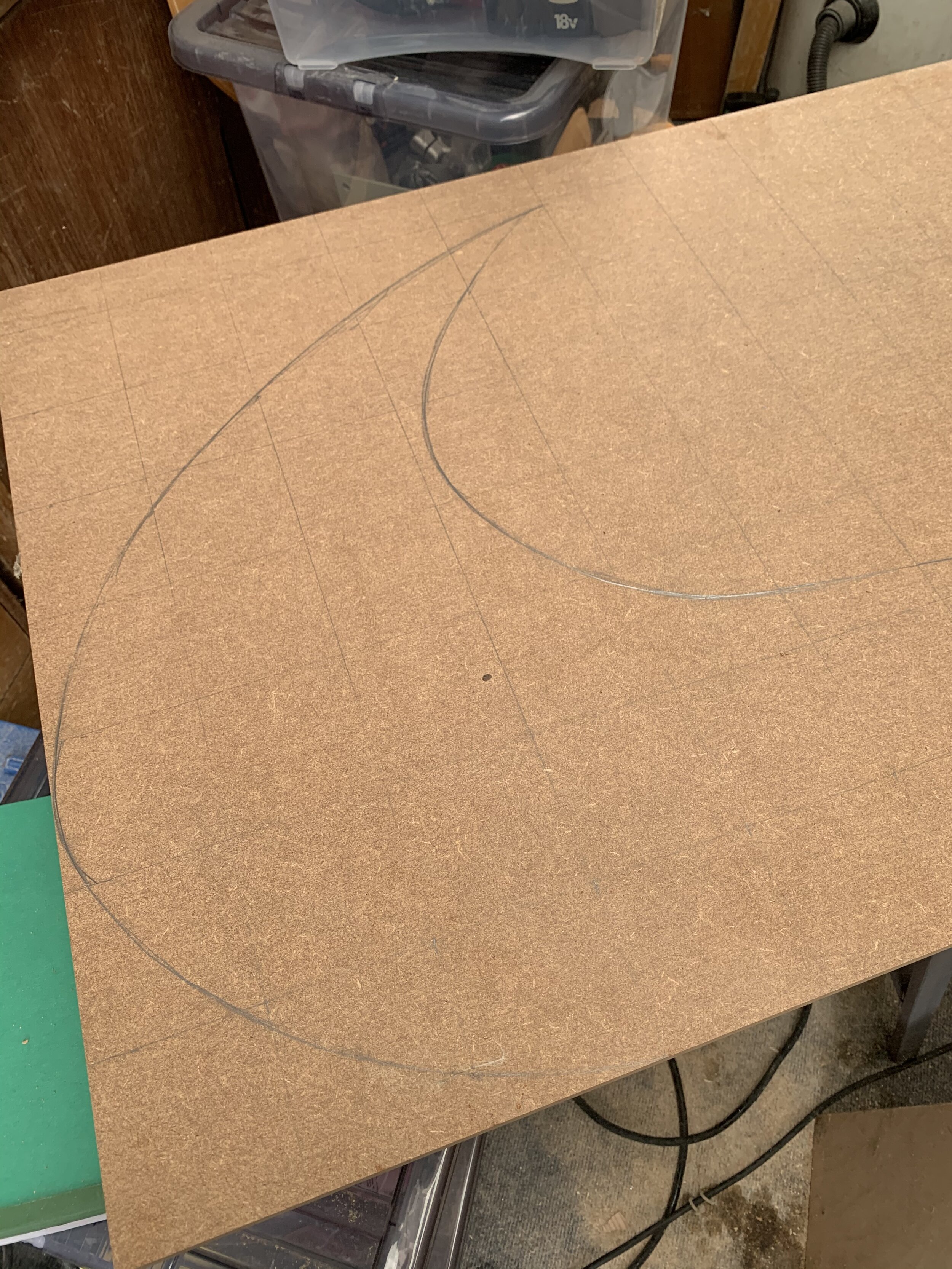
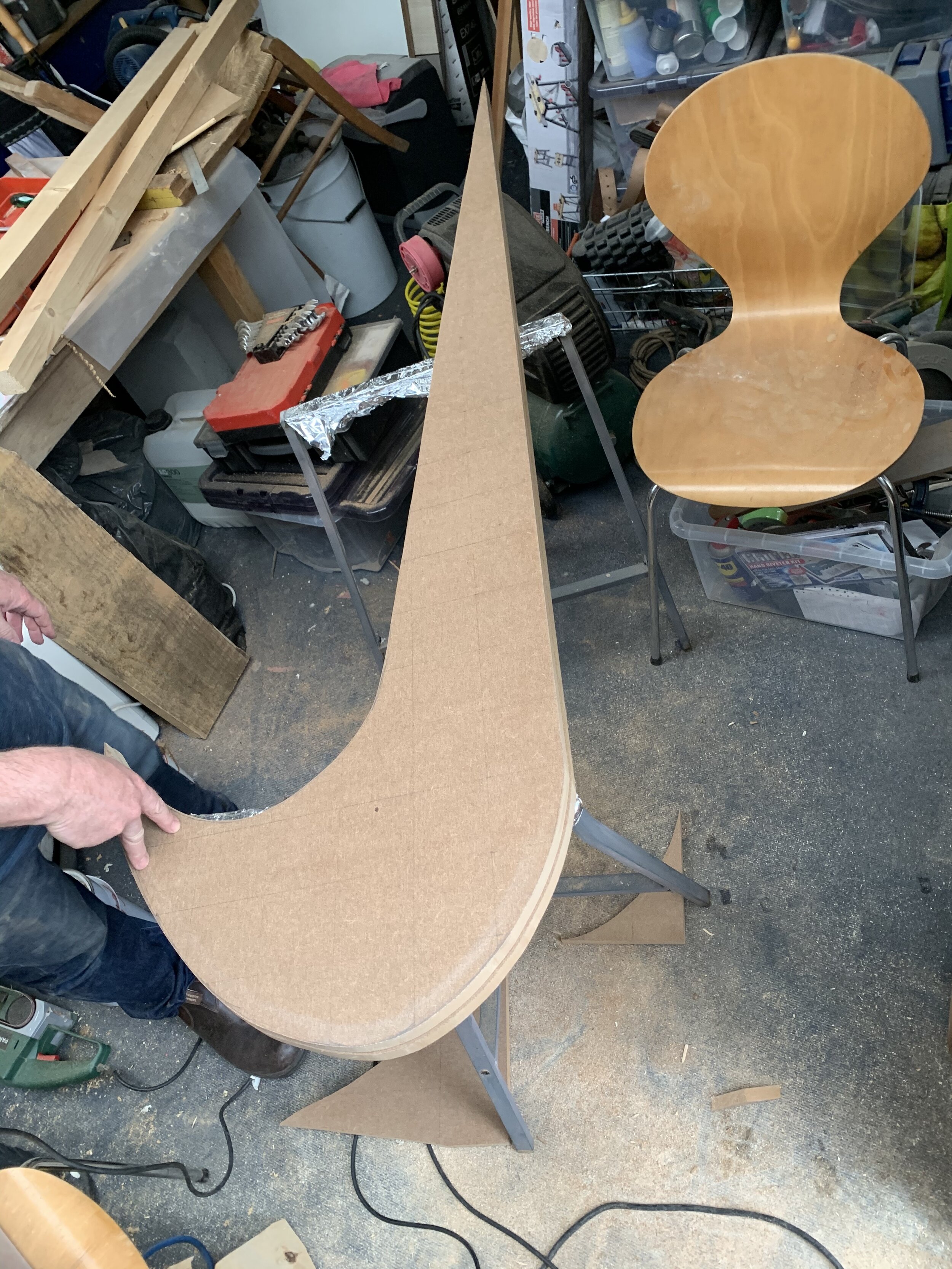
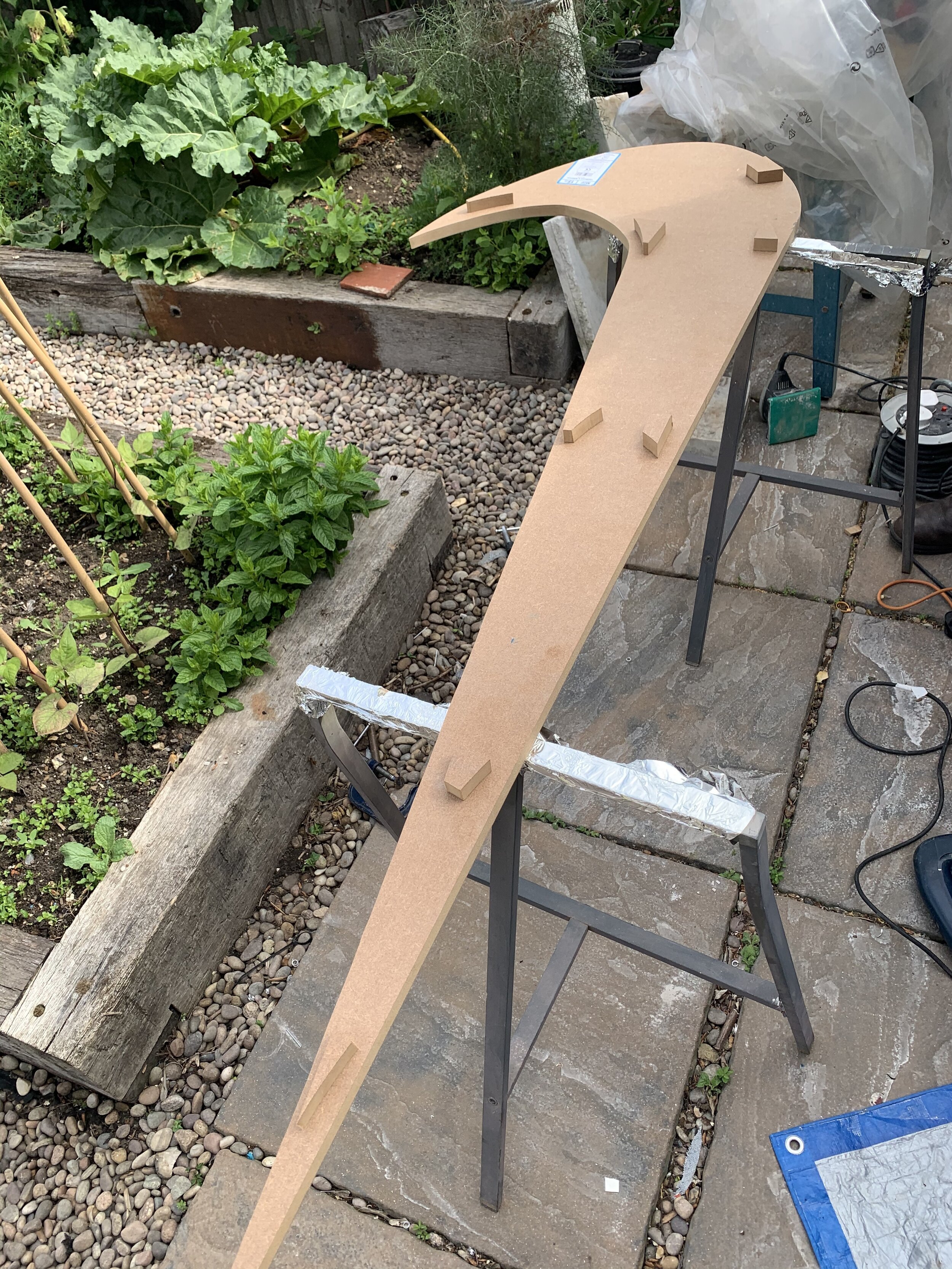
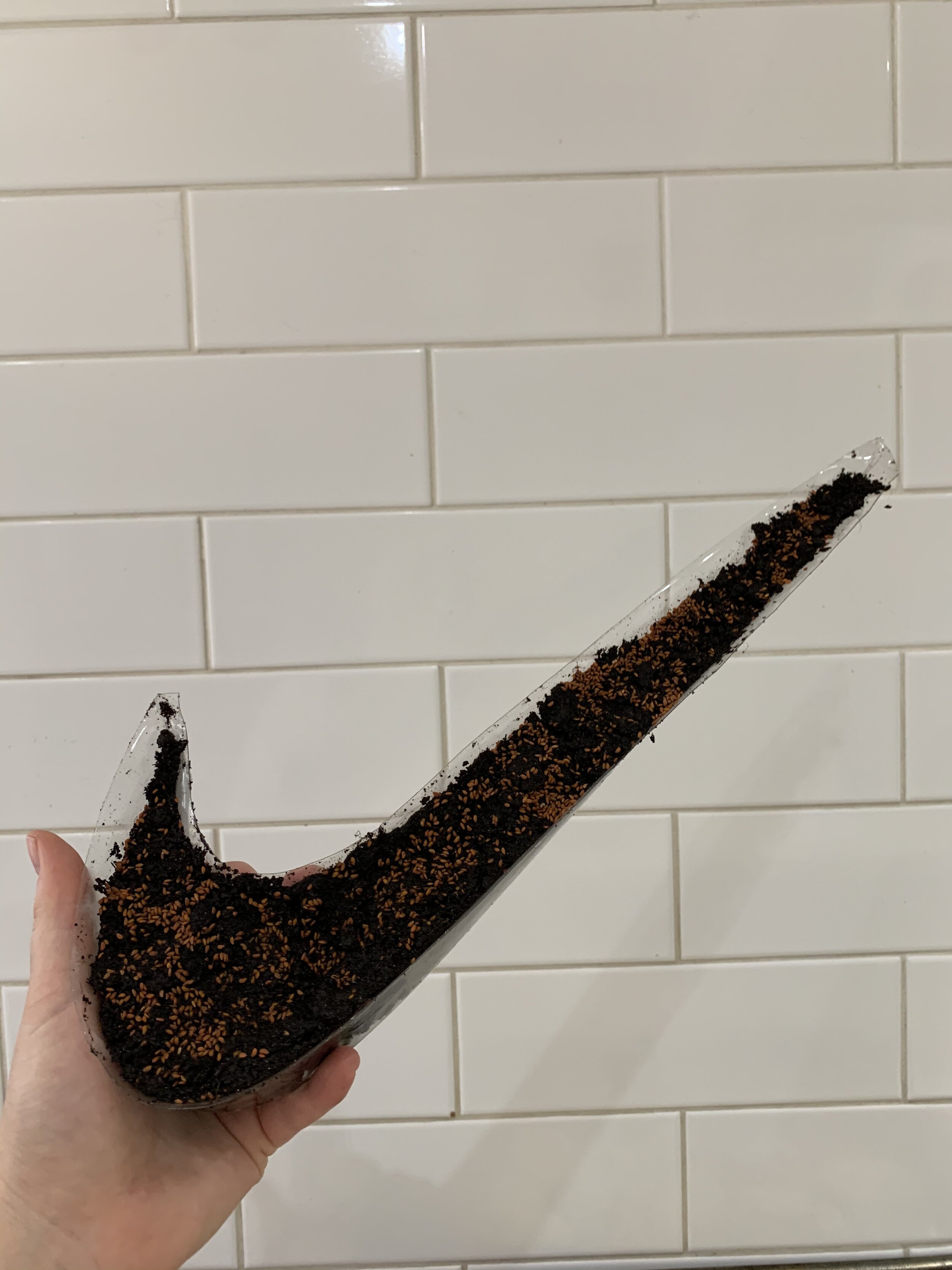
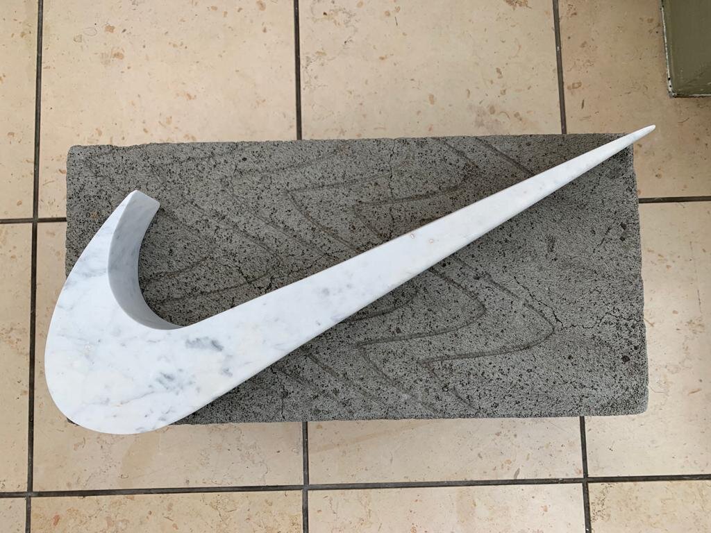
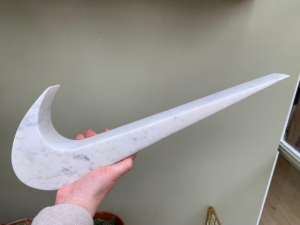
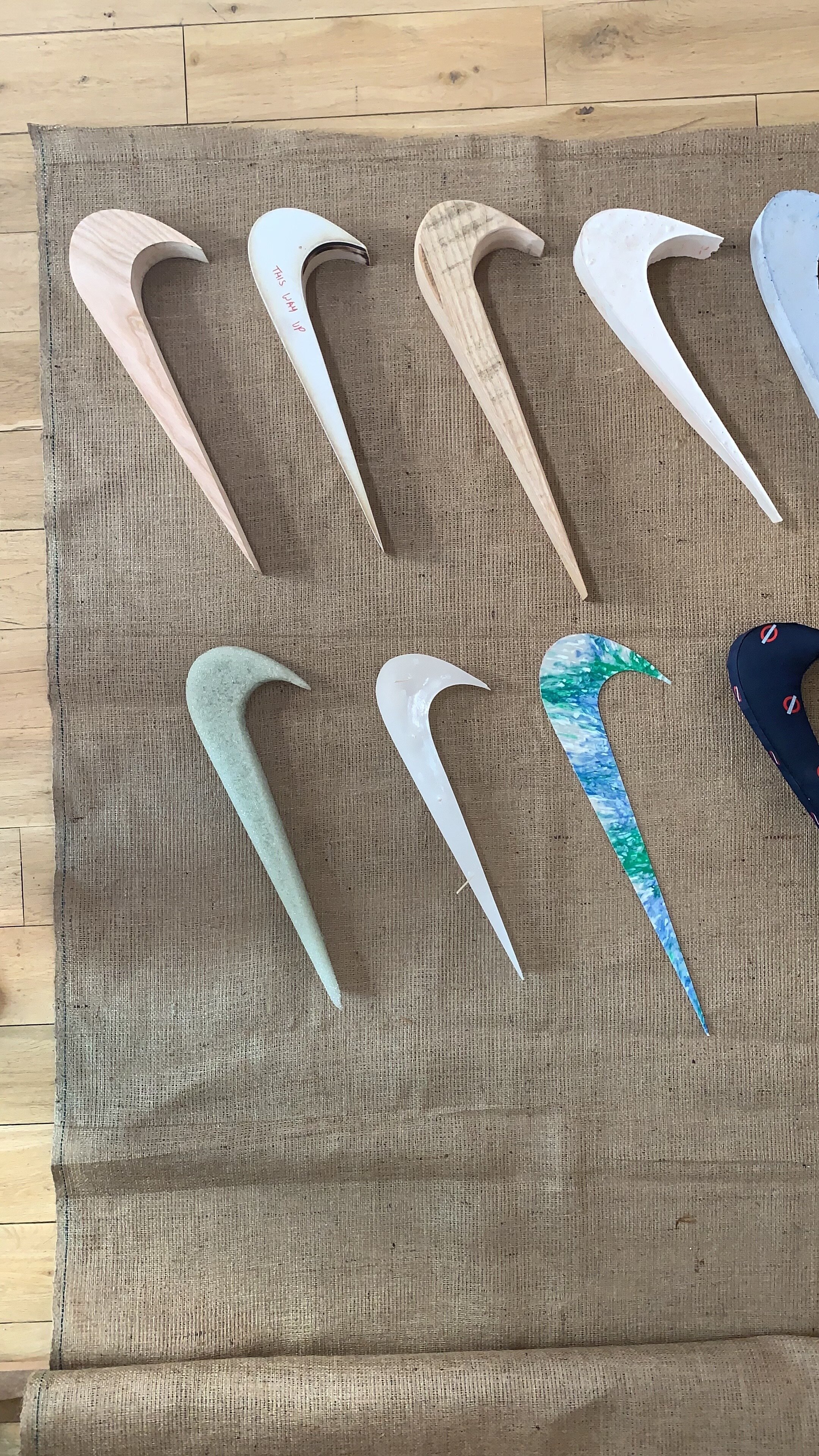
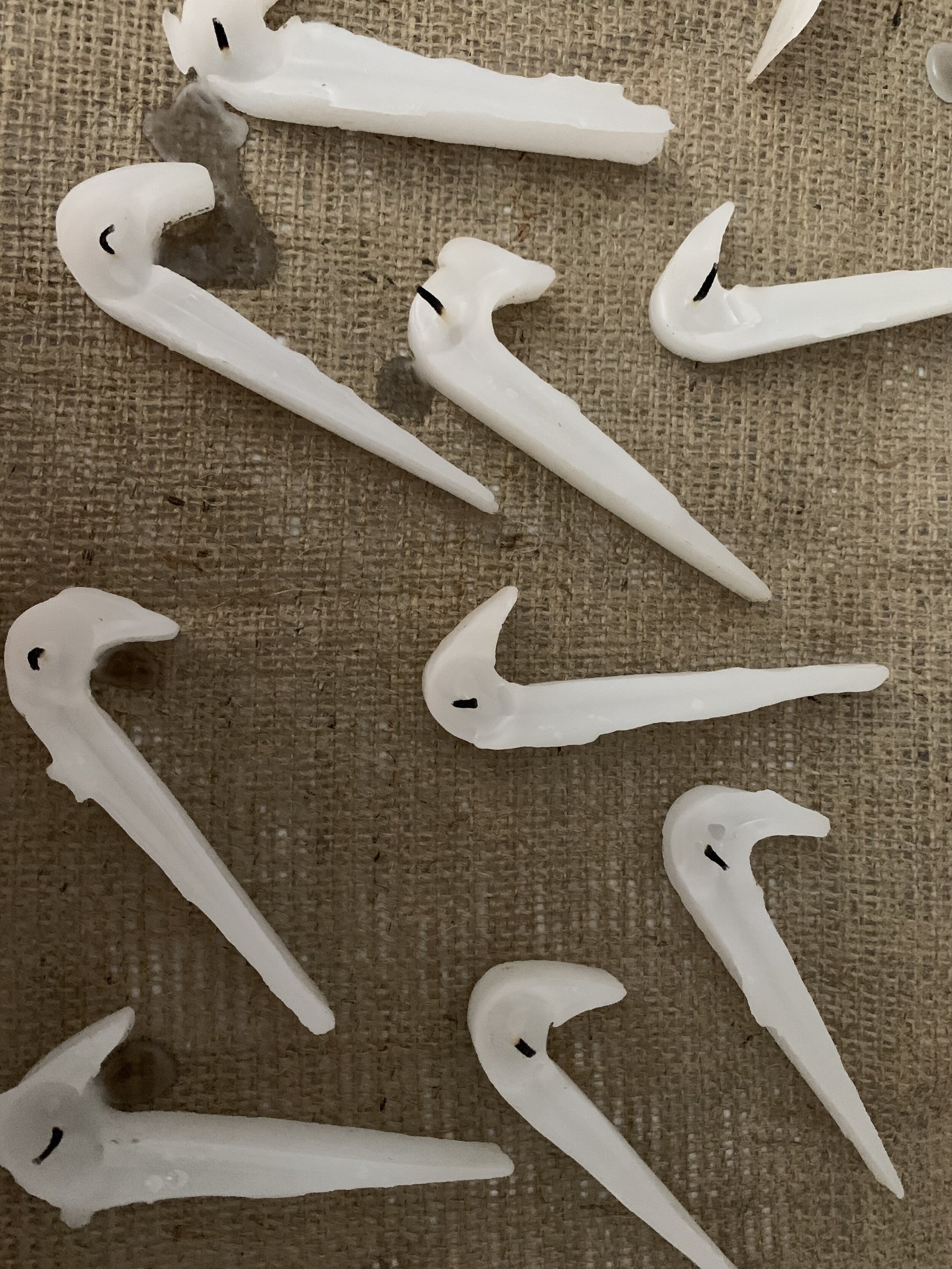
This installation is built by my own obsessions. We worship brands, however these logos are worth nothing until some kind of value is applied. Carolyn Davidson, a student at Portland State university designed the Nike logo in 1971 and was paid $35 dollars. It has been said that in a capitalist market, products are regarded as having inherent value, whereas in fact their value is created by human labour. Others would argue that these products gain their value from their logo. I think that a large proportion of Nike products are purchased because they have been designed with the swoosh logo front and centre. By buying a product with this logo on we are proudly associating with that brand and elevating it’s visibility. Brand fetishism’ is the phenomenon of perceiving trademarks as spiritual entities rather than as informational devices. I am interested in how we can become so dominated by a logo, even when we don’t know the history of that brand. As fans we become so obsessed with a logo that the logo becomes more important than the products it sits on. So does this mean that we could just sell logos? By taking a symbol out of its standard context and reproducing it in different materials I want to communicate the power this logo holds. Focusing on craftsmanship and design, I have learnt and applied different methods of making to each piece. Each sculpture represents my own journey into material understanding whilst placing the logo at the forefront of my obsessions. My work moves away from making functional products and focuses on objectness and the craftsmanship manifested in a brand logo. The logo is now the product but it’s still “Just A Tick”.


Art Director & Curator: Lilli Conreen
Photographer: Lilli Conreen
Sculpture: Lilli Conreen
Collaborators: Martin Conreen, Katya Rogers, Terry Hughes & Alina zum Hebel.